by abduzeedo
LAT | A Creative Company has delivered a stunning branding and visual identity for LFG, a wellness podcast dedicated to spreading happiness and positivity through exercise. The American brand incorporates the well-known urban acronym into its DNA, standing for Life Fitness Goals. With a vision to inspire and uplift, LFG aims to share real-life stories of individuals who have overcome challenges through physical and mental fitness. LAT's creative output for LFG encompasses a positive, honest, and straightforward brand that resonates with its audience.
A Striking Brand Identity
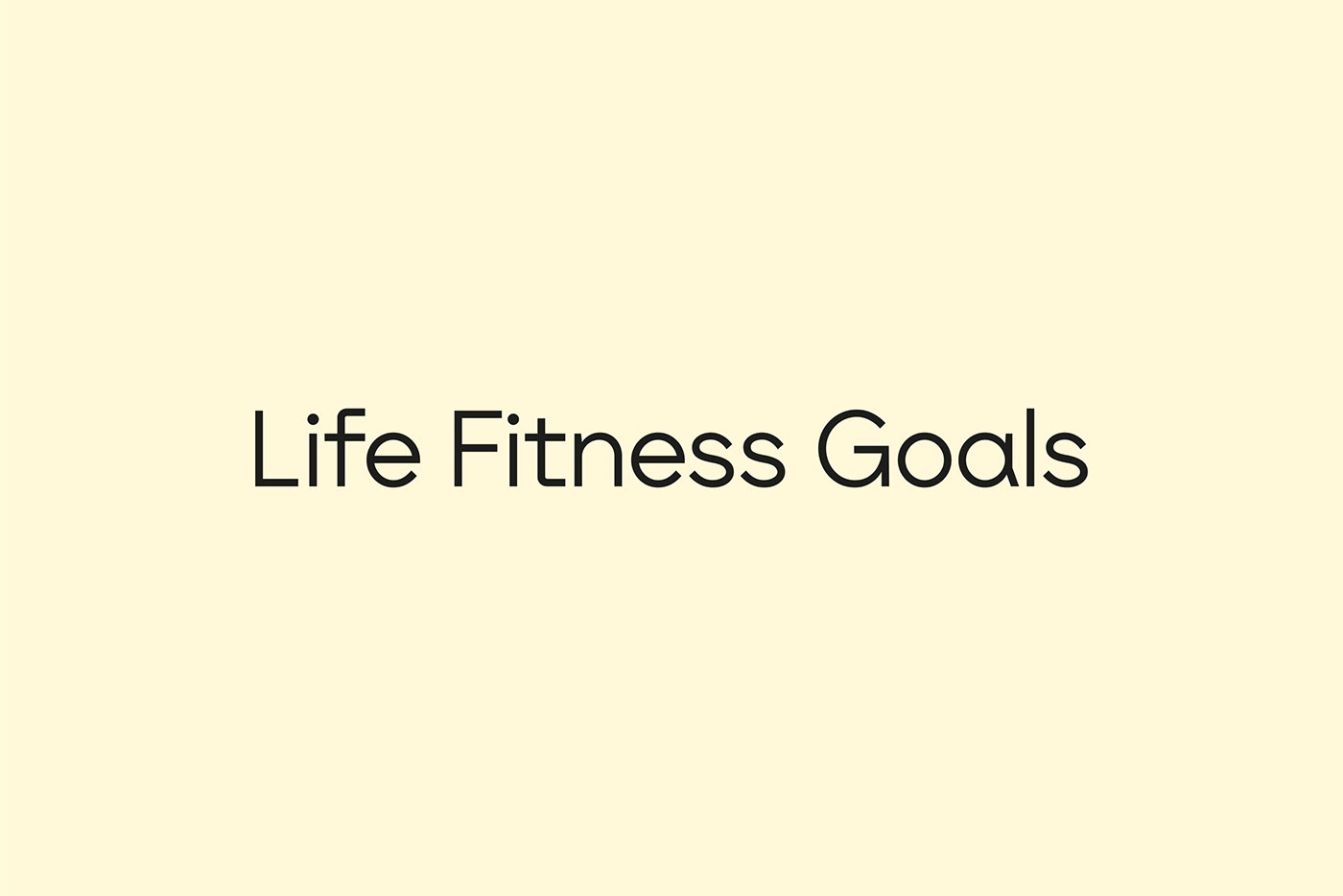
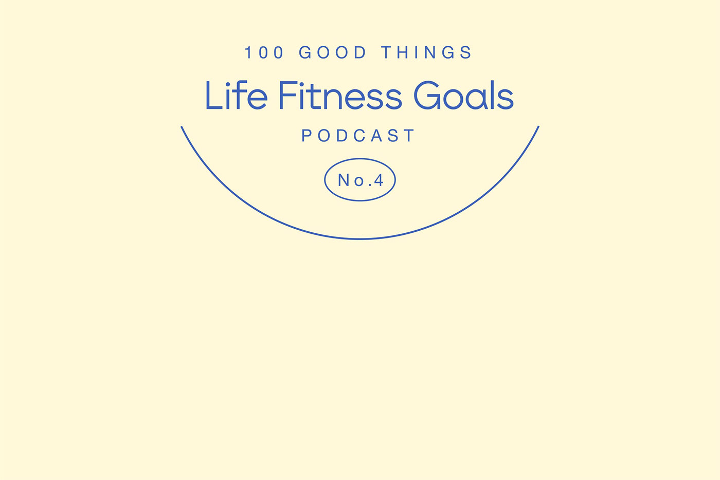
LAT's approach to the LFG branding centers around positivity and authenticity. The wordmark features a semi-bold, sans-serif font, which conveys a sense of strength and clarity. This choice reflects the podcast's dedication to promoting well-being and achieving fitness goals. The brand palette utilizes warm, muted, yet vibrant colors that evoke a feeling of energy and positivity. By carefully selecting these hues, LAT establishes a visual language that aligns perfectly with LFG's core values.
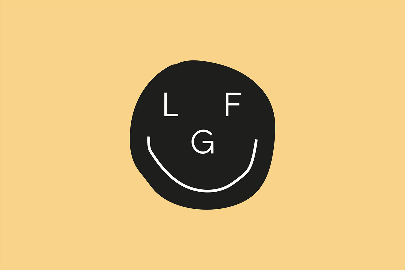
The Smiling Face Icon
At the heart of LFG's visual identity lies a cleverly crafted brand icon. The letters LFG are ingeniously arranged to form a smiling face, reinforcing the podcast's message of happiness and positivity. This iconic element immediately captures attention and becomes a memorable symbol associated with the brand. The incorporation of the smiling face adds a touch of warmth and friendliness to the overall visual identity.
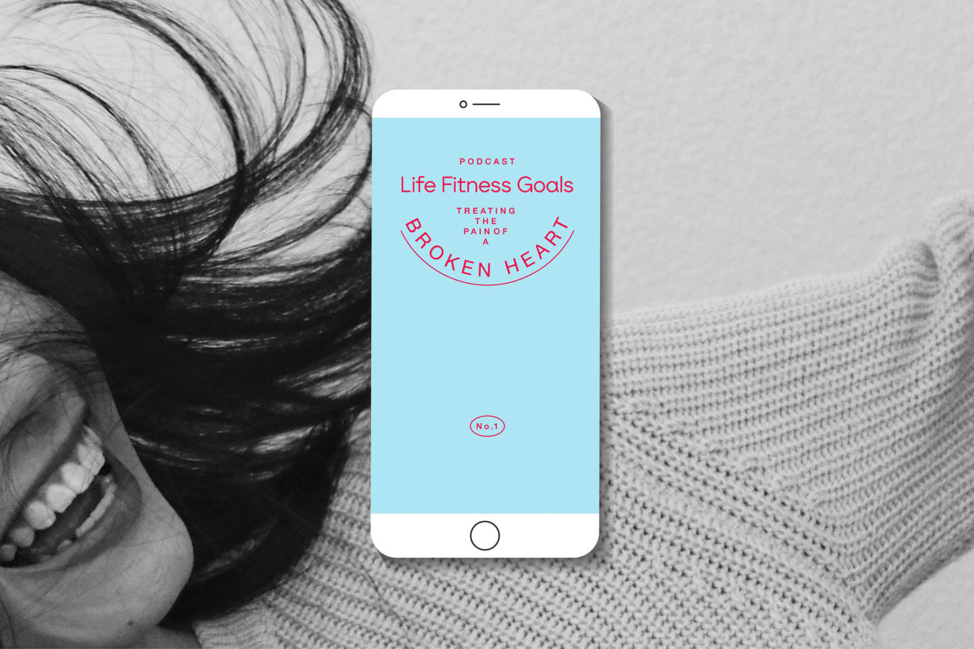
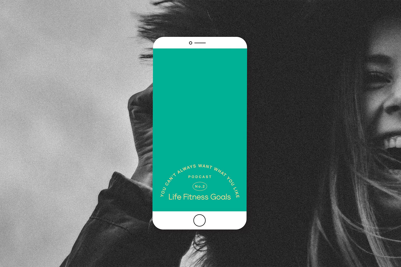
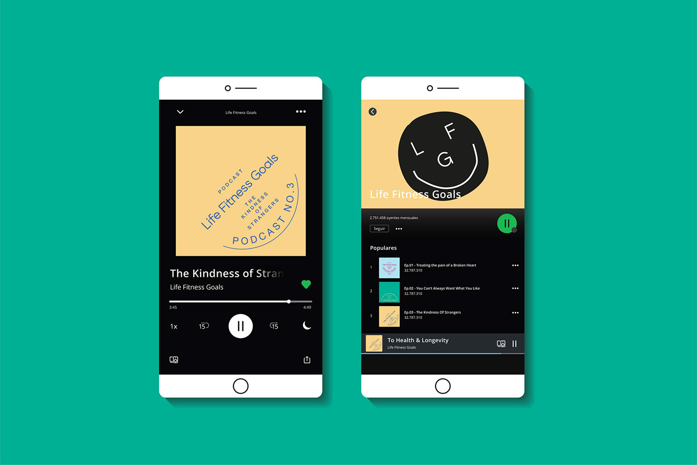
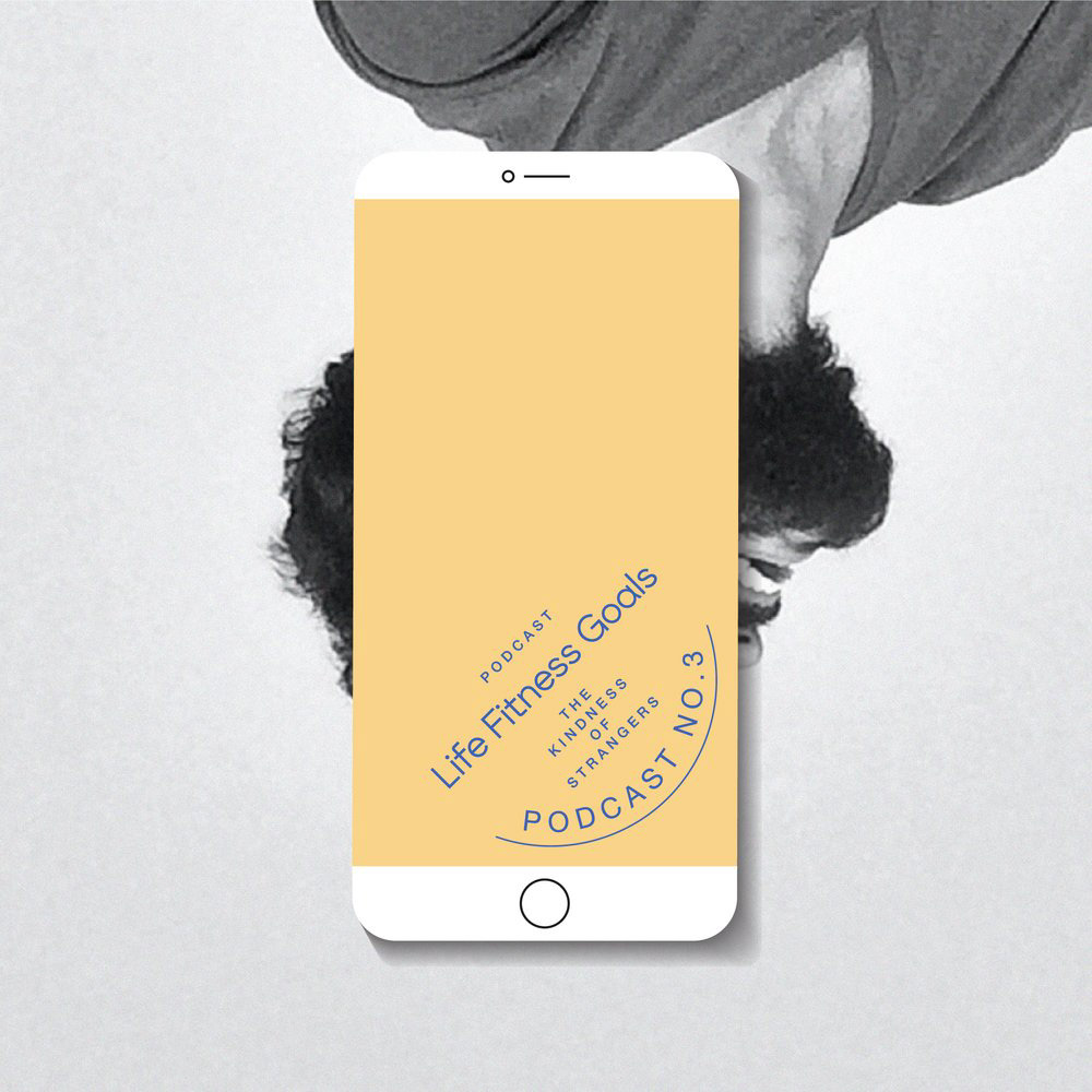
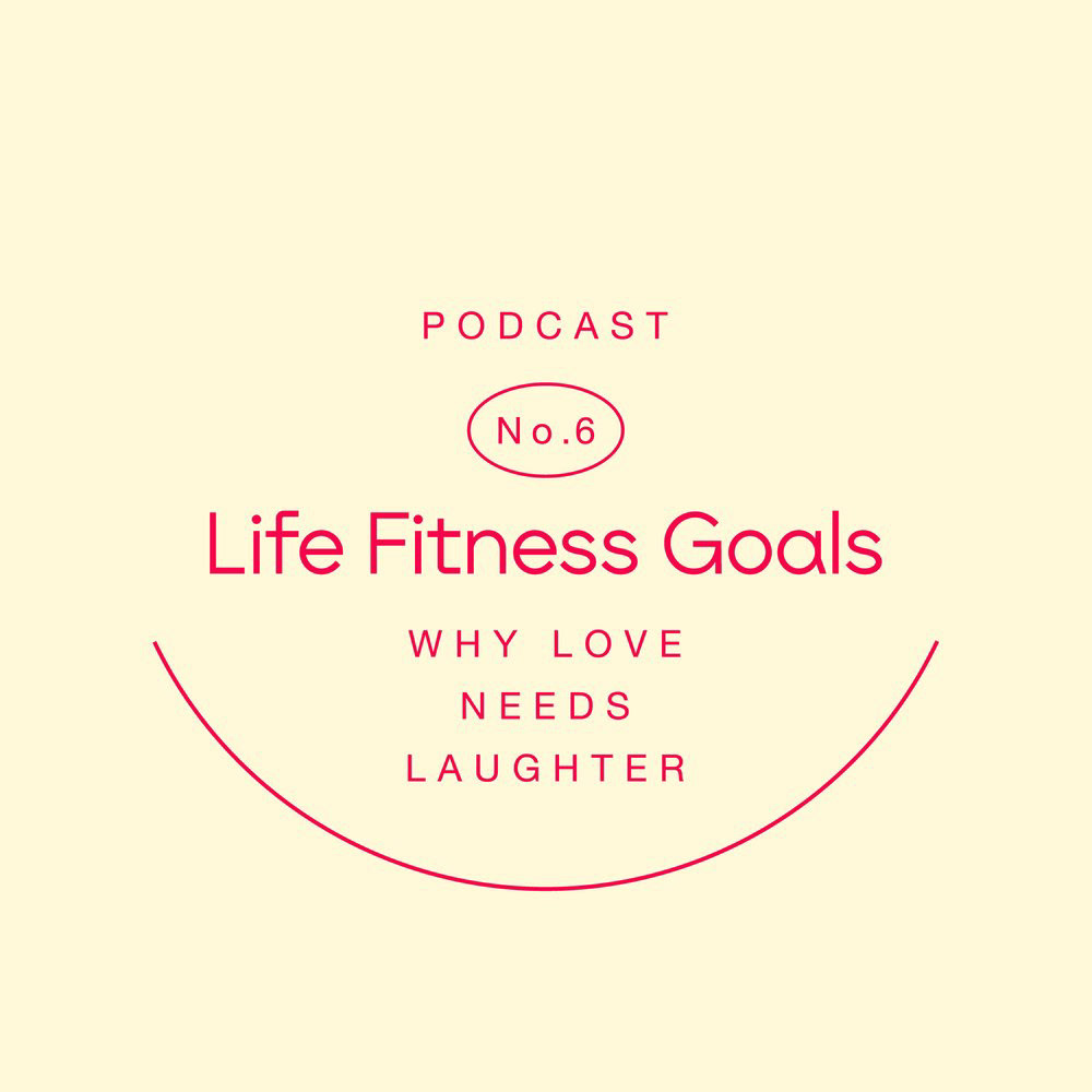
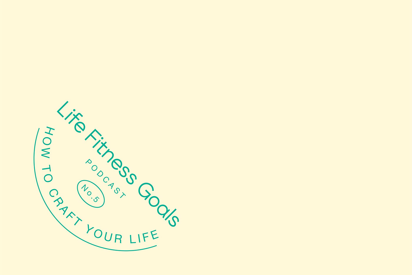
Distinctive Episode Covers
One of the standout applications of the brand identity is evident in the design of each podcast episode cover. LAT's team meticulously crafts unique typographic compositions for each cover, ensuring that every episode has its own distinct character. While the designs differ, they all maintain a consistent feature—the presence of a subtly stylized smile, conveyed through lines or font. This unified element provides a sense of cohesion and reinforces the brand's positive messaging.
LAT | A Creative Company's branding and visual identity for LFG wellness podcast showcases their exceptional talent for creating vibrant and engaging brand experiences. By combining a semi-bold, sans-serif wordmark, a warm color palette, and a distinctive smiling face icon, they have crafted a visual identity that reflects the podcast's mission to inspire and uplift. The attention to detail is further exemplified through the unique typographic compositions for each episode cover, adding a personal touch to the brand's visual storytelling. With LAT's expert touch, LFG has established a powerful brand identity that truly resonates with its audience and emphasizes the importance of fitness for overall well-being.
Branding and visual identity artifacts
For more information make sure to check out LAT | A Creative Company website or follow them on Behance.


