by abduzeedo
In Singapore, over 3 million people a day travel via taxis, buses and trains – and many of these links are owned by transport behemoth ComfortDelGro (CDG). In short, CDG is synonymous with getting around the city. However by 2019, market share was being eroded due to strong competition from new-economy tech platforms like Grab and Gojek. To top it off, when the COVID-19 pandemic hit, people hunkered down at home even more.
Challenge
CDG came to R/GA with an opportunity; how could they not just adapt, but point the way forward? Starting with looking at real people’s behaviour, R/GA uncovered a core insight – Singaporeans feel like they know all there is to know of their 42 sq km island and are looking for new opportunities to delight in their city and find things to do together.
This presented a bigger opportunity – to create a genre-defining lifestyle & mobility platform that could drive discovery by bringing together CDG’s vast transport network and integrating it with the city’s lifestyle food and experience offerings. But they needed a business, brand and product to bring it all together.
Solution
Introducing Zig, Singapore’s first ever integrated mobility and lifestyle platform. Think of it as a super app delivering everything needed to help people enjoy city life – rideshare, food delivery, meetups, restaurant bookings and more.
Zig was built entirely from scratch through R/GA’s multidisciplinary approach to consulting, research, design and technology. R/GA developed the business, brand, experience, product and tech stack based on rigorous research, agile design and consumer testing. All to arrive at an intuitive platform built entirely around existing and newly forming consumer behaviours.
The idea
Conceptually, everything about Zig – from business to brand to product – is built upon a key idea, Be Moved. It became the starting point for verbal and visual design, with the name Zig chosen for its sense of meandering movement that conveys discovery.
The brand shifts between two fundamental ways people journey – they ‘zig’ or they ‘zag’. In other words, they either want to move, or they want to discover.
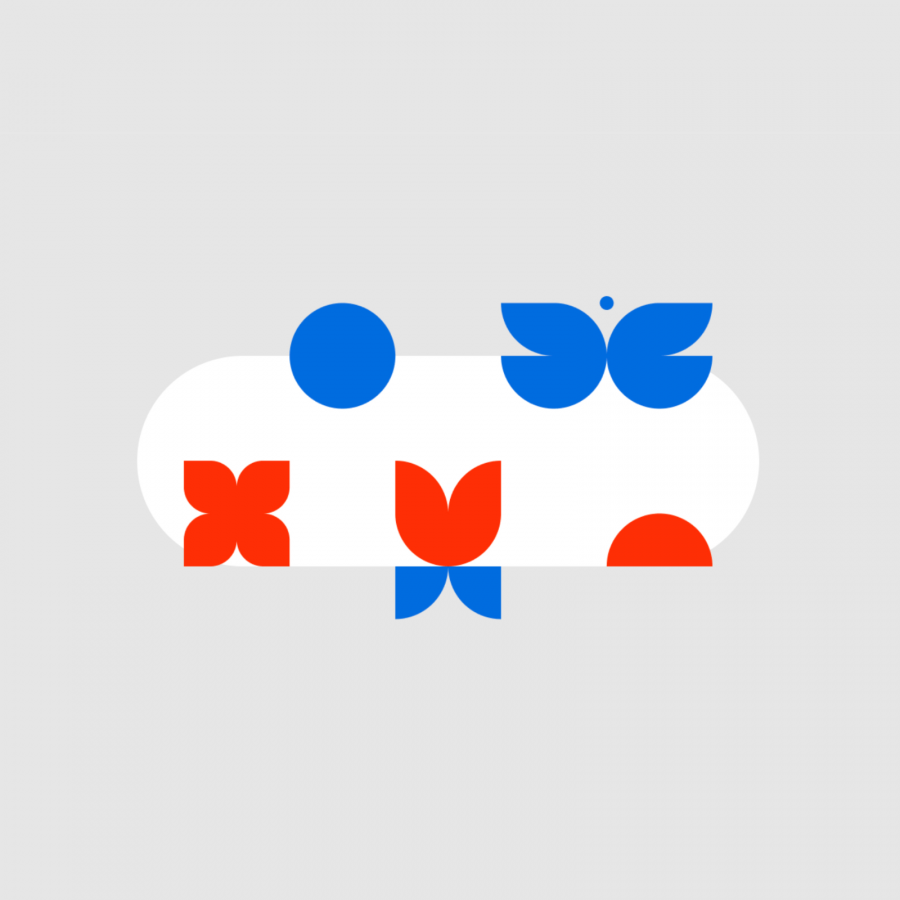
People zig when they’re looking to get from A to B as quickly and easily as possible. At these moments the brand expression dials back and the focus becomes simply getting you where you need to go. Simplified, utilitarian and to the point, the brand becomes effortless and quick, with a graphic device that literally vizualises a journey, while icons and infographics represent destinations along the way.
People zag when they’re looking to explore and be inspired. This is when the brand pulls on more emotive levers, becoming more expressive, with a bright and interactive visual identity and more creative and engaging language. The app itself becomes gamified, playful and dials up delight with illustrated Zigfluencer characters that inspire people to move and discover new places.
In a world where high-growth start-ups and tech giants are disrupting the old ways of doing business, Zig shows how legacy businesses with an holistic approach to brand, insight and technology, can still be at the forefront.
For more information make sure to check out RG/A on
