by AoiroStudio
Let's start off the week (for me for sure) with a branding project that involves graphic design, illustration and lots of data. I would agree with most of you that data is quite a boring subject and quite a challenge to tackle through design. If we are looking for a UX data-driven perspective, then I would say that is a really fun thing to do because making UI design based on data will always make things even more effective but not an illustrative kind of way. Let's take a closer look at the work from Casey Martin and the rebrand at Arcadia Data.
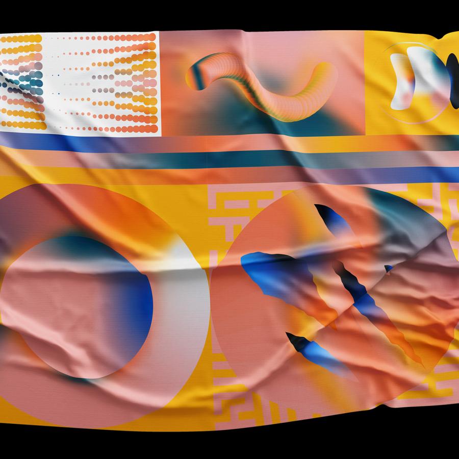
From the Logo, Identity, Posters, Collateral, Iconography; what's striking from his approach is the tone of the colours, the contrast of the black colour on thick clean light gray lines just set everything off on the right foot. The fact you can make something boring into something beautiful but informative is just amazing.
There are millions of ways to analyze big data—most of which are pretty complicated and confusing. For analysts, investors, researchers, and opinion leaders, these statistics are a big part of life. Big data looks different for them than for the rest of us; it’s not static—it’s exciting, dynamic, even beautiful. That became the goal: to show that Arcadia Data translates raw information into something meaningful, compelling, and personal. After all, everything becomes interesting through the right lens.
Brand Identity
Credits
- Brent Clouse
- Jonathan Corriveau
- Eric Louis Haines
- Craig Mangan + Paul Charney
More information: http://www.caseymart.in.


