by abduzeedo
Brand identity for Design Dissolve, a Brazilian design school with a fluted-glass logo mark, dark type palette, and a versatile print and digital system.
Design Dissolve is an independent educational institution based in Brazil that trains designers and consultants through a holistic, multidisciplinary approach. The brand identity built for this school mirrors its philosophy: dissolving fixed ideas and conventional thinking.
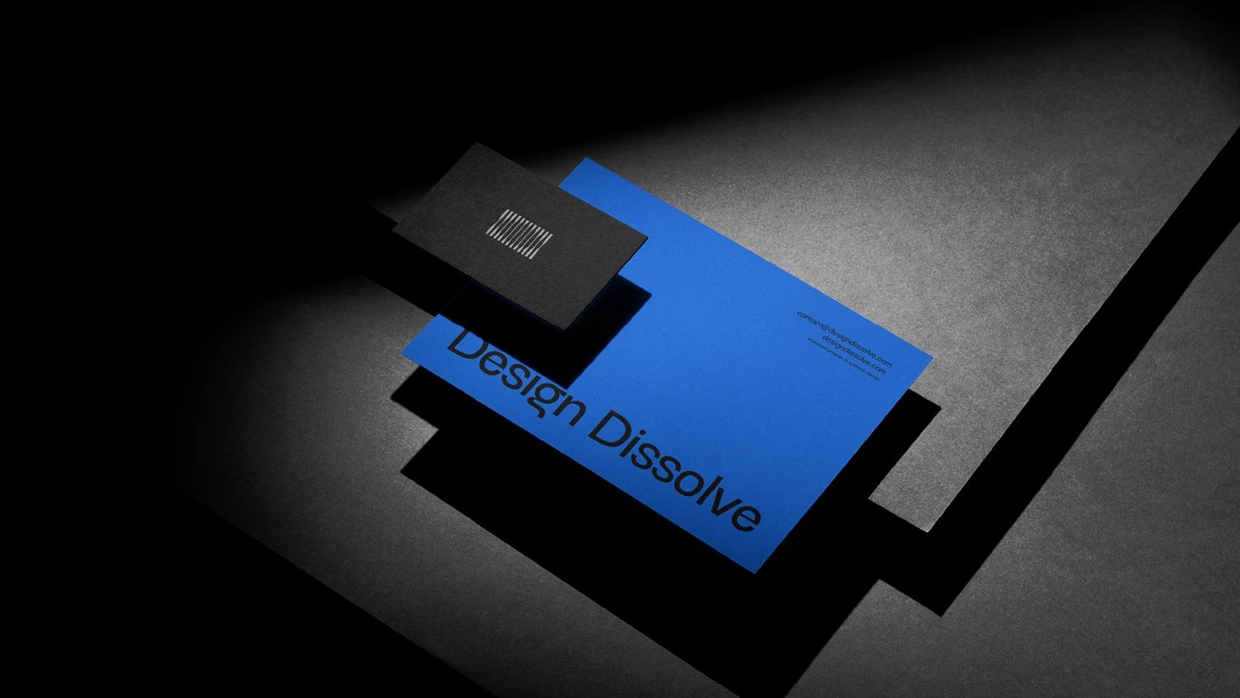
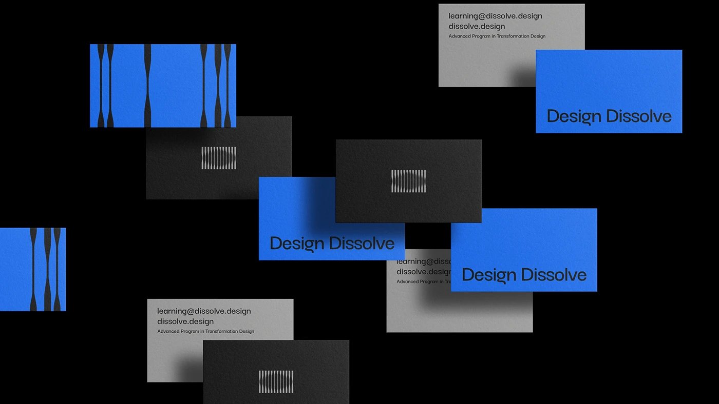
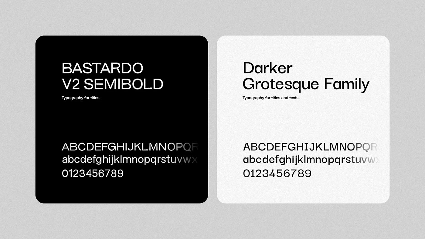
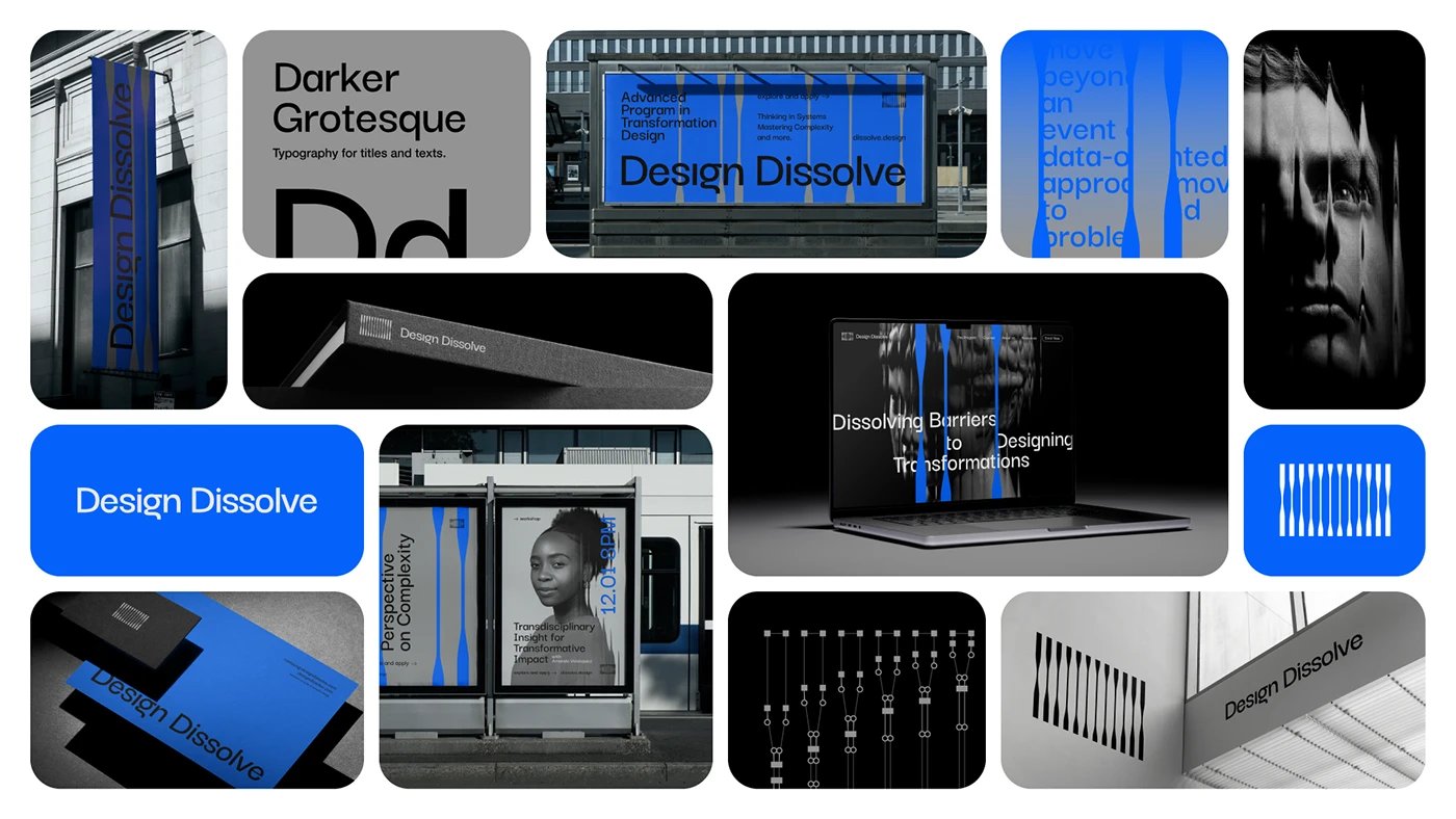
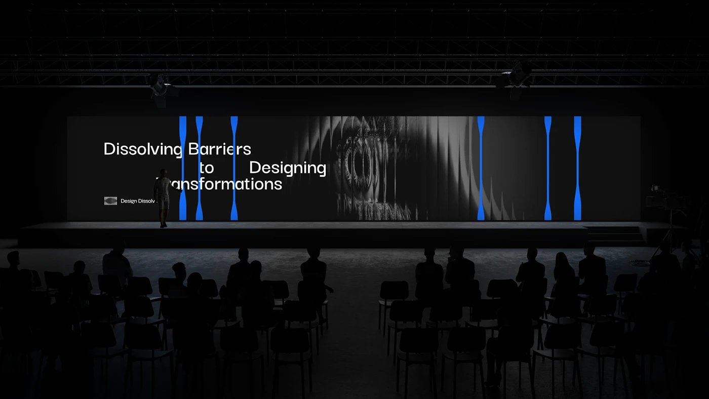
The logo draws from the visual effect of fluted glass, a material that fractures and multiplies what lies behind it. Multiple vertical lines of varying thickness come together to form the silhouette of an eye, evoking the layered knowledge and shifting perspectives at the core of the school's curriculum. The wordmark, set in a modified version of Darker Grotesque Family and Bastardo V2 Semibold, reads as precise and contemporary without losing character.
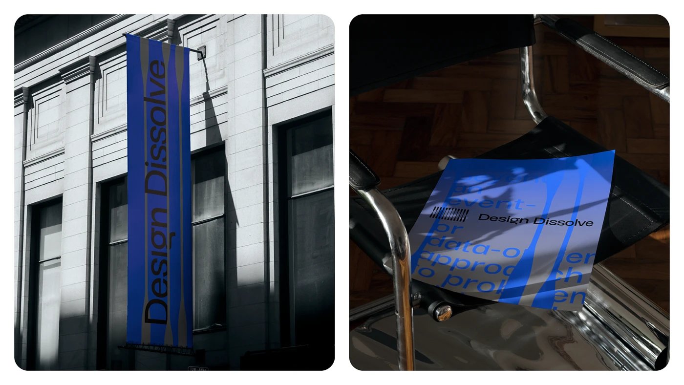
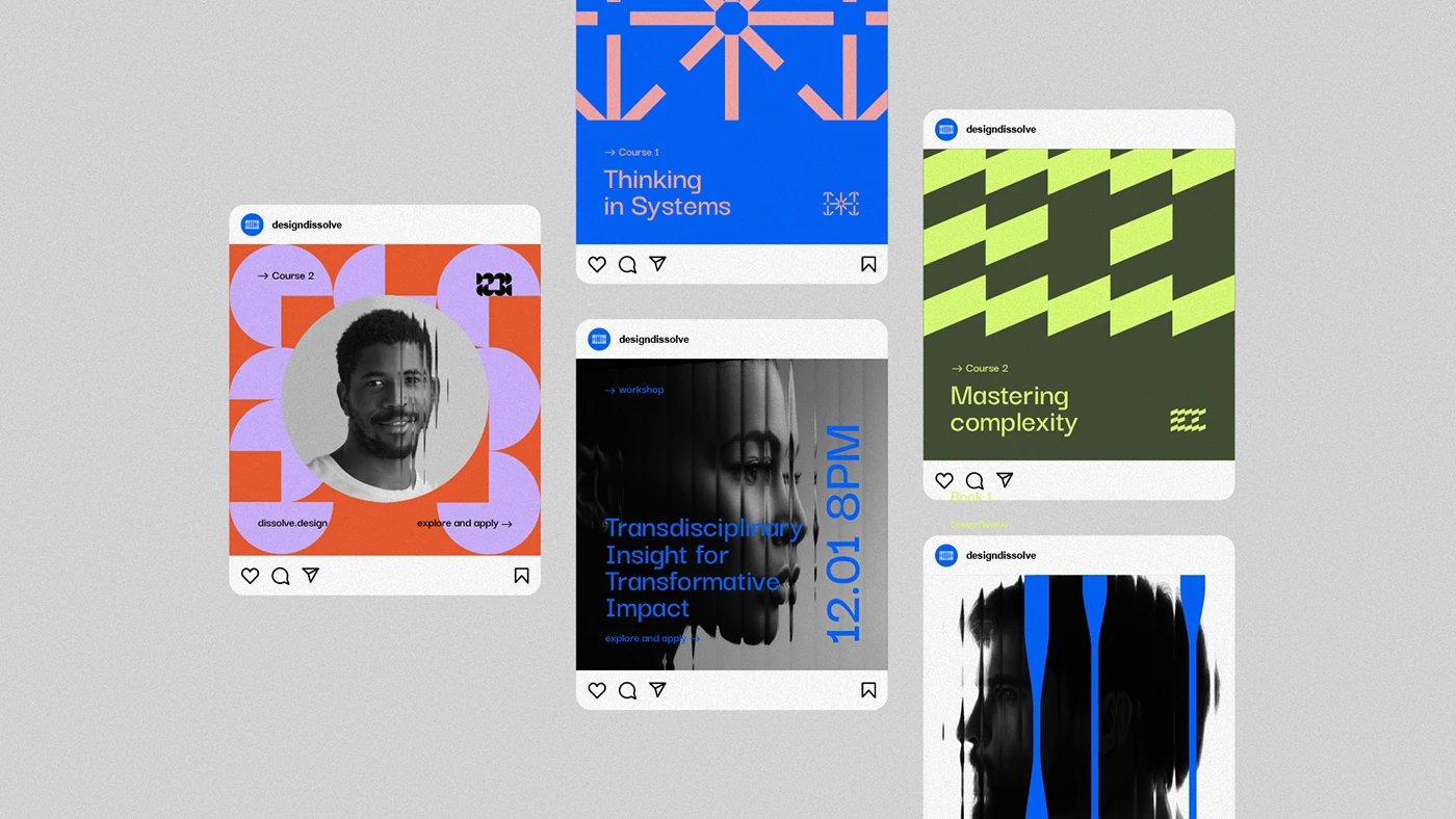
The color system anchors on black and deep blue as the primary brand identity palette, projecting seriousness and authority. Accent colors including lilac, coral, olive, and yellow punctuate course materials and social media templates, each pairing chosen to differentiate subject areas while remaining cohesive across the full system. Business cards and stationery carry the mark in charcoal and blue on dark stock, polished and restrained. Environmental applications extend the brand identity to building banners, event stages, and editorial posters, confirming the identity holds across every scale.
Brand Identity Built to Dissolve Conventions
The full system, including the website, social media templates, and print collateral, demonstrates how a strong brand identity can communicate rigor and creativity at the same time. Design by Matheus Ferreira.
Source: Design Dissolve on Behance


