by ibby
Cash App unveils a bold new design language and introduces Moneybot, an AI-powered assistant built to help users manage their money with intuitive, beautifully crafted interactions. Explore the refreshed visual system, new typography, expanded iconography, and the future-forward interface shaping Cash App’s next chapter.
Earlier today, Cash App revealed a bundled preview of its biggest design and product evolution to date—150+ improvements delivered in one coordinated drop. But what caught our eye most wasn’t the scale of the update (though it’s huge)… it’s the clarity of its design ambition. This refresh marks a strategic shift for Cash App: a reimagined interface powered by AI, wrapped in a bold, expressive, unmistakably Cash visual system. And at the center of it all is Moneybot, a new AI-driven assistant designed to help people actually use their money, not just track it.
Meet Moneybot: Personal Finance, Designed With Intention
AI in fintech has been trending for years, but Cash App’s research uncovered a surprising gap:
6 in 10 Americans use AI tools, yet only 12% use AI features inside financial apps. That’s the creative opportunity. Moneybot isn’t a generic chatbot bolted onto a product, it’s a proactive, design-integrated assistant that learns from customer behavior and surfaces actions that matter. Users can give commands such as sending money to a contact, checking their weekly spending, or scheduling routine payments and Moneybot handles the task with their confirmation. The interaction sits at the intersection of human-centered design, intelligent automation, trust, and craft, an approach that feels much closer to the next generation of interface thinking than a novelty feature. And crucially: control and privacy remain the pillars. This is AI with guardrails and good UX.
The New Cash App Design Language
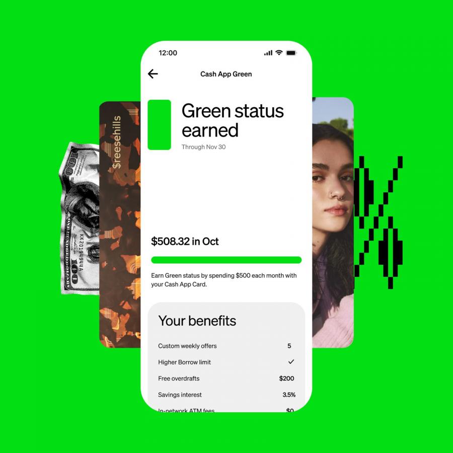
Cash App didn’t just add AI. It used this moment to refine the entire system—from typography to motion to 3D imagery, resulting in a design language that feels louder, sharper, more intentional, and unmistakably “Cash.”
Some highlights:
Hyper Neon Green: The signature brand color goes even bolder—like digital phosphor. It’s loud in the best way possible.
Cash Sans + Refined Type Scale: A custom typographic foundation that balances personality with clarity. Strong character, no noise.
650+ New Icons: A massive expansion of the icon set—geometric, modern, and expressive enough to match the ecosystem’s scale.
Personalized Assets: Payments and cards get visual individuality, adding emotion and ownership to routine financial actions.
Custom Motion + Haptics: Micro-animation and feedback loops that make interactions feel alive, intentional, and human.
Expressive 3D Imagery: A visual world that elevates Cash App beyond a utility tool—closer to a creative platform with attitude.
Shape, Scale, Grids: A system refreshed at the atomic level, building the foundation for the AI-powered interface that’s coming next. This isn’t a redesign. It’s a recalibration of Cash App’s personality, with system thinking at every layer.
A Design System as Product Strategy
The Cash App team has built a foundation that treats design as a strategic engine. The system is expressive enough for brand expansion, rigorous enough for product scale, and flexible enough for an AI-powered future.
Credits:
- Cameron Worboys (Head of Product Design)
- Justin Danks (Head of Moneybot Design)
- Lauren LoPrete (Head of Design Systems)
