by ibby
Discover NKORA’s rebrand by monopo, redefining coffee-to-go as a thoughtful ritual with tactile design, lino prints, and a warm, human identity.
In a world where takeaway coffee is often synonymous with speed and convenience, NKORA and monopo london offer a refreshing counterpoint: coffee as a ritual, not a rush.
From Hackney Road to a Collective of Cafés
NKORA first opened its doors in 2015, when founders Nancy and Emile transformed a vacant spot on Hackney Road into the kind of café they always wished for, uncomplicated, warm, and thoughtfully designed. What began as a single neighborhood hideaway has since expanded into seven locations, all while holding on to the character and independence of its origins.
As the cafés grew and city life made sit-down space harder to come by, coffee naturally shifted toward a takeaway culture. Instead of leaning into speed and convenience alone, NKORA saw an opportunity to reimagine what coffee-to-go could mean. To bring that vision to life, they partnered with monopo to create a refreshed identity, one that embraces growth while preserving the brand’s understated charm and human touch.
Coffee as a Ritual, Not a Routine
When we first sat down with Emile and Nancy and heard their vision to open more coffee-to-go shops, we saw an opportunity to turn the image of take-away coffee on its head,” says Mélanie Hubert-Crozet, Creative Director at monopo london. “Coffee-to-go is often seen as purely practical or hurried, but through this rebrand we wanted to reveal its beauty: the uplifting and comforting ritual you can carry with you.
This framing repositions NKORA’s takeaway coffee not as a rushed pit stop but as part of a daily walk, a quiet ritual that helps people think more gently and notice more.
Analogue Marks in a Digital World
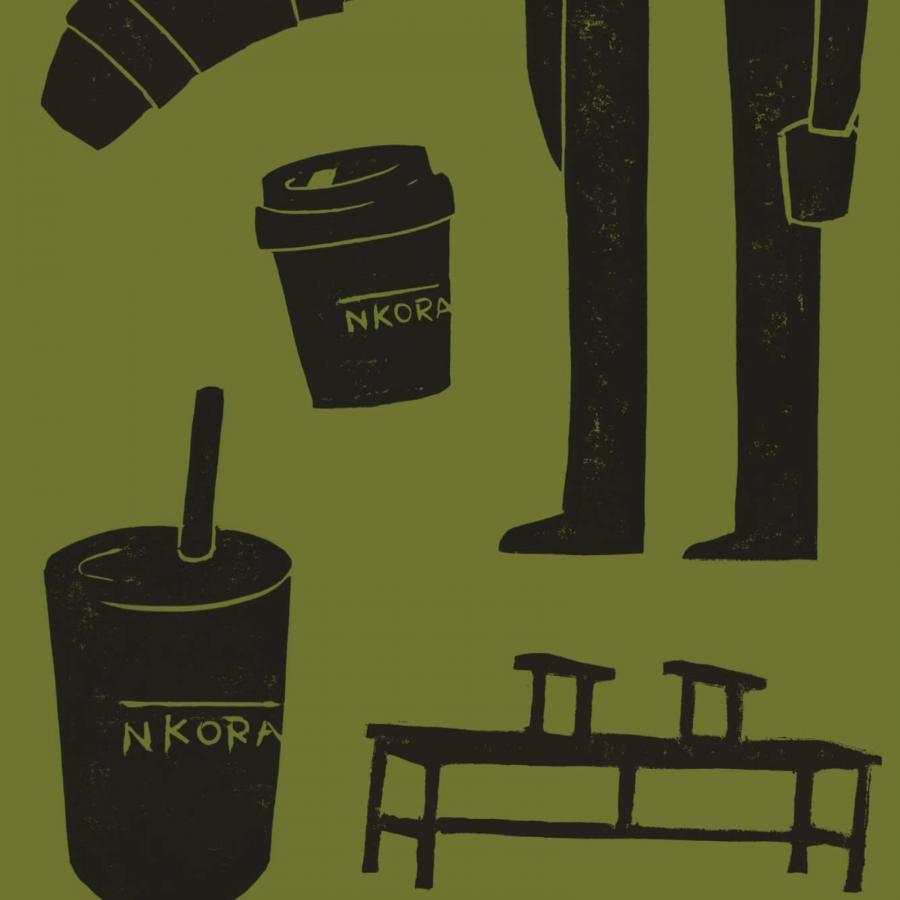
To bring this idea into form, monopo leaned on tactile processes that carry a human mark. The new walking mascot, Miles, was lino-printed by hand, digitized, and animated, a character embodying NKORA’s quiet, thoughtful pace. Each raw edge and natural imperfection echoes both walking paths and coffee grounds.
The system also includes location-specific stamps inspired by walks around each NKORA café, paired with a softened geometric typeface that blends modern clarity with handmade warmth. Variable styles like Italic and Reclined add rhythm, almost as if the letters themselves are wandering.
A Warm Palette, A Quiet Invitation
Olive green, butter yellow, and burnt orange anchor the refreshed palette, while film photography captures each café in a soft, observational style. Locals mid-walk and textured details of the spaces are documented with warmth, grounding NKORA’s identity in lived experience.
Design Takeaway + Rebrand Artifacts
NKORA’s rebrand is a reminder of how design can shift perception. By slowing down the language of coffee-to-go, monopo created an identity that feels textured, intentional, and deeply human. It’s a brand built not just for the rush, but for the walk that follows.
