by abduzeedo
Discover Mat Voyce’s kinetic typography in motion design, blending animation and personality for impactful visuals.
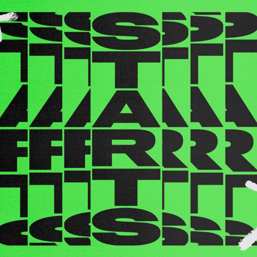
Mat Voyce’s “Type Scraps” collection is a captivating exploration of kinetic typography in motion design. Known for his unique take on 2D type animation, Voyce’s work pushes letterforms beyond static visuals, bringing them to life with character and flair. The March ’23 “Type Scraps” series showcases the potential of typography in motion, from 80s-inspired graphics to vector-based animations. Each piece underscores the power of dynamic text to convey emotion, rhythm, and personality—a perfect study in how motion design and typography can work together to engage and communicate.
Voyce’s approach to typography is anything but traditional. Known for “illustrative kinetic typography,” he transforms static letters into animated personalities. By adding motion, he infuses type with depth and expression, moving beyond conventional design to create something alive. These animated pieces make type the star of the show, capturing the viewer’s attention with bouncing letters, shifting shapes, and vivid transitions that embody each word’s message.
The result? Letters that seem to react and interact, transforming simple text into visual stories. This approach brings a playful, engaging quality to typography, highlighting how the right motion can enhance legibility while adding layers of meaning.
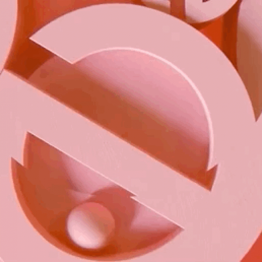
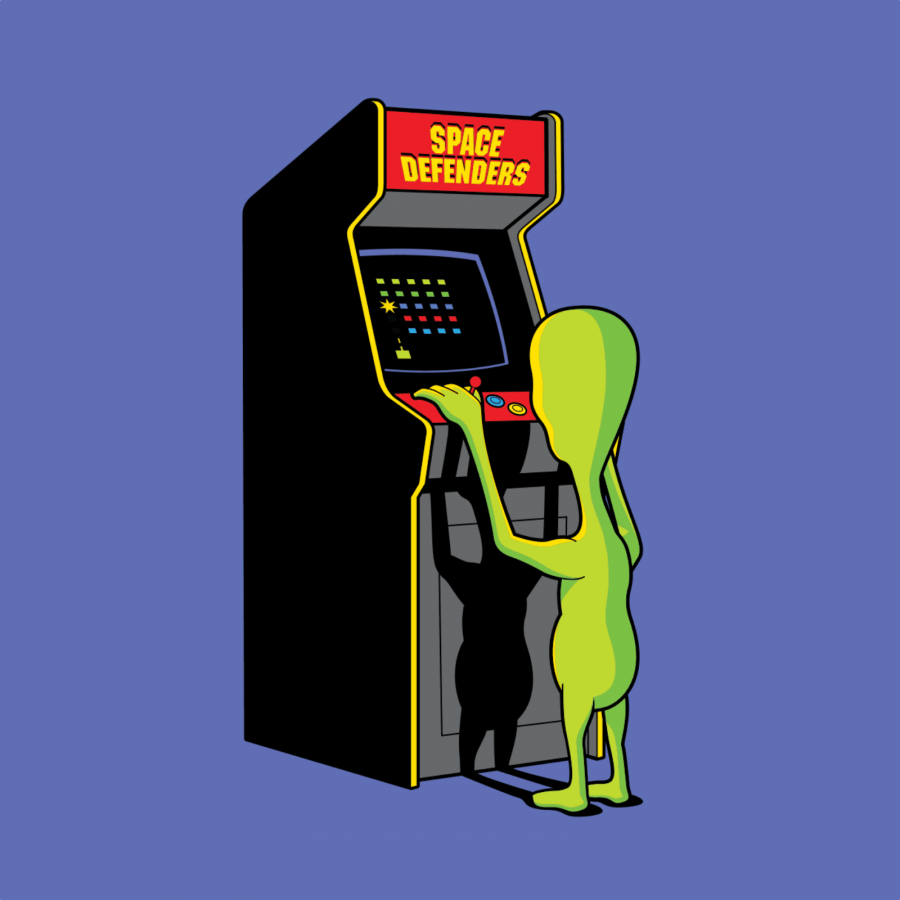
“Type Scraps” features a diverse mix of styles, from retro 80s aesthetics to minimalistic vector designs. Voyce’s work is eclectic, drawing on nostalgia while remaining modern and versatile. By exploring different visual languages, he demonstrates how motion design can bridge various styles while retaining cohesion in theme and personality.
Each piece is thoughtfully animated, with motions tailored to its specific style. For example, 80s-inspired text may pulse with neon vibrancy, while vector-based letters might exhibit smooth, clean transitions. This attention to style diversity shows how motion design and typography can communicate beyond words, making each piece feel tailored and intentional.
Mat Voyce’s kinetic typography isn’t just for the web—it’s made for a variety of media. His animated type appears in GIFs, music videos, and broadcast branding, demonstrating its versatility and wide appeal. Motion typography is particularly suited for digital-first platforms, where short, impactful visuals are key to grabbing attention. By creating text that moves, Voyce taps into the fast-paced nature of digital media, ensuring his work resonates in a screen-dominated world.
Voyce’s “Type Scraps” offers plenty of inspiration for motion designers and typographers alike. His work emphasizes that typography isn’t limited to static images or page layouts; it’s a flexible medium capable of storytelling. Designers exploring this field can learn from his use of timing, rhythm, and style to evoke emotions. Each animated letterform is a reminder that even the smallest design choices—whether a bounce or a fade—can have a significant impact on the viewer’s experience.
Mat Voyce’s “Type Scraps” is a testament to the potential of motion design in typography. By combining animation and typographic design, Voyce has created a unique, engaging style that resonates across platforms. For designers and animators, his work is a masterclass in using motion to add depth and personality to text, proving that typography can indeed move and inspire.
For more information make sure to check Mat Voyce at matvoyce.tv
