by jeff
Studio Five brand identity by The Negra pairs electric lime and tangerine with a hand-drawn ‘5’ logomark — built for a creative studio fluent in culture.
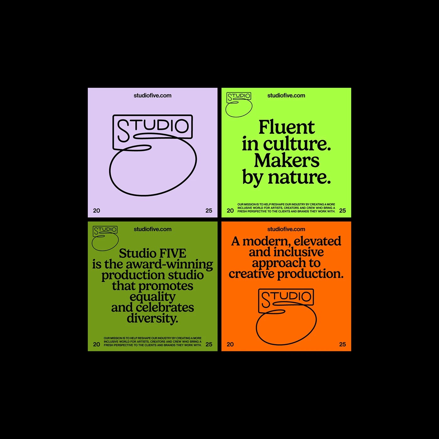
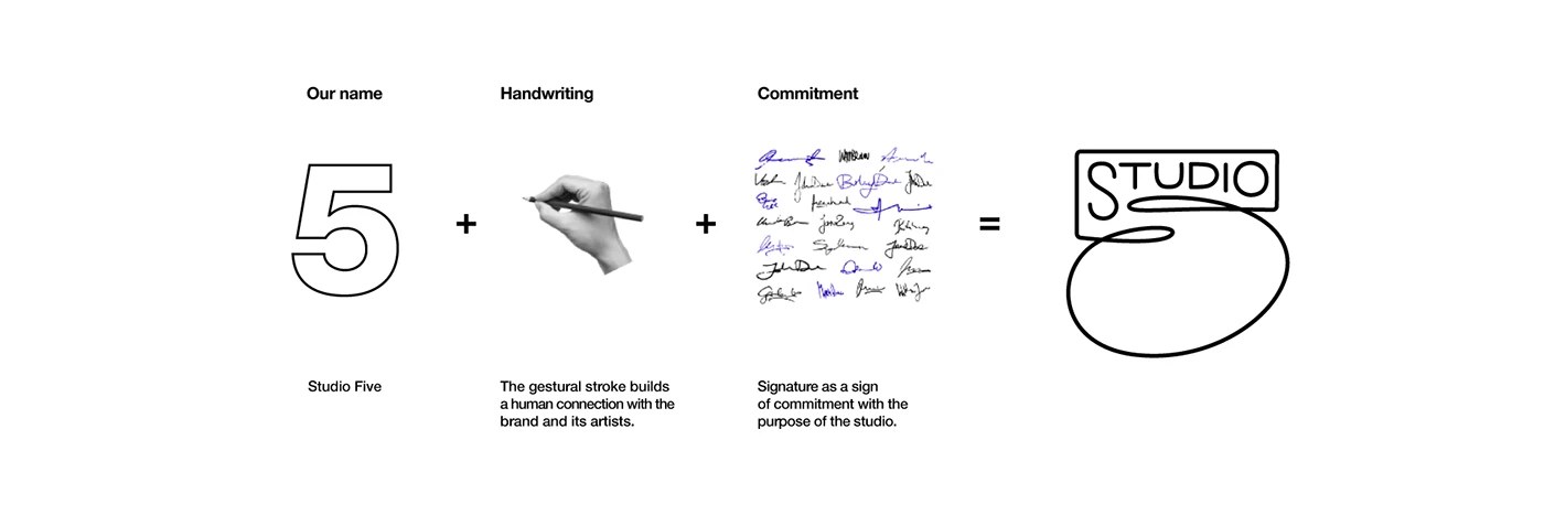
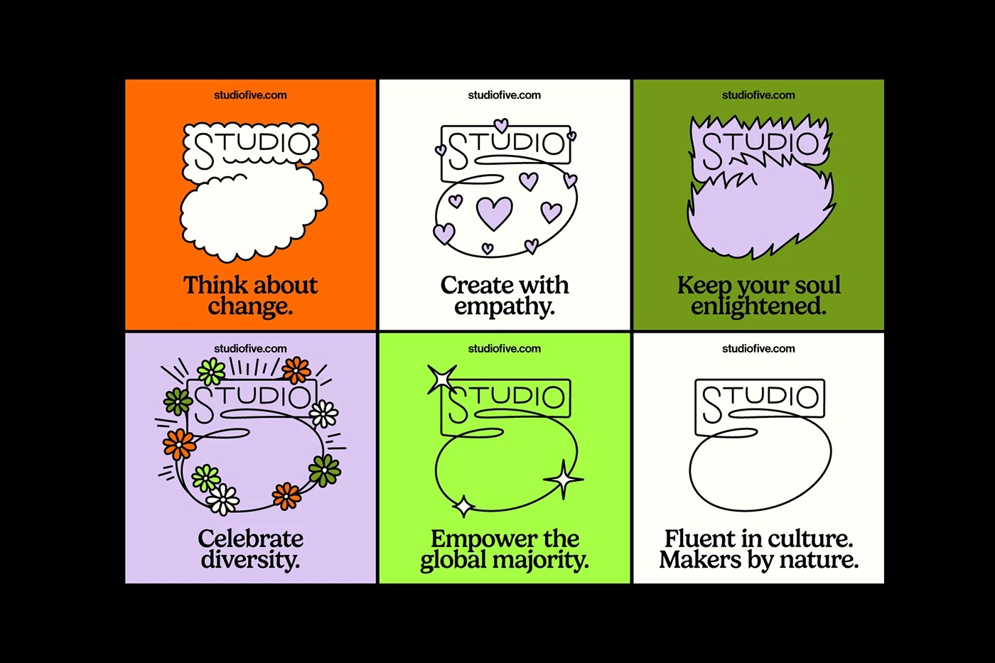
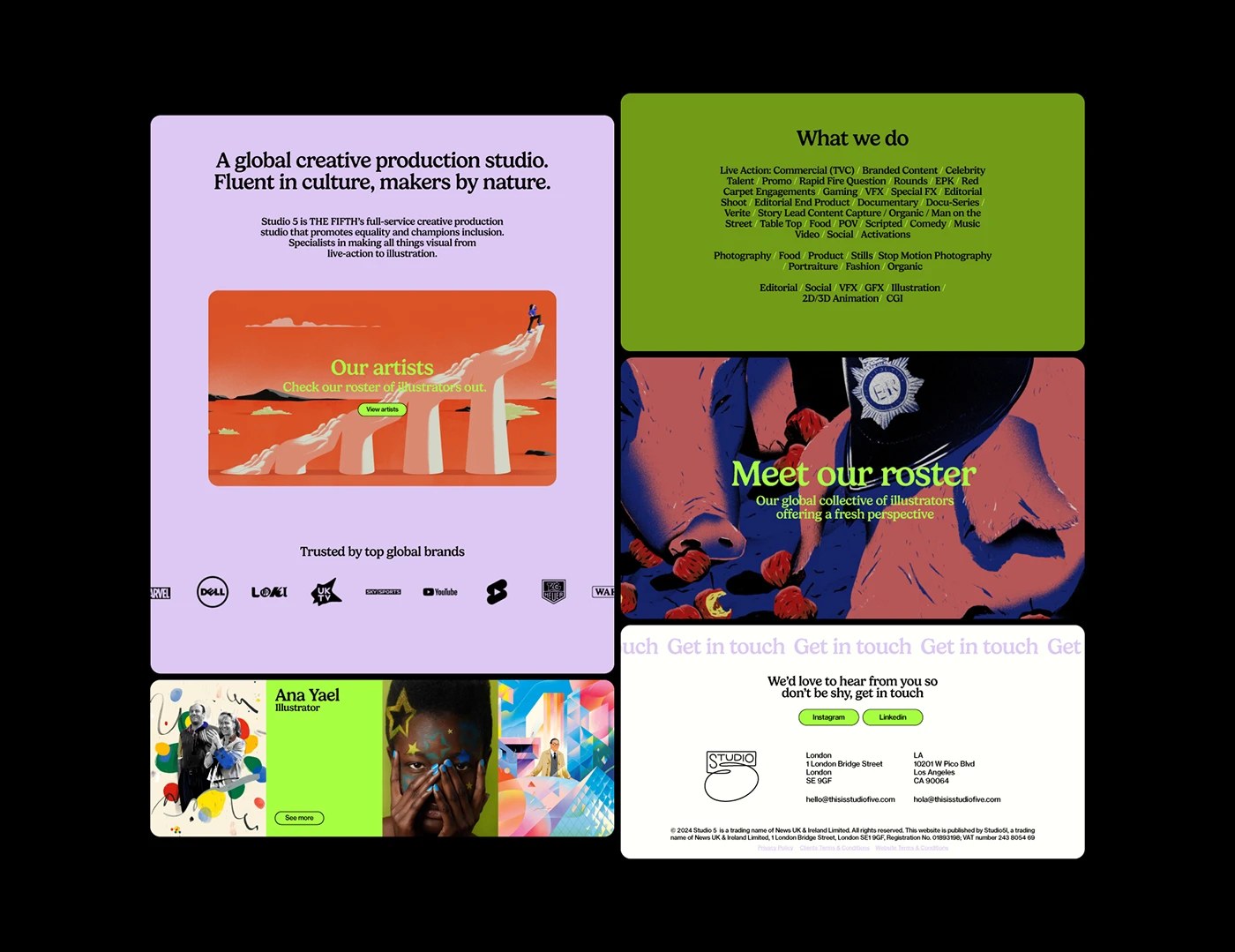
The Studio Five brand identity centers on a logomark fusing the numeral ‘5’ with a gestural loop. It is human handcraft inside a production machine. The Negra built the palette around four flat tones: electric lime, tangerine orange, soft lavender, and near-black. No gradients. No shadows. Headlines land in a bold grotesque slab; body copy shifts to a transitional serif. That two-typeface system keeps hierarchy clean across social templates, web, and merchandise. Mission language — ‘Fluent in culture. Makers by nature.’ — runs as a visual element, not filler.
How the Studio Five Brand Identity Holds Across Live Action, Animation, and Social
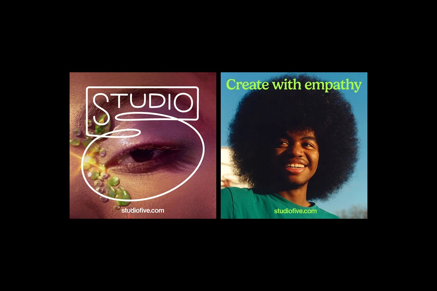
Studio Five operates across live action, commercial, animation, VFX, and social content — a span that taxes any system. The Negra resolved it by avoiding photographic texture entirely: the marks and flat colors carry the weight. This Studio Five brand identity holds in a 9:16 Reel and a full-bleed editorial spread without breaking. What the Studio Five brand identity does best is resist the crutch of photography. The studio’s commitment to diversity is encoded in the palette: no single tone dominates. See the full project on Behance.