by abduzeedo
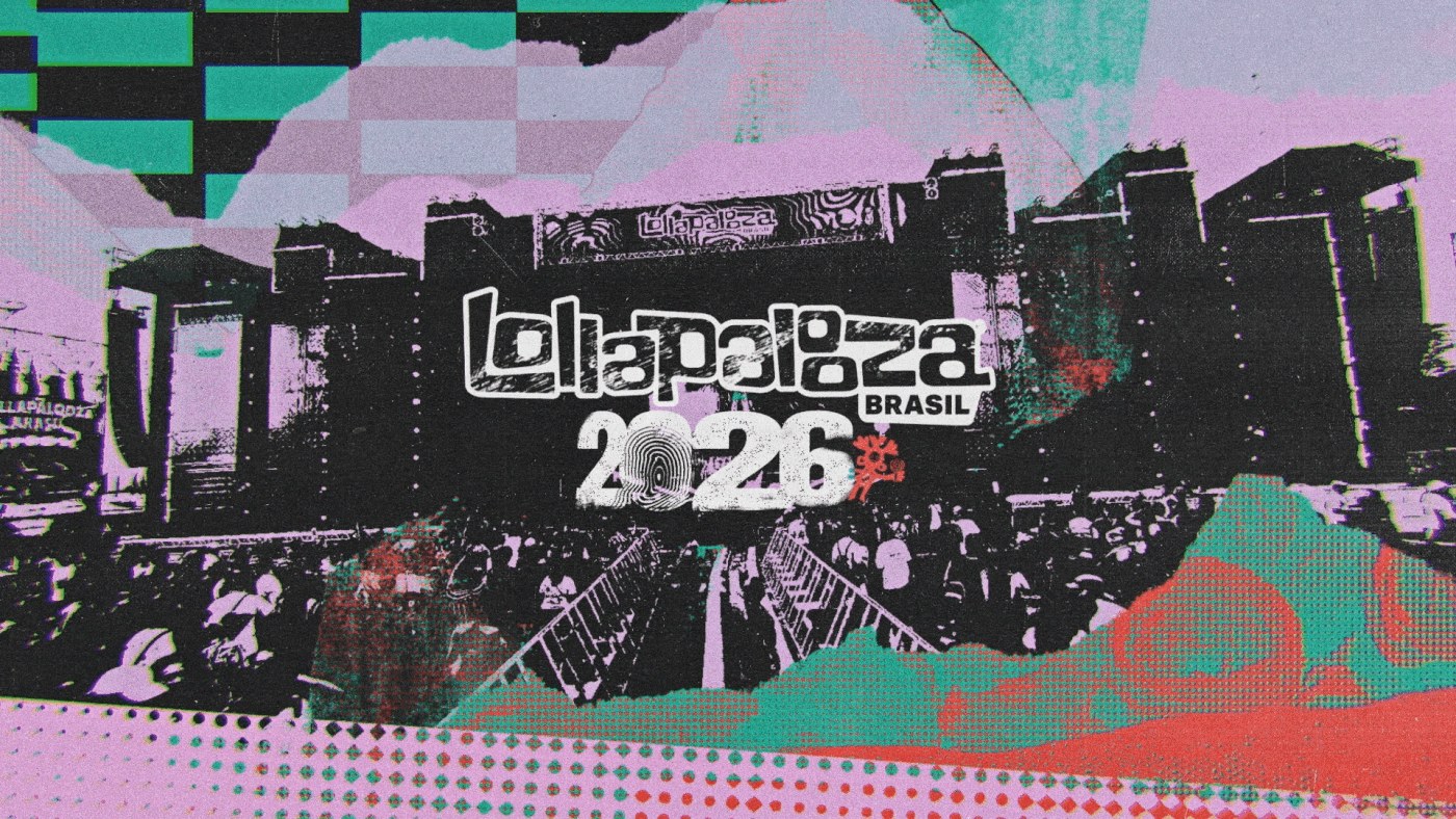
LUKTHIS (São Paulo) built Lollapalooza Brazil 2026 lineup motion as music festival motion design — halftones, collage, and analog texture doing the work.
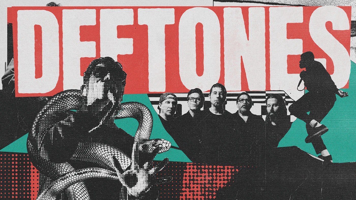
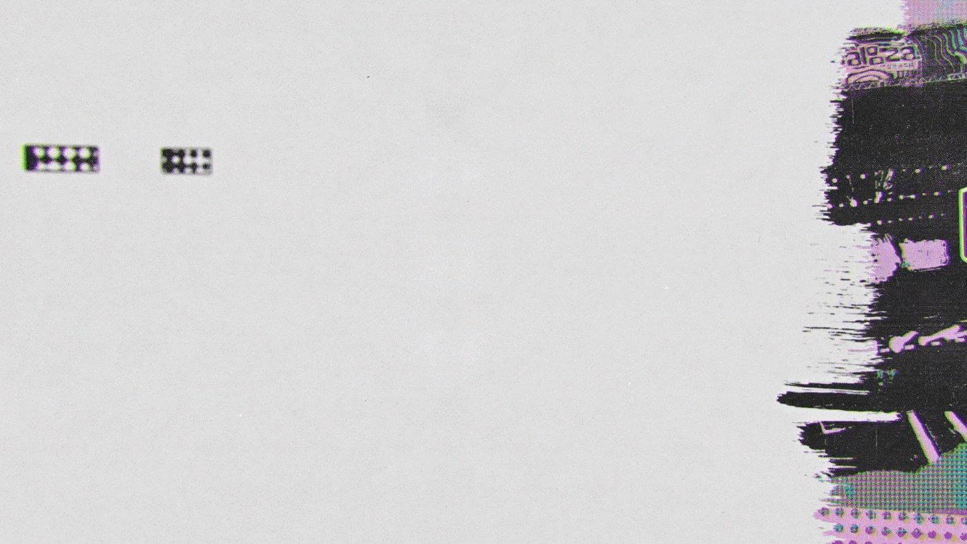
The brief for a lineup reveal is specific: ten seconds to make the audience feel like they’re already there. LUKTHIS (Lucas Ribeiro) answered it through layered collision. Each frame in this music festival motion design campaign operates as a simultaneous cultural archive — the opener title card runs teal paint-splash shapes against lavender halftone dot fields and a red halftone strip, all over a dark stage photograph. A condensed white slab-serif ‘DEFTONES’ at roughly 200pt fills the top third of one frame against a halftone-textured black ground, with an engraving-style snake coiling at lower left and a band photo at right. Three registers — type, illustration, photography — occupy the same frame without fighting each other. Motion design by Ricki Mendes builds the rhythm that holds this music festival motion design together.
Music Festival Motion Design: How LUKTHIS Built Lollapalooza Brazil 2026
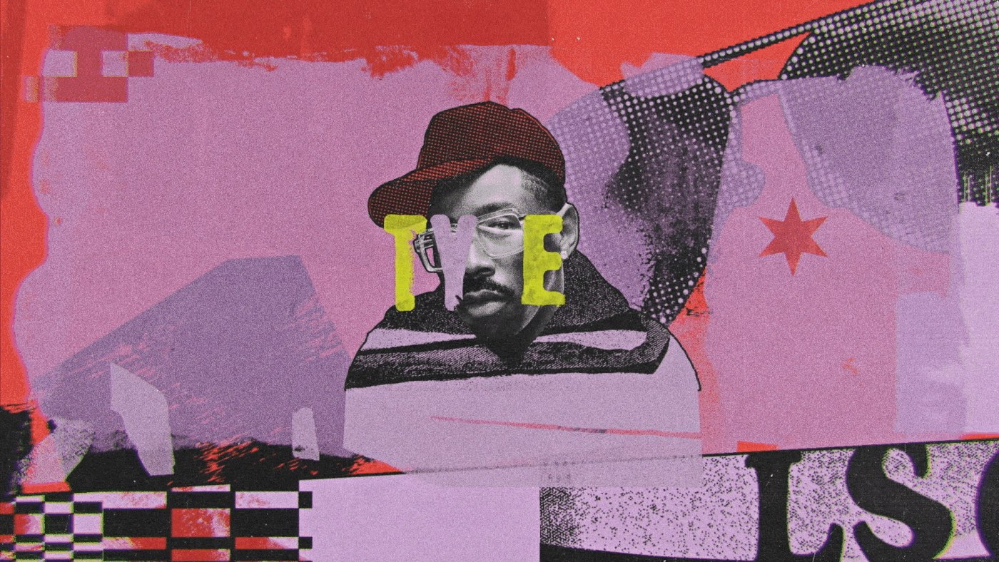
The male artist portrait frame pushes further: yellow disc-halo behind the subject, high-saturation teal background, deep red halftone shapes at left, a Marilyn Monroe screen-print composite in the lower right — five cultural reference layers in one composition. The guitar silhouette frame reduces it differently: three overlapping figures, halftone-rendered face, teal Fender as the sole saturated object cutting through grunge texture. The music festival motion design logic holds across both — density as argument, not decoration. The festival’s hybrid identity (classics and avant-garde in collision) is encoded in the visual method, not stated in a title card. That’s what separates this music festival motion design work from a standard lineup announcement: the form is the argument.
See the full project by LUKTHIS on Behance.