Marblis Typeface: The Grotesque That’s Anything But Grotesque
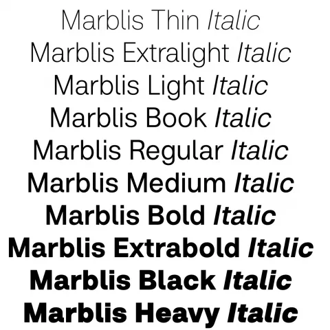
Meet Marblis, a modern sans serif typeface with clarity, warmth, and range. Its 10 weights and 1400+ glyphs make it a versatile new go-to for designers.
Move over Helvetica, there’s a new neutral in town, and it’s got range, reliability, and just the right amount of personality. Meet Marblis, a fresh modern sans serif from designer Julien Fincker, crafted for clear communication and built like a typographic Swiss Army knife (but sleeker).
If you’ve been searching for a typeface that won’t steal the spotlight but still holds its own weight, Marblis comes in ten of them. Plus italics. Plus over 1410 glyphs, because who doesn’t love an overachiever? Marblis is available exclusively at Font Cuisine (yes, typography is on the menu) with a 50% discount until January 16, 2026 using Marblis50.
A Typeface You Can Build On, Literally
Fincker describes Marblis as “a foundation you can build on,” and honestly, the metaphor stands. This is the typographic equivalent of a dependable friend who always shows up on time and remembers your coffee order. Neutral? Yes. Reliable? Absolutely. Boring? Not at all.
Marblis hits that sweet spot between functional grotesque and quiet charm, delivering: Balanced proportions for stability; Straight strokes in letters like t and f for structural clarity; Soft curves in characters like a and l for warmth and approachability.
Behind the Font: Helvetica Walked So Marblis Could Run
Marblis began as a pragmatic attempt to answer the global Helvetica fatigue, a “we get it, you’re neutral” reaction many designers secretly feel but rarely admit. But somewhere between the first sketches and the 1,410th glyph, strategy gave way to passion. What started as a functional alternative became a personal homage to classic grotesque forms, reshaped with: extended language support, refined spacing, a multitude of OpenType features, and glyphs for nearly every typographic situation you can throw at it be editorial, signage, corporate design, UI, print, wayfinding, you name it, Marblis will behave. It’s clear, consistent, and incredibly usable—the kind of font you discover once and rely on for the next decade.
Grab Marblis While It’s Still Hot Off the Press: fontcuisine.com/fonts/marblis
Embargo your hesitation, this might just be your new go-to grotesque. And as always, kern responsibly.