by abduzeedo
Munseong Yeom and Seongmin LEE shared an awesome UI/UX design post on their Behance profile. It is titled Avaya and it includes much more than just the interface, it's actually a full branding project, including the logo. For this post, I want to feature it more because of the website and the interface, but below you can see the full description of the project.
Logo
Avaya intuitively shows the viewers about the mountains all over the world. The logo is designed with the motif of the shape of the mountain, expressed by the alphabet “A” in the center, and the vibrating frequency, and consists of the expressions "alive/vibration/young /aim” It intended to express the process of getting out of the repetitive and dull everyday life by feeling the living mountain and constantly reaching the youth and passion.
Situation
People today easily find and share information through media, such as many websites and social applications.But the social network works by exchanging and spreading the information rather than merely exposing a brand, it takes time to find the needed information.
Avaya will gather the scattered information and provide faster and intuitive information.Avaya is believed to be a sharing community that provides information about worldwide mountains and share the reviews by the users.
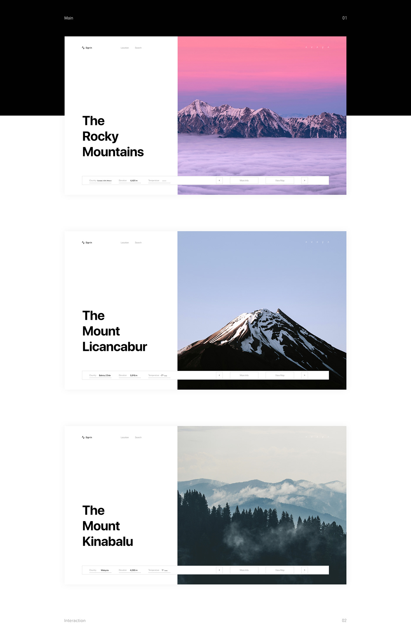
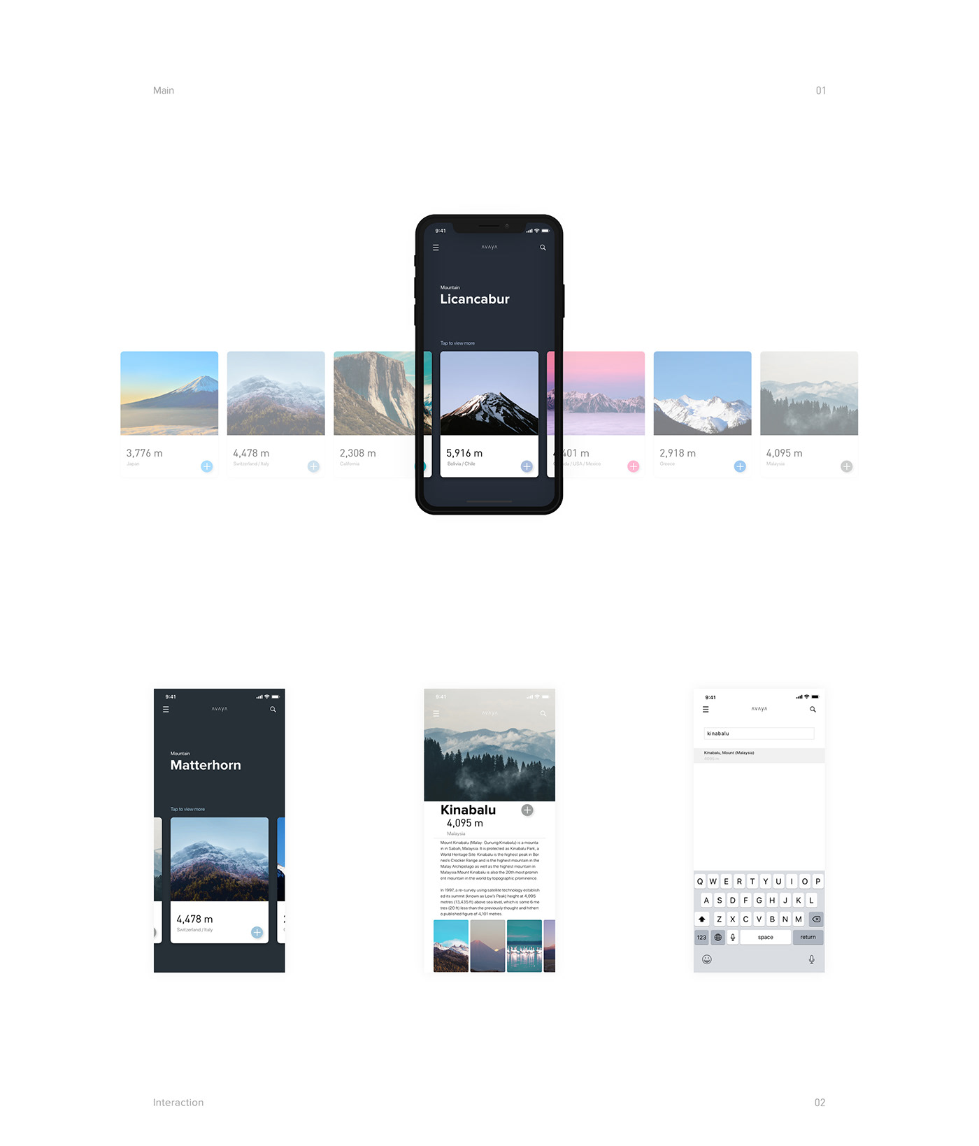
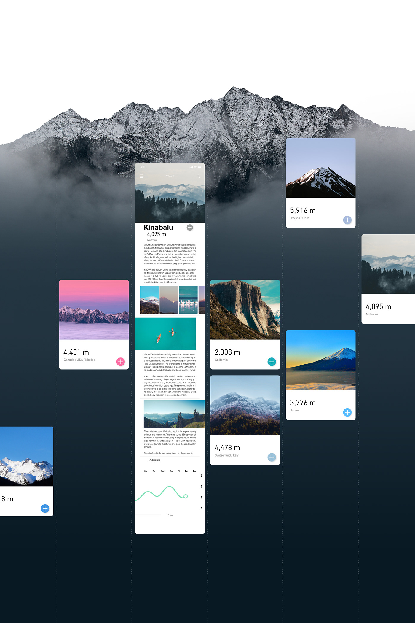
About UI/UX
There are functions to search mountains by its name, by location and also about unknown mountains. Each mountain page is composed of card-type content, and it provides basic information including altitude, temperature, traveling route and location, and you also can find photos, videos, and reviews by the users. It has been designed with a simple and optimized design to view the information easier and more intuitive.
UI/UX Design