by AoiroStudio
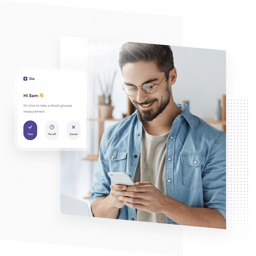
The fine folks from Fireart Studio has shared a well-documented UX case study on their work for 'The Dia App' which is an application for diabetes control. It's no secret that people with diabetes face a daily challenge that could affect their health on the daily basis. I think giving some sort of control can help ease the process of repetition and how accurate we can support them somehow. First and foremost, kudos to Katerina Krukova for this lovely, detailed case study that is interesting to go through and that is not showcasing meaningless beautiful UI. Always a fun thing to dive into the process, it shows a lot more meaning, information, the 'why' to the final solution. They are common patterns that currently exist but I personally appreciate the reading. Kudos again to the entire team.
Credits
- Art Direction: Tolik Nguyen
- Team Lead: Anton Sokol
- Product Design & Behance Case: Katerina Krukova


