by abduzeedo
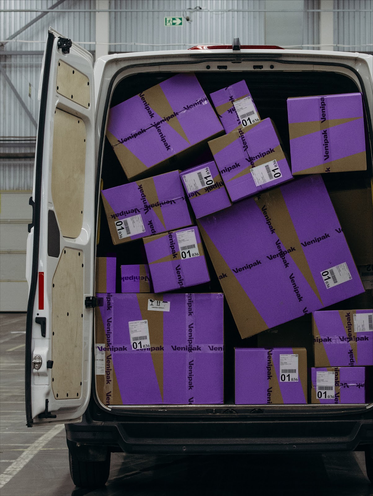
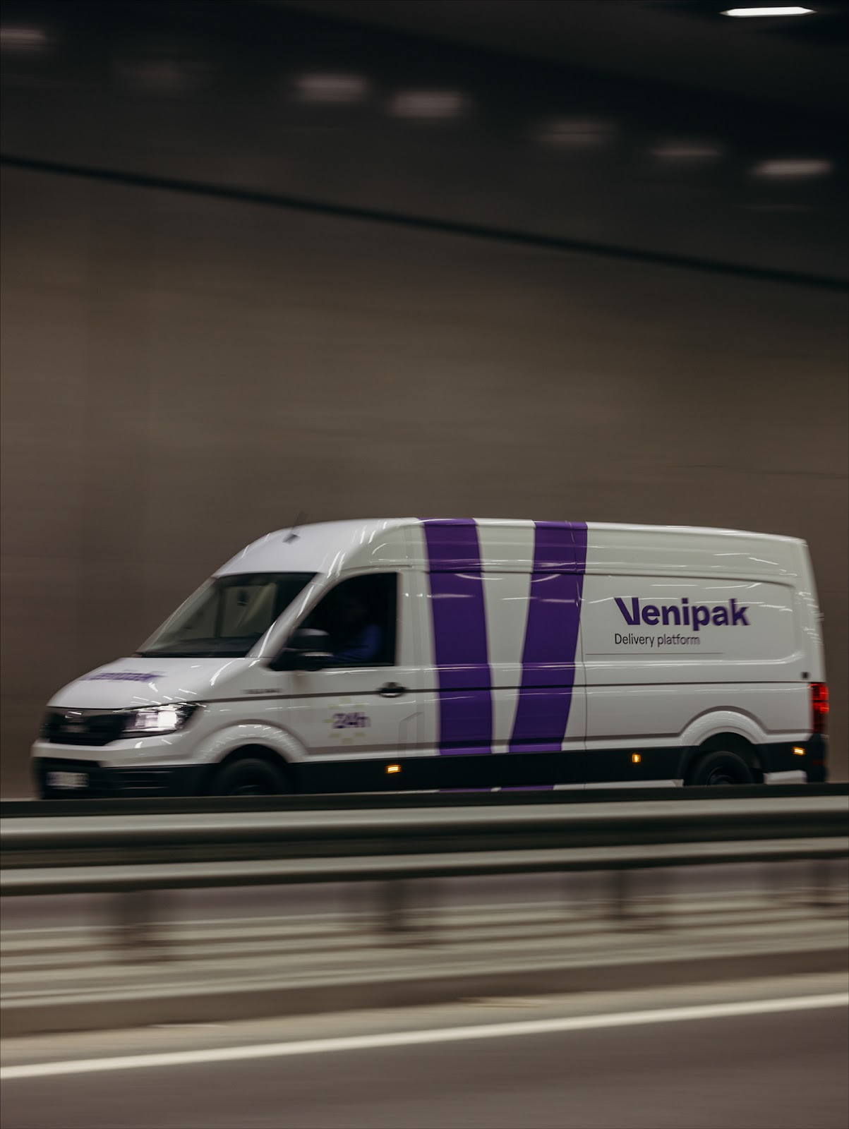
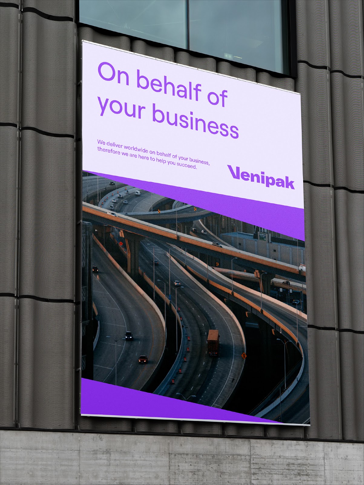
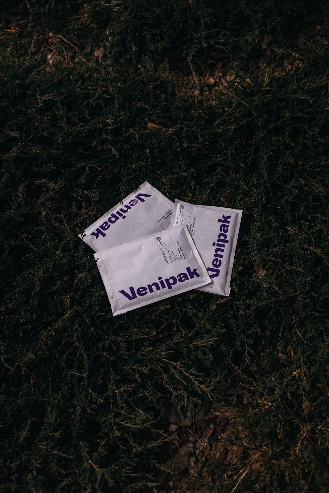
Andstudio shared a branding and visual identity for Venipak, a company that has been in the delivery market for over 15 years now, reaching milestones even above what we could have expected. From parcel lockers to Venipak Avia service, Venipak collaborates with their clients by optimizing the processes and representing the needs on their behalf.
Client needs
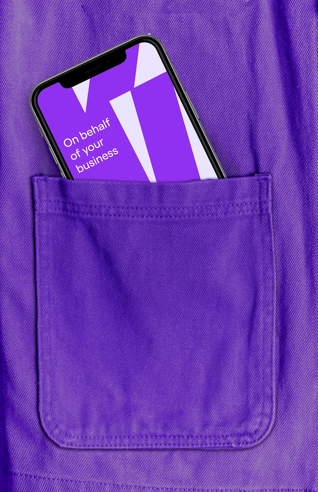
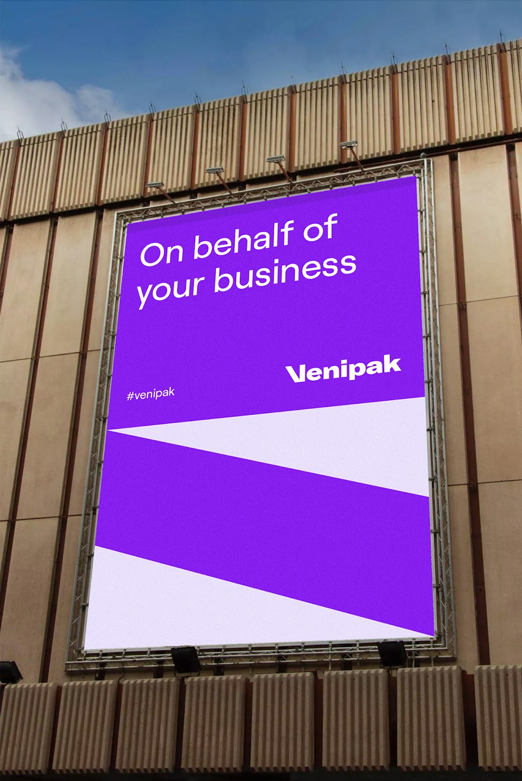
Venipak seeks to save clients’ time and make its services intuitive and effortless. Hence, the new visual look needed to prove the company’s expertise in turning good solutions into the best practices and experiences.
Venipak logo animation from andstudio on Vimeo.
Design value
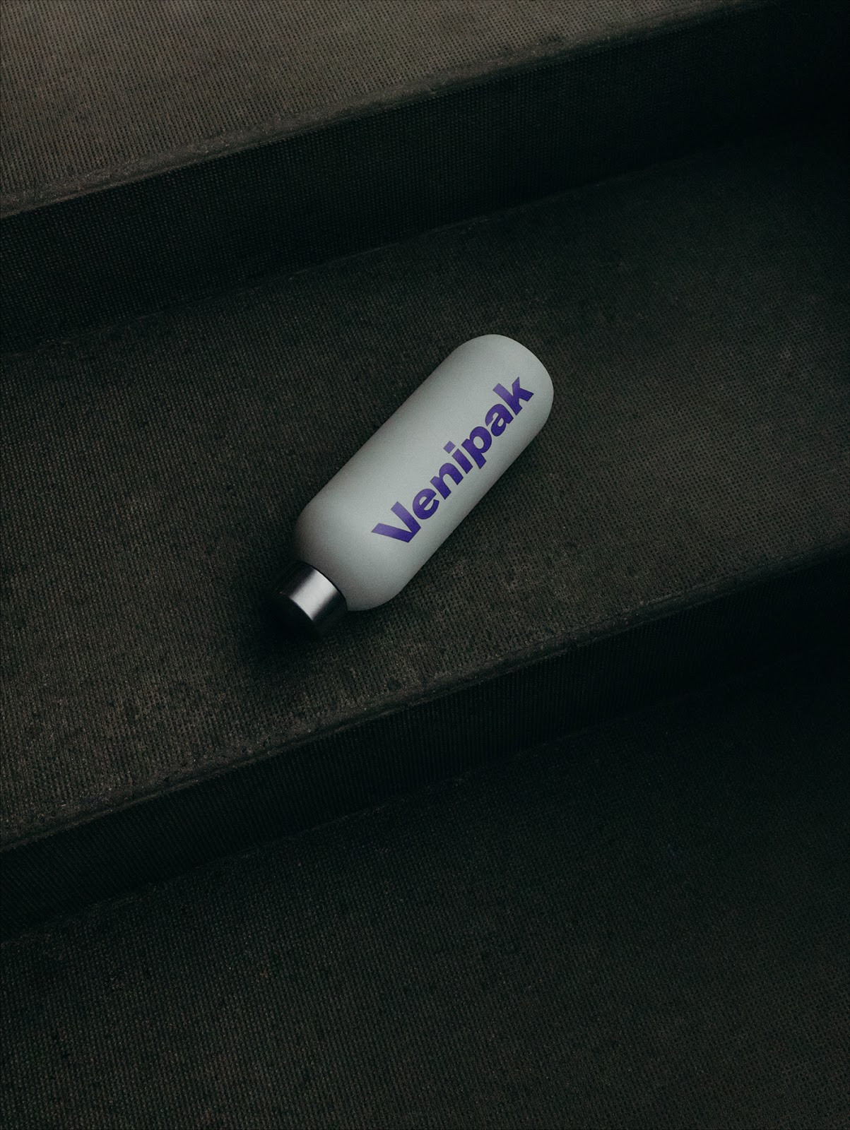
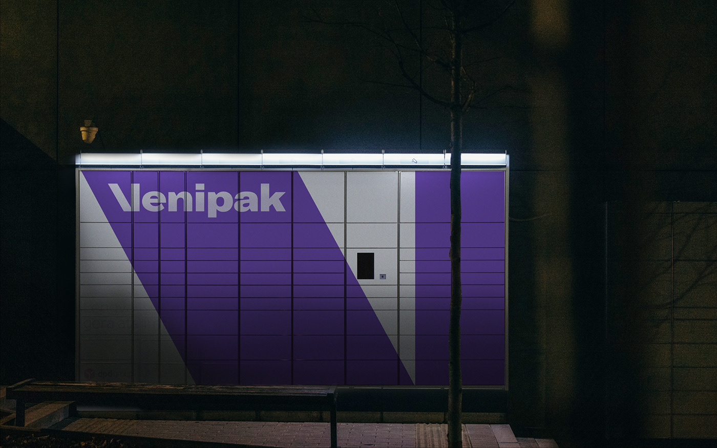
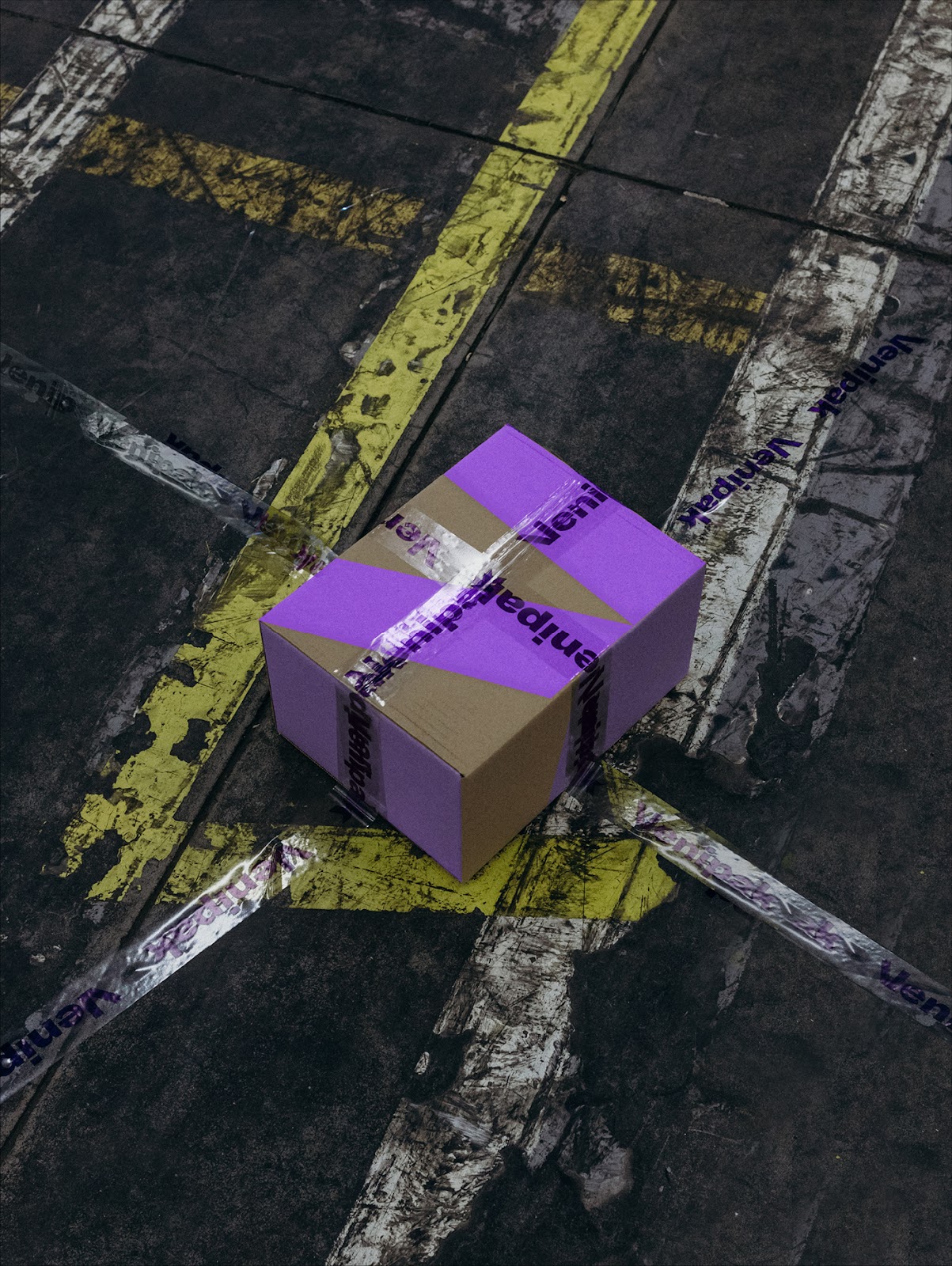
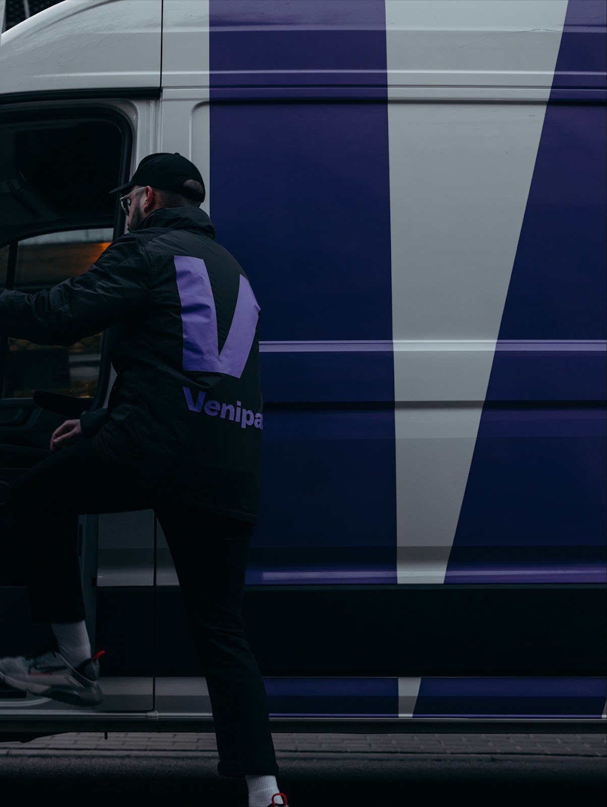
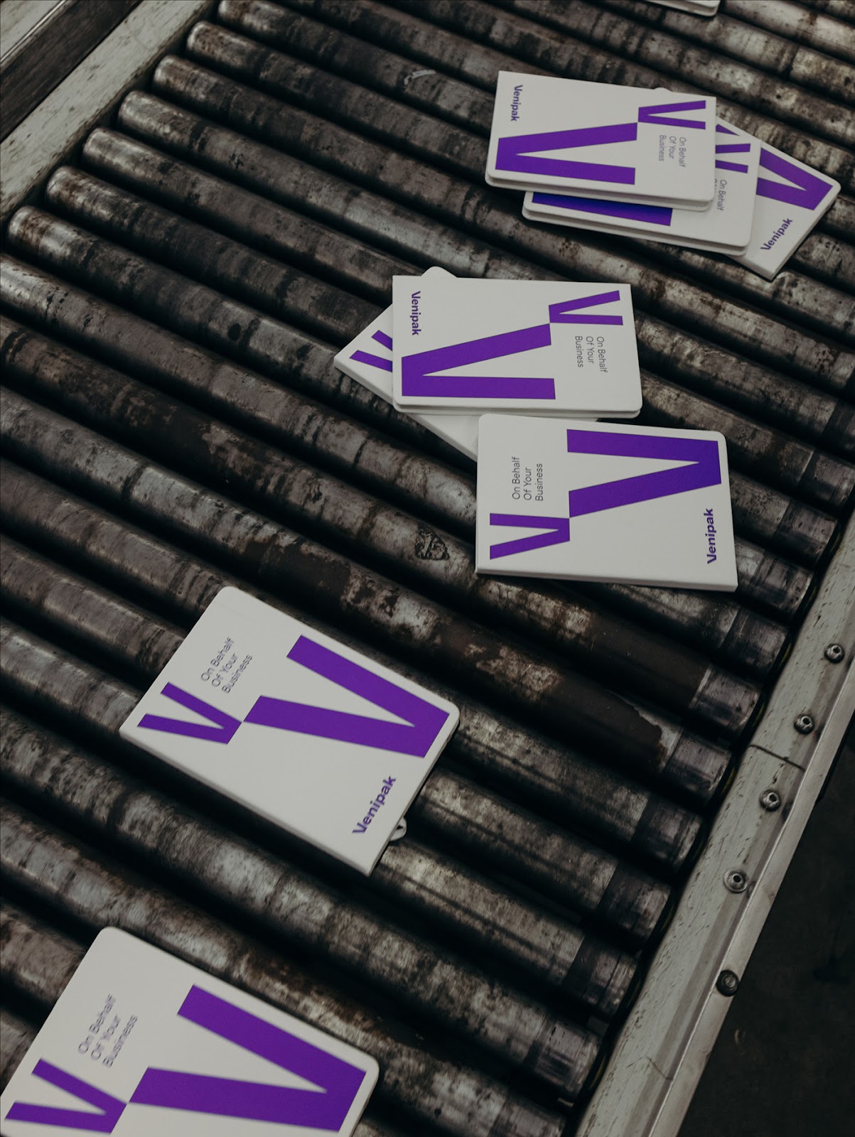
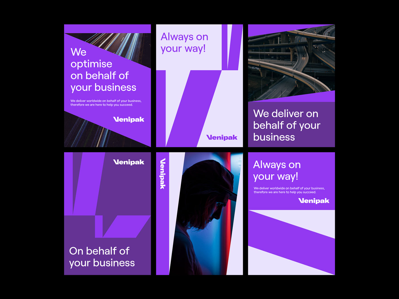
Delivery service could be described as a process of transporting goods from source location to destination. Or, to put it briefly, a movement from one place to another. Therefore, it also resonates with Venipak’s aim to represent the constant movement forward, leading to the future. As a result, we created a meaning for that process of ‘shifting’ by leaving a color trail and element repetition in the identity. That’s how a forward movement becomes an essential element in the new direction among the bold, simple visual language. In addition, squares become an important accent as a connotation of delivery parcels.

Credits
- Client: Venipak Group
- Brand Design: Andstudio
- Brand Strategy: Synthesis Consulting Group
- Case Photos: Vincas Cygas
For more information make sure to check out Andstudio on: