by sofia
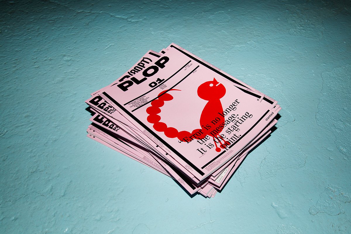
PLOP #01 is a quarterly Polish design revue by Slanted Publishers that questions whether polish enhances or erases graphic identity in contemporary design.
Slanted Publishers launched the Polish design revue PLOP with a simple but charged question at its core. Does polish sharpen a designer's voice, or quietly sand it away? The first issue frames that tension as a design object and a critical document in one. It arrives through a collaboration between Slanted, Three Dots Type Foundry, and the Polish Graphic Design Foundation, three organizations that together represent a significant share of contemporary Polish visual culture.
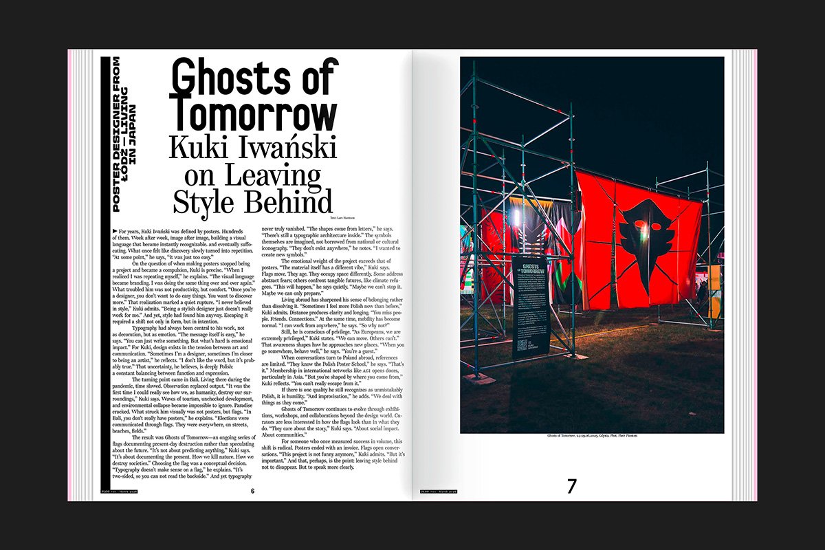
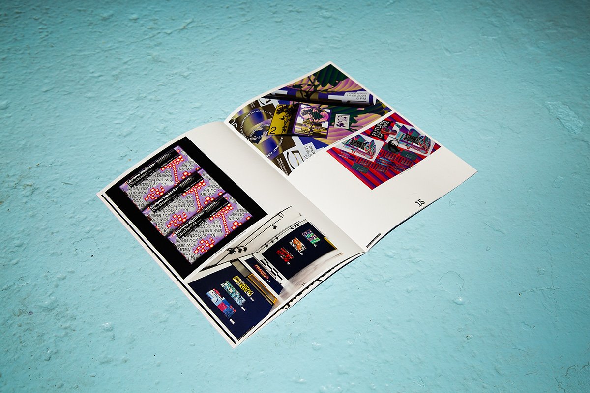
The Polish design revue features work by designers Martyna Wędzicka, Kuki Iwański, and Paweł Mildner, each of whom approaches Polish visual identity from a distinct angle. Their contributions read as arguments rather than portfolios. The publication uses the Radius typeface, designed by Three Dots Type Foundry, as both a structural tool and a symbol of intentional craft. Radius carries weight on the page while staying out of the way of the ideas it sets.
Polish Design Revue as Critical Object
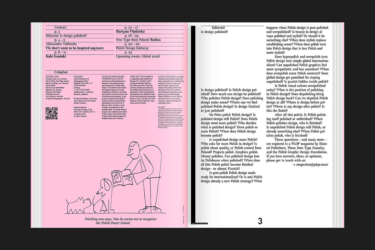
What makes this Polish design revue stand out is its refusal to celebrate without questioning. The editorial position is direct. Polish graphic design has a distinct history tied to poster art, political resistance, and a particular kind of wit. PLOP #01 picks up that thread and asks what it means to carry a national design identity into a globally connected field. The answers it offers are not neat, which is precisely the point.
The format of the Polish design revue is quarterly, which matters. Design publications that commit to regularity make a different kind of argument than one-off anthologies. Each issue of PLOP can build on the last, tracking shifts in Polish graphic design thinking over time. The first issue sets a high bar for that ongoing conversation.
PLOP #01 is available through Slanted Publishers. For more on the Polish graphic design scene, the Three Dots Type Foundry documents related typographic work in depth.