by jeff
London studio Templo designed the CASI brand identity around hobo hieroglyphics and Matisse cut-outs: a climate brand built to inspire rather than alarm.
CASI (Climate Action Service International) is the sister organisation of the Gallery Climate Coalition, a non-profit focused on sustainable practices in the visual arts. The brief to Templo was clear: build a mission-driven identity that speaks to the creative community without resorting to guilt or alarmism. The result is one of the more considered CASI brand identity systems to emerge from cause-led design.
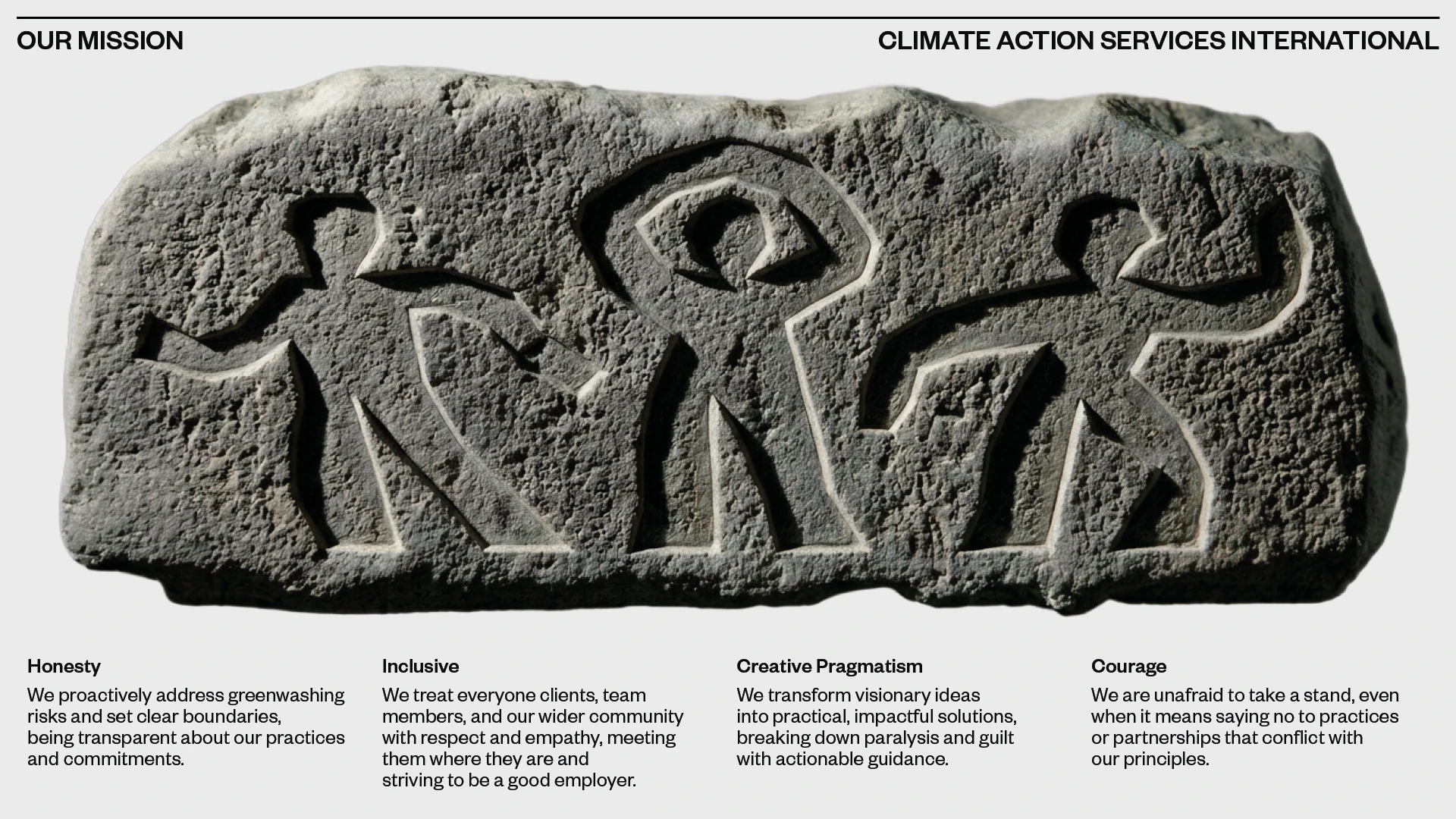
The logo's conceptual root is genuinely unexpected. Templo looked to hobo hieroglyphics, the chalk symbols used by Depression-era travellers to communicate safe routes and local dangers. Those marks were pragmatic, direct, and human. That same quality became the target for the CASI mark. Early reduced forms felt too polished. The breakthrough arrived on a hike with studio co-founder Pali Palavathanan and his daughter. She shaped forms with her arms, casting a shadow that read as an eye. That gesture crystallised the CASI brand identity logo: a standing figure with arms encircling its head.
CASI Brand Identity: Motion System and Type
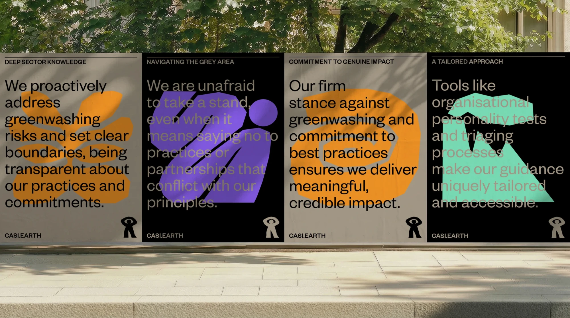
Templo built a wider graphic system of Matisse-style cut-out forms. Each piece was hand-animated using traditional onion-skinning techniques, studying natural movement frame by frame. The motion language feels genuinely handmade rather than digitally smooth, preserving the deliberate imperfection that makes the system feel alive.
Balancing these organic marks is a quiet contemporary Grotesk typeface. The typographic restraint is intentional: it mirrors the ordered calm of a gallery space set against the generative energy of a studio. The CASI brand identity holds that tension throughout, from flyposters to business cards to digital.
![]()
![]()
![]()