by abduzeedo
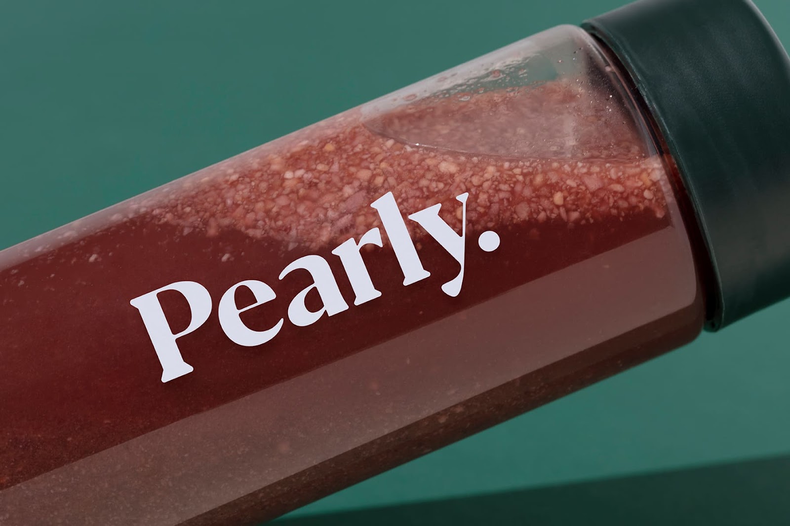
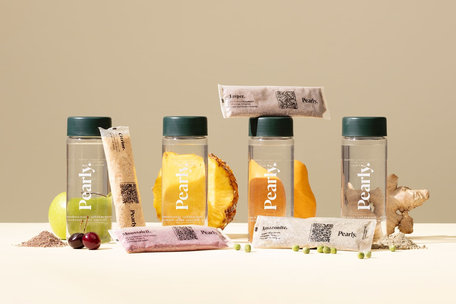
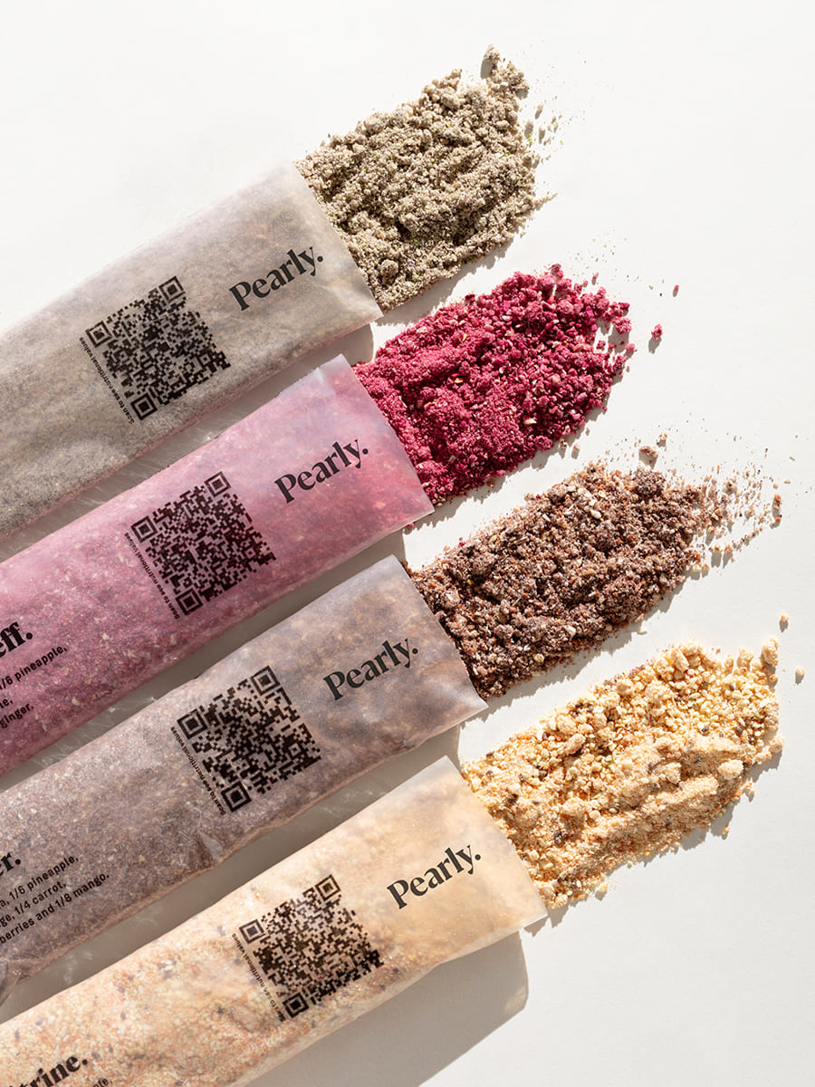
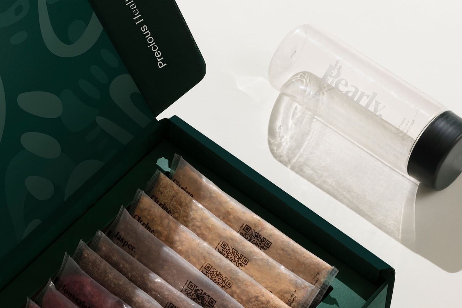
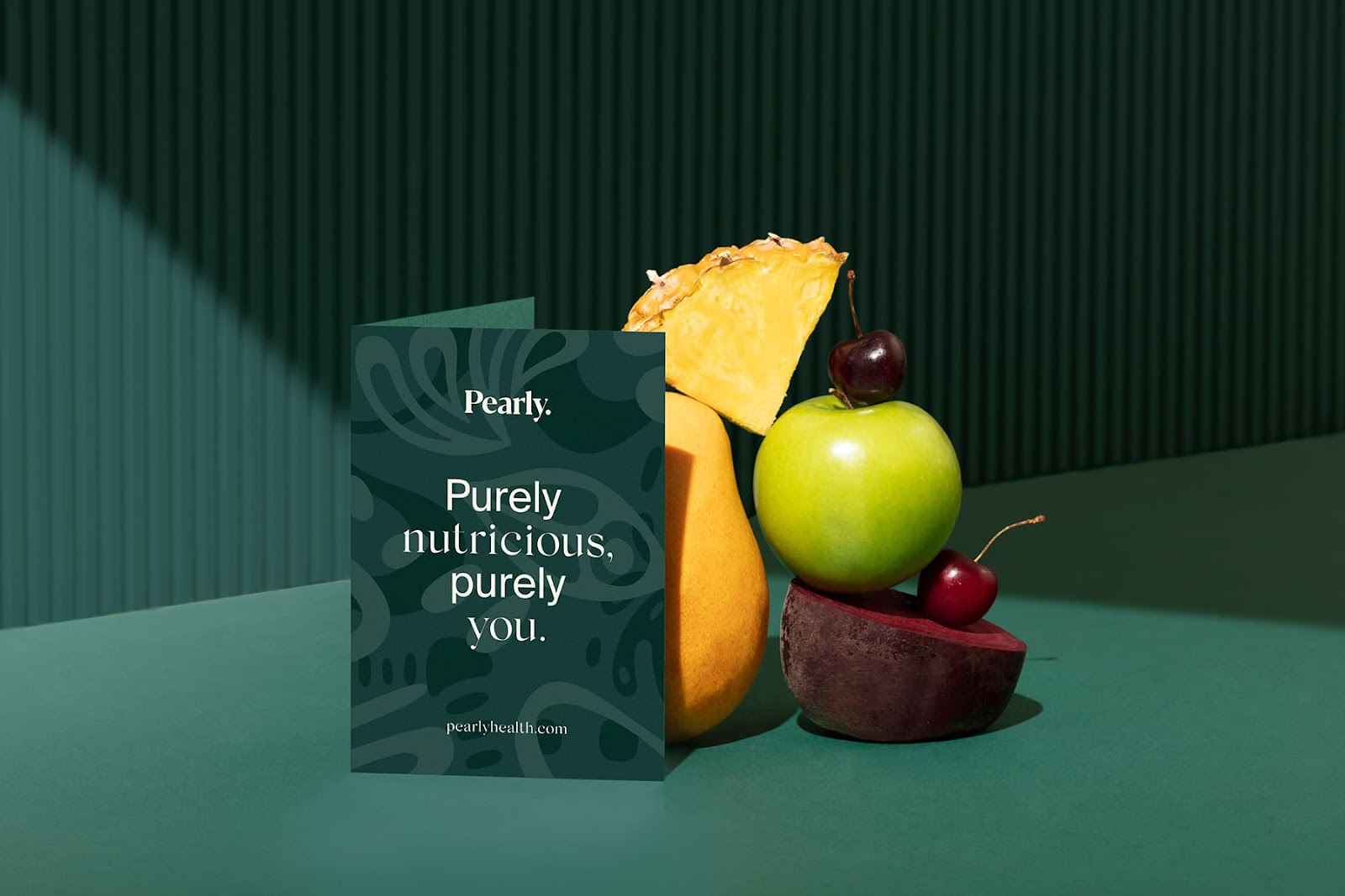
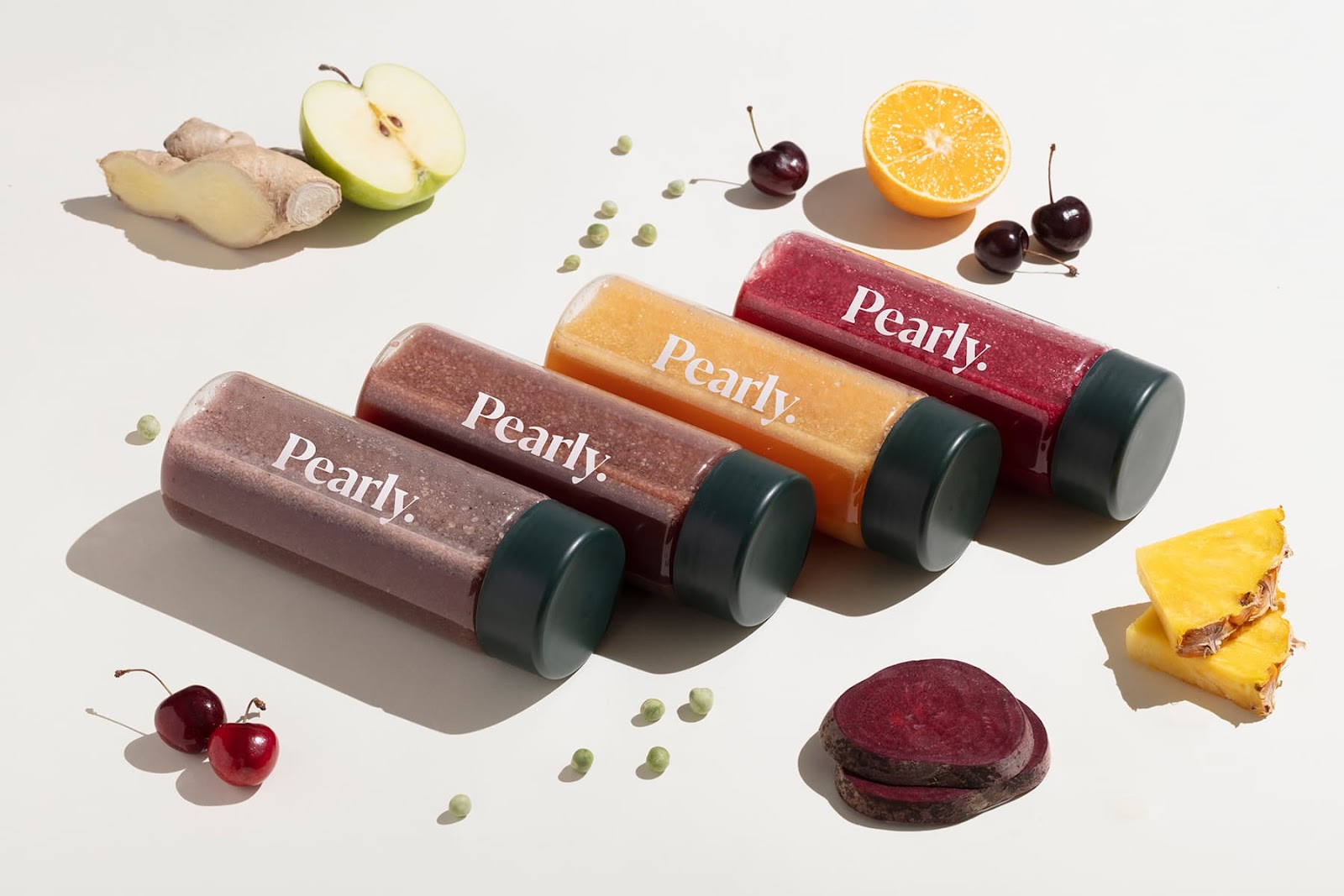
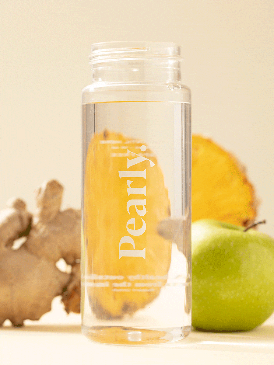
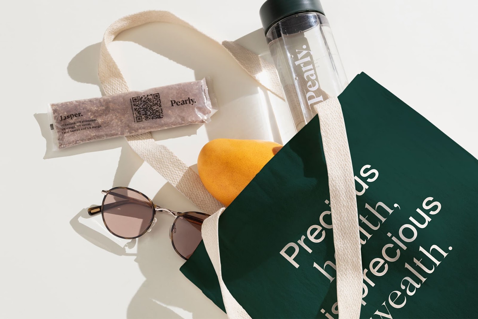
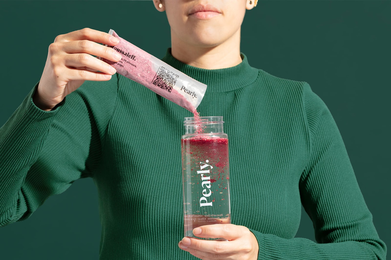
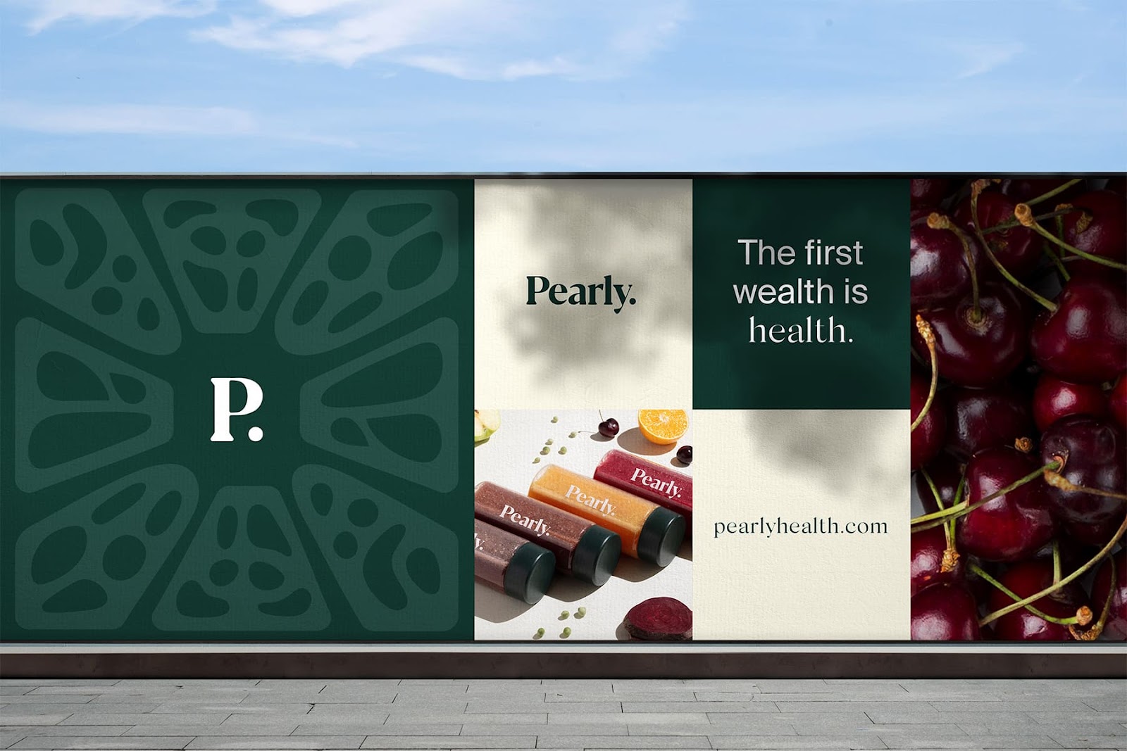
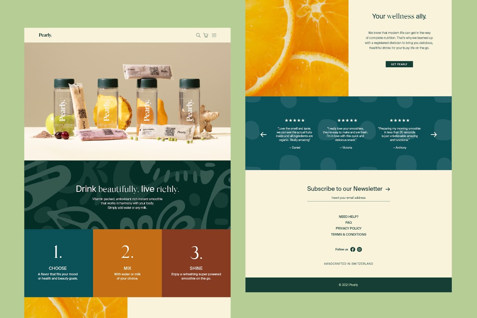
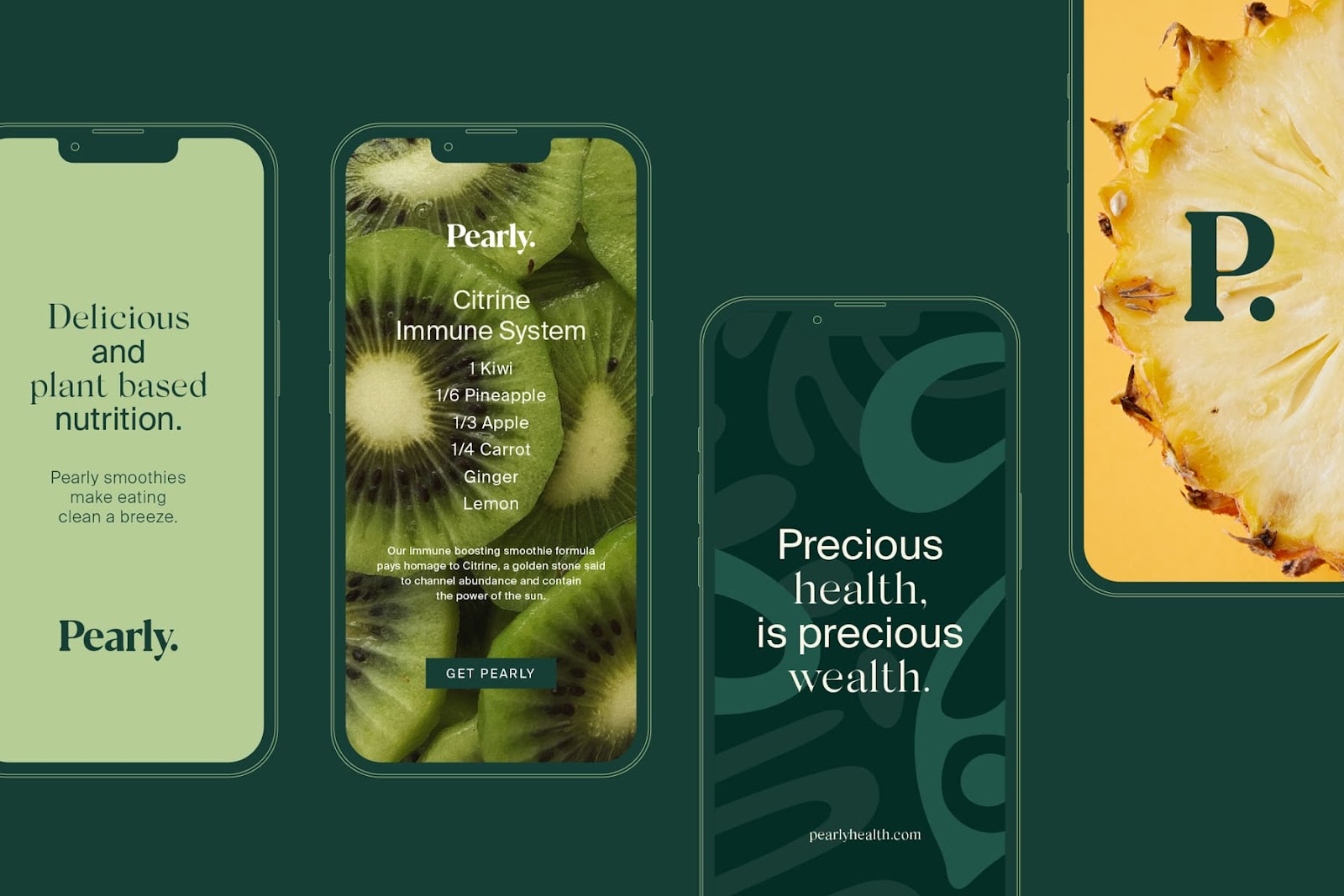
Pearly is a superfood organic smoothie brand based in Switzerland that uses Freeze-Dry technology to provide consumers with instant smoothies made of fine organic food and vegetables that supply high-quality nutrients. tbpmx created a concept composed of a progressive and dynamic design, complemented by an earthy color palette and contrasting green tones that allude to a fresh and fashion-forward brand balanced with fruit and vegetable-inspired textures. In contrast, other graphic elements like the logotype and photography curatorship were inspired by the aesthetic qualities of pearls to achieve a refined look.
Sparkling elements and silky outlines represent Pearly’s authentic ideals to enclose the precious aspects of the communication, where lifestyle and technology meet.


For more information make sure to check out the branding people (tbpmx) website.


