by abduzeedo
Explore the rebellious spirit of Danish juice maker Rebæl through their ever-changing packaging design by EVERLAND. A fresh take on beverage branding.
Meet Rebæl, a Danish beverage company founded in 2016 by entrepreneur Emil and sommelier Tom. Their goal? To create extraordinary taste experiences, treating every bottle like a piece of art. Whether it's gastro juices, lemonades, ice teas, or cocktails, Rebæl aims for the unique and uncompromising.
But how do you visually capture a spirit that thrives on constant creation and artistic ambition? Rebæl needed a brand identity and packaging design that could match their rebellious nature and challenge the mainstream beverage category. Standard solutions wouldn't work.
Crafting a Living Identity
Scandinavian design agency EVERLAND stepped in to help. They understood that Rebæl's process isn't static; it changes like the seasons influence their ingredients. The solution was not a fixed identity, but a fluid one. EVERLAND provided Rebæl with tools to create an ever-changing brand expression.
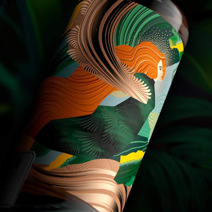
This dynamic approach is most evident in the packaging design. Each product batch might feature a different result because the creative process itself varies. The labels showcase unique collages. These aren't just decorative; they visually interpret the culinary experience bottled inside, sparking associations for the drinker. Think abstract shapes hinting at crisp lemon or deep hues suggesting rich berries. This method ensures the packaging design is as alive and evolving as the product itself.
A Logo That Breaks the Mold
Even the Rebæl logo embraces flexibility. Its letters can be stacked and rearranged as needed, breaking free from rigid lockups often seen in packaging design. This adaptability allows the logo to integrate seamlessly with the varied label art, reinforcing the brand's unconventional personality. Look at the shipping boxes – the logo playfully adapts across the surface, far from a typical, repetitive pattern.
Standing Out
This approach results in a packaging design system that feels complex yet straightforward, mirroring the flavors within. It’s designed to fit the specific product and the occasion. The use of distinct visual elements for each flavor, like the clear depiction of ingredients on the Elderflower Lemonade or the abstract representation on the Blackcurrant Juice, makes each bottle feel individual.
"Only a true rebel would dare to embrace this design universe," notes Jonathan Faust, Design Director at Everland. The Rebæl packaging design intentionally steps away from category norms. It avoids cookie-cutter aesthetics, offering instead a vibrant, artistic, and constantly fresh face on the shelf. It’s a brave choice that reflects the brand's core philosophy: making art from fruits. This commitment to unique packaging design ensures Rebæl captures attention and communicates its dedication to craft from the first glance.
This fluid system allows Rebæl to maintain a cohesive brand presence while celebrating the individuality of each product. It’s a smart solution that balances artistic expression with clear communication, proving that packaging design can be both beautiful and strategically rebellious.
Learn more about the design studio behind this work: EVERLAND
Branding and packaging design artifacts
