Cellmong: Weaving the Future of Skincare Branding
Discover Cellmong's unique branding and packaging design, inspired by spider silk for a delicate yet strong visual identity.
Skincare brands often aim for feelings of purity and newness. They also want to show scientific progress. Cania Agency did this well with Cellmong. This brand promises to bring tired skin back to life. Their design blends nature's gentle strength with science. This creates a strong visual story.
Cellmong's main idea is simple: awaken the "dream" in skin cells. It draws power from a mountain's strength. It also uses the grace of a "rêve" (dream). A special ingredient, spider silk peptide, is key. It promises renewal and strength. This unique science forms the brand's look.
A Design Inspired by Webs
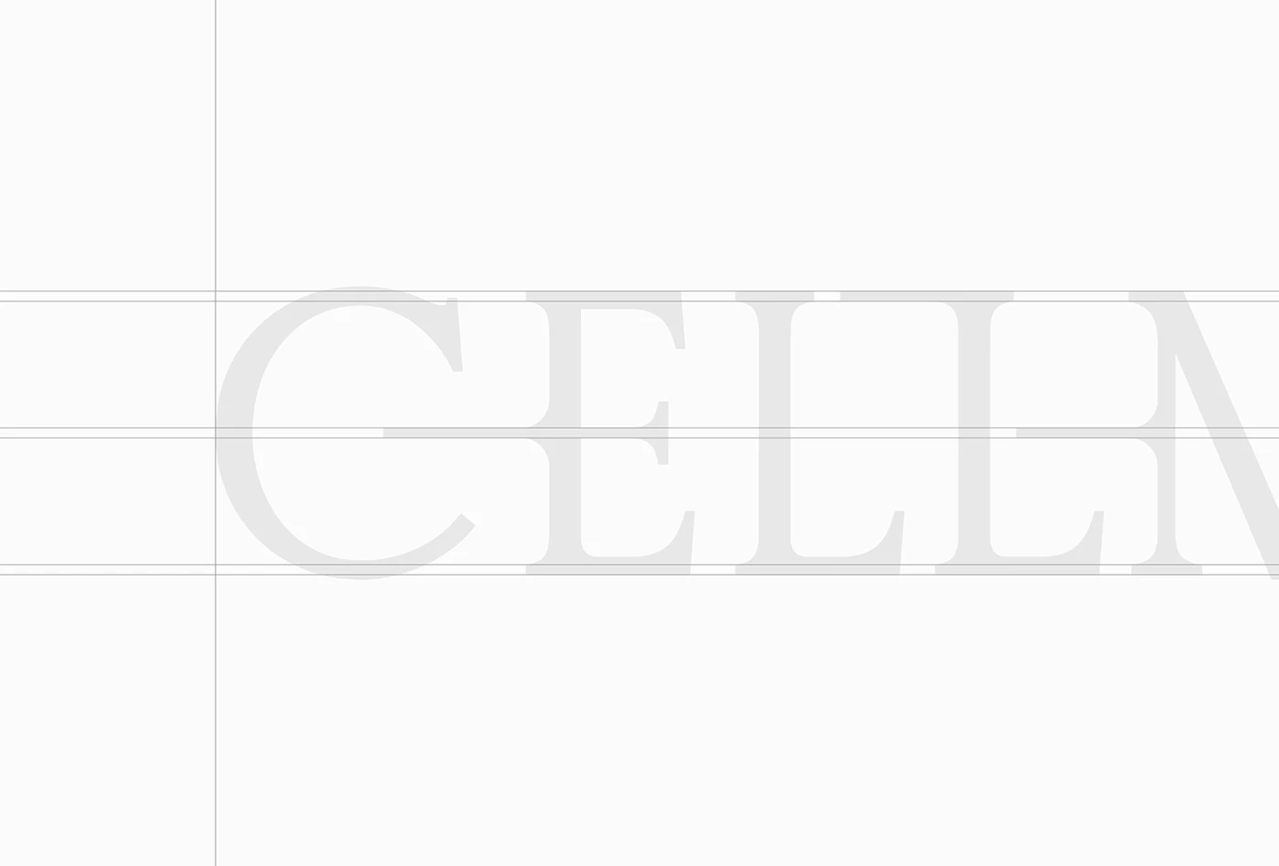
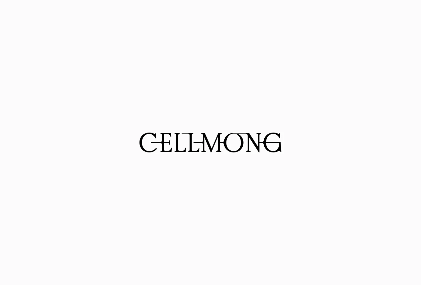
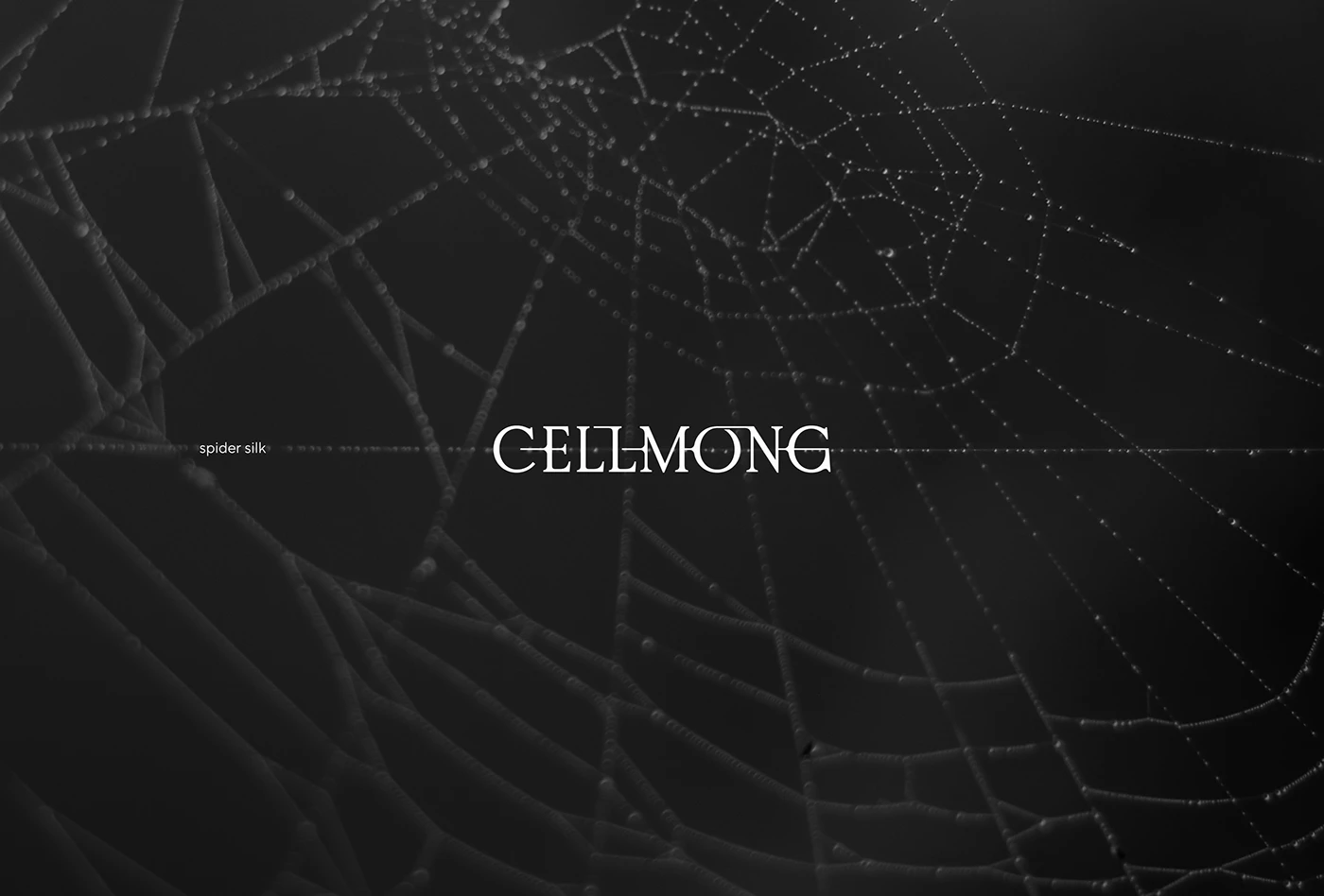
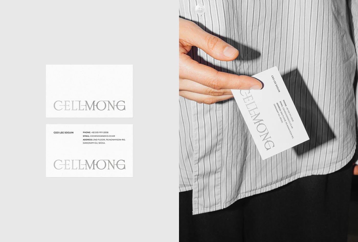
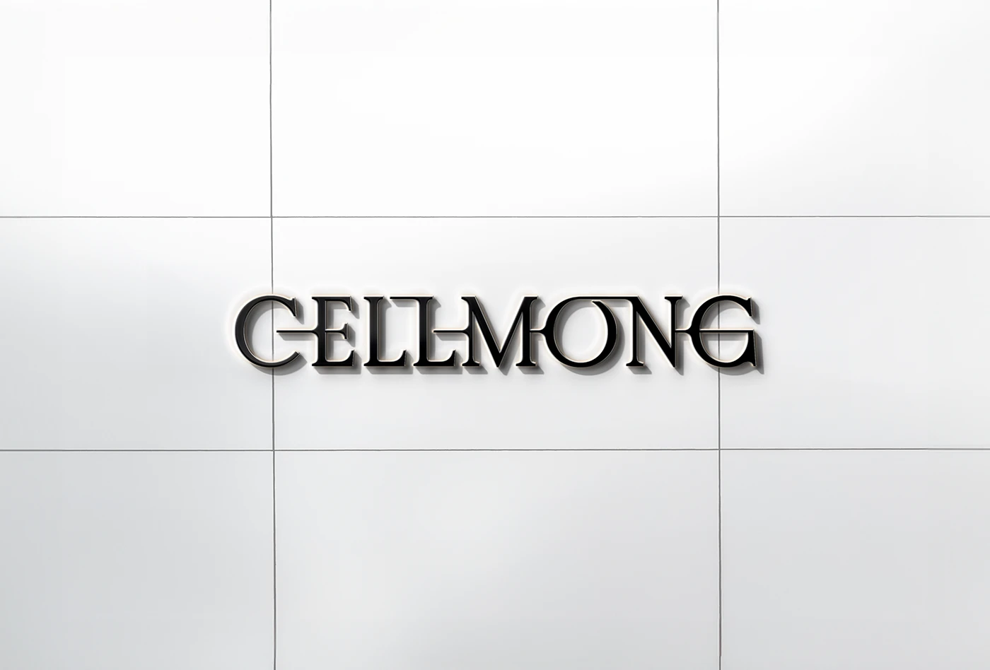
Cellmong's branding comes from the spider's web. Each thread is thin but very strong. It connects perfectly. Cania Agency used this idea for the Cellmong logo. They made it with tightly woven lines. Every detail is careful. It looks like the logo is gently pulled by an unseen thread. This creates a feeling of soft movement and lasting connection. This design clearly shows the product's gentle yet powerful effects.
Elegant Font and Colors
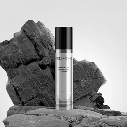
A modern font was chosen for Cellmong. It shows the brand's fine style, smart look, and high quality. This font works well with the woven lines of the logo. It helps create an overall premium feel.
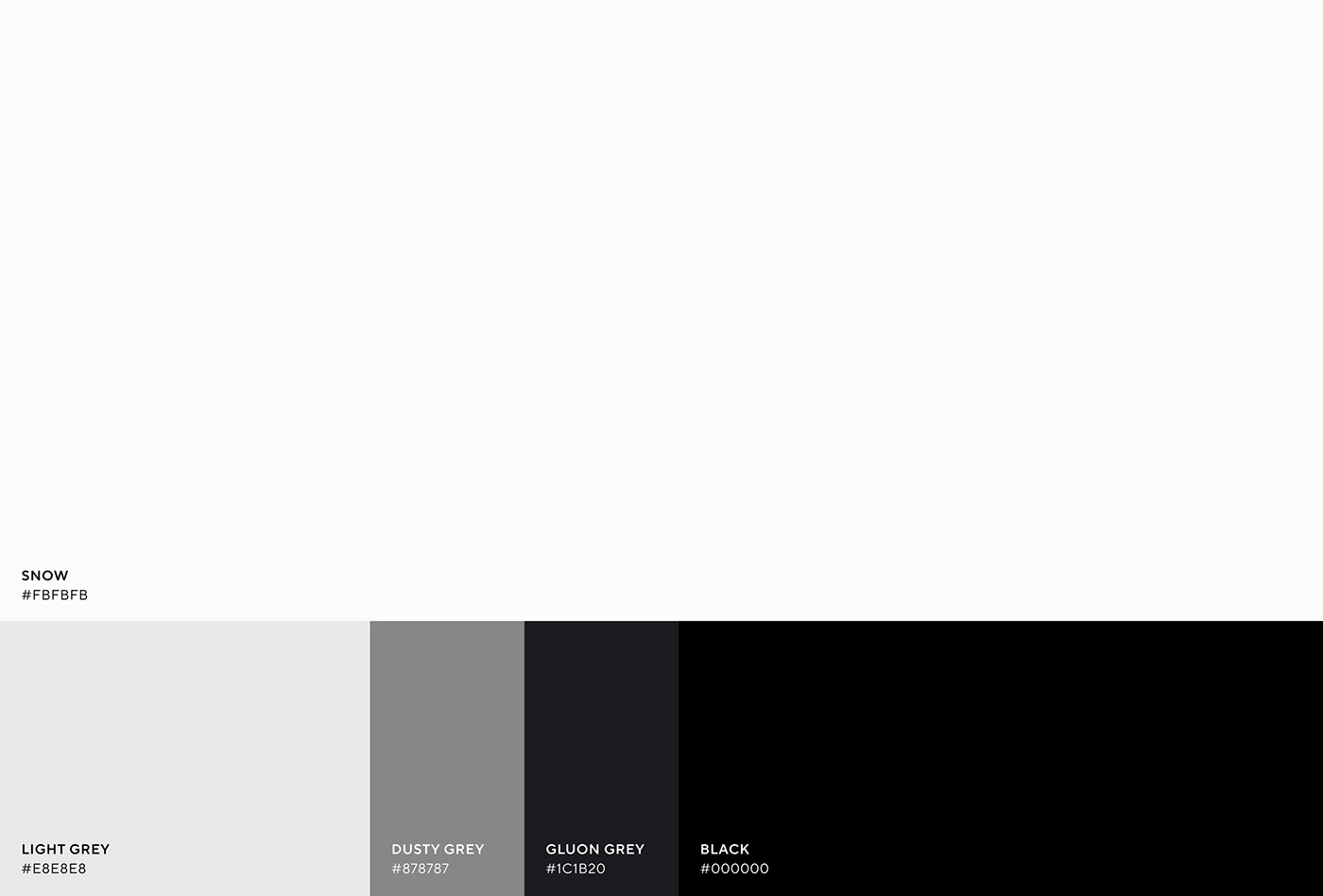
The colors for Cellmong's branding and packaging are simple but strong. They mainly use shades of grey, black, and white. "Snow" (#FBFBFB), "Light Grey" (#E8E8E8), "Dusty Grey" (#875787), "Gluon Grey" (#1C1B20), and "Black" (#000000) make a clean, classy look. These few colors highlight the product's pure science and high-end feel.
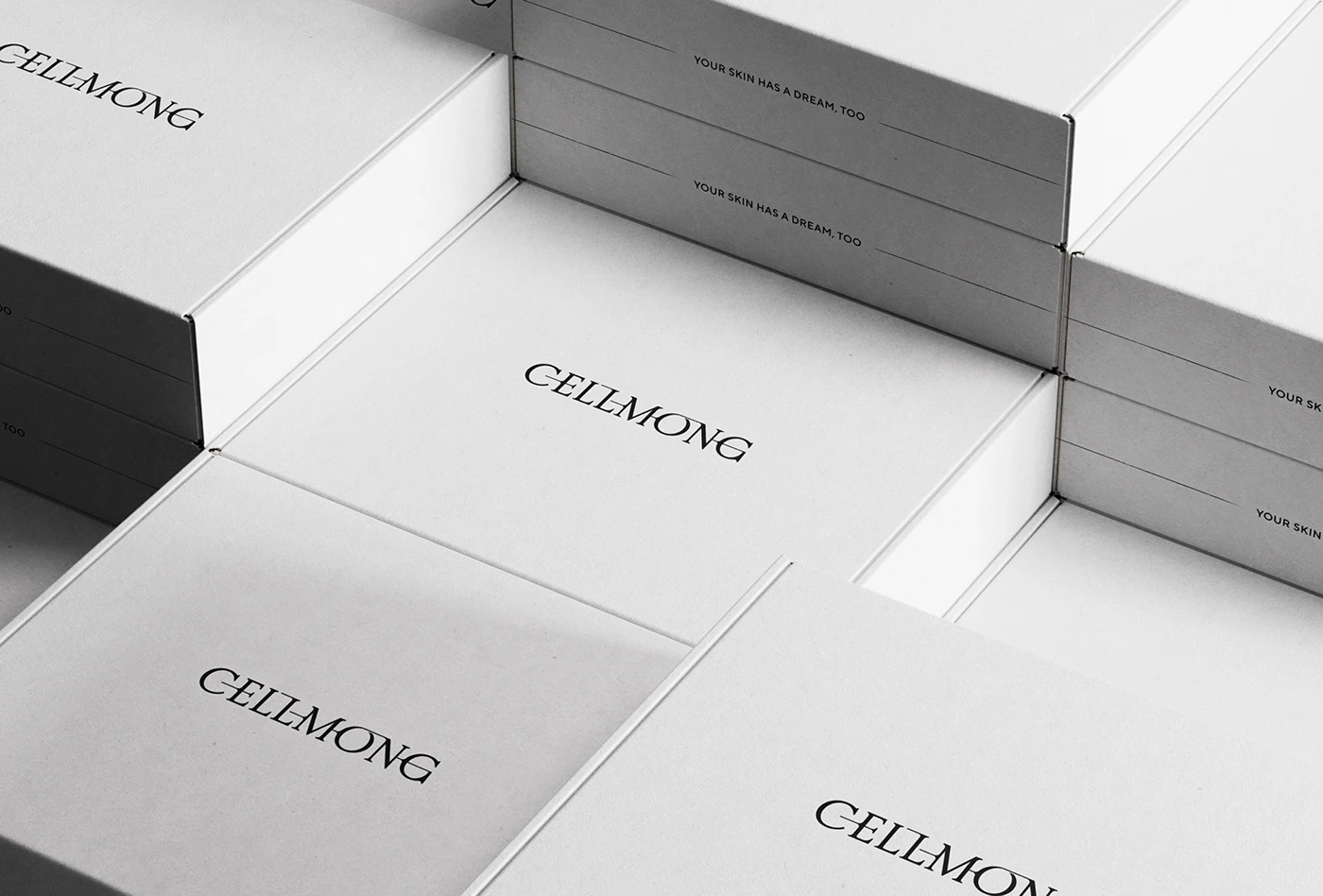
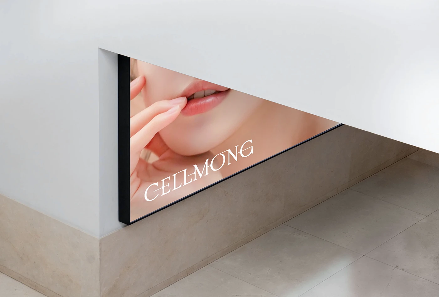
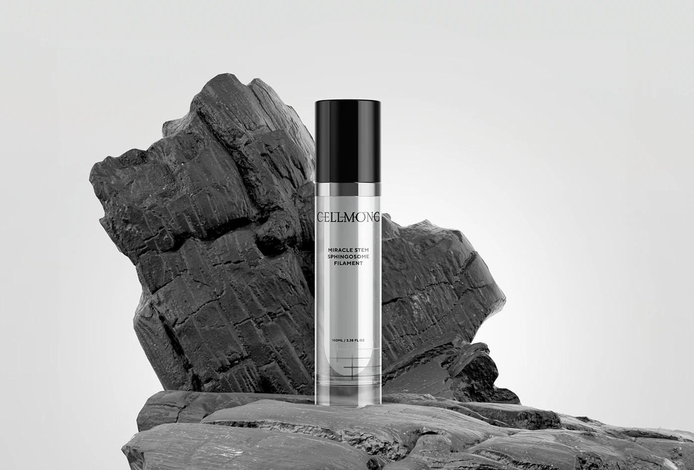
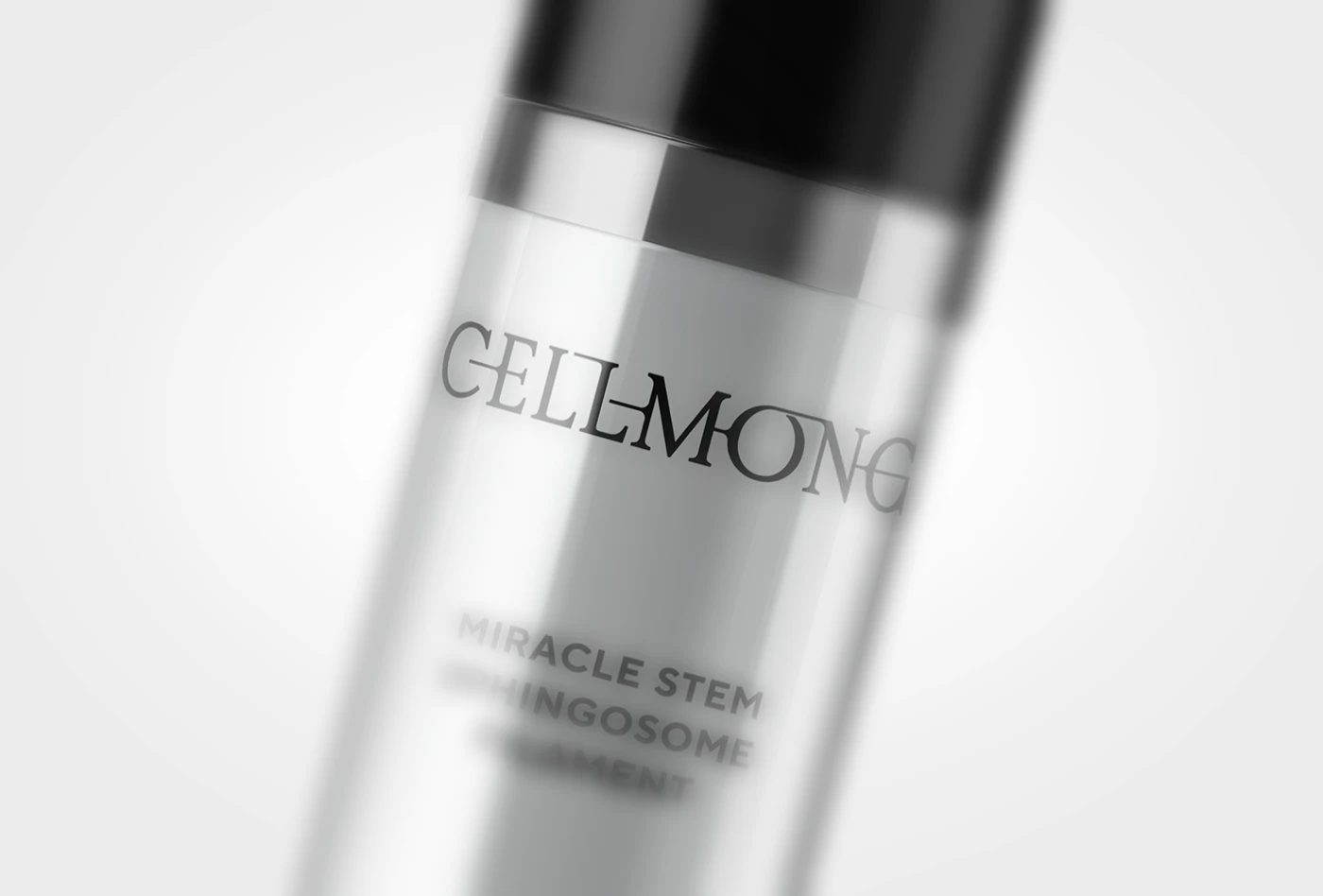
Packaging That Speaks
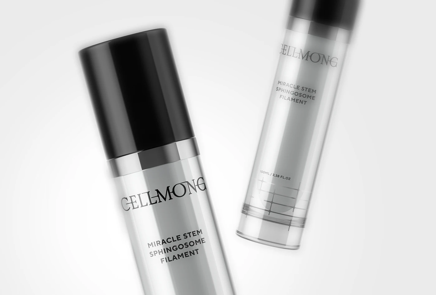
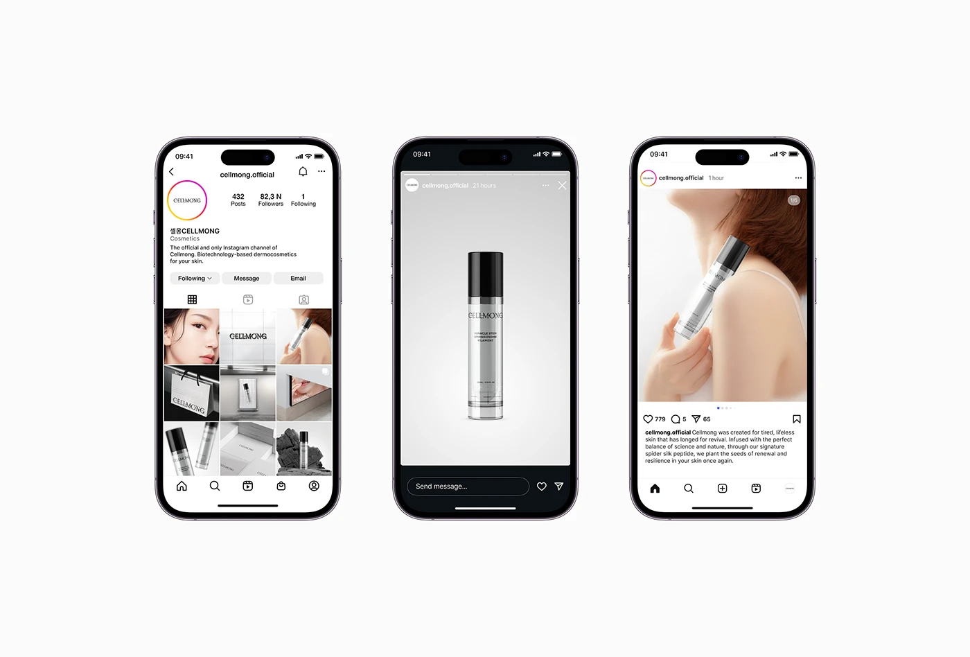
Cellmong's branding and packaging always share its main message. The product bottles, for example, clearly show the "CELLMONG" logo. They also show the product name: "MIRACLE STEM SPHINGOSOME FILAMENT." The clean lines and clear text on the packaging show the brand's focus on exactness and results. Pictures of the products on spider silk backgrounds further link to the brand's special idea. The outer boxes repeat the brand's slogan, "Your skin has a dream, too." This reminds users of the emotional bond Cellmong wants to build.
Cellmong's branding shows how a unique idea can become a strong, clear visual identity. The soft yet strong image of spider silk, mixed with a modern and smart look, makes Cellmong a top skincare brand. It truly understands how skin transforms. This careful way of doing branding and packaging creates a strong, memorable presence in the market.
Cania Agency. See more of their work at behance.net
Branding and packaging design