by abduzeedo
Explore the innovative UI/UX design of the Eat Che app by Pocolo Design, a standout example of app design excellence.
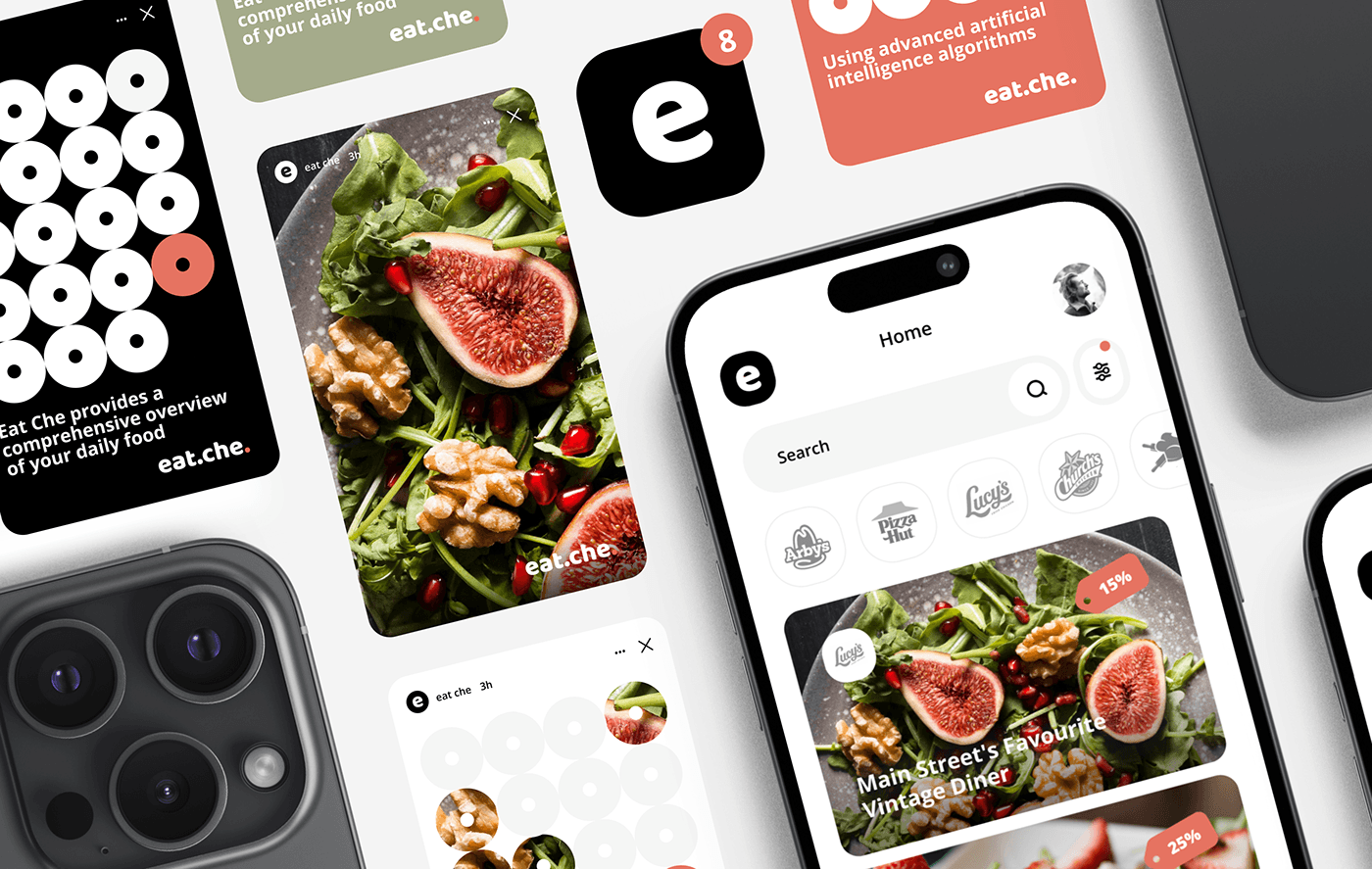
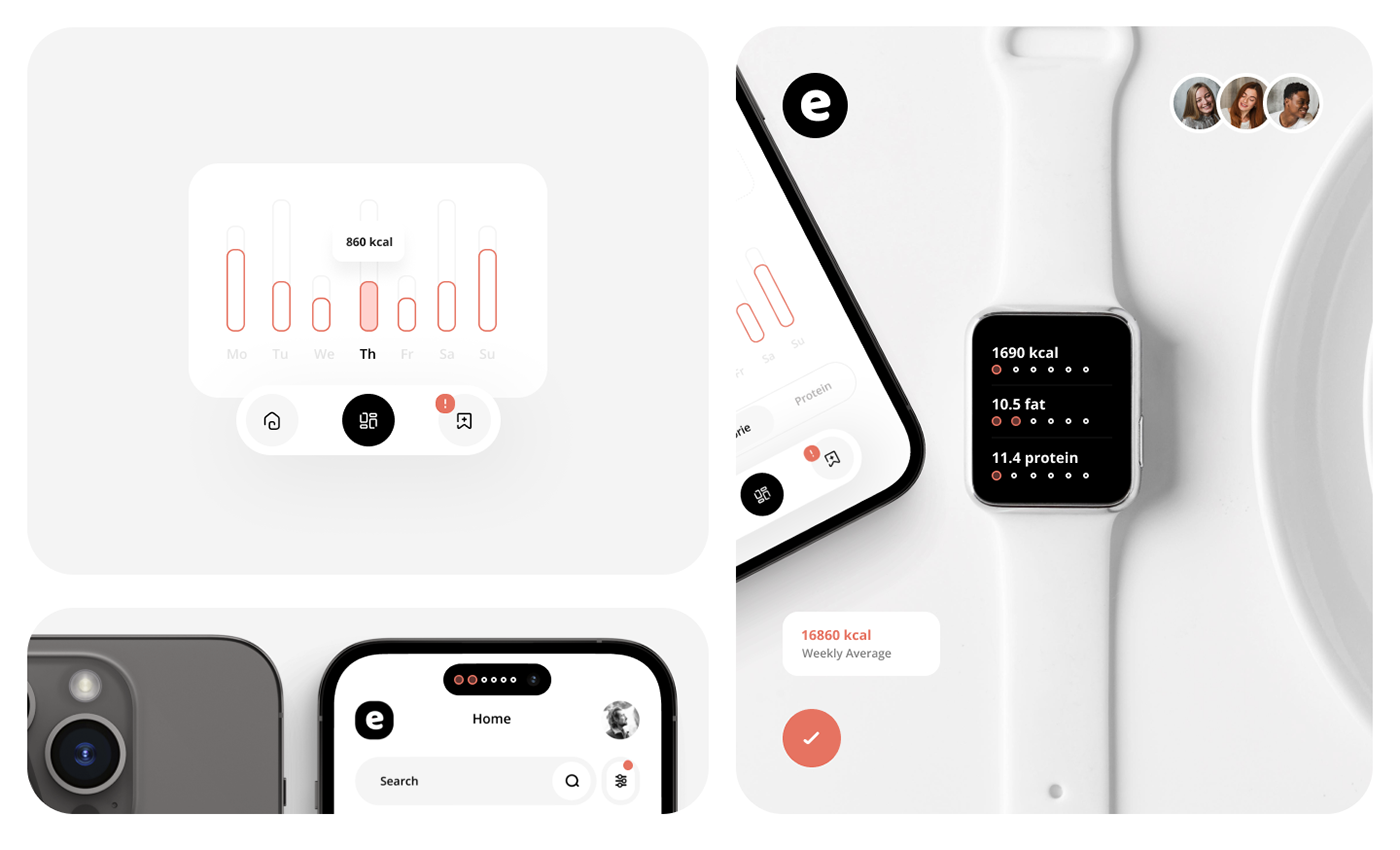
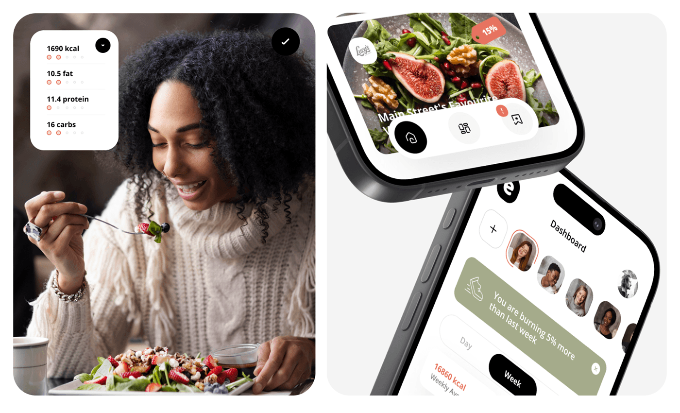
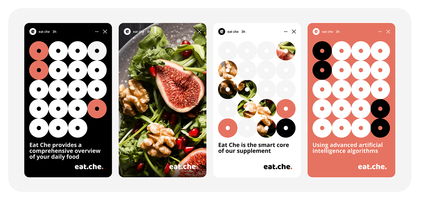
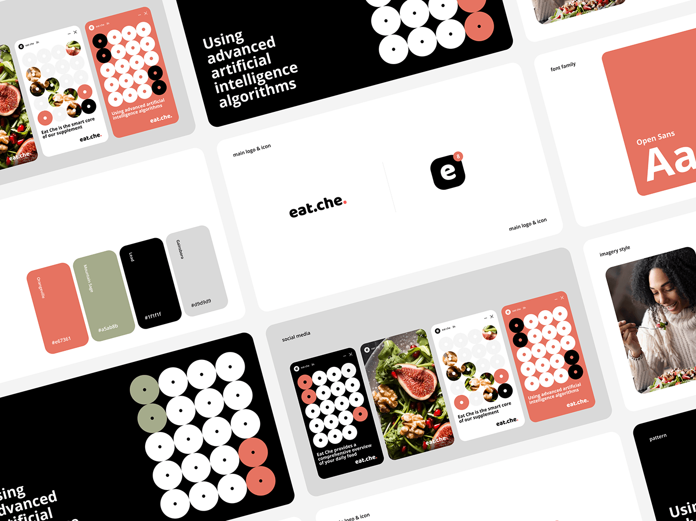
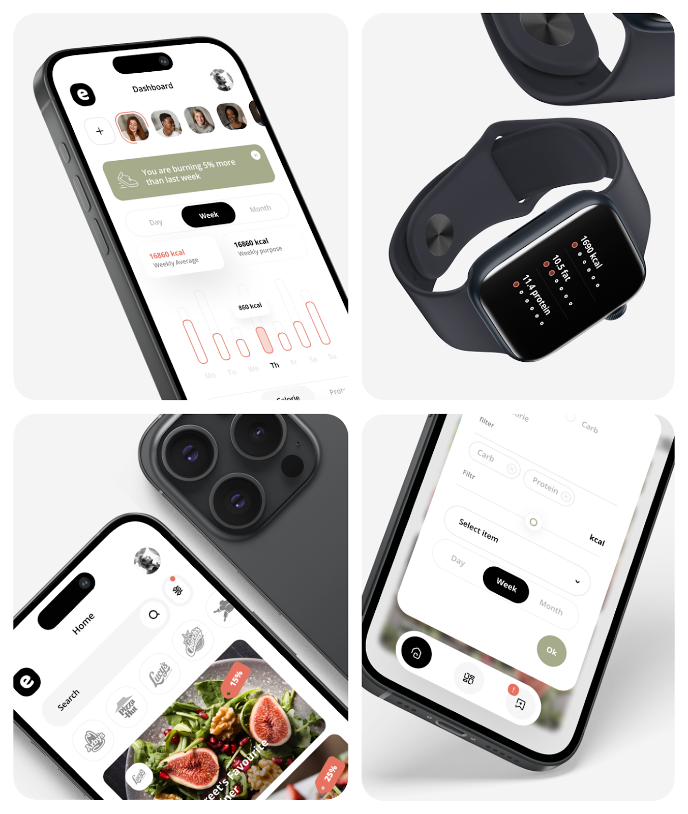
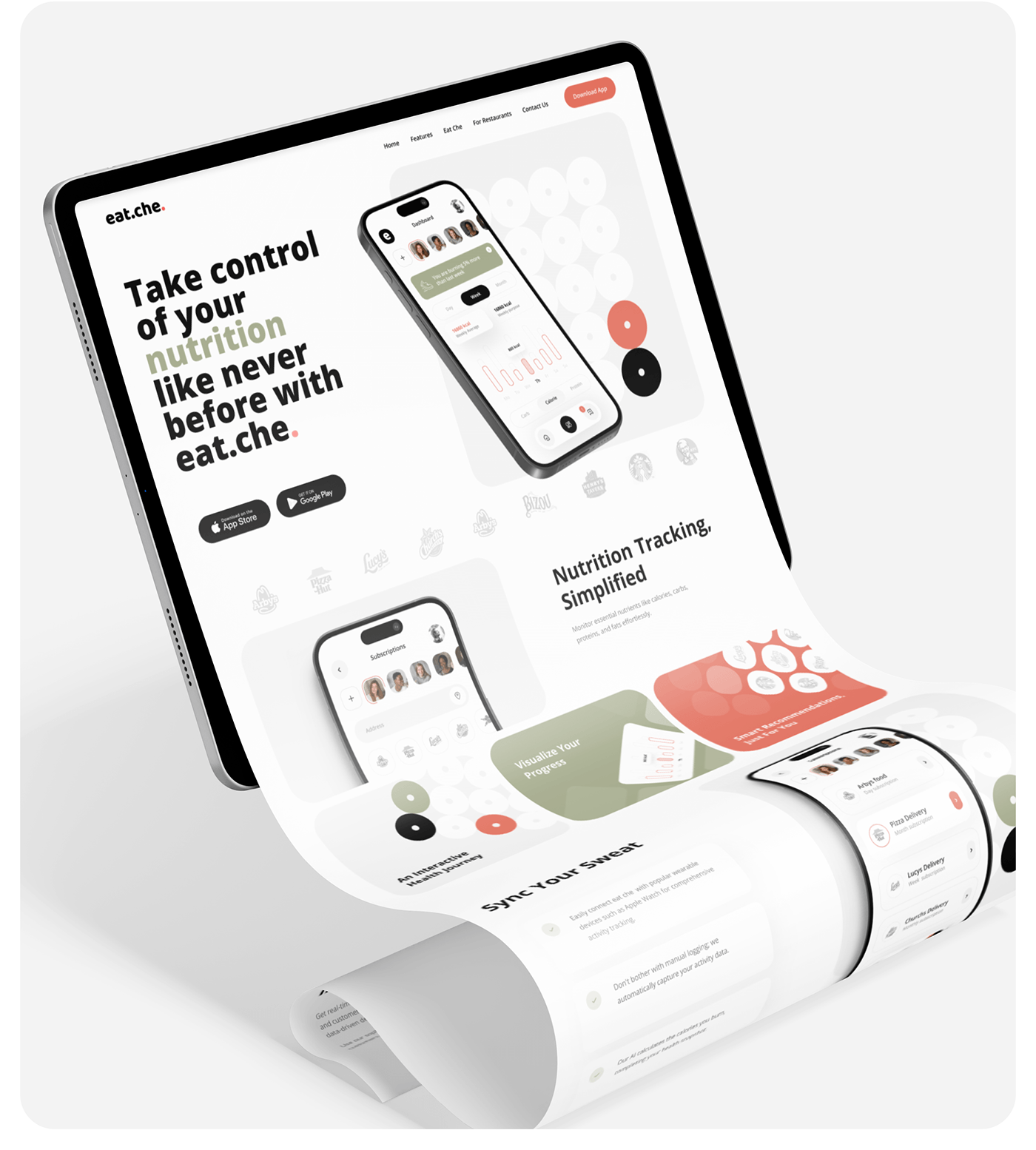
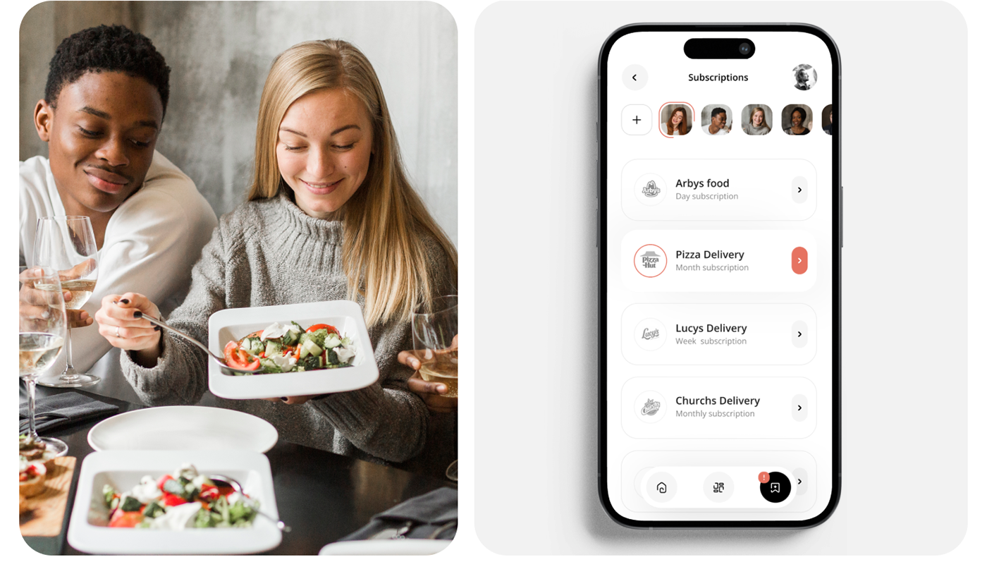
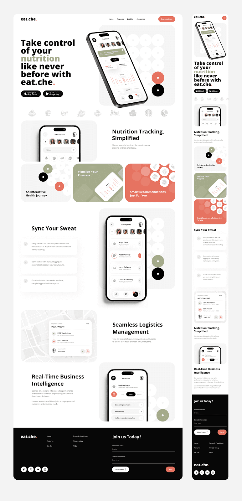
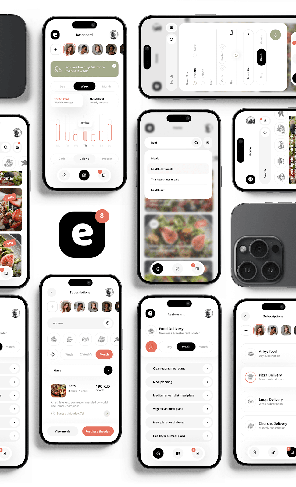
Eat Che, a calorie screening mobile app designed by Pocolo Design, sets a new benchmark in app design. The app integrates advanced artificial intelligence algorithms to provide users with a detailed overview of their daily nutritional intake, including calories, proteins, carbohydrates, and fats.
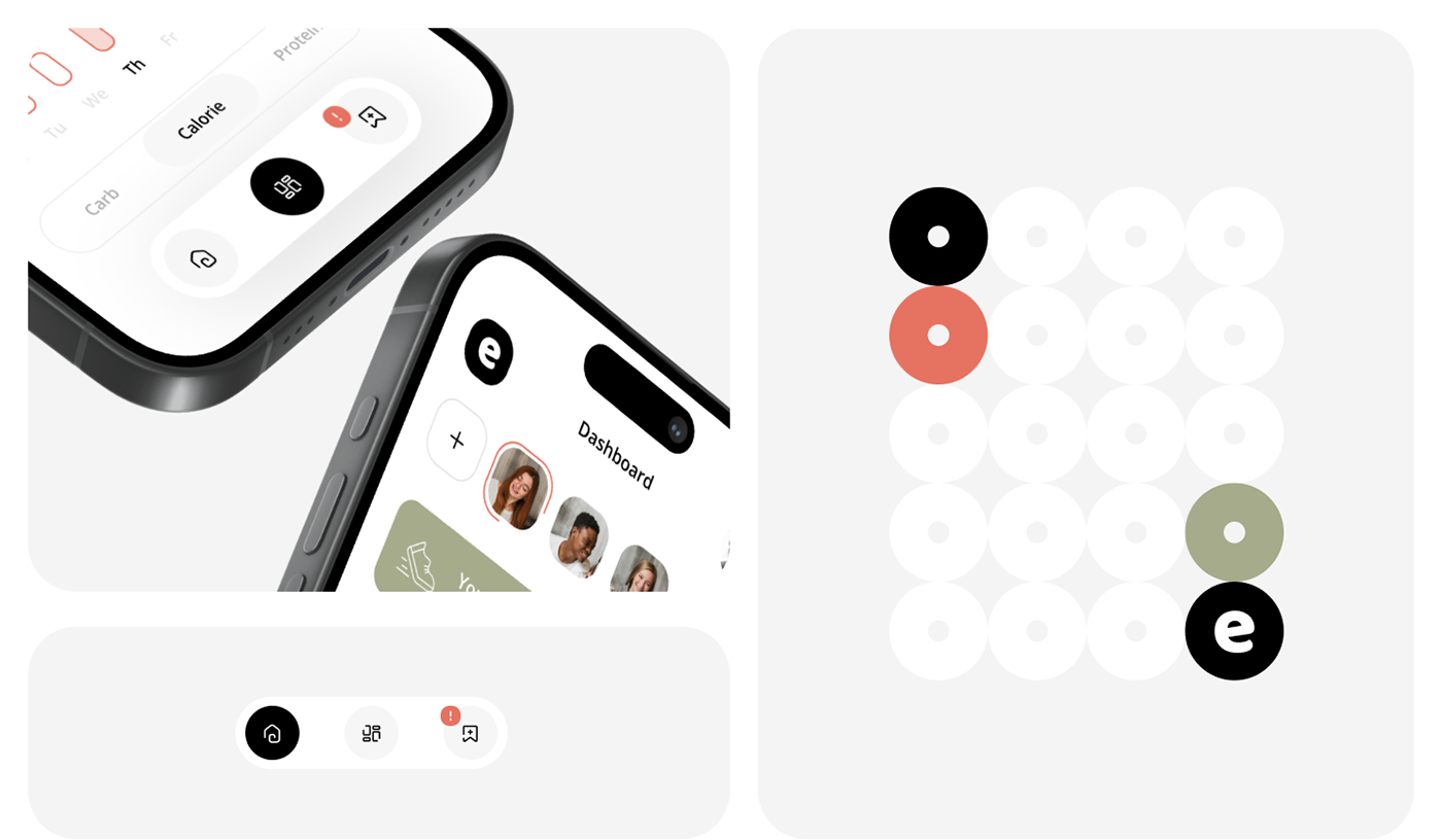
The app’s design focuses on clarity and user experience, making it easy for users to navigate through their dietary information. The interface is intuitive, with a clean layout that prioritizes essential data without overwhelming the user. This balance is achieved through thoughtful use of color, typography, and iconography, ensuring that each element serves a purpose.
Pocolo Design has emphasized the importance of accessibility in Eat Che. The app’s design considers various user needs, ensuring it is inclusive and user-friendly. The use of large buttons, simple icons, and readable fonts makes the app accessible to a broad audience, including those with visual impairments.
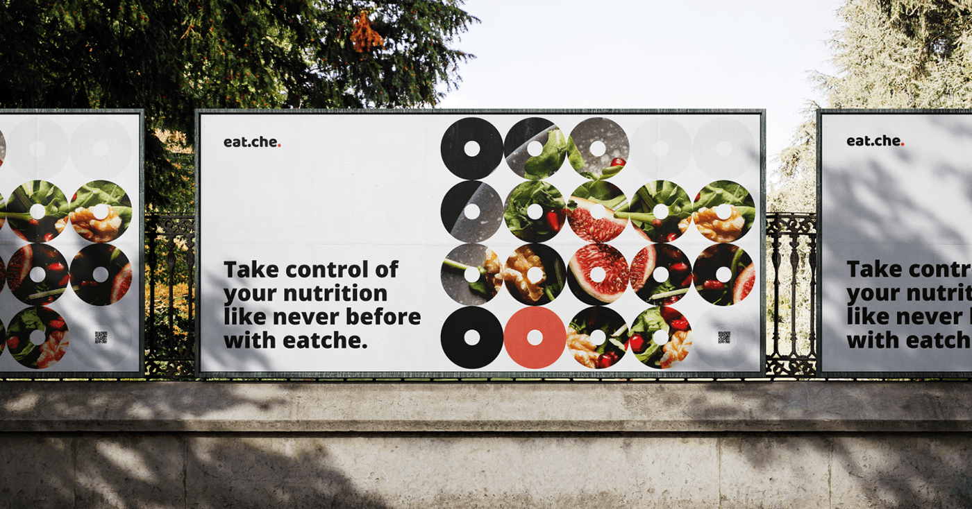
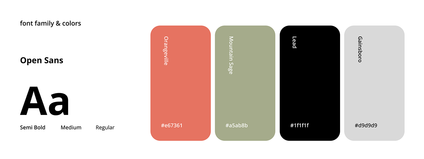
The app’s color scheme is both aesthetically pleasing and functional. Soft, neutral tones dominate the background, creating a calming effect, while brighter colors are used sparingly to highlight key information and actions. This approach not only enhances the visual appeal but also guides the user’s attention to critical areas of the app.
Typography plays a crucial role in Eat Che’s design. The choice of fonts ensures readability across different devices and screen sizes. Clear, sans-serif fonts are used for headings and body text, contributing to the app’s modern and clean look.
Eat Che’s design also incorporates subtle animations to improve user interaction. These animations provide feedback and make the app feel more responsive, enhancing the overall user experience.
In conclusion, Eat Che by Pocolo Design is an exemplary app that combines functionality with a sophisticated design. Its user-centric approach, coupled with thoughtful design choices, makes it a standout in the field of app design.
App design and UI/UX artifacts

For more information Pocolo . Behance profile.


