by abduzeedo
Many people have been asking me how to create a nice, Apple-style UI in Pixelmator with bevels and letterpress effects. I have also received some inquiries about creating rounded corners. So, I created this tutorial to explain some efficient, helpful tips.
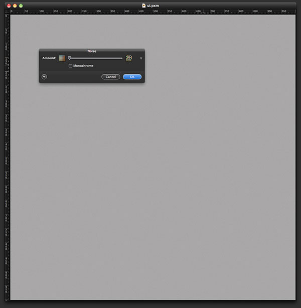
Step 1
Open Pixelmator and create a new document. I used 1000×1000 pixels. Then, fill the background with grey. On the menu, select File>Stylize>Noise. Select 1 as the amount.
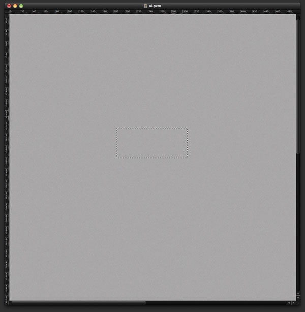
Step 2
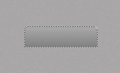
Select the Rectangular Marquee Tool (M) to create a rectangular marquee.
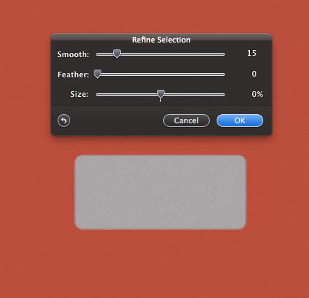
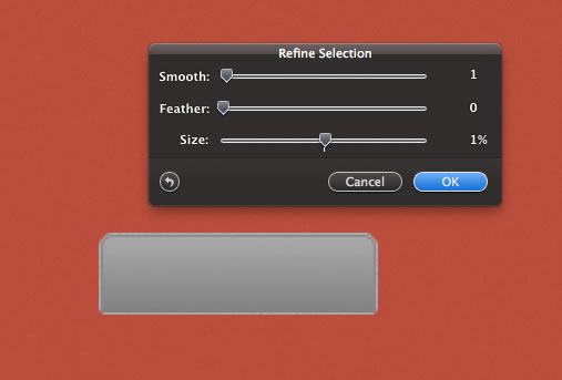
Step 3
Go to Edit>Refine Selection. Now you will be able to change the selection; you can increase or reduce the size, make the edges blurry with Feather, or create rounded corners with Smooth. I select level 15 for Smooth.
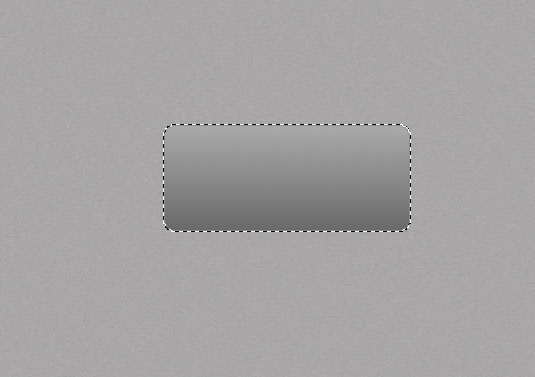
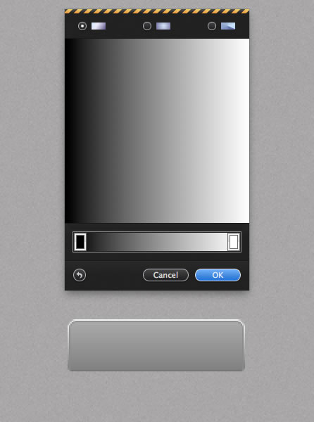
Step 4
Add a new layer, and then use the Gradient Tool (G) to fill the marquee area with the gradient. For the colors, I used a dark grey gradient from #666 to #999.
?
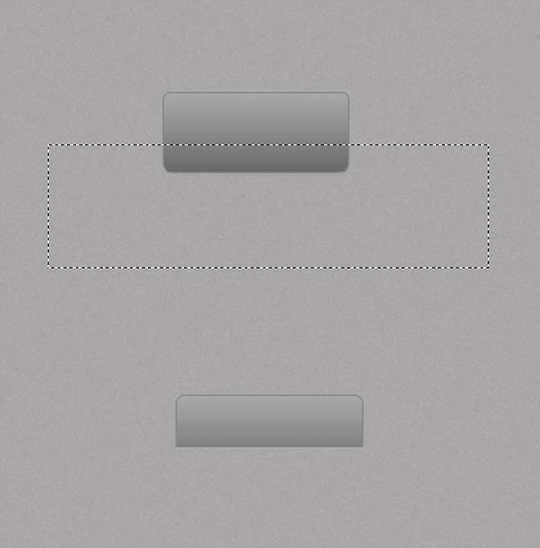
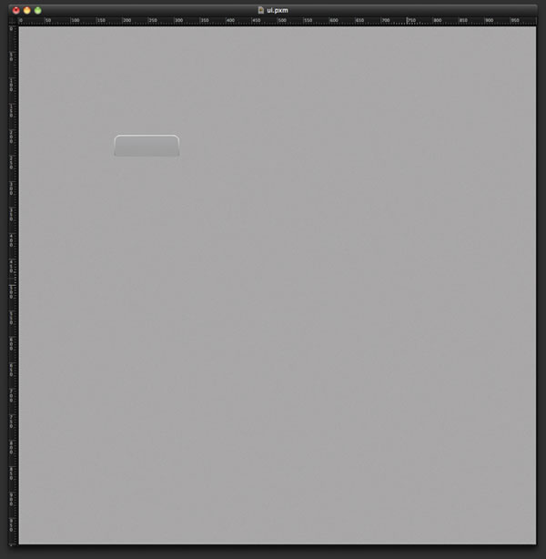
Step 5
Select the Rectangular Marquee Tool (M) again and create a marquee selection like the one in the image below. The idea here is to create a tab for site navigation. Next, simply delete the bottom part of the rectangle.
Step 6
To select only the objects within the layer, roll over the Layers Panel, hold Command, and click on the thumbnail of the layer you want to select.
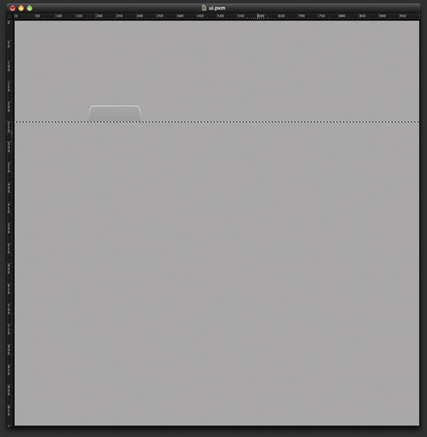
Step 7
Go back to Edit>Refine Selection. Let’s increase the size by 1% and raise the Smooth level by 1%. The idea here is to create a little bevel, or stroke, and apply a gradient on it.
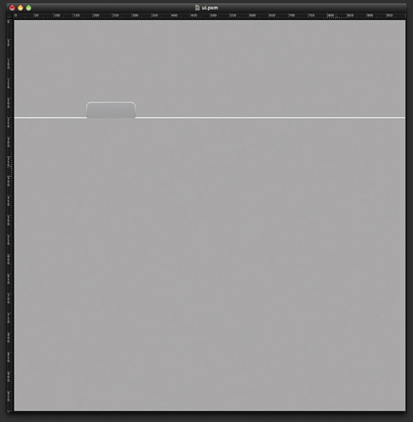
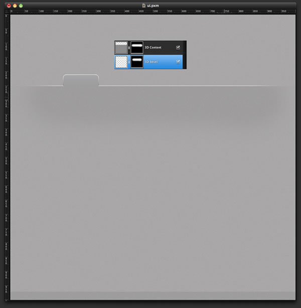
Step 8
Add another layer behind the tab layer. With the gradient tool and the selection still active, fill the layer with the gradient. The colors of this gradient are black to white, with the dark grey is at the bottom and the white at the top like a highlight 3D bevel. Use the image below for reference.
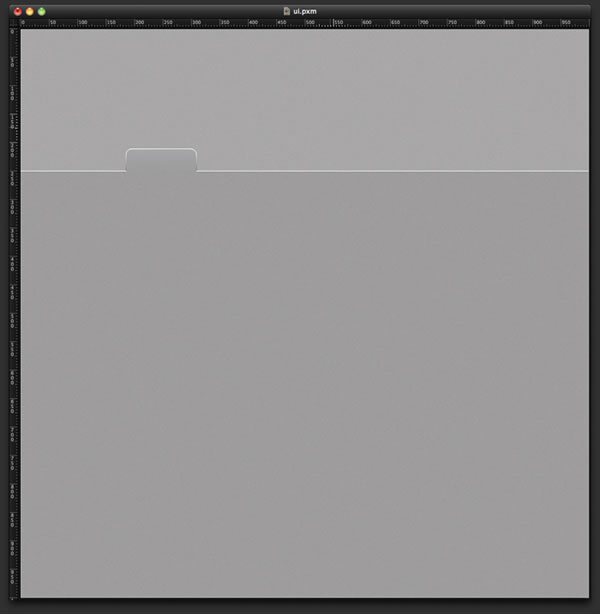
Step 10
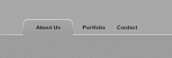
Here is our navigation tab. We are accustomed to having filters and commands to create this type of effect in tools such as Fireworks or Photoshop, but as demonstrated here, these can be easily replicated. Of course, the manual process might take a few extra steps, but it can also help us better the way in which light and shade add depth to things.
Step 11
With the Rectangular Marquee Selection (M), create a rectangular selection of 1px height.
Step 12
Add a new layer and fill the selection with white. That way, we can create a white line.
Step 13
Add another layer and fill it with grey that is a little bit darker than the background. Go back to Filter>Stylize>Noise and add 1% noise to the grey. Then, move the layer down and place it right beneath the white line. The line will be the 3D bevel of the layer.
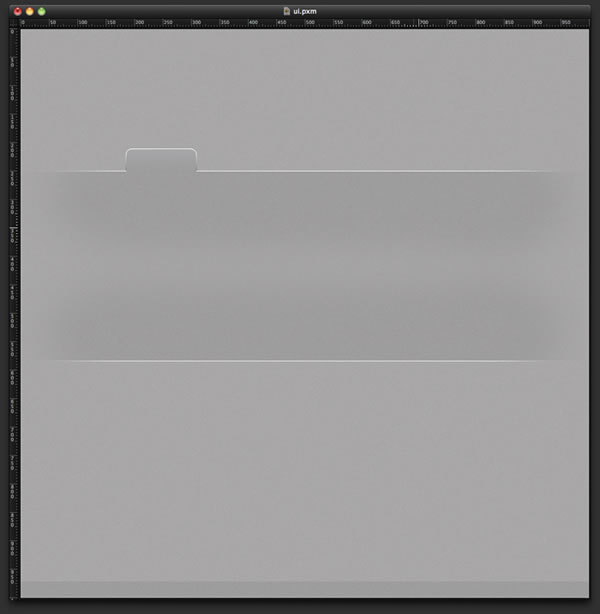
Step 14
Select each layer and go to Layer>Add Layer Mask. Fill the layer mask with black using the Paint Bucket Tool (N). The layer will disappear. With the Brush Tool (B) and a very soft brush, select the color white and paint over the areas you want to show. In this case, only the top center part of the rectangle and line will show, as in the image below.
Step 15
Select the two layers and duplicate them, then go to Layer>Merge Layers. Next, select Edit>Transform>Flip Vertical. This will create a rectangular area in which to feature the main content of the site. Try to match the colors of the tab with those of this main area. You can edit the colors of the layers by selecting Image>Adjustments>Hue and Saturation.
Step 16
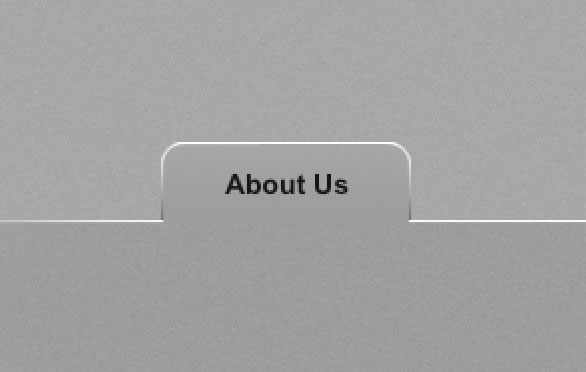
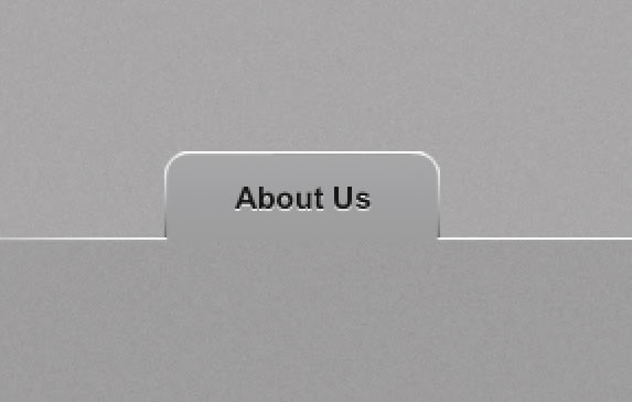
People often ask me how to create a subtle letterpress effect. Some tools allow you to apply shadows or bevels, but Pixelmator does not have such an automated feature. However, there is a quick and easy way to create the same effect. First, add the text you want; in my case, I added “About Us” in black text, Arial font 16px.
Step 17
Duplicate the layer and change the color of the text to white, and then move it down 1 pixel. Now you will have a very nice letterpress effect. You can also make the effect subtler by reducing the opacity of the white.
Step 18
Create a few more navigation items, this time without tabs. The tab will be used only for the selected item.
Step 19
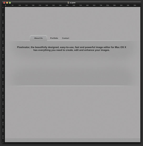
Add a little text about the product. For this, I switched to a bigger font, black Arial at 20px.
Step 20
Repeat the Step 17 to create the letterpress effect. Duplicate the text layer, change the color to white, and move it down by one 1 pixel. Tip: If your text color is white, you can create the effect by selecting black and moving the text 1 pixel up.
Step 21
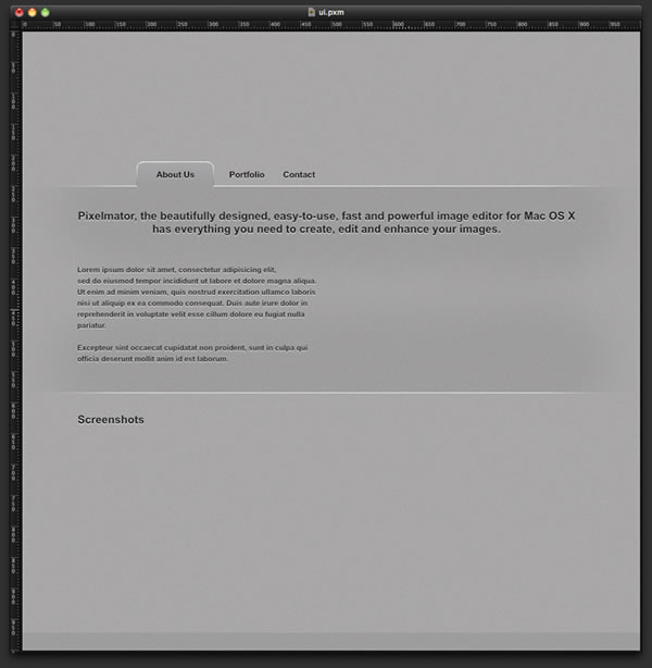
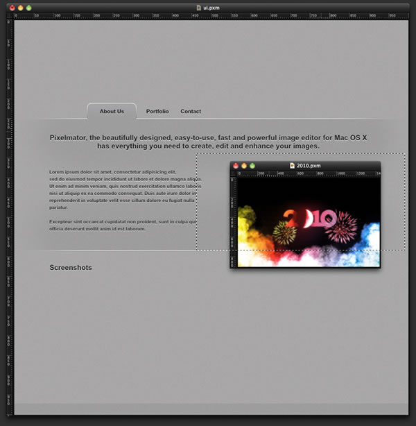
Add more text using a much smaller font of 12 pixels. Outside the main area, add a title for Screenshots using the same 20-pixel font used to create the main text. Repeat the letterpress effect.
Step 22
Import a screenshot or other image and place it in your design. Move it to the right side so it can become the main image of the site. As you can see in the image below, the one I used is bigger than the main area and is overlapping the white line. To fix this, use the Rectangular Marquee Tool (M) to select an area that fits the part of the image located within the two white lines. Use the image below for reference.
Step 23
Next, go to Layer>Add Layer Mask. The mask will hide the areas that did not fit inside the marquee selection.

Step 24
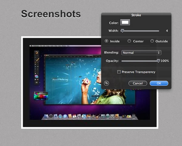
Import a few more screenshots to use in the area below the Screenshots title. Let’s add some nice touches to these images. To create a little white stroke, go to Edit>Stroke. Select white for the color, 4 for the Width, and Inside. Press OK.
Step 25
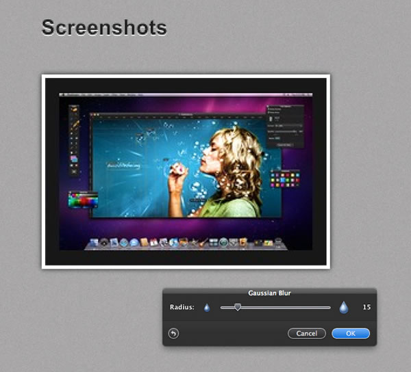
It’s also very simple to create a shadow. First, create a marquee selection of the image, as we did in Step 6. Then add a new layer and fill it with black using the Paint Bucket Tool (N). To create the shadow, go to Filter>Blur>Gaussian Blur. I used 15 for the radius, but you can select a larger radius to create a larger shadow.
Conclusion
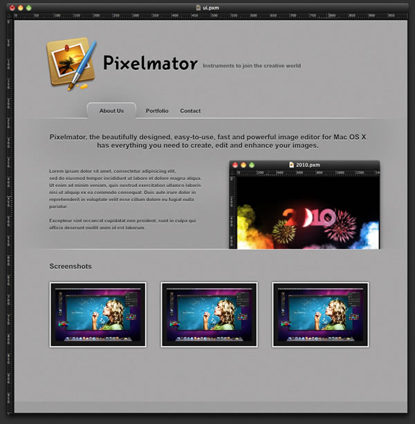
Next, just add your logo and a slogan. That’s it! Even though there are not explicit filters to create round corners or bevels, it’s very simple to make these yourself with only a few extra steps. This process is a good exercise for our eyes and brain, and will help us better understand the way in which simple gradients, colors and shades can add depth to a flat image.
I hope you find this tutorial useful. Please feel free to send additional requests to abduzeedo@abduzeedo.com.


![Neon light effect in Photoshop [revisited]](/sites/default/files/styles/square_1x1/public/originals/hero_neon.png?itok=lP4mbIak "Neon light effect in Photoshop [revisited]")


