by AoiroStudio
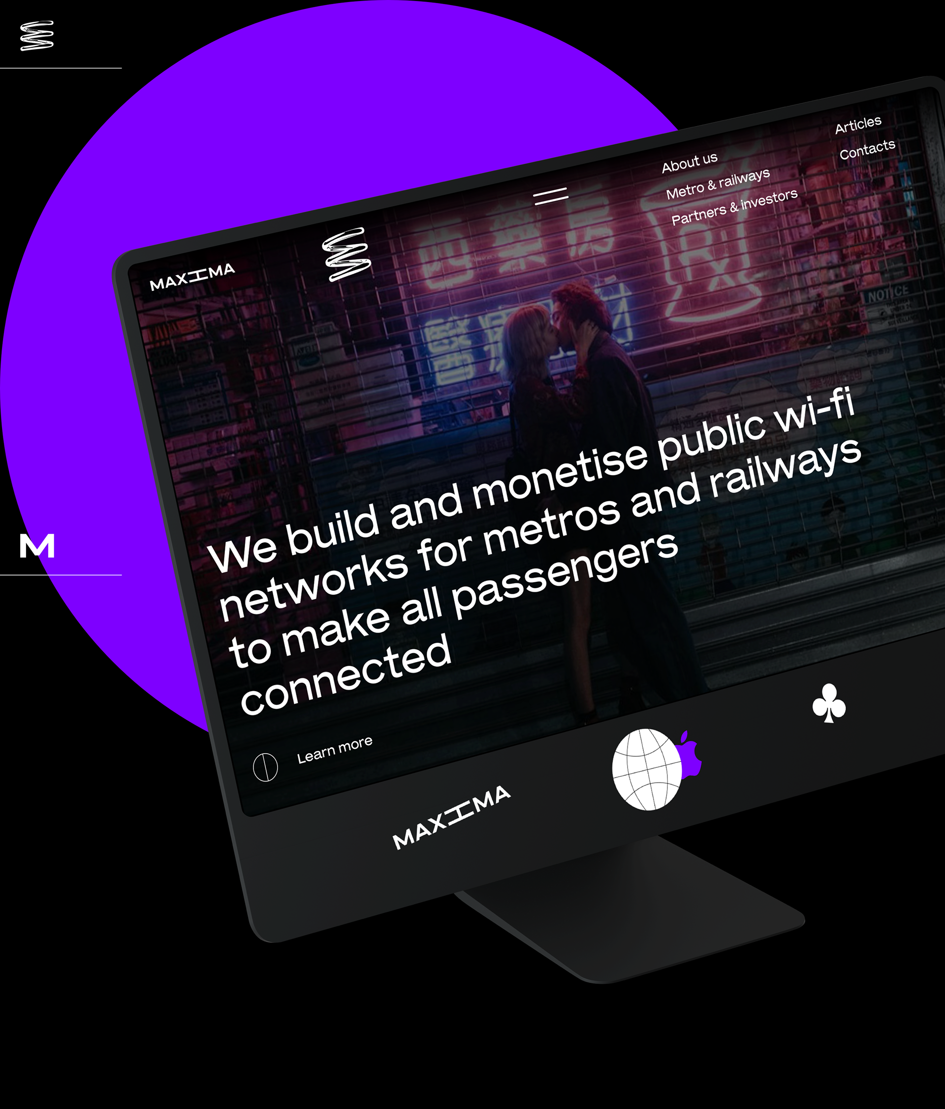
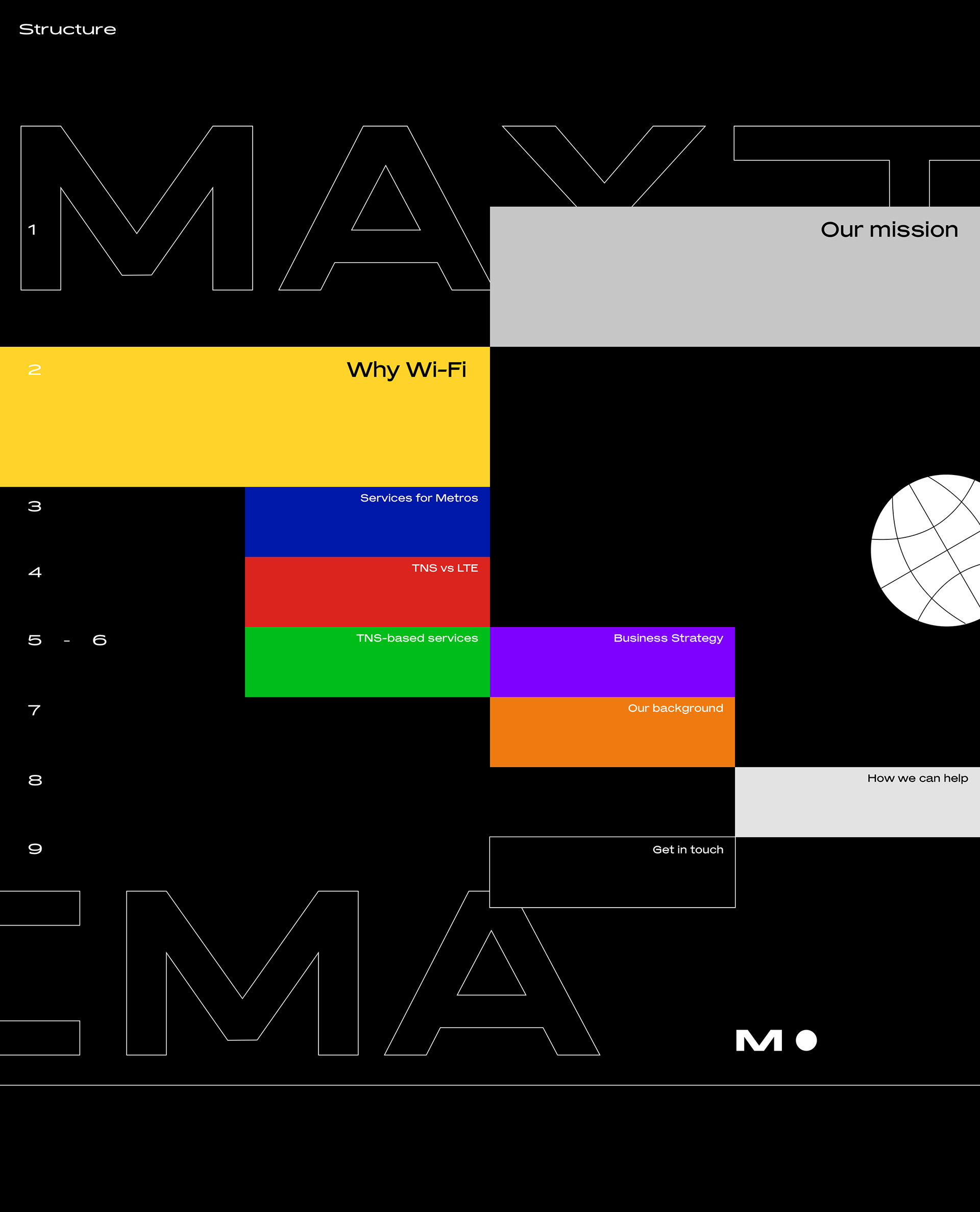
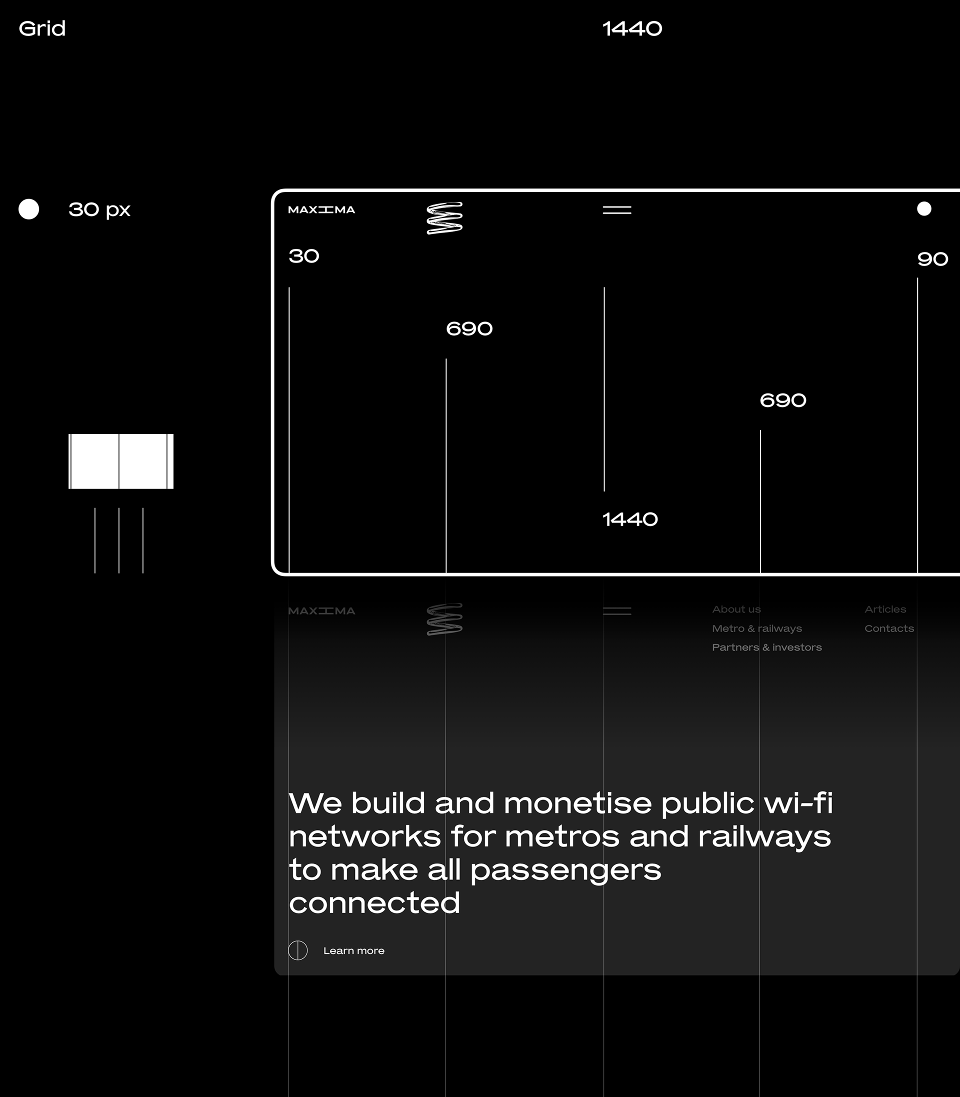
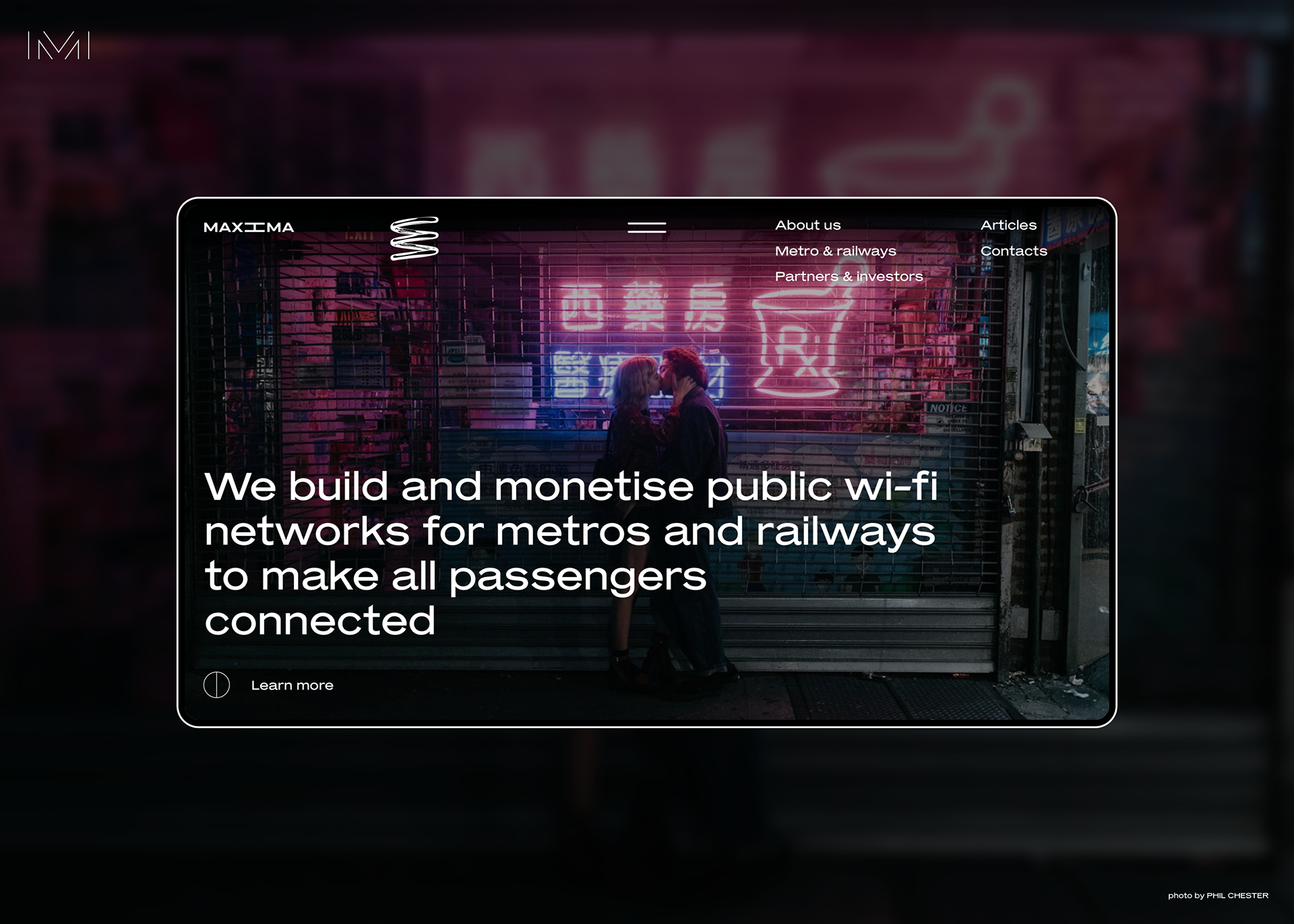
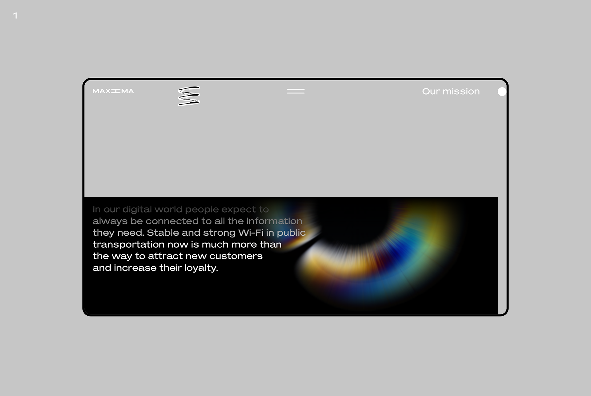
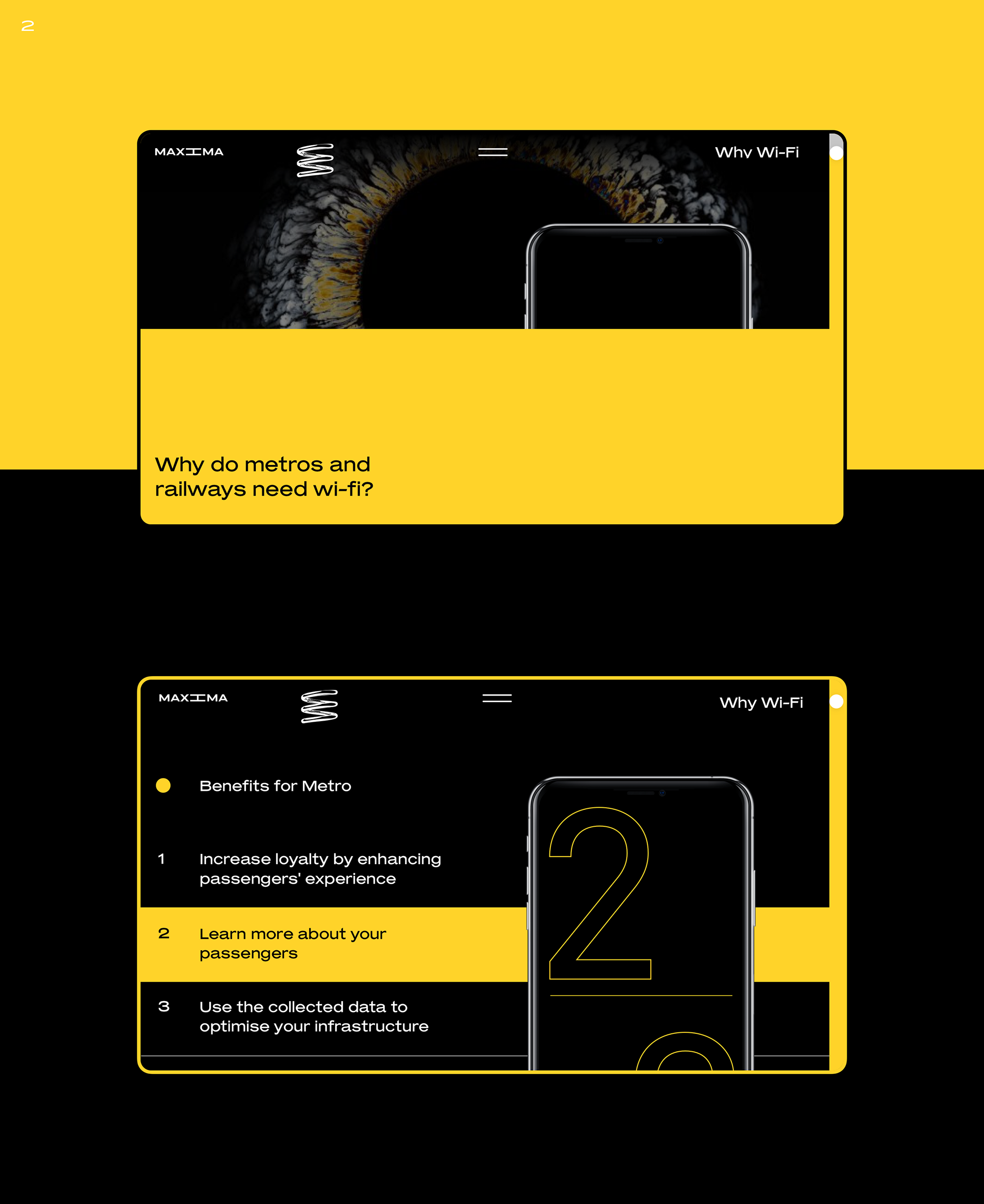
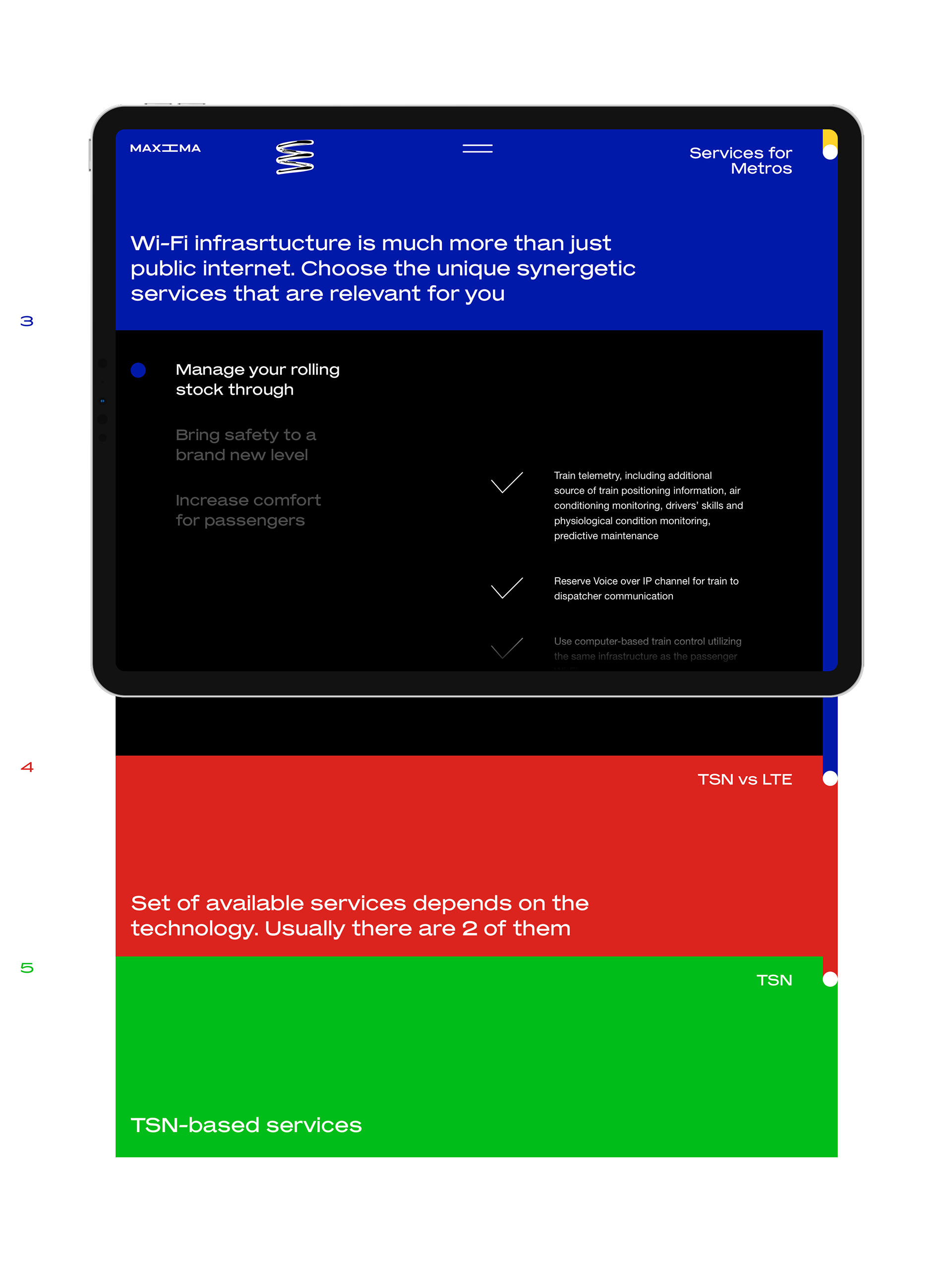
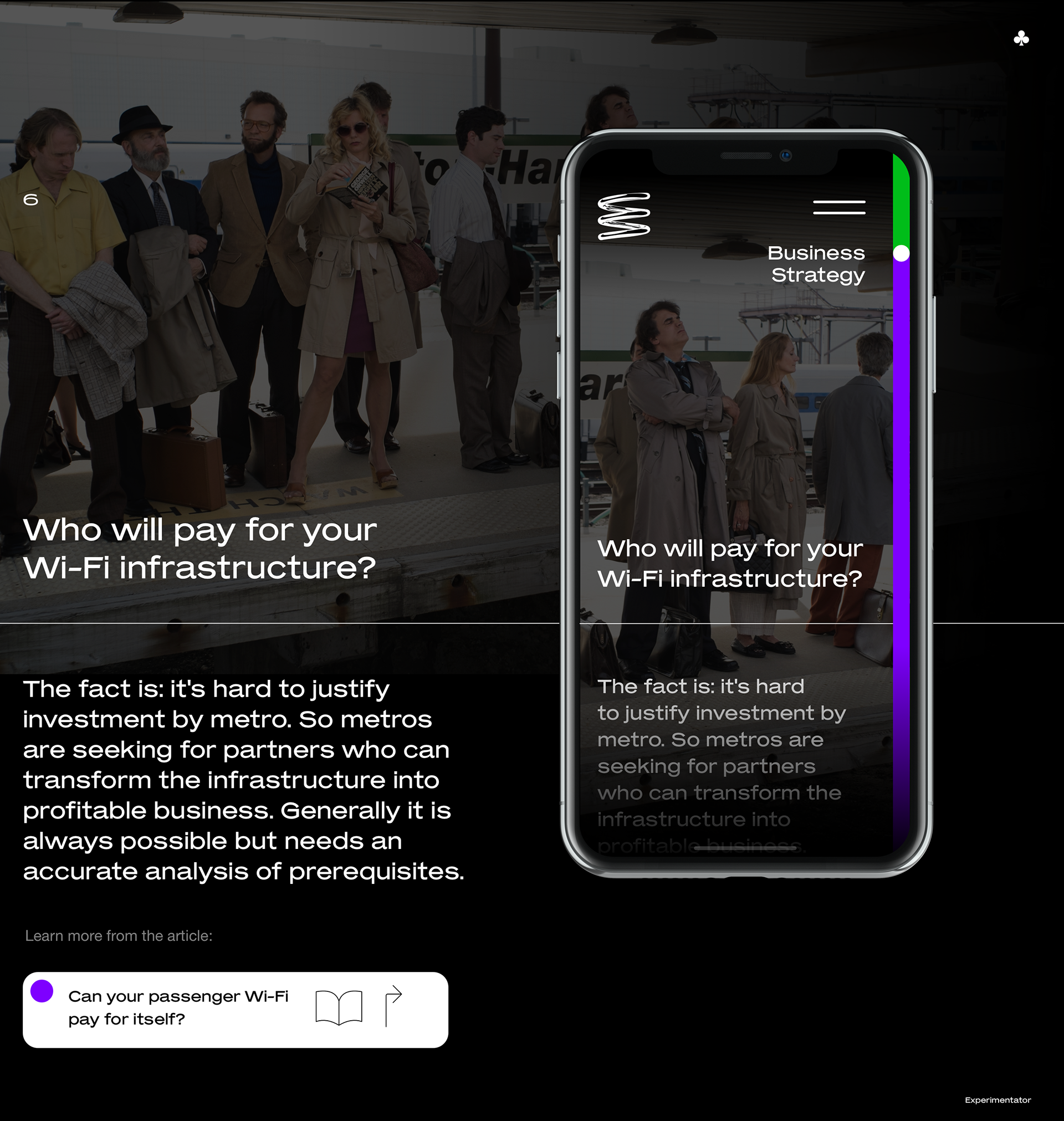
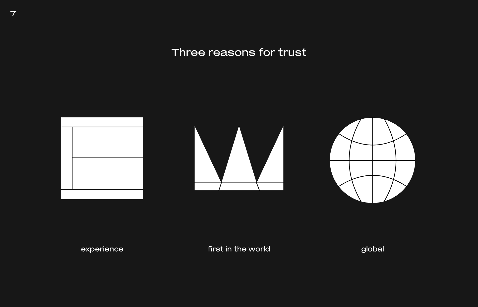
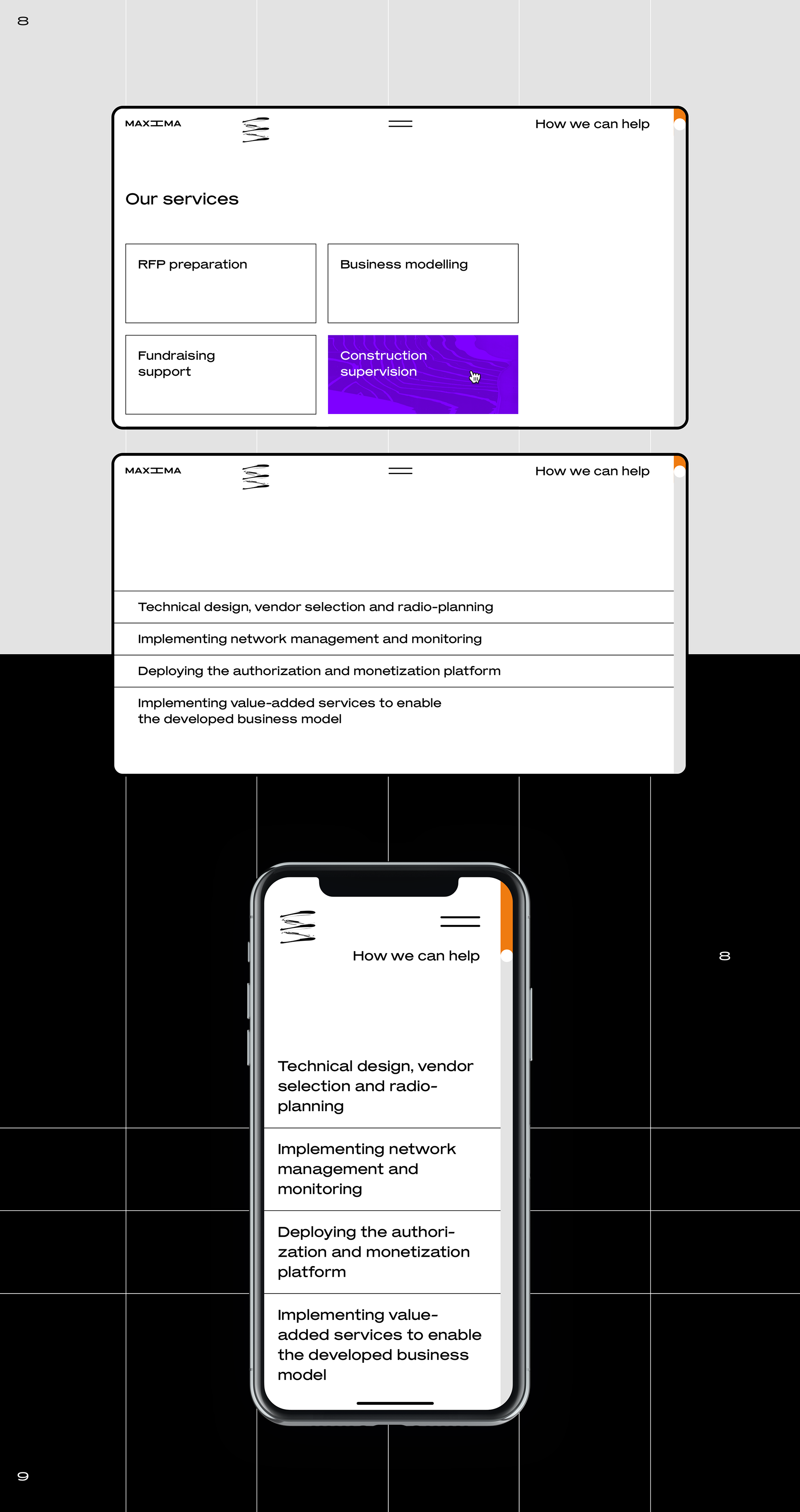
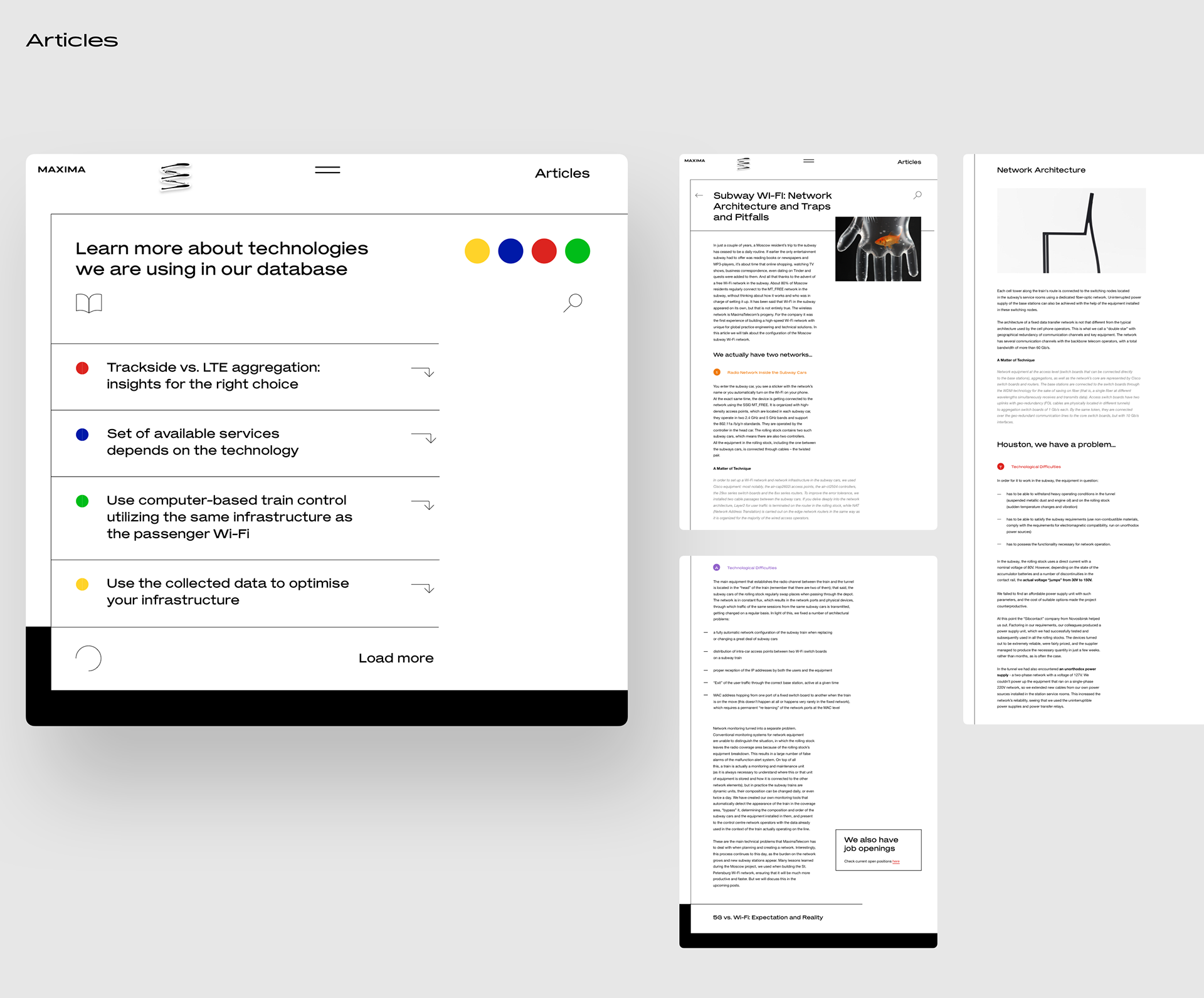
We are featuring the work of Misha No, an art director and UI/UX designer based in Singapore. He has worked on a web design project for Maxima.tech. A company that built public wi-fi networks for metros and railways to make all passengers connected, the design is eye-catchy with a set of familiar colours for us to recognize the site's sections. I personally love the design of the icons, they are quite straight to the point and at the same time unique in its form. I surfed on the live site and the experience feels out-of-scale in terms of proportions, what do you think?
