by abduzeedo
Explore Cozyla®'s innovative branding and visual identity design by Othila, featuring modern typography and a vibrant color palette.
In the field of digital innovation, the significance of branding cannot be overstated. A robust brand identity is pivotal, serving as the cornerstone for all customer interactions. This is the philosophy that guided the creative team at Othila / Creative House when they embarked on the journey of rebranding Cozyla®, a purveyor of smart digital photo frames.
Othila's approach was holistic, encompassing not just a logo refresh, but a comprehensive overhaul of Cozyla®'s branding and visual identity. The objective was clear: to craft an identity that resonates with modern sensibilities while underscoring the brand's ethos of simplicity and connectivity.
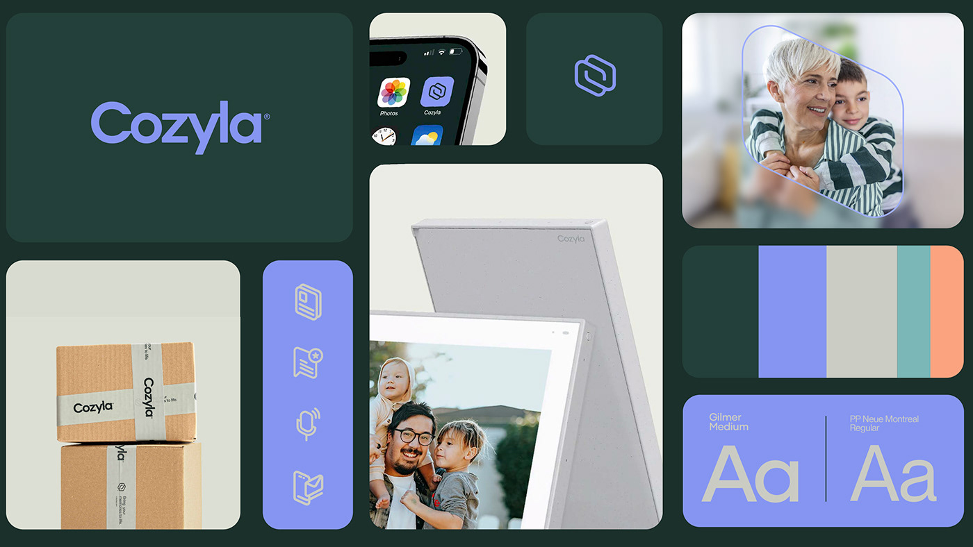
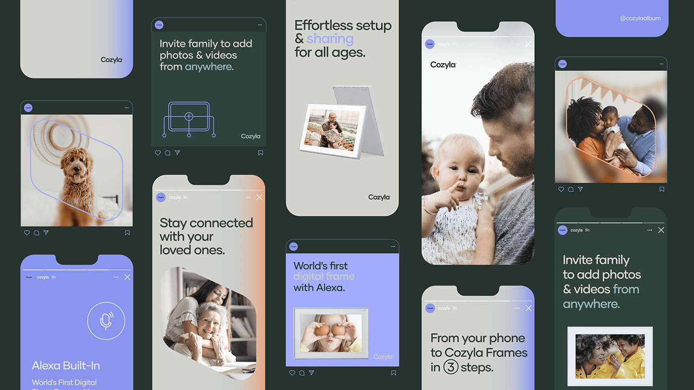
The logo redesign is a study in minimalist elegance, utilizing clean, straightforward typography that speaks to the brand's accessible nature. This simplicity is complemented by a modern color palette, where hues of purple, orange, and teal interplay, injecting vibrancy into the brand's visual language.
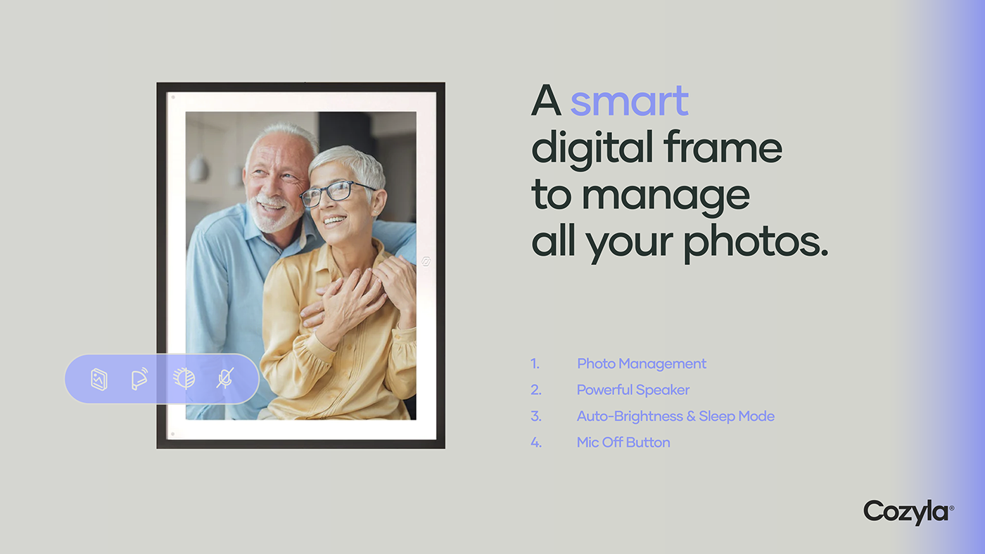
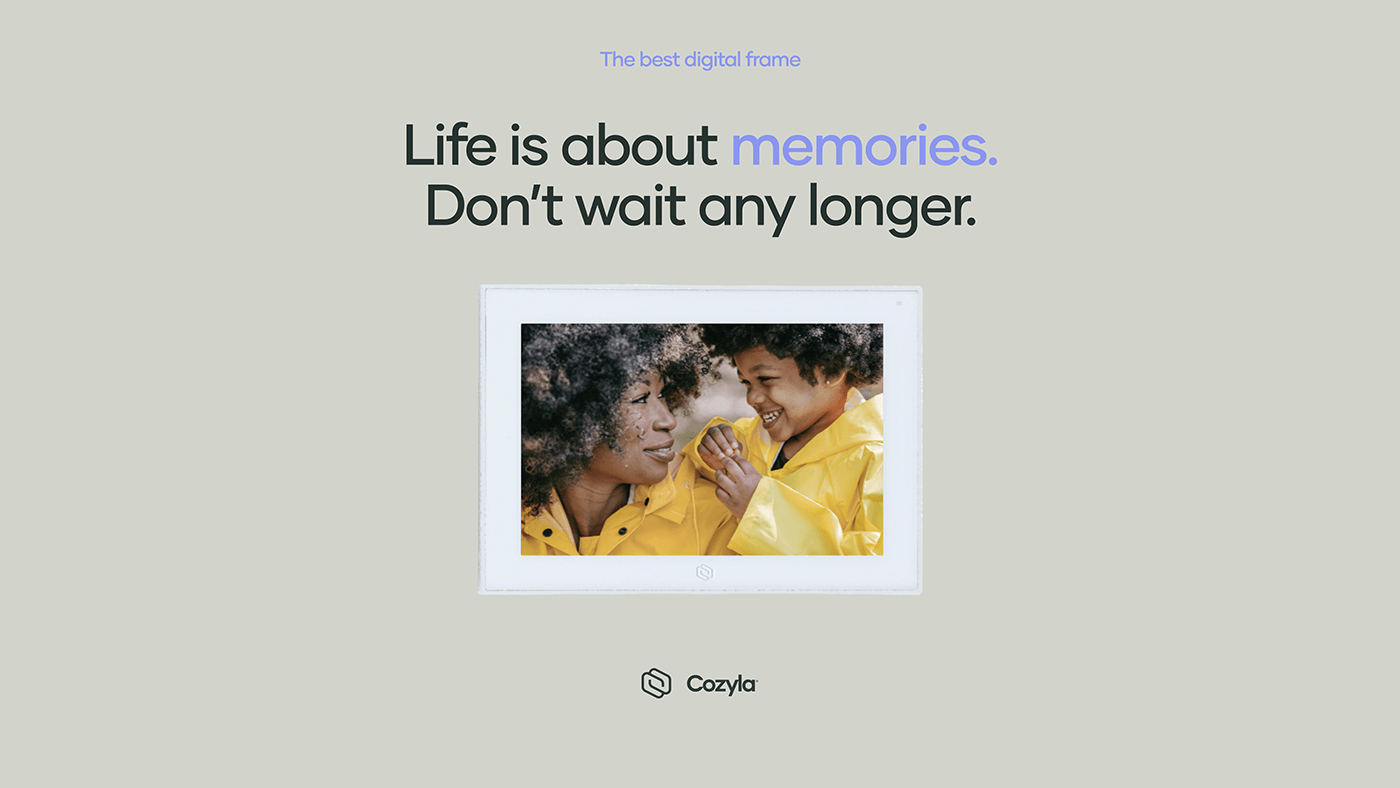
The new symbol, a stylized 'C' that also hints at an infinite loop, encapsulates Cozyla®'s commitment to seamless integration of user's memories and experiences. It’s a subtle nod to the brand's core product - a digital photo frame that brings endless moments of joy to its users.
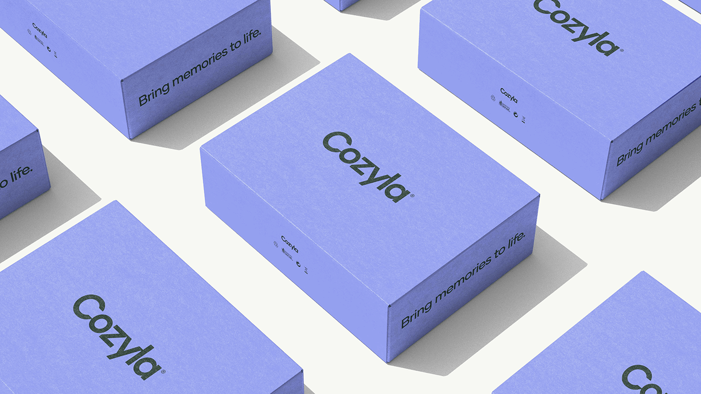
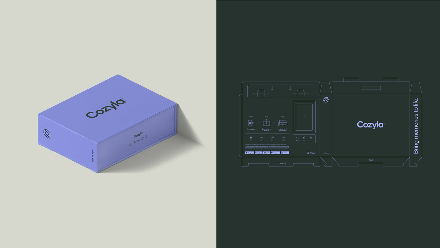
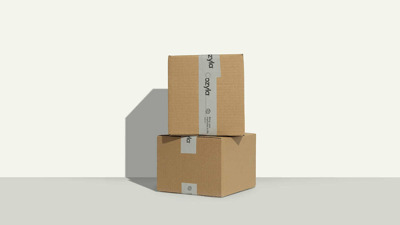
In application, the brand identity displays remarkable versatility. On packaging, the refined logotype and color scheme convey quality and innovation, inviting users to experience the brand's promise even before the product is unveiled. The on-product application is equally thoughtful, with the logo gracefully adorning the frames, thus becoming an integral part of the consumer's home décor.
This rebranding initiative by Othila does more than just present a new look for Cozyla®; it articulates a visual narrative that captures the essence of the brand's journey and its forward-thinking vision. The result is a cohesive and elegant branding and visual identity that stands as a testament to Othila's expertise in the realm of design.
Scoring high in readability and ease of understanding, this case of brand identity development serves as a benchmark in the design industry, showcasing how visual elements can intertwine to tell a compelling brand story.
Branding and visual identity artifacts


For more information make sure to check out Othila / Creative House website and Behance profile.


