by abduzeedo
Explore the vibrant rebranding and packaging design for Lithuanian cosmetics brand Uoga Uoga by &ANDSTUDIO. A juicy take on natural beauty.
Sometimes, growth means change. For Lithuanian natural and organic cosmetics brand Uoga Uoga, expanding into new cities meant its original crafty look needed a refresh. The challenge? To evolve the branding while staying true to its natural roots, appealing to a contemporary, urban audience that values wellness amidst the city hustle. Design studio &ANDSTUDIO stepped in to craft a new identity.
From Crafty to Contemporary Natural
The original aesthetic served Uoga Uoga well initially. But as the brand grew, it needed a visual language that spoke to a broader audience. The goal wasn't to abandon its core values but to present them in a more modern context. This meant moving towards a "contemporary natural" feel – sophisticated yet grounded, vibrant yet pure. The new branding needed to invite people in, showing that natural cosmetics can be both effective and joyful.
Capturing Nature's "Juiciness"
&ANDSTUDIO found the core message in "juiciness." This concept comes directly from nature, the source of Uoga Uoga's ingredients. It also cleverly connects to the brand name itself ("Uoga" means "berry" in Lithuanian). This idea of juiciness became the driving force behind the visual identity, aiming to bring small moments of joy into daily routines.
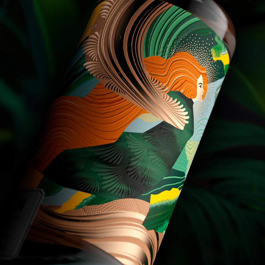
Unlike many boutique brands that opt for muted palettes, Uoga Uoga embraces bright, vivid colors. This choice reflects the brand's dynamic nature and celebrates individuality. The packaging design uses a base of Ivory and Black, providing a clean canvas. Then, accent colors pop, chosen specifically based on the natural ingredients within each product. This creates a visually exciting and informative system across the product range, as seen in the vibrant yellows, greens, and reds of their creams and elixirs.
Typography and Logo: A Modern Blend
The logo itself embodies the brand's philosophy: merging the urban and the natural. It’s clean and modern. The wordmark is designed to be flexible, playfully wrapping around the edges of packaging or adapting to digital spaces.
A key differentiator is the typography. Instead of common geometric sans-serifs often seen in the cosmetics industry, &ANDSTUDIO chose Groteska and Epilogue. This pairing creates an expressive, dynamic feel that helps Uoga Uoga stand out. It adds personality and reinforces the brand's unique position.
Bringing it all Together
The result is a cohesive branding system that feels fresh, energetic, and authentic. The packaging design is eye-catching on the shelf, clearly communicating the natural origins and joyful spirit of the products. From the tactile feel of the containers to the vibrant color strategy and distinctive typography, every element works together. It’s a successful evolution, proving that natural brands can be both sophisticated and full of life. The art direction, captured beautifully in photography by Martyna Paukste, further enhances this juicy, natural vibe.
This project shows how thoughtful branding and packaging design can effectively reposition a brand for growth, attracting new audiences without losing its soul.
Check out the full project by &ANDSTUDIO. Photography by MARTYNA PAUKSTE.
