by abduzeedo
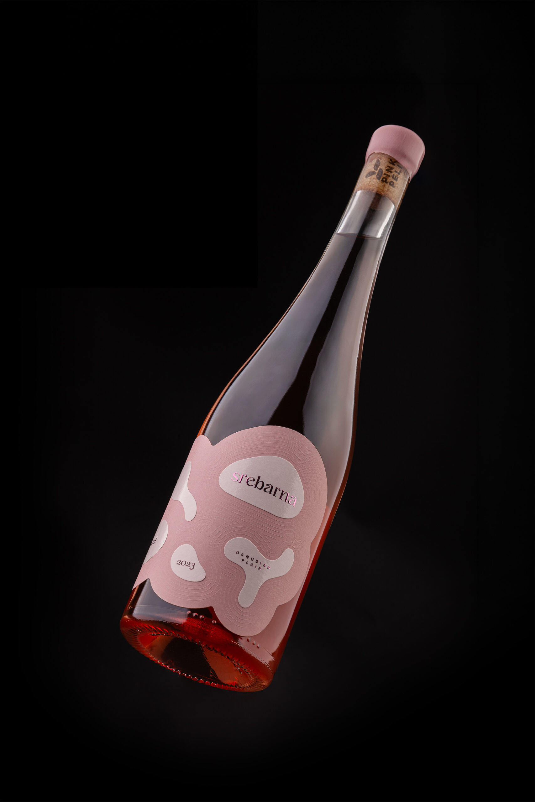
Foxtrot Studio crafts a wine label design for Srebarna Rosé that translates a Bulgarian nature reserve into layered textures and embossed ripple details.
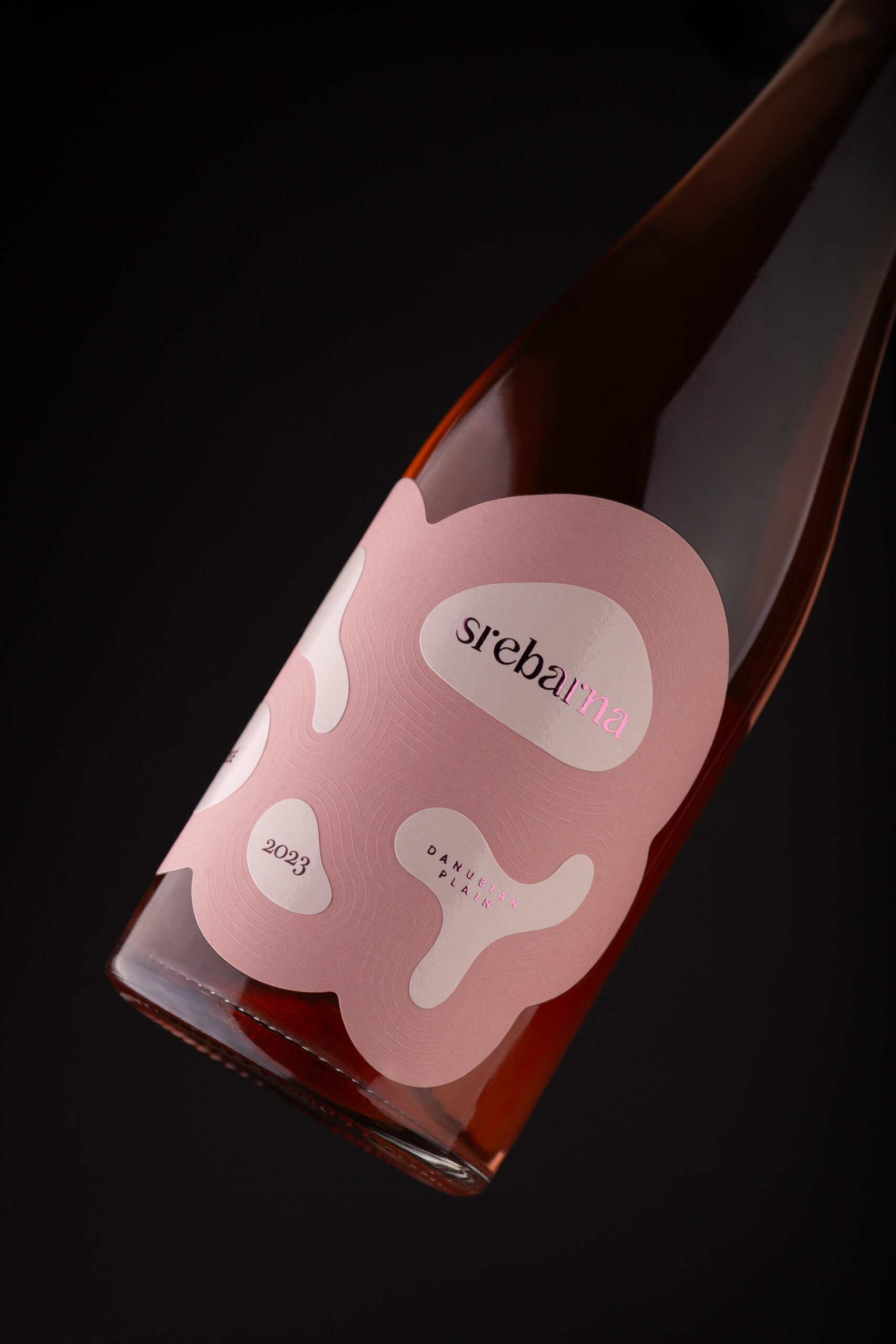
Foxtrot Studio, a creative boutique based in Poland with a focus on wine, spirits, and luxury goods, brought a clear geographic brief to their wine label design for Srebarna Rosé, produced by Pink Pelican. The Srebarna Nature Reserve in Bulgaria — a protected wetland landscape of lake water, reed beds, and fragmented island formations — became both the conceptual anchor and the material blueprint for the label.
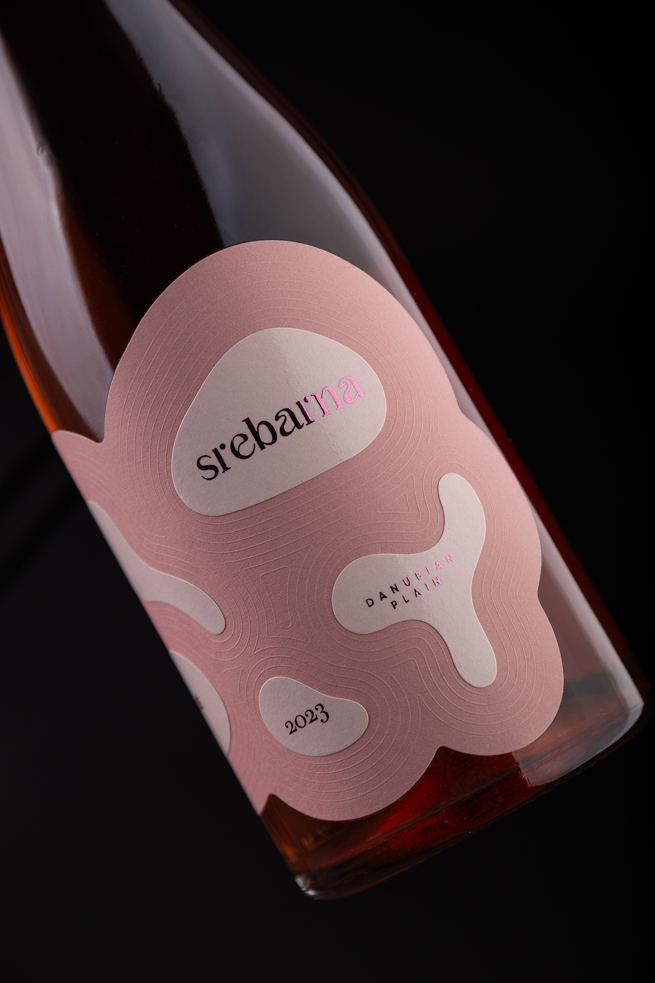
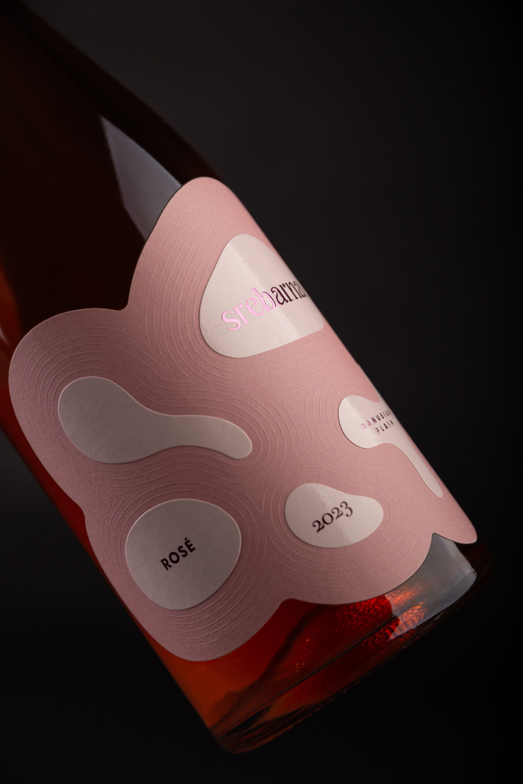
The design avoids literal illustration entirely. Rather than depicting the landscape through imagery, the studio built the label from two contrasting paper stocks layered together. The physical relationship between these materials echoes the relationship between land and water at the reserve. This is wine label design at its most restrained: the scenery is not depicted — it is felt through surface and structure.
Wine Label Design Through Material, Not Image
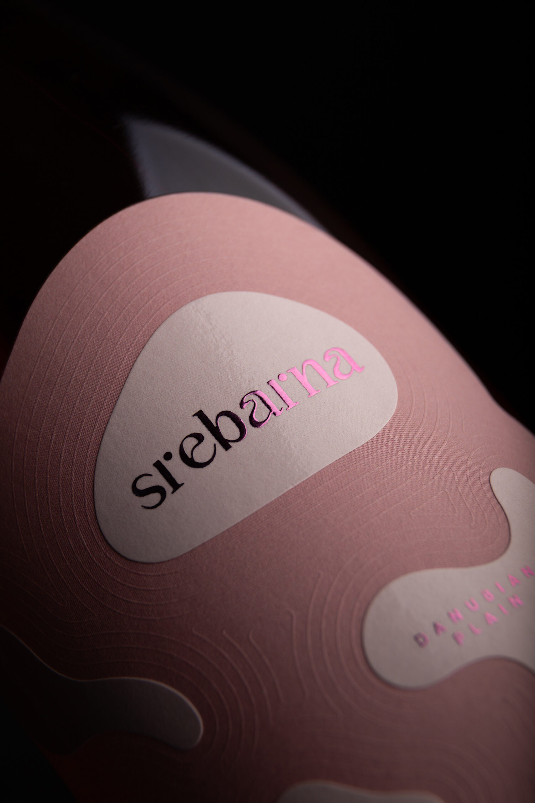
The two paper textures do distinct work. One grounds the composition; the other lifts it — much as the islands of Srebarna sit above the lake surface. Embossed ripple patterns run between these forms, tracing the movement of water across the label face. The ripples are subtle, pressed into the paper rather than printed onto it, so the effect shifts with light and angle. It gives the label a tactile depth that photography can only partially capture.
The typographic treatment sits cleanly over this layered ground. The Srebarna Rosé name and vintage information are set in a refined, contemporary style that does not compete with the material texture underneath. The label reads clearly from a distance, then rewards closer inspection with the embossed detail and paper grain. This layered logic — immediate clarity, then discovery — is what separates considered wine label design from purely decorative work.
Foxtrot Studio's approach to the Srebarna Rosé project reflects a wider philosophy: the most effective wine label design translates place into material form rather than illustrates it. The result is a label with a strong sense of origin, built from texture and composition rather than scenic imagery. The full project can be explored at foxtrot.studio.