by abduzeedo
Forner Studio's Soto branding turns home improvement into a creative act — square-to-circle wordmark, sage green packaging, and pure modernist restraint.
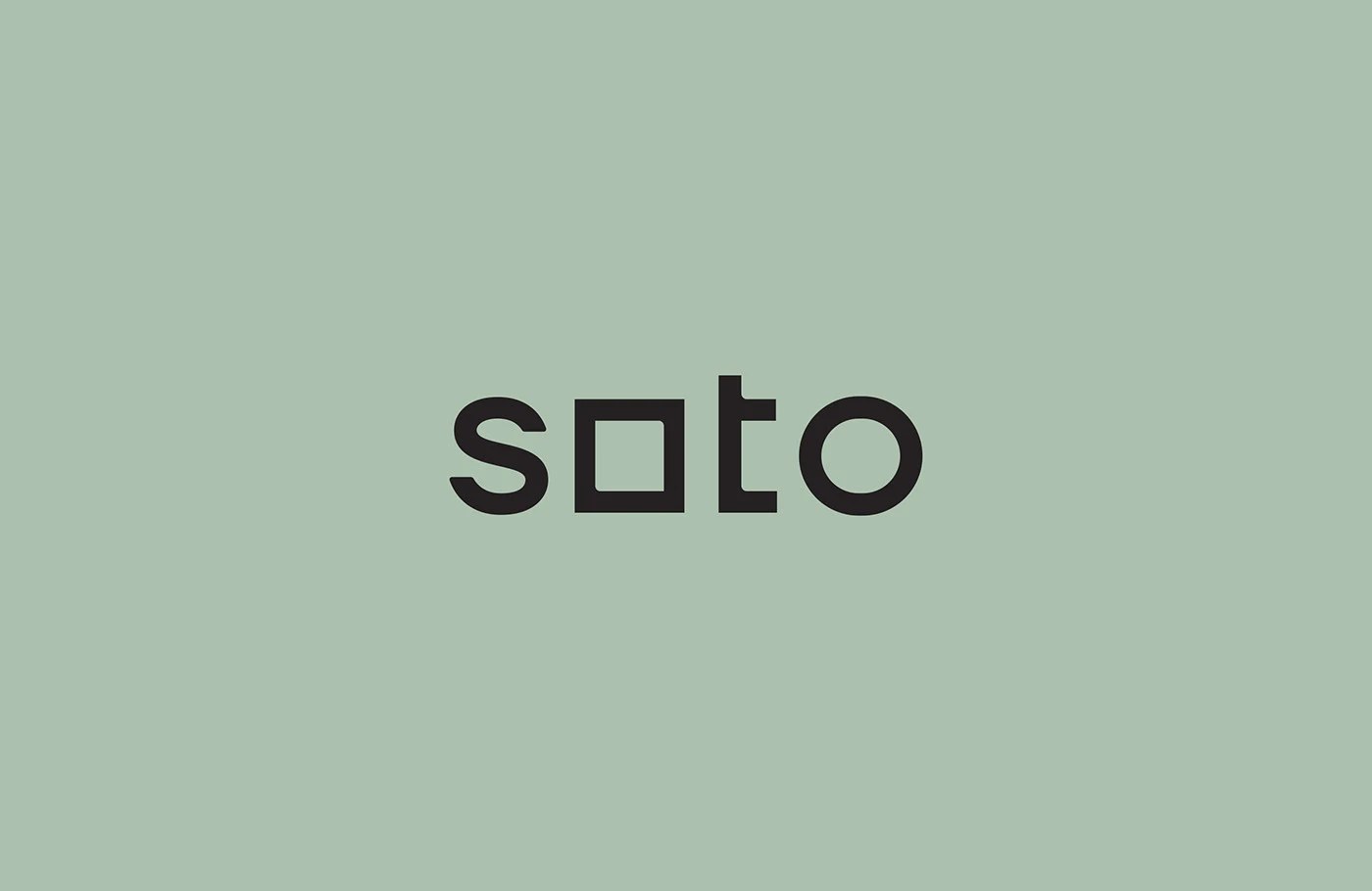
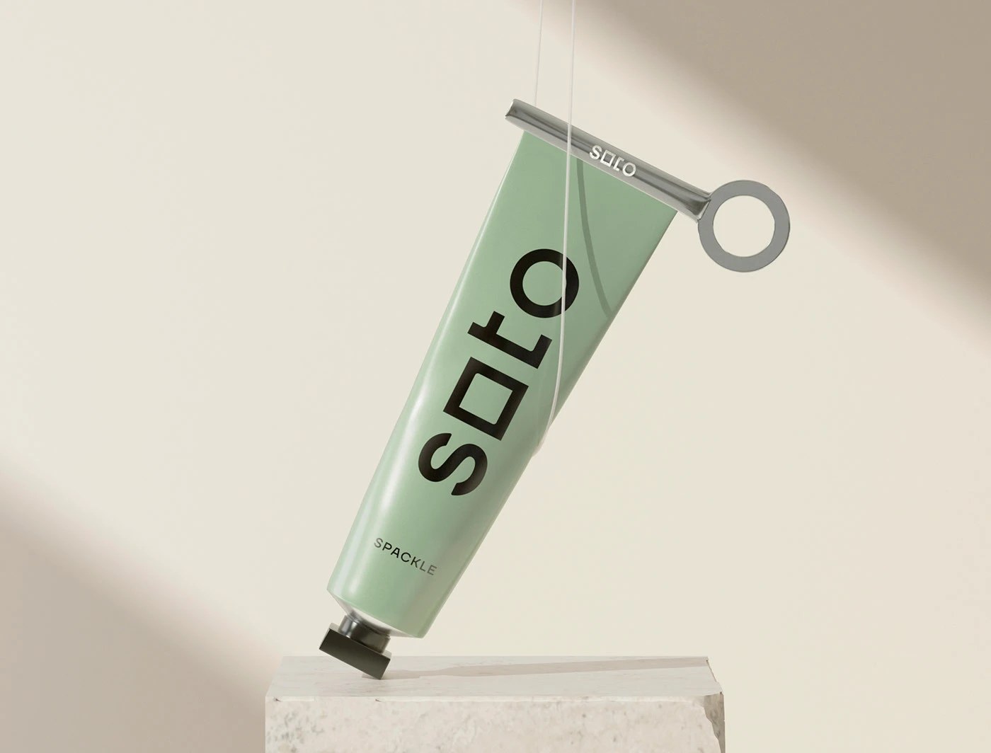
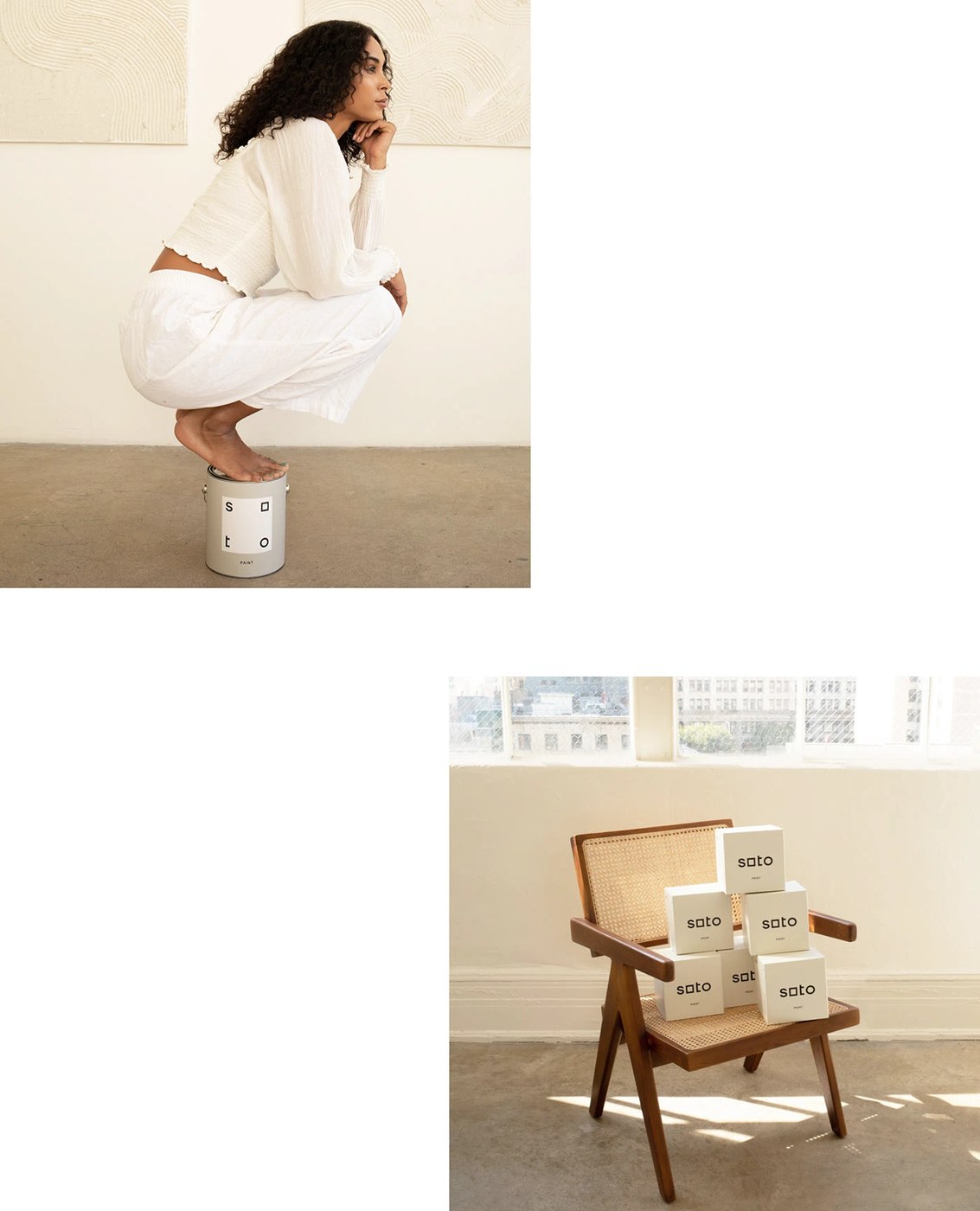
The wordmark is the argument. In the Soto branding system, the first 'o' is a square; the last 'o' is a circle. That single letterform shift — borrowed from Massimo Vignelli's insistence that geometry holds meaning — carries across every touchpoint. Spackle tubes in sage green (#8DAF9A) wear the wordmark at roughly 200pt, running vertically along the body. A chrome key-winder beside it reframes the utility object as a precision instrument. Forner Studio commissioned this Soto branding to move a hardware supply company out of the big-box register and into the company of objects people actually want in their homes.
How Soto Branding Reframes the Home Improvement Kit
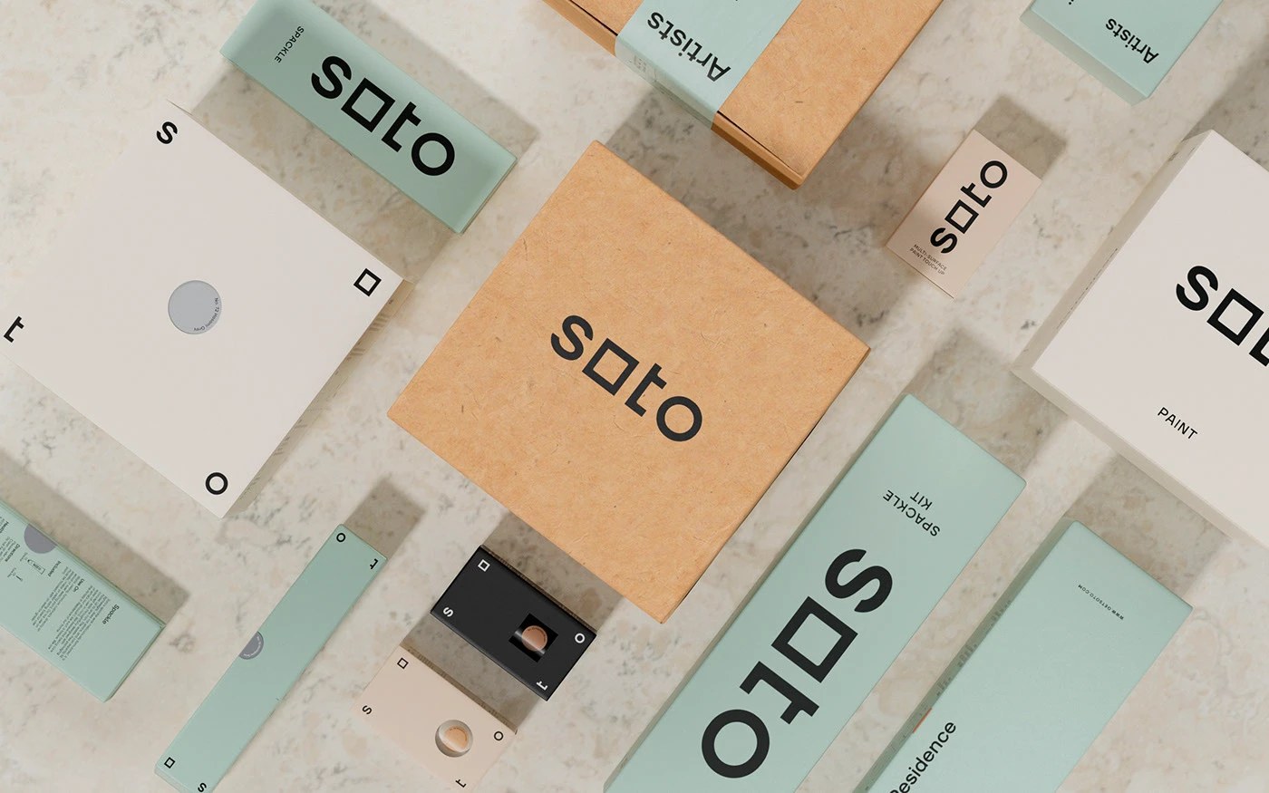
The color palette holds the same conviction: sage green, warm sand (#E8E0D4), and near-black charcoal (#1A1A18) — earth tones pulled from interior material references rather than hardware-store primaries. Kraft boxes, arch-cut color chart envelopes, and cream paint cans all share the square-circle motif, letting the Soto branding system work as both logotype and graphic element. The tagline "Artists in Residence" makes the position explicit: home improvement is a creative act, and these are the tools for it.
Typography and System Coherence
Beyond the wordmark's geometric conceit, the broader typographic system sustains the modernist argument. Body copy is set in a grotesque with tight leading — no decorative serifs, no nostalgic warmth. Every label, instruction panel, and box copy block follows the same discipline, so the Soto branding reads as a unified document rather than a logo applied after the fact. This is the difference between a branding system and a logo-and-slap job: here, the rules travel with the product wherever it goes.
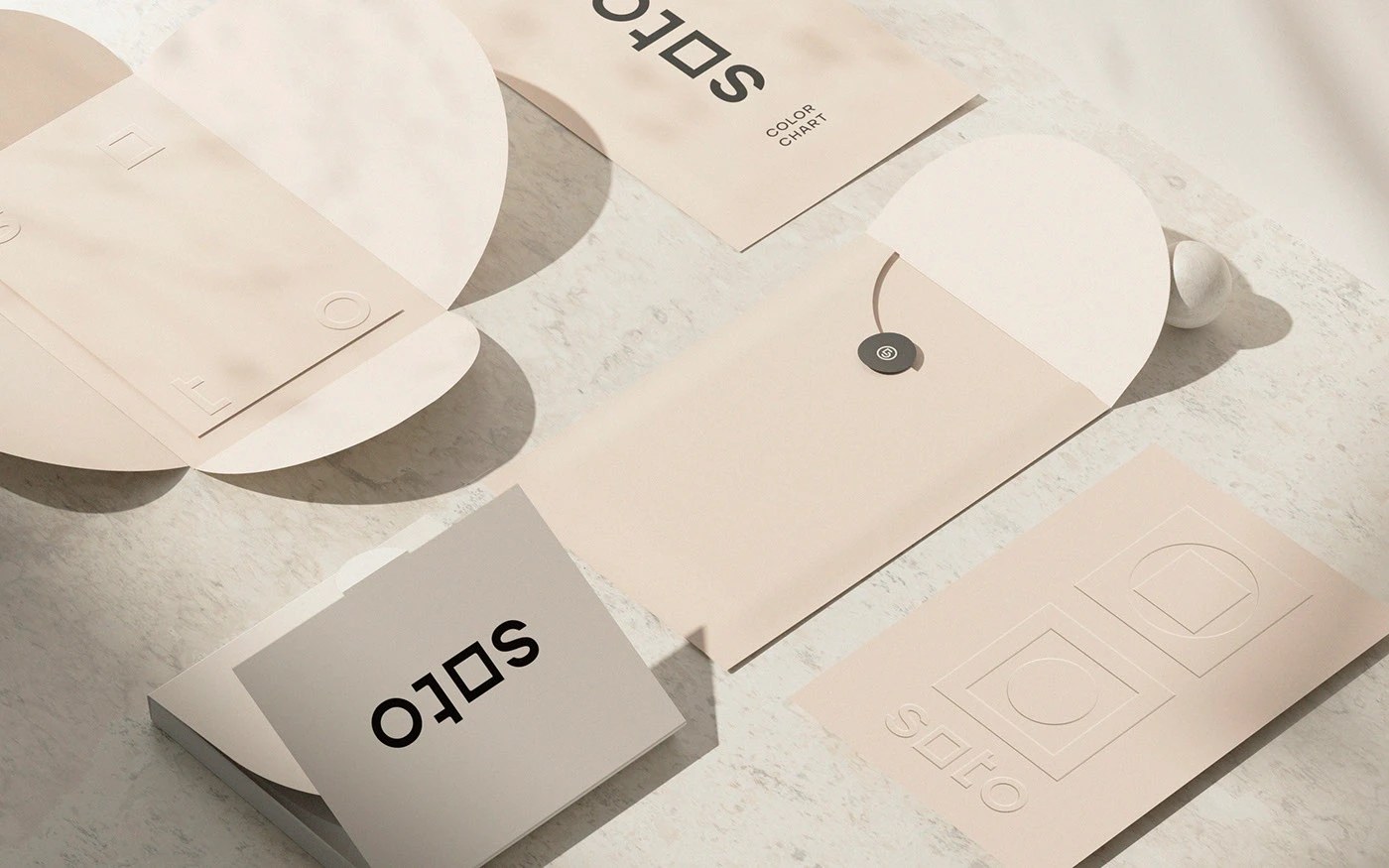
The packaging architecture reinforces the point. Arch-cut windows on envelopes reveal color swatches without breaking the outer geometry. Kraft stock keeps production costs grounded while the restrained palette reads as considered rather than cheap. Even the internal tissue paper carries the square-to-circle motif as a watermark — a detail visible only to the person opening the box, which is exactly the right audience for that level of craft.
Why This Kind of Branding Matters Now
Home improvement as a category has spent decades treating aesthetics as an afterthought. The assumption has been that people buying spackle or paint supplies care only about function — price, coverage, drying time. Soto rejects that premise entirely. By applying the same rigour to a tube of filler that a luxury goods house would apply to a perfume, Forner Studio argues that the tools you use shape how you think about the work. If your supplies look like they belong in a design-forward home, you might approach the project differently. That is not a small claim, and the Soto branding system earns it.