by jeff
Plus X rebuilt KT’s corporate identity around a curvilinear Flow motif, a bespoke typeface, and a coral gradient that scales from app icon to lobby wall.
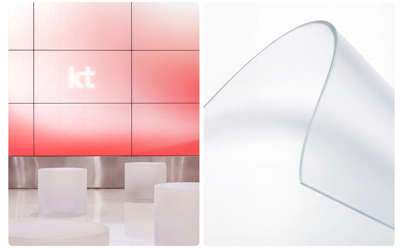
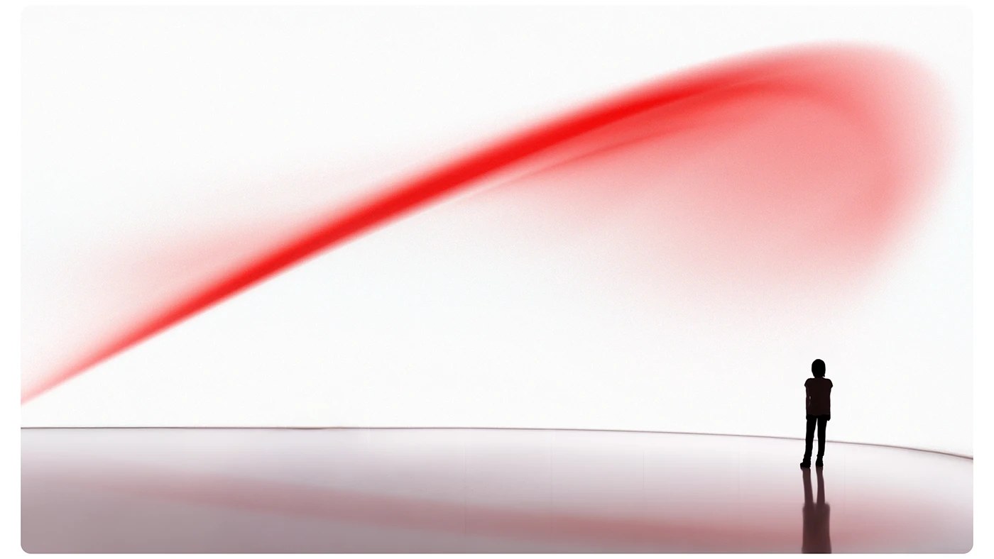
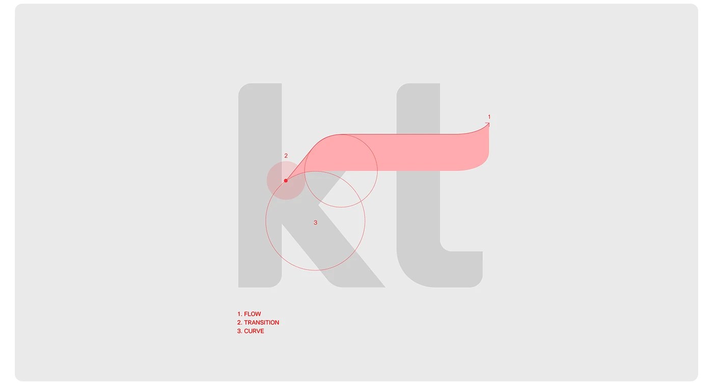
Plus X built the identity renewal for KT—South Korea’s major telecom operator—around a single structural idea called ‘Flow’: a curvilinear ribbon derived from the diagonal stroke of the ‘K’ letterform. The studio parsed this motif into three named forces—Flow, Transition, Curve—giving the entire corporate identity system a geometric logic rather than a decorative one. The primary color is a coral-red (#FE2E36) deployed as a sweeping soft gradient called Ambient Texture. Sub-brands pull from purple (#AA50FF), teal (#00BEAC), and blue (#00A5FF), each a legible departure that still reads as part of the same brand system. KT Flow, a bespoke typeface developed with Sandoll, carries squarish internal counters that echo the motif’s straight-line-to-curve construction—built to hold at display scale in environmental signage.
How a Corporate Identity Rebrand Holds at Telecom Scale
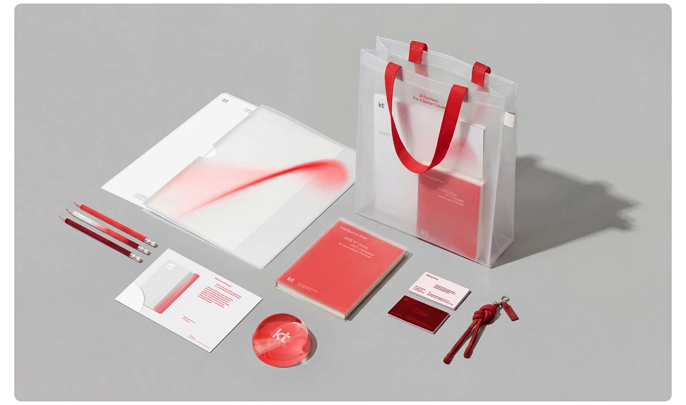
The lobby installation at KT headquarters—a curved LED screen approximately 10 metres wide—shows the Ambient Texture gradient sweep in full. Above the entrance, a metal-relief ‘kt’ wordmark sits flush to the architecture. Physical collateral follows the same material logic: frosted translucent tote bags with red ribbon handles, a crystal-domed ‘kt’ paperweight, gradient-wash notebooks. This is a brand system designed for a Korea 2026 context where every surface is a screen or a competing signal. Plus X anchored everything to the Flow motif—rather than a fixed grid or color field—giving the telecom identity room to operate across surfaces the studio could never fully control. The motif bends to the context; the brand system holds.
See the full project by Plus X on Behance.