by abduzeedo
Hello Comrade's sports drink packaging brand identity design makes SPYRE's product clarity the visual argument — transparency as feature, not a footnote.
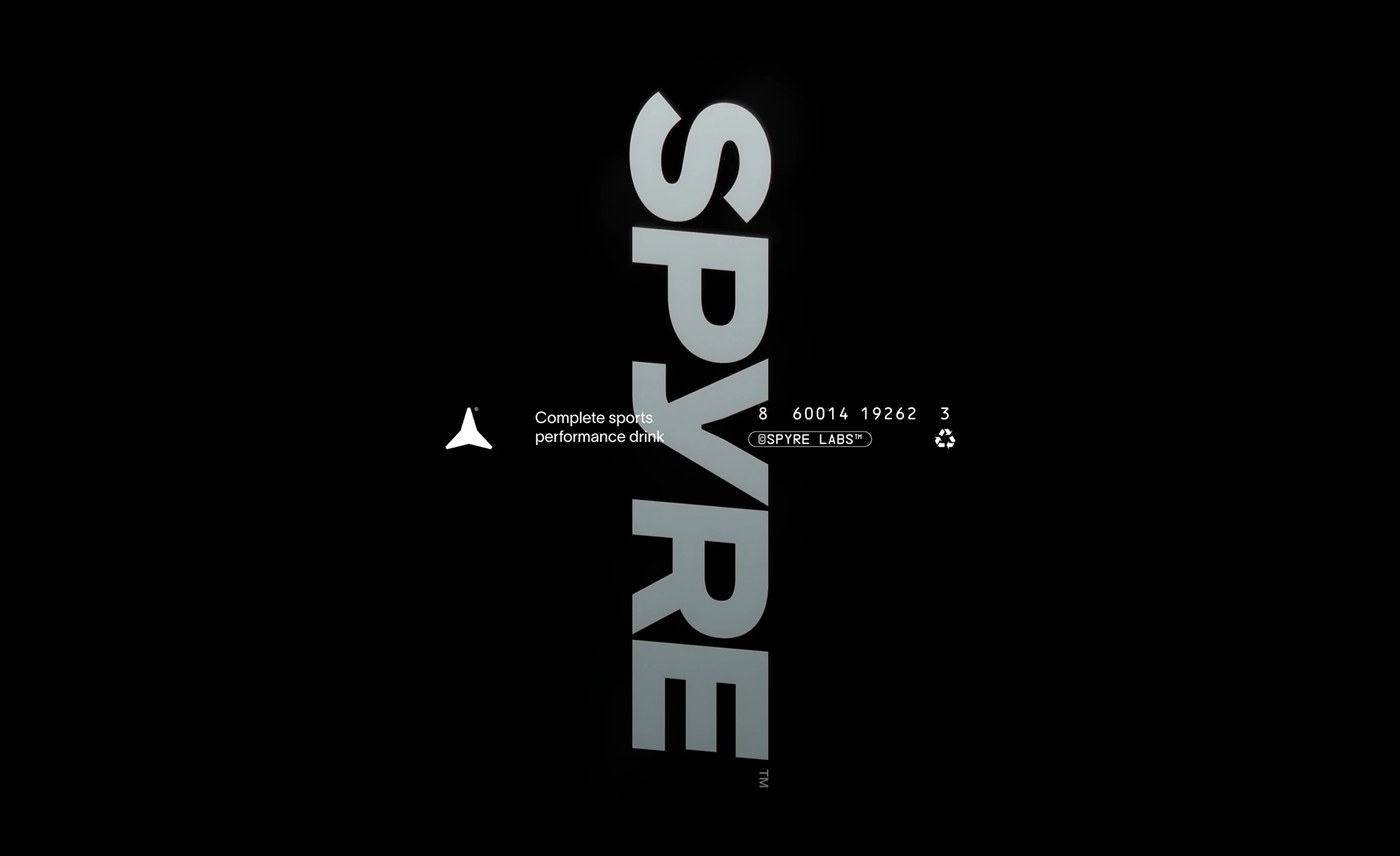
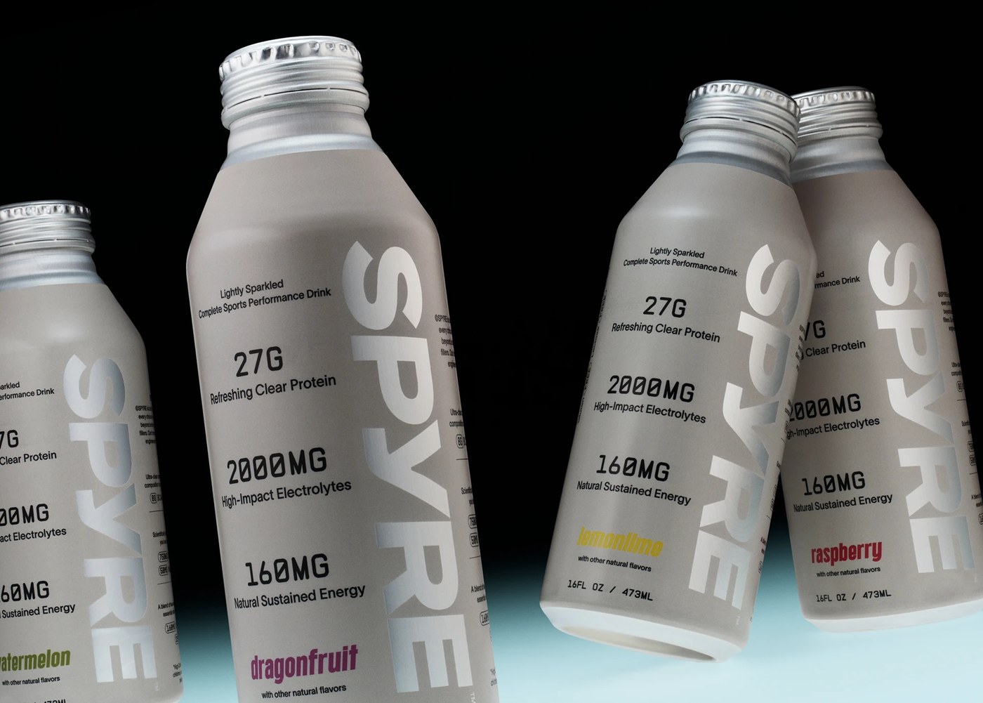
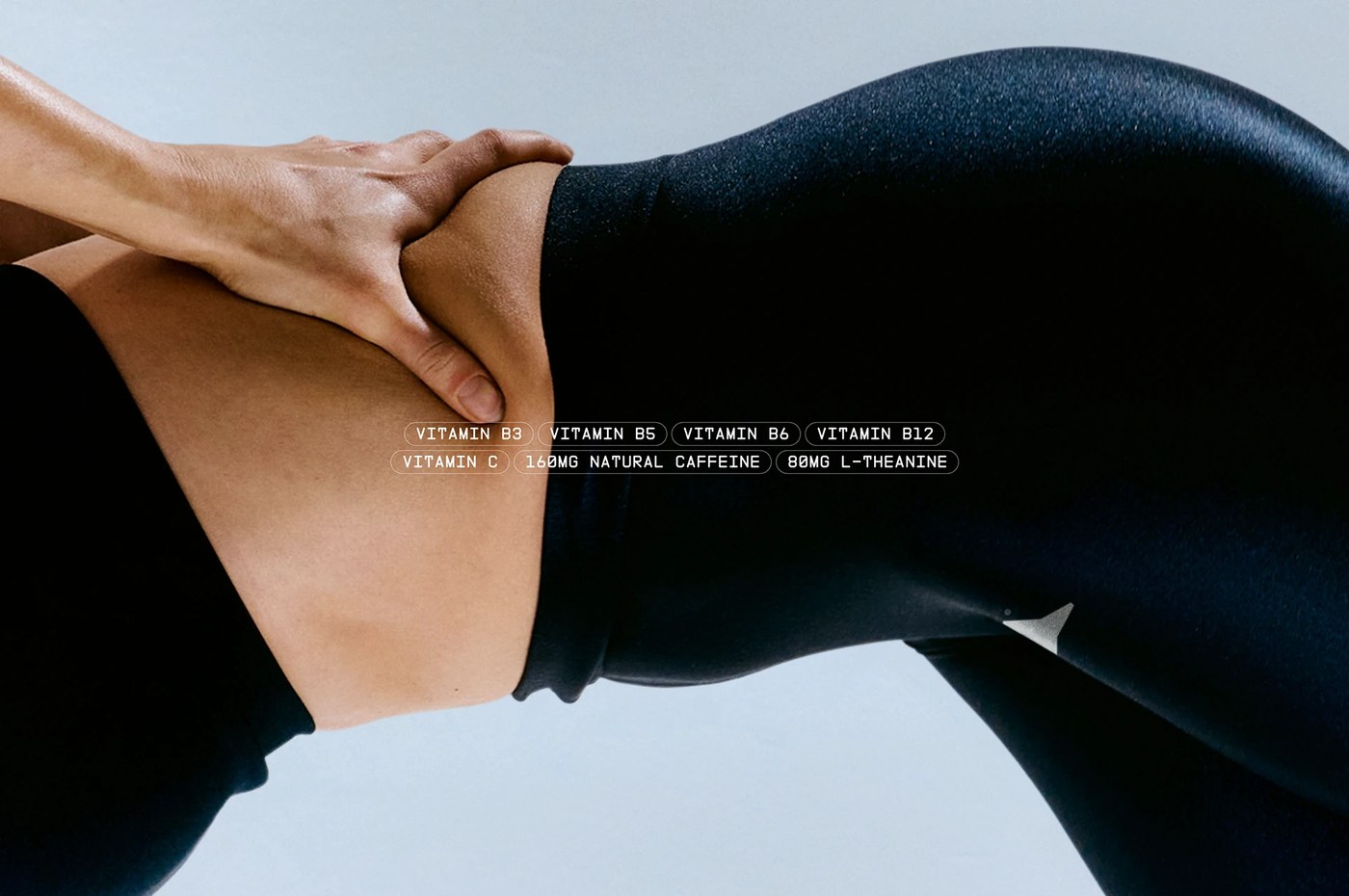
Most performance drink packaging communicates energy through aggression. Hello Comrade, Amsterdam, went the other direction. SPYRE is a clear, lightly sparkling beverage — protein, electrolytes, clean caffeine — and the sports drink packaging brand identity design makes that clarity do the work. The bottle itself is the visual argument. Near-colorless liquid in a transparent container, nothing masking what's inside. The label doesn't fight the product; it frames it. Compressed geometric sans, heavy weight, all-caps SPYRE set large enough to read at arm's length on a cylindrical surface. A near-white ground with cool gray and a restrained slate-blue accent. No aggression, no peak-state photography, no dark field.
Sports Drink Packaging Brand Identity Design Built Around What You Can See
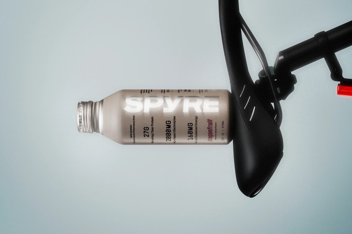
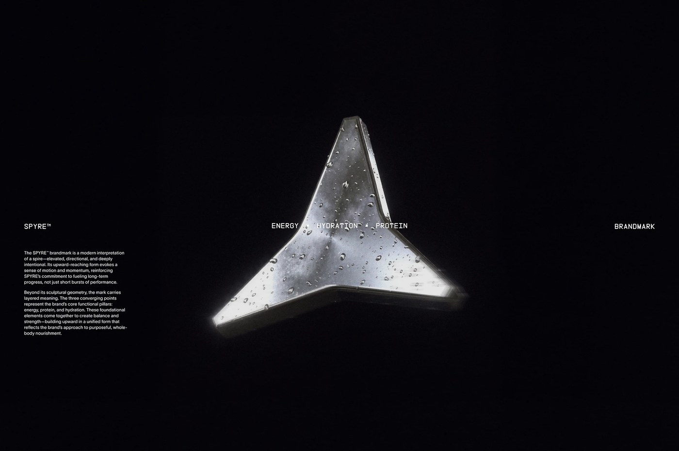
Photographer Yuhsing Lin's product shots function as graphic design. Bottles arranged on clean surfaces with precise shadow control — not lifestyle warm-up. The sports drink packaging brand identity design spans 15 images: label, cap detail, multi-bottle lineup, and athletic-context placement, all consistent without repetition. Hello Comrade held three pillars — hydration, energy, fuel — in a single word: clarity. When the product is proof, the sports drink packaging brand identity design doesn't need to perform. See the full project by Hello Comrade on Behance.