by abduzeedo
Explore Mimo.Cool's rebranding journey focusing on branding and visual identity, where contemporary design meets sustainability in children's fashion.
The recent rebranding of Mimo.Cool marks a significant milestone in the world of children's fashion. This project is a testament to the fusion of heritage and modernity, reflecting the brand's unwavering commitment to children's apparel. The transformation aligns with Mimo.Cool's ethos of simplicity, joy, and sustainability, making it an exemplary case study in branding and visual identity.
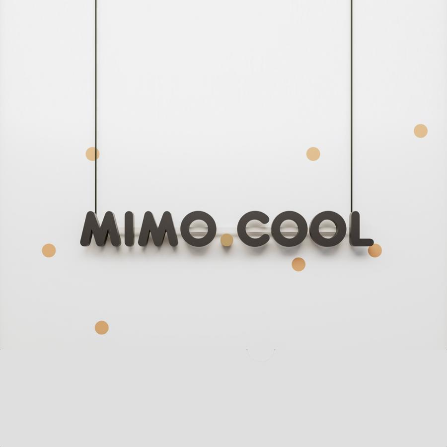
Central to this redesign is the introduction of spheres in the logo, ingeniously bridging the words 'mimo' and 'cool'. These spheres are more than mere aesthetic elements; they encapsulate the essence of childhood - its playfulness, innocence, and straightforward beauty. This strategic use of symbolism in branding is a masterstroke, providing a deep connection with the target audience.
The color scheme of the new visual identity deserves special mention. The choice of brown and beige shades resonates with the brand's core values. Earthy tones are not randomly picked; they are a deliberate nod to Mimo.Cool's dedication to environmental consciousness and sustainability. This color palette subtly communicates the brand's stance on responsible fashion, a crucial aspect in today's eco-aware market.
Moreover, the rebranding extends beyond mere visual appeal. It aligns with the brand's mission to offer sustainable and conscious choices in children's fashion. Each piece of clothing and toy in their collection is a testament to a better future for the younger generation. This approach is not just about creating a brand; it's about building a legacy of responsible consumerism and environmental stewardship.
In summary, Mimo.Cool's rebranding journey is a compelling blend of aesthetics, ethics, and strategic branding. It stands as a shining example of how visual identity can be leveraged to reflect a brand's core values while connecting deeply with its audience. The project goes beyond mere design; it's about crafting a narrative that resonates with and inspires the consumer, paving the way for a more sustainable future in children's fashion.
Branding and visual identity artifacts
For more information make sure to check out Erva Design website and Behance profile.
