by AoiroStudio
If you have been following the news from SDCC which is the Comic-Con International happening in San Diego, California. Marvel took everyone and shared a social media blast about 'Phase 4'. We all knew this announcement will be coming but I didn't expect to be this huge along with surprises. What was your most surprising announcement? I am pretty excited for the next Thor especially knowing it's going to be Taika Waititi returning as Director. Something entirely new for this announcement is the upcoming TV shows and movies straight on Disney+, a streaming platform coming soon from Disney.
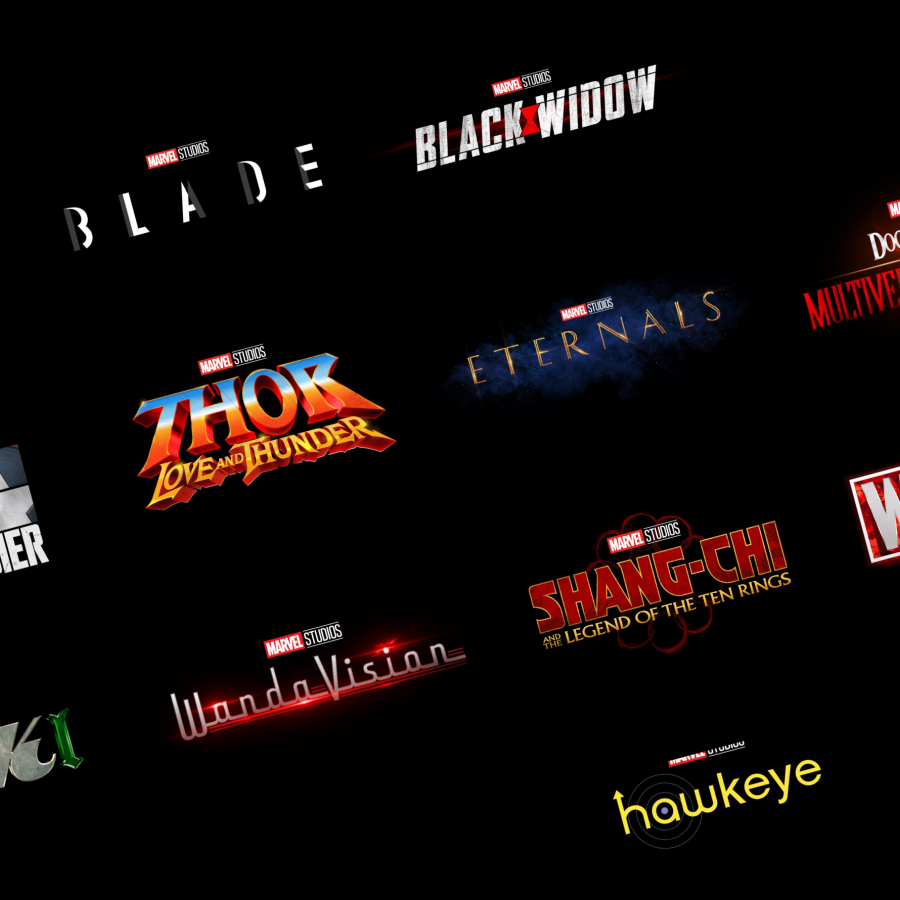
About the logos, this is where I come in. I am aware these logos are part of what I would call a teaser? The designs will probably change in the near future but the first impression is everything right? My favorite? I tremendously love the logo for Thor: Love and Thunder. I think it's the one that stands out the most from the bunch, you just gotta love its 70s feel to it. It totally brings excitement to what's coming. A runner-up would be the logo for My least favorite? Hawkeye, it doesn't ring the awesomeness that Jeremy Renner brings to the character. It does remind me of a 90s sitcom TV show? I get the representation of the 'arrow and target' but still. I have mixed feelings for the logo for Loki for which I get its meaning right away but how do you feel about its mixture of a different style for each letter of its name? What do you think?
In their words
Fans can look forward to these titles over the next two years
Logo Design
Just announced in Hall H at #SDCC, Marvel Studios’ THE ETERNALS with Angelina Jolie, Richard Madden, Kumail Nanjiani, Lauren Ridloff, Brian Tyree Henry, Salma Hayek, Lia McHugh, and Don Lee. Directed by Chloé Zhao. In theaters November 6, 2020. pic.twitter.com/inn67bSZiM
— Marvel Entertainment (@Marvel) July 21, 2019
Just announced in Hall H at #SDCC, Marvel Studios’ THE FALCON AND THE WINTER SOLDIER, an original series with Anthony Mackie, Sebastian Stan, and Daniel Brühl. Streaming exclusively on Disney+, Fall 2020. pic.twitter.com/COes9WV7Wv
— Marvel Entertainment (@Marvel) July 21, 2019
Just announced in Hall H at #SDCC, Marvel Studios’ SHANG-CHI AND THE LEGEND OF THE TEN RINGS, with Simu Liu, Awkwafina, and Tony Leung, directed by Destin Daniel Cretton. In theaters February 12, 2021. pic.twitter.com/WePmw8d5Gq
— Marvel Entertainment (@Marvel) July 21, 2019
Just announced in Hall H at #SDCC, Marvel Studios' WANDAVISION, an original series with Elizabeth Olsen, Paul Bettany, and Teyonah Parris. Streaming exclusively on Disney+, Spring 2021. pic.twitter.com/mDgxZVW3BF
— Marvel Entertainment (@Marvel) July 21, 2019
Just announced in Hall H at #SDCC, Marvel Studios’ LOKI, an original series with Tom Hiddleston. Streaming exclusively on Disney+, Spring 2021. pic.twitter.com/lDqAWtIE0u
— Marvel Entertainment (@Marvel) July 21, 2019
Just announced in Hall H at #SDCC, Marvel Studios’ DOCTOR STRANGE IN THE MULTIVERSE OF MADNESS with Benedict Cumberbatch and Elizabeth Olsen. Scott Derrickson returns as director. In theaters May 7, 2021. pic.twitter.com/bVyOYjPLly
— Marvel Entertainment (@Marvel) July 21, 2019
Just announced in Hall H at #SDCC, Marvel Studios’ WHAT IF...?, the first animated series in the MCU, with Jeffrey Wright as the voice of The Watcher, and many actors from across the MCU reprising their roles as voice talent. Streaming exclusively on Disney+, Summer 2021. pic.twitter.com/6aPhlQvMR9
— Marvel Entertainment (@Marvel) July 21, 2019
Just announced in Hall H at #SDCC, Marvel Studios’ HAWKEYE with Jeremy Renner, an original series that will also introduce Kate Bishop. Streaming exclusively on Disney+, Fall 2021. pic.twitter.com/n2u6G4i4iG
— Marvel Entertainment (@Marvel) July 21, 2019
Just announced in Hall H at #SDCC, Marvel Studios’ THOR: LOVE AND THUNDER with Chris Hemsworth, Tessa Thompson, and Natalie Portman. Taika Waititi returns as director. In theaters November 5, 2021. pic.twitter.com/Lq4hM8GSRV
— Marvel Entertainment (@Marvel) July 21, 2019
Just announced in Hall H at #SDCC, Marvel Studios’ BLACK WIDOW with Scarlett Johansson, David Harbour, Florence Pugh, O-T Fagbenle, and Rachel Weisz. Directed by Cate Shortland. In theaters May 1, 2020. pic.twitter.com/oyUvYdzF3P
— Marvel Entertainment (@Marvel) July 21, 2019
Just announced in Hall H at #SDCC, Marvel Studios’ BLADE with Mahershala Ali. pic.twitter.com/JPcrSqSerW
— Marvel Entertainment (@Marvel) July 21, 2019
- Read the entire announcement on Marvel
