Shake It's New Era: Bold Branding and Visual Identity
BULLSEYE's latest work on Shake It's branding and visual identity showcases a futuristic, technologically-driven design, embodying the essence of Portugal's leading event company.
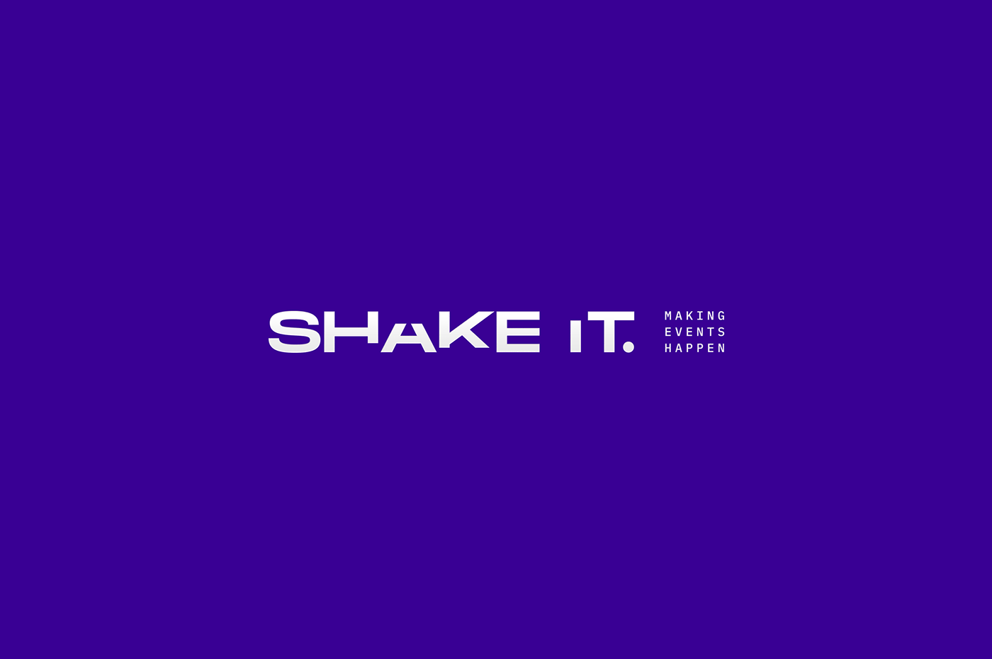
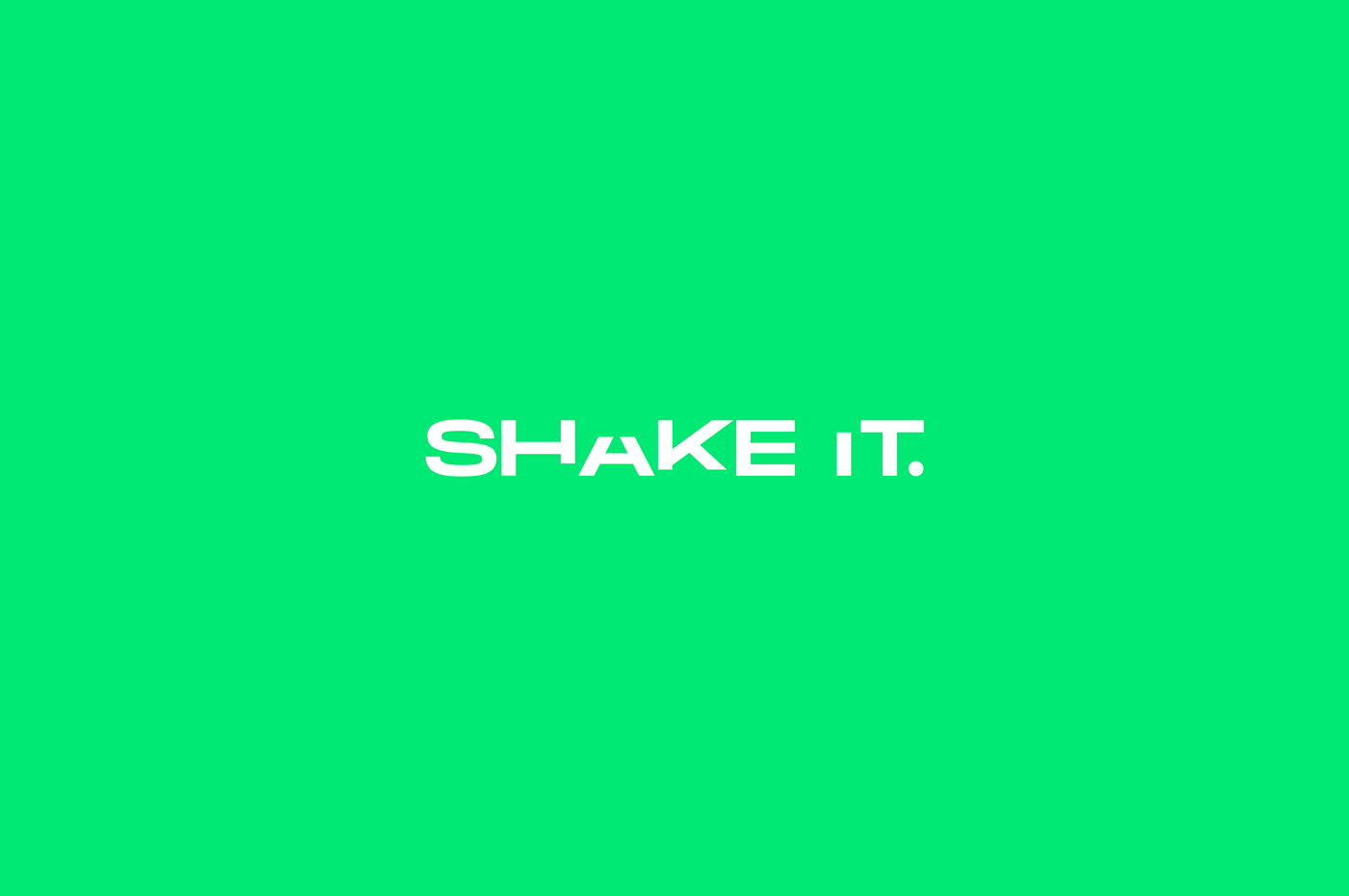
Shake It, Portugal's foremost virtual and hybrid event company, recently unveiled its new branding and visual identity, masterfully created by BULLSEYE. This rebranding marks a significant milestone for Shake It, reflecting its evolution and dominance in the event industry. With over 300 events under its belt, Shake It's new identity needed to embody its technological prowess and creative flair.
BULLSEYE, known for their innovative approach to design, undertook the challenge of encapsulating Shake It’s essence in its new visual identity. The aim was to create a brand image that not only represented Shake It's core strengths but also aligned with its robust and intuitive platform. This rebranding initiative was more than a visual makeover; it was about crafting an identity that resonated with Shake It’s innovative spirit.
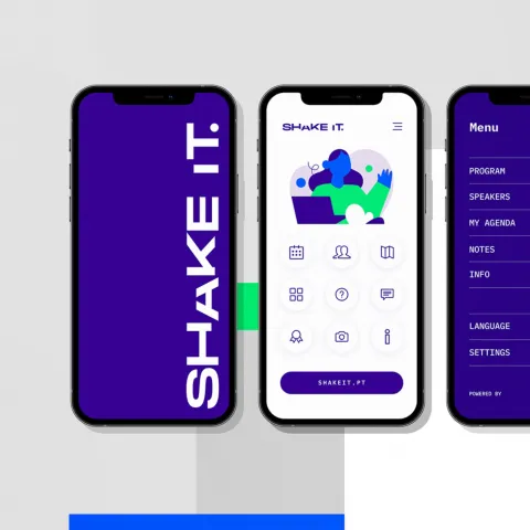
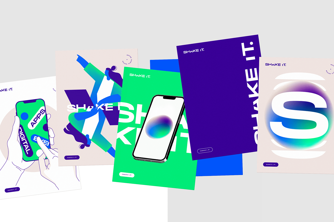
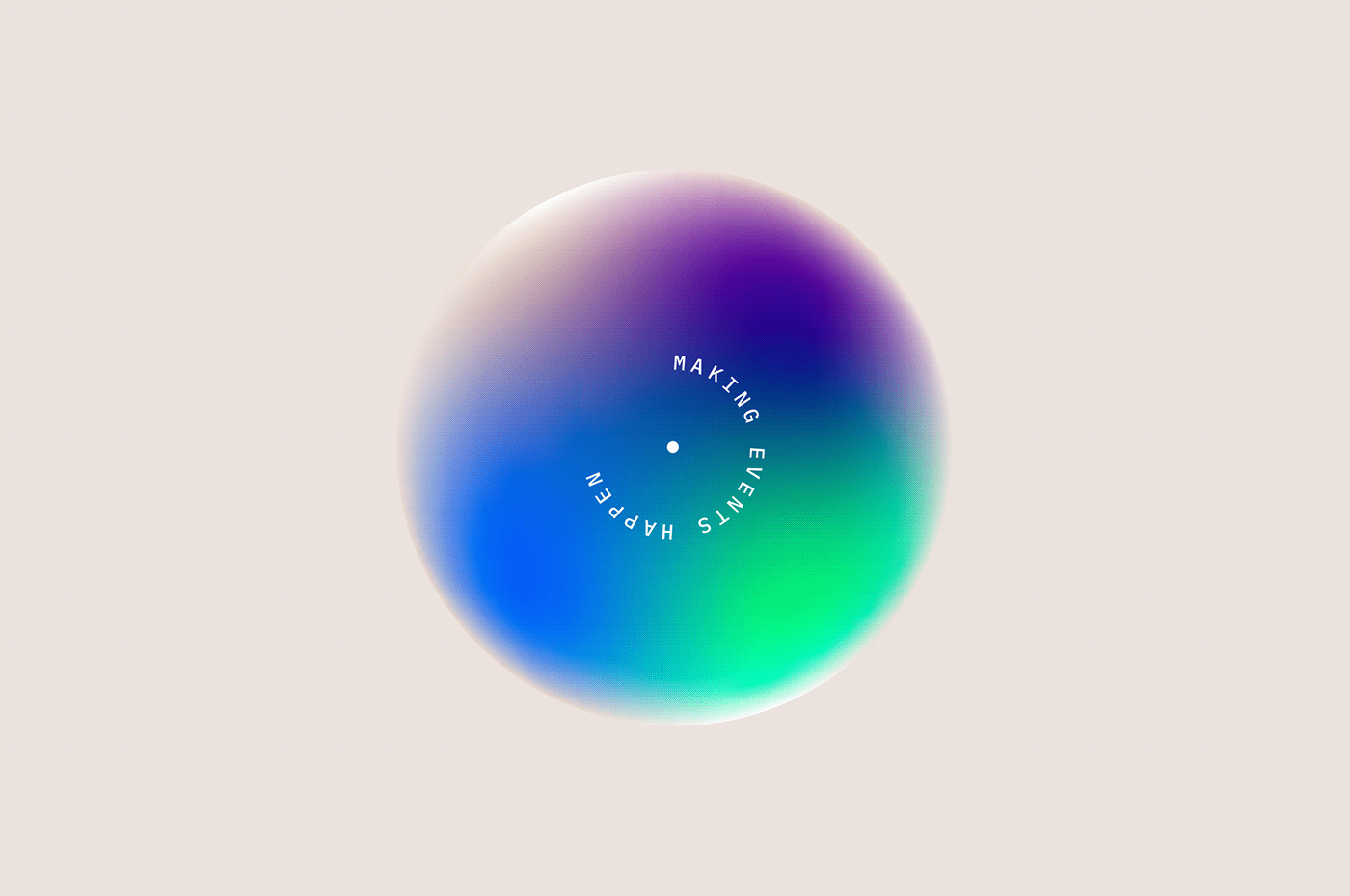
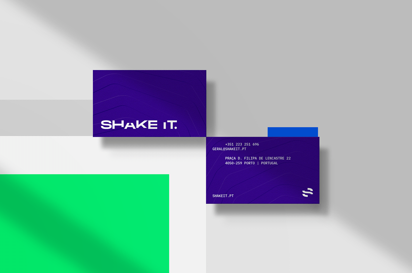
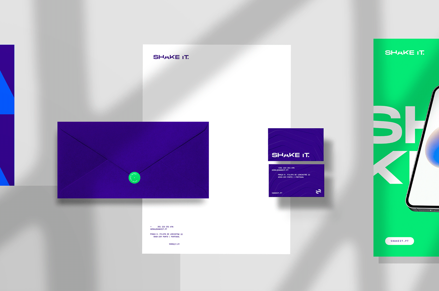
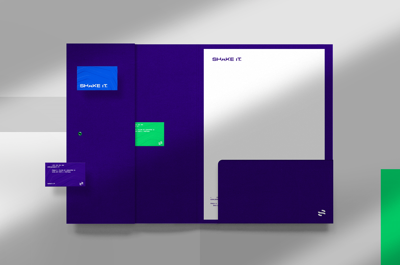
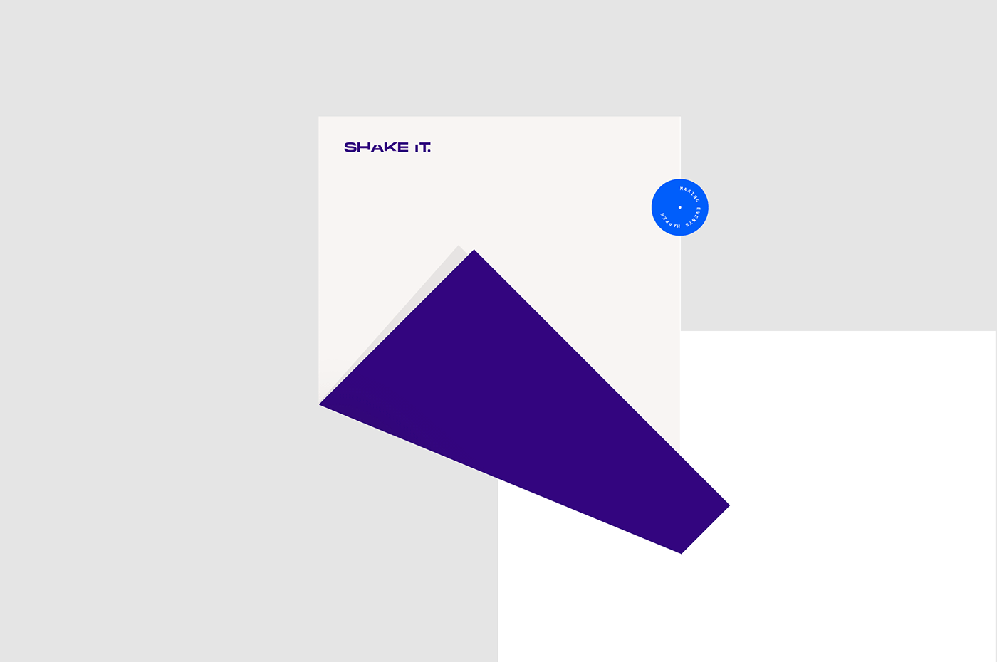
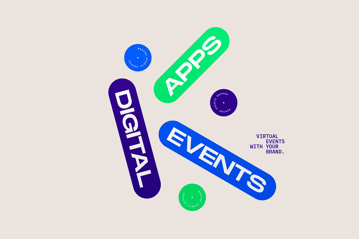
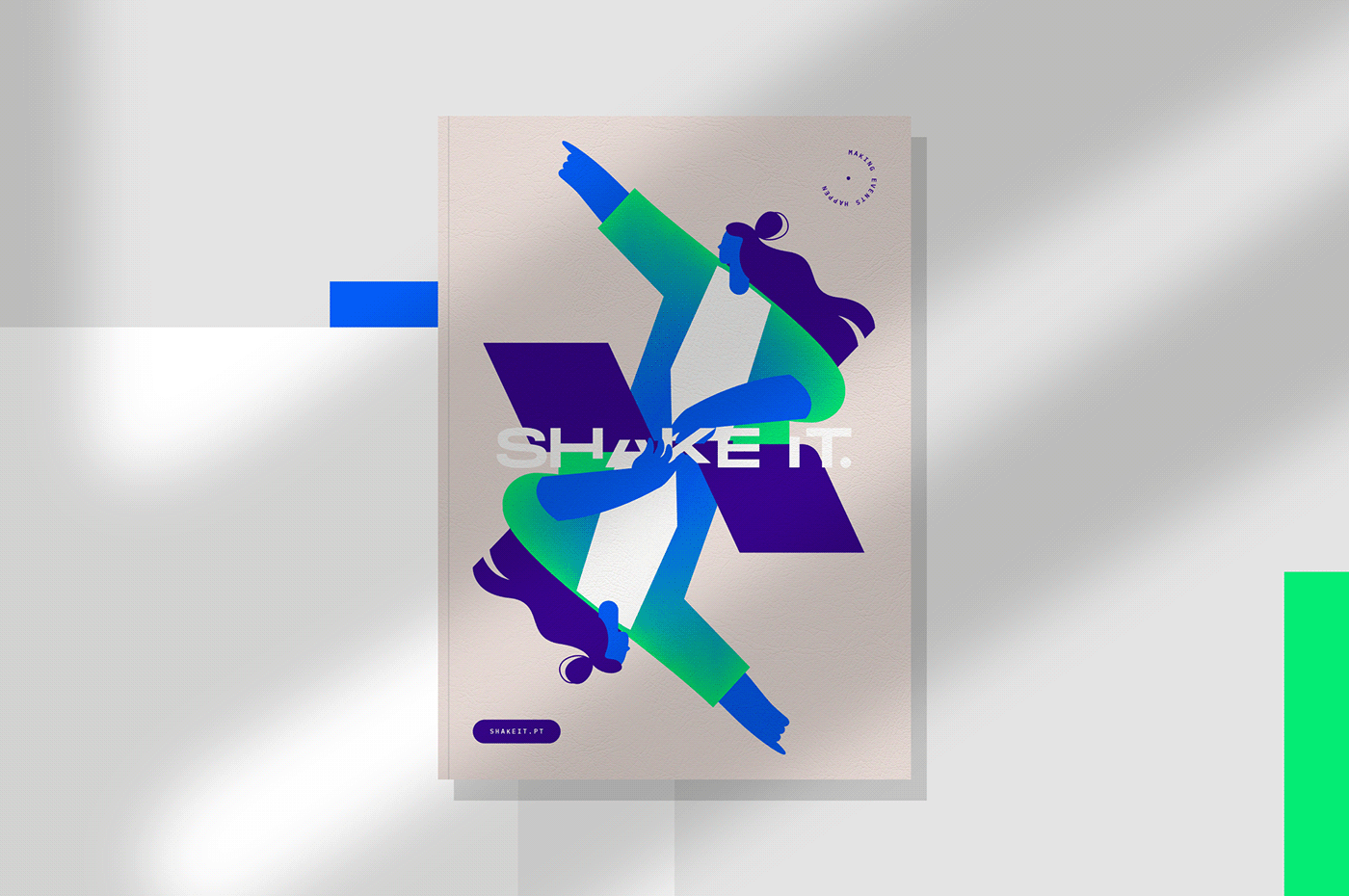
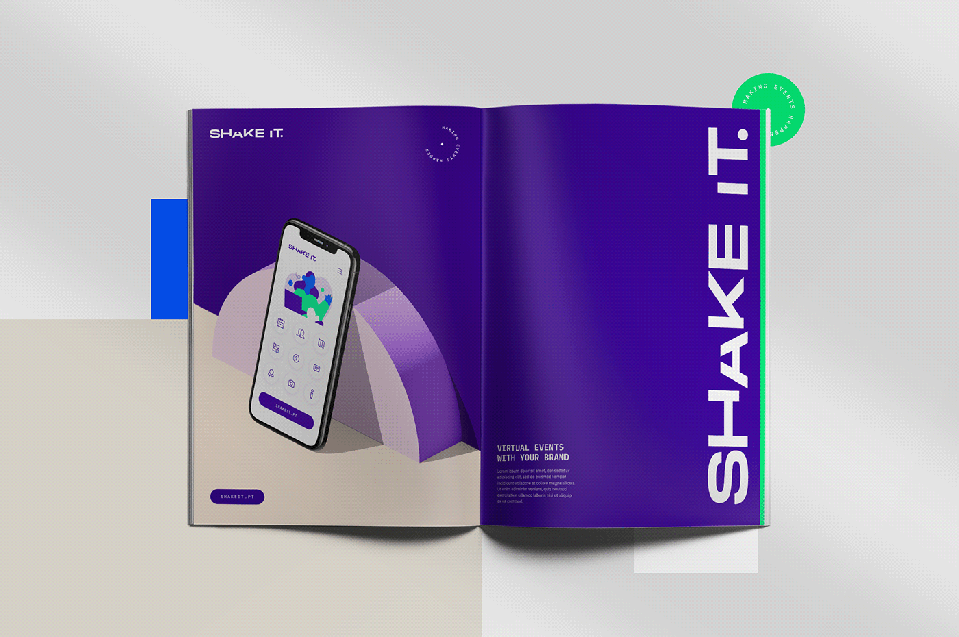
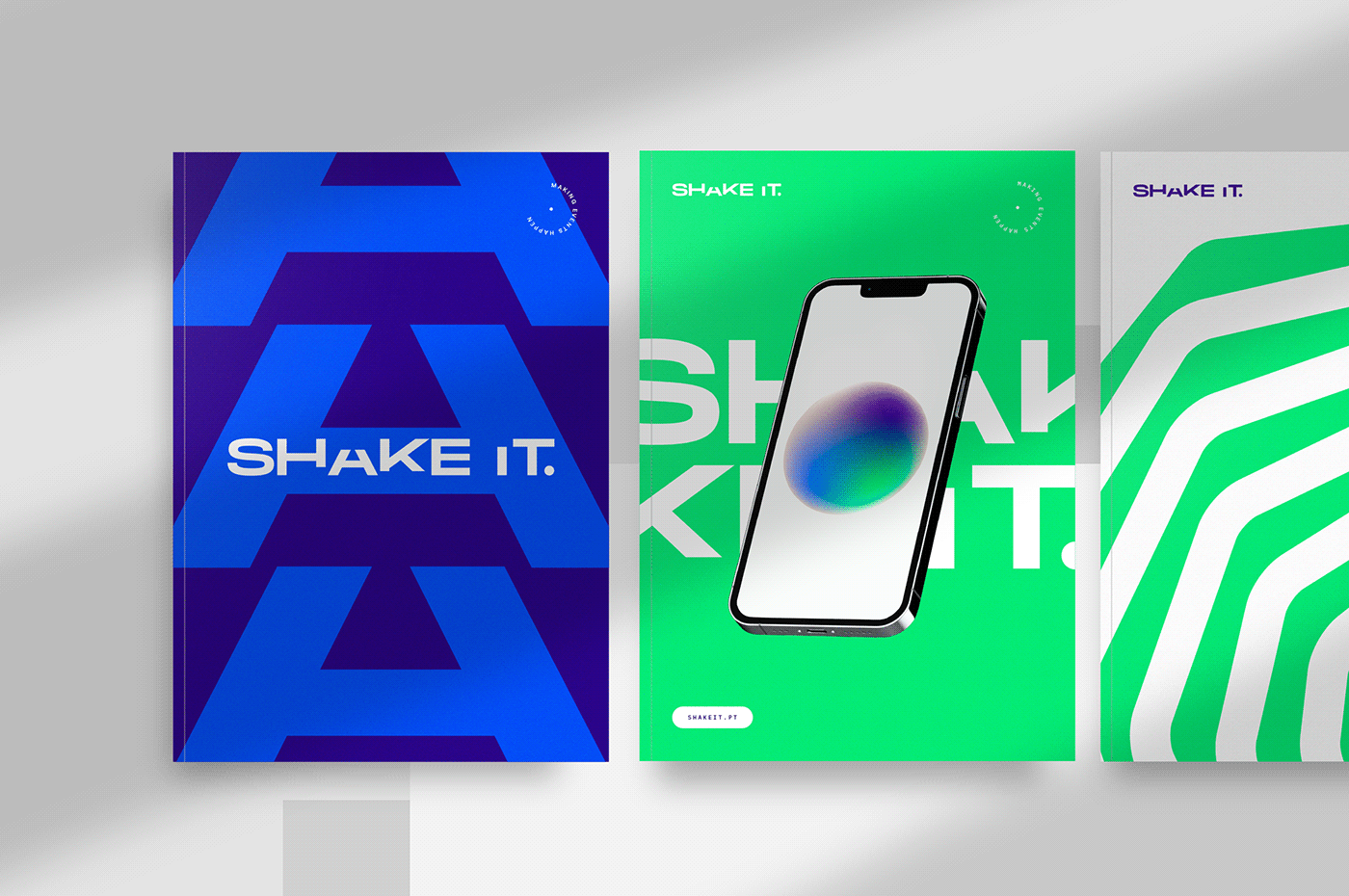
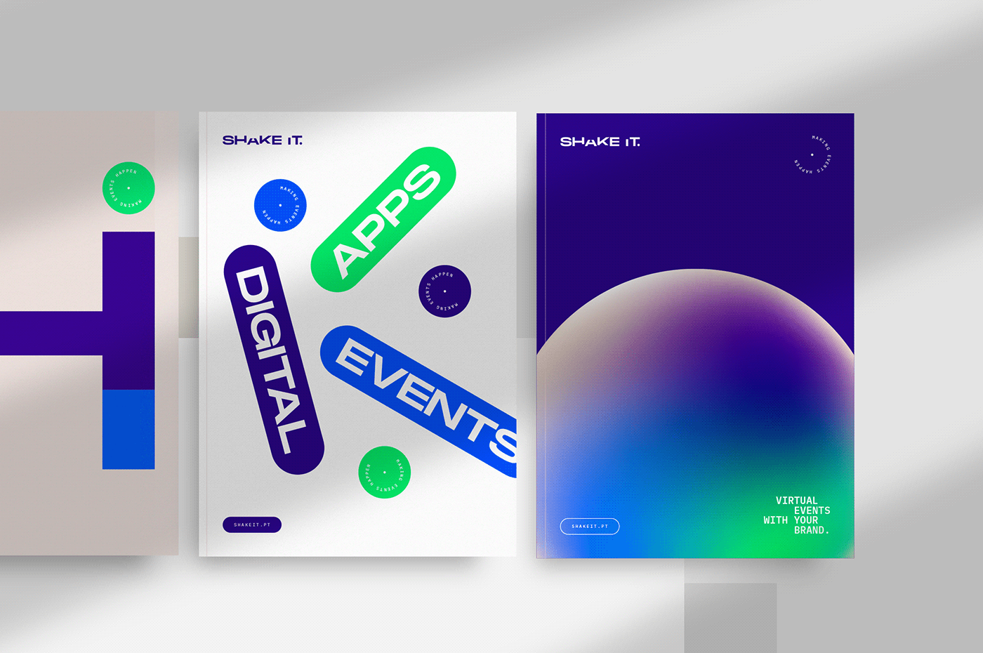
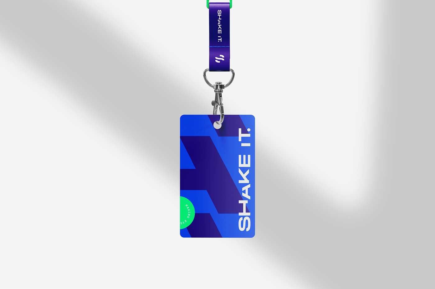
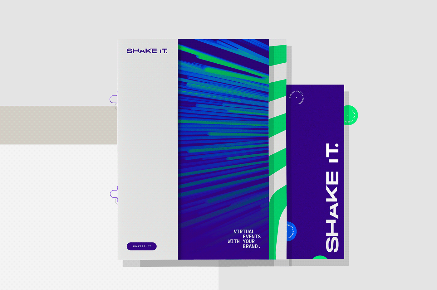
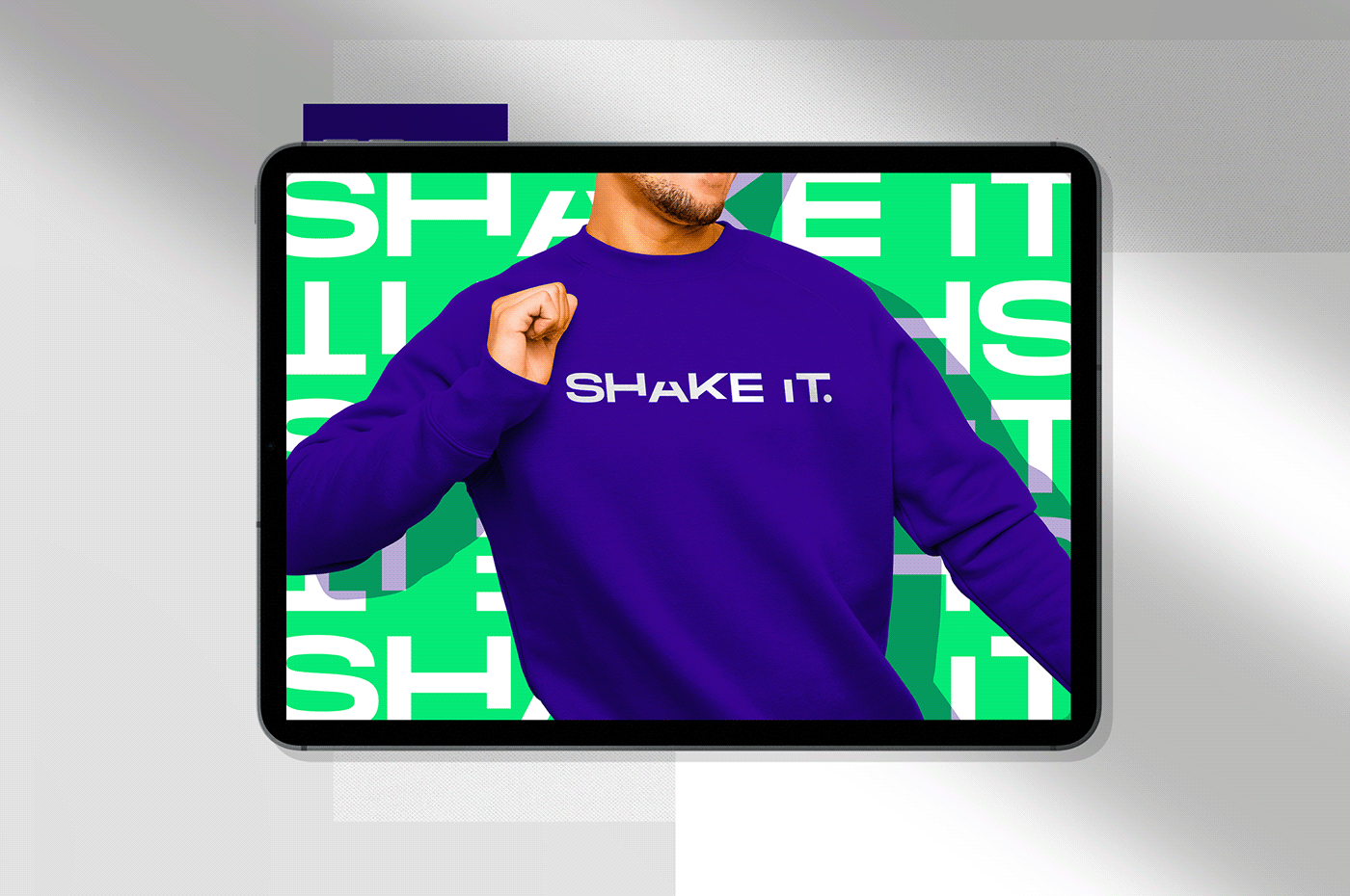
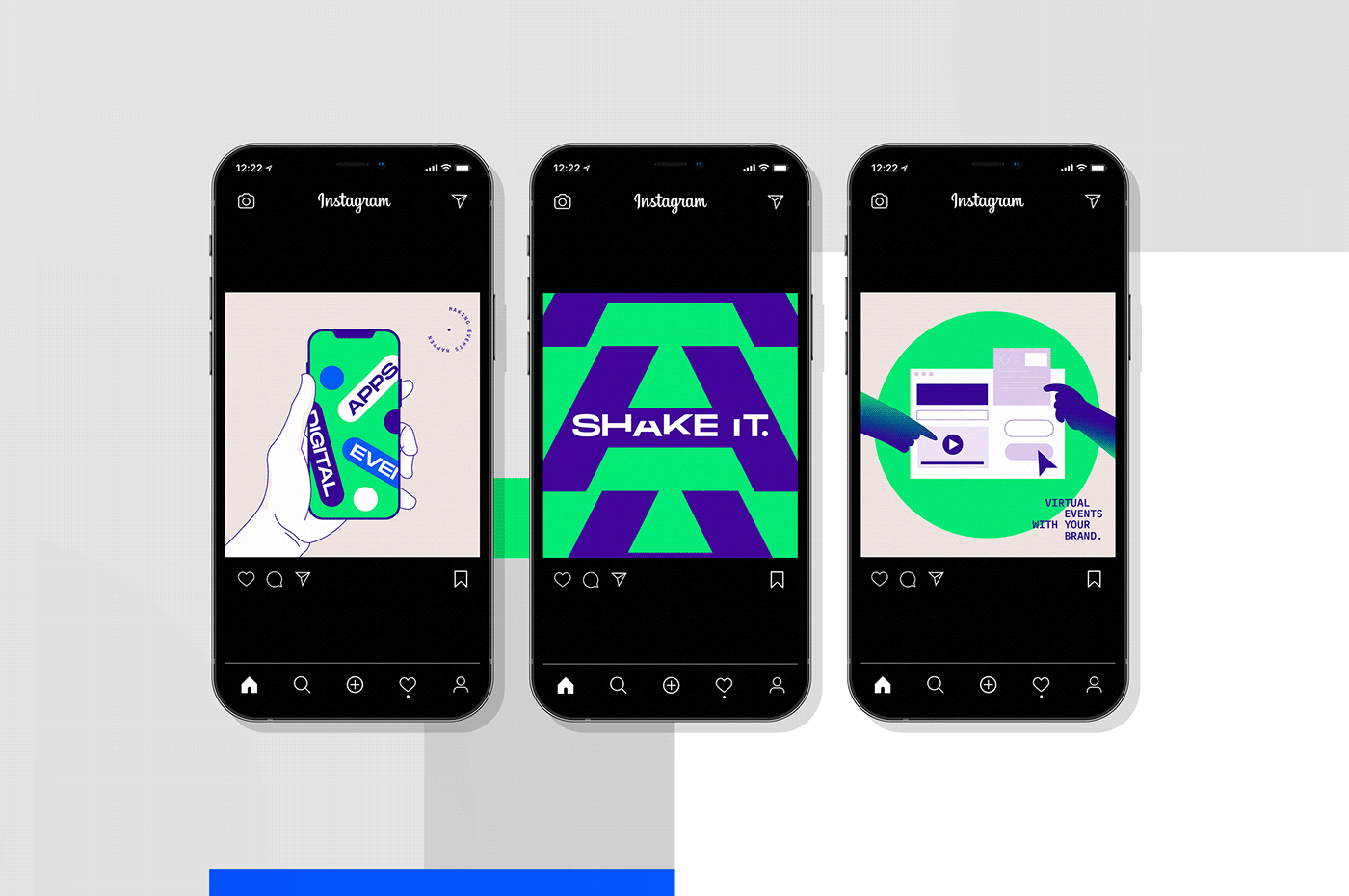
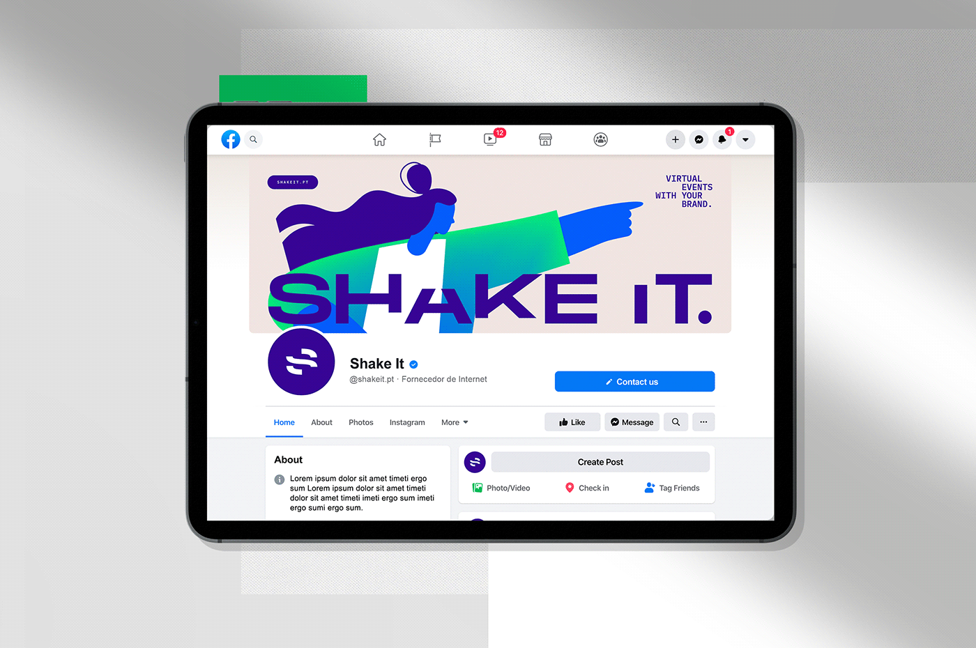
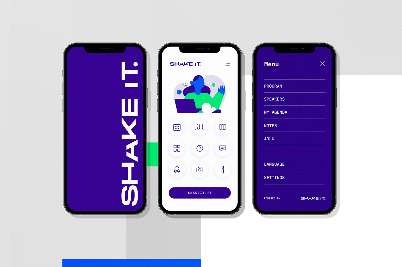
The most striking aspect of the new design is the explosion of neon colors, a deliberate choice to drive user experience. The vibrant accents of blue and neon green weave a futuristic theme throughout the brand. These colors are not just visually arresting; they communicate a sense of energy and forward-thinking, traits synonymous with Shake It.
This color scheme, combined with a minimalist yet dynamic design language, creates a visual narrative that speaks of technology, innovation, and excitement - all elements central to Shake It's identity. The new branding is not just a facade; it's a reflection of the company's commitment to delivering exceptional experiences through its events.
In summary, Shake It's new branding and visual identity by BULLSEYE is a testament to the power of design in conveying a company's ethos. It goes beyond aesthetics, encapsulating the spirit of innovation and technological excellence that Shake It stands for. This rebranding sets a new standard in the events industry, highlighting how a well-executed visual identity can elevate a brand's perception and connect with its audience on a deeper level.
Branding and visual identity artifacts


Credits
- Art Direction / Design: Bullseye aim on branding
- Client: Shake It
- Year: 2022
For more information make sure to check out BULLSEYE website and Behance profile.