Streamlined Branding for Bitree’s Link Management Platform
Bitree’s clean branding and visual identity focus on clarity and user-friendly link management.
When you’re dealing with digital tools, simple is best. Bitree, a platform that helps users manage and share links, makes that simplicity its main strength. Designed by Bamidele Segun, the brand identity puts clarity first.
A Clear Look and Feel
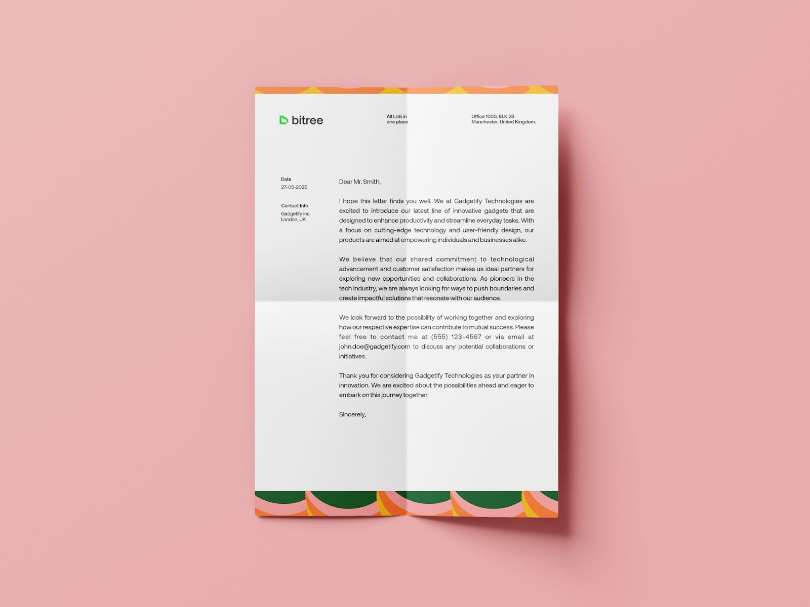
Bitree’s branding and visual identity are built to stay out of the way. The design is calm and modern, using simple colors, shapes, and fonts to create a smooth experience.
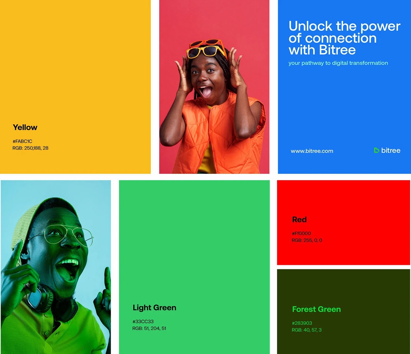
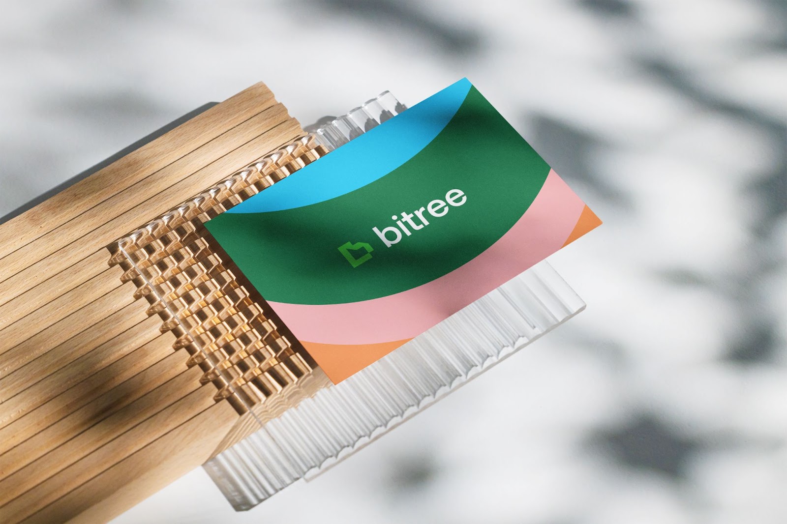
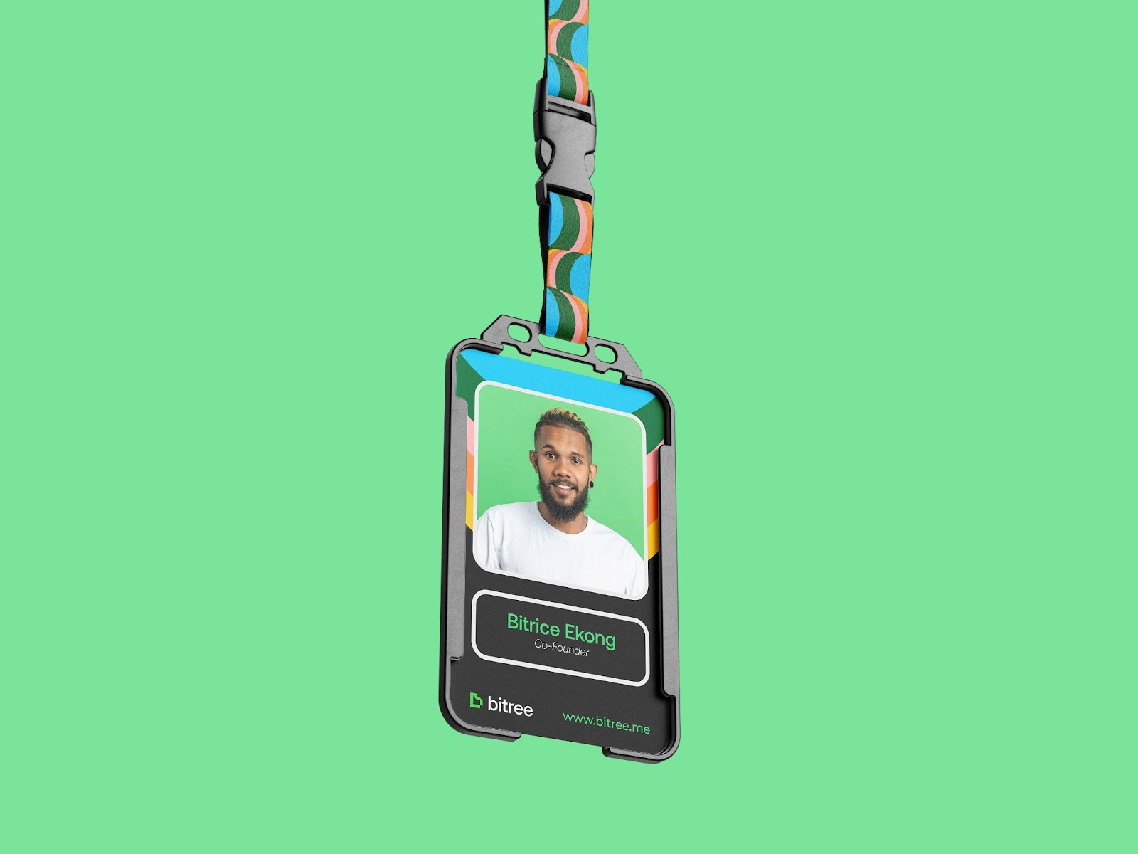
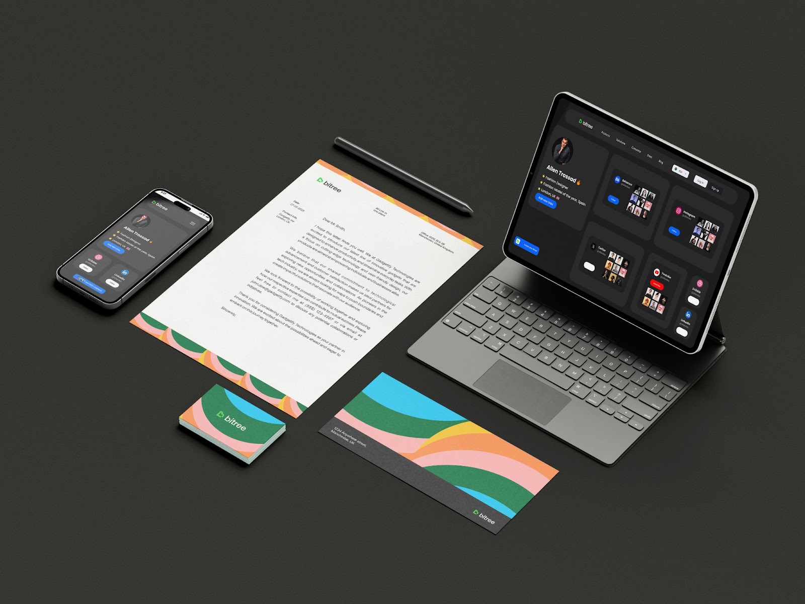
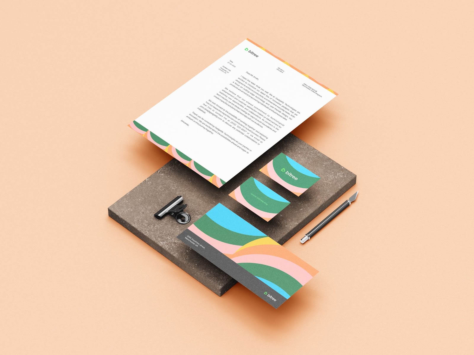
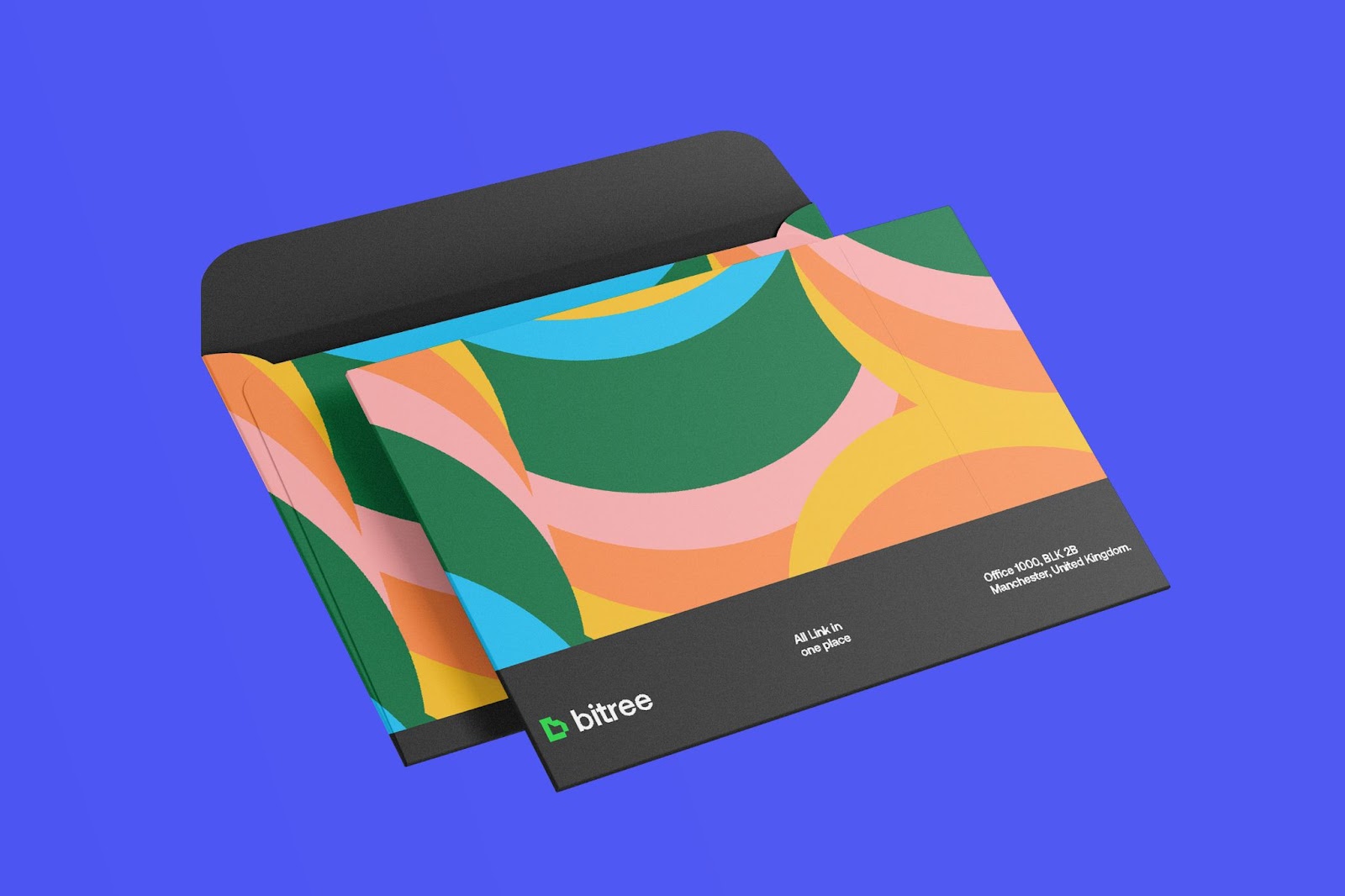
The main colors? Soft greens and whites. These colors feel fresh and natural, tying back to the name “Bitree.” They make the interface feel light and help user content stand out.
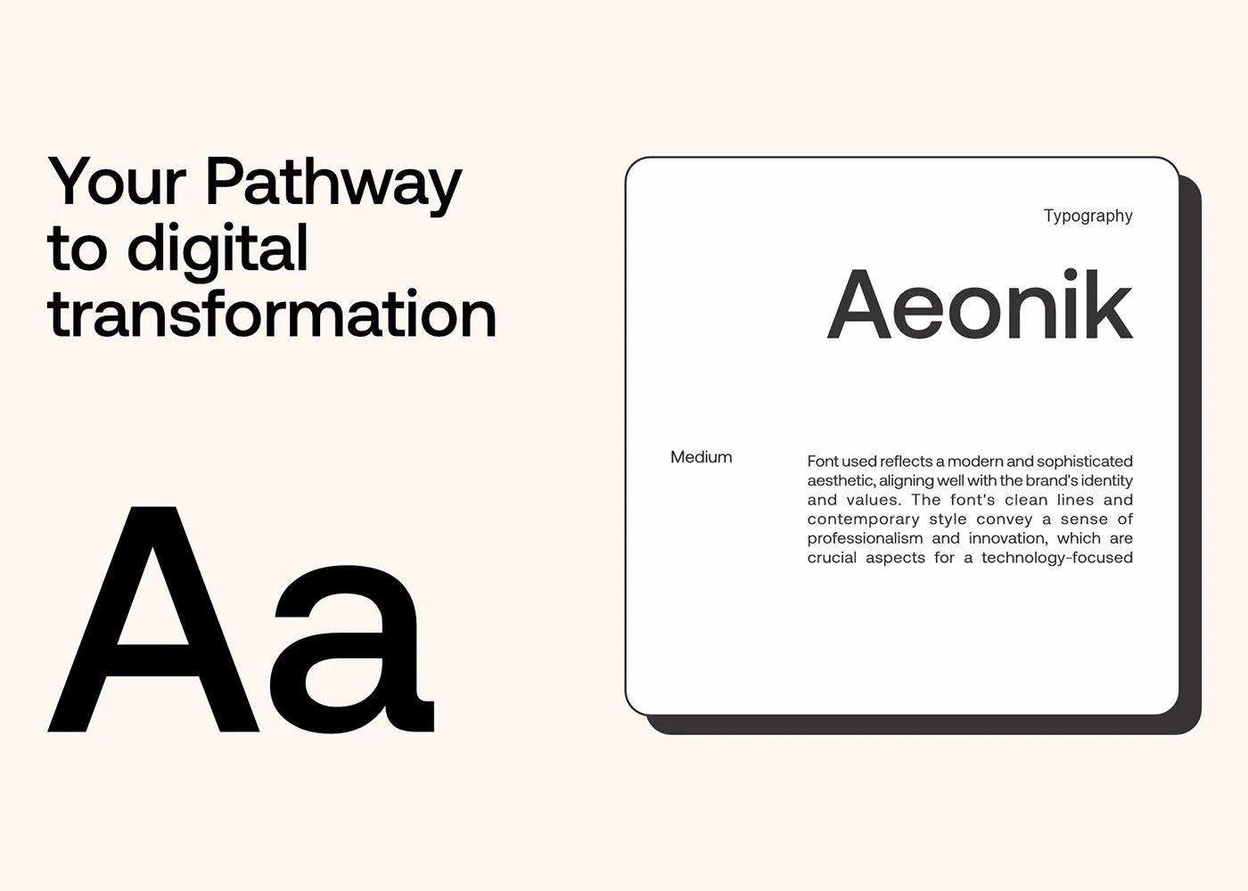
Easy-to-Read Fonts
Bitree uses a clean, sans-serif font that’s easy to read. Whether you’re on your phone or laptop, the text stays sharp and clear.
By using the same font everywhere—from the app to the website—Bitree builds a strong, reliable look. It keeps things simple and lets the product do the talking.
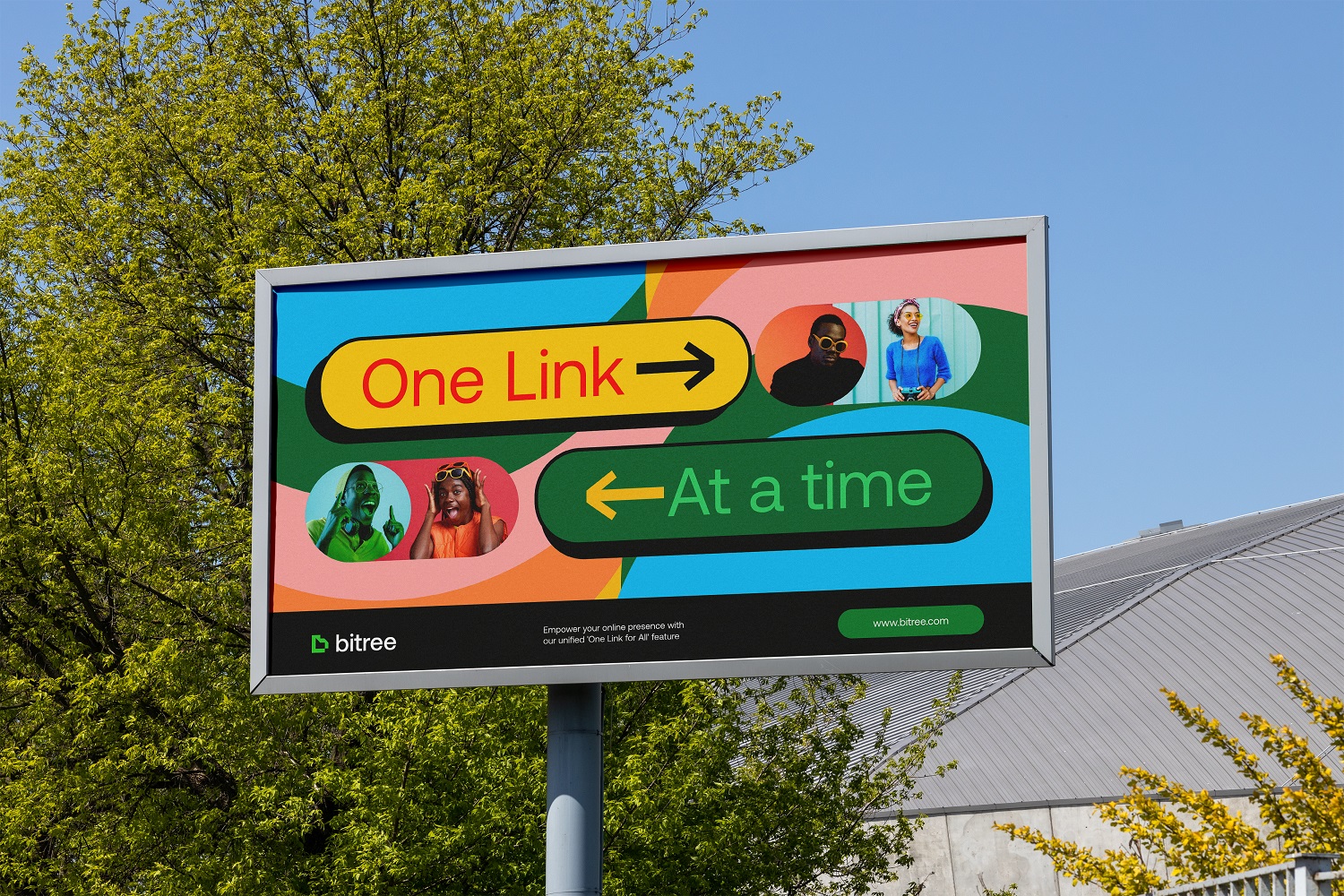
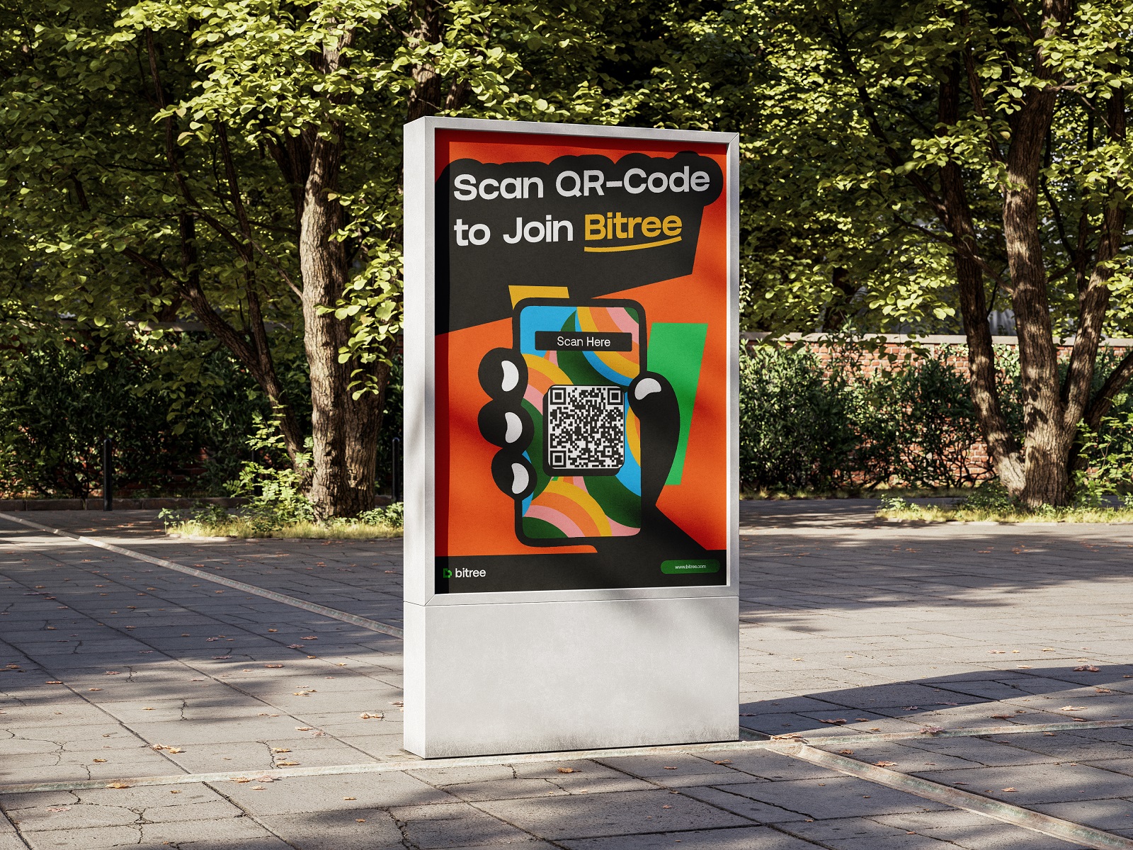
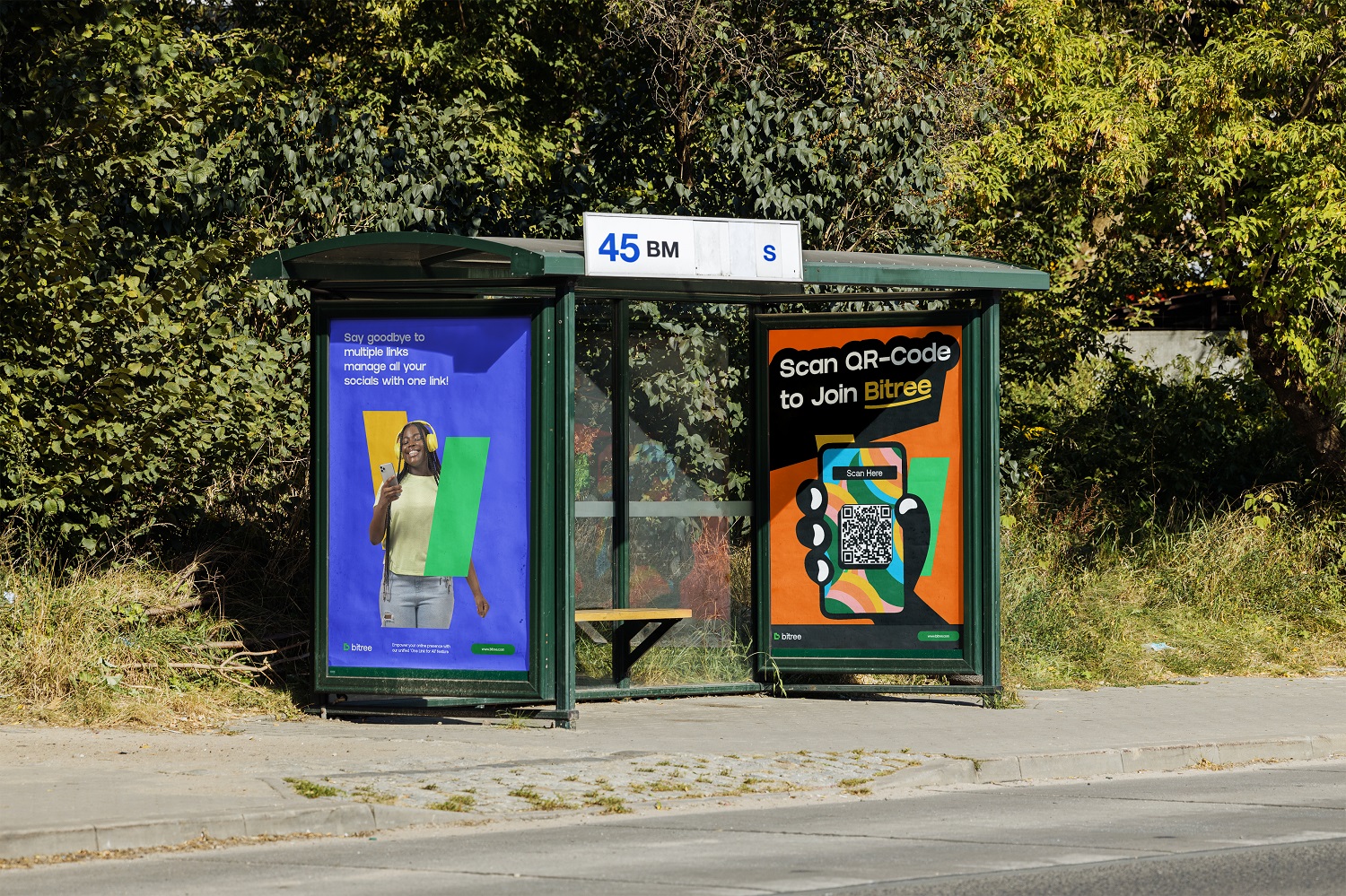
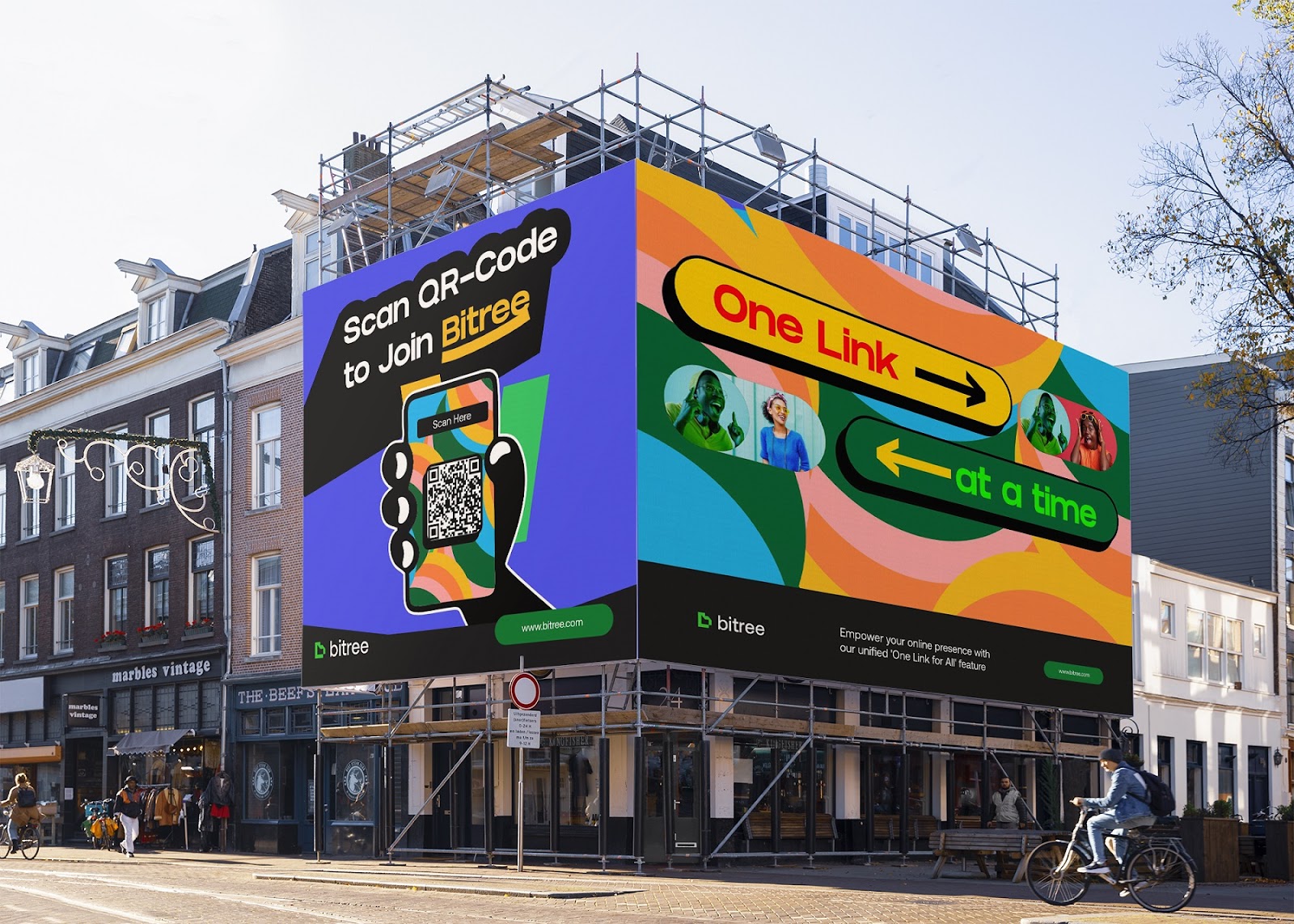
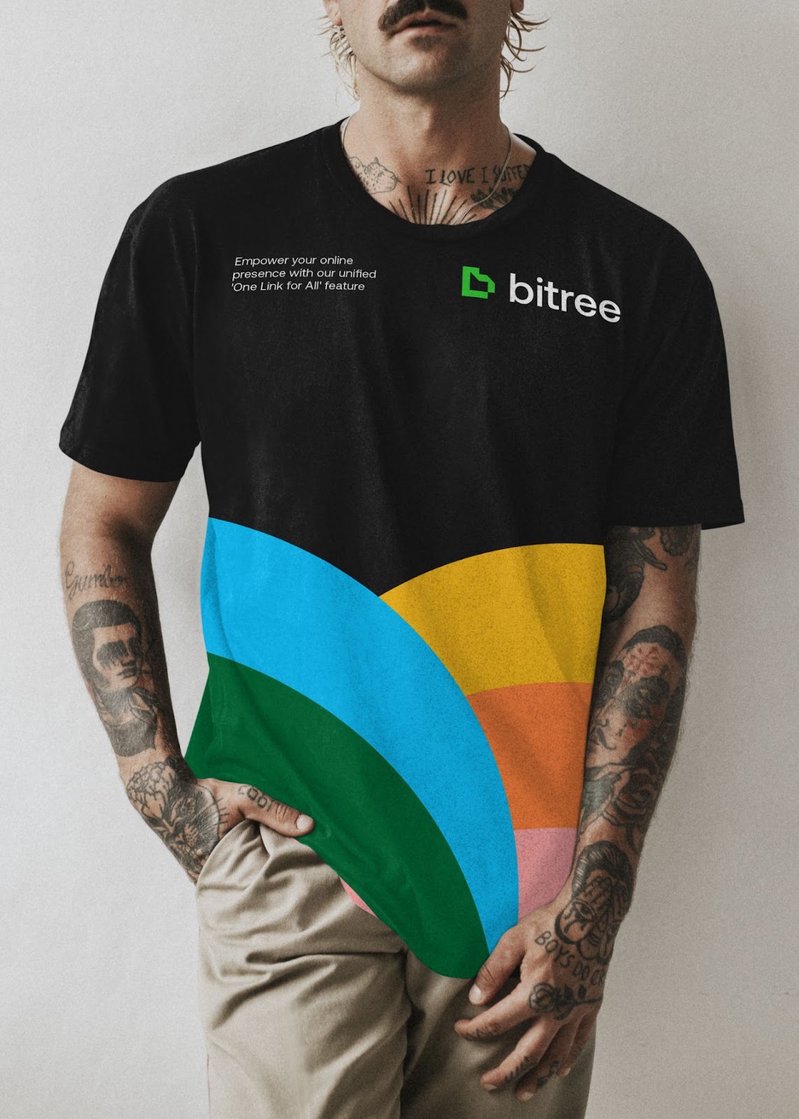
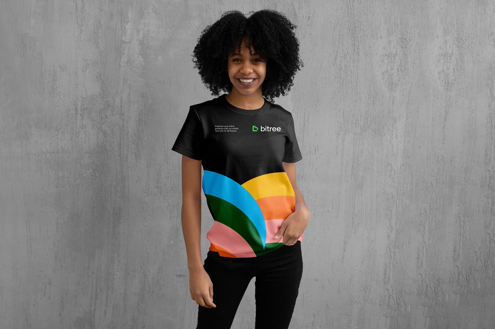
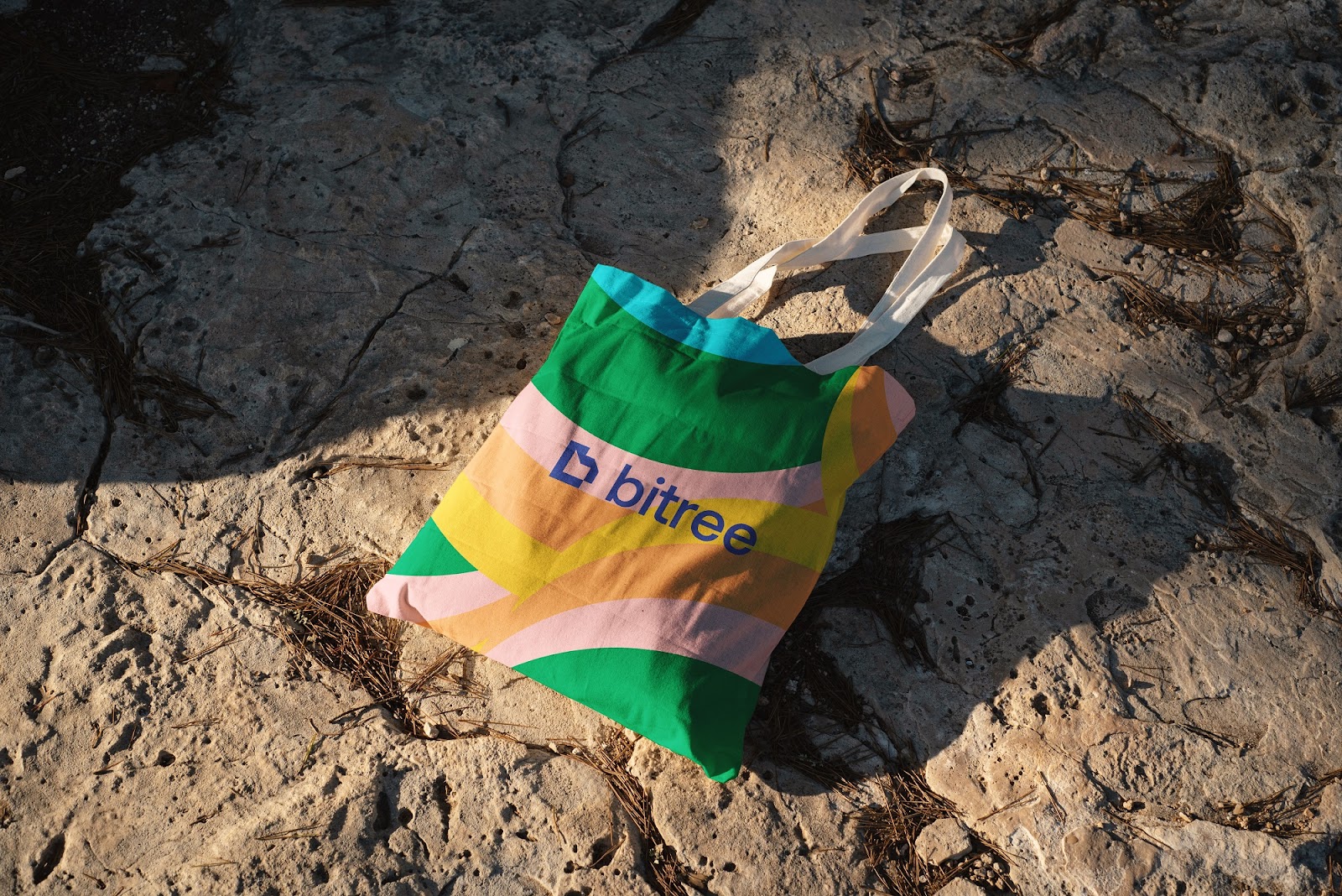
Smart Visual Elements
Small graphic touches, like lines and dots, give a hint of structure. They remind us of branching paths or links but never distract. The design leaves lots of open space, which makes everything easier to use.
These small details help guide users without overwhelming them. It’s a smart use of design that feels thoughtful and light.
Why It Works
Bitree’s design isn’t trying to impress with fancy tricks. It sticks to what matters—clear layout, smooth navigation, and a strong brand identity.
It’s proof that branding and visual identity don’t have to be loud to be powerful. When done right, quiet design can speak the loudest.
Explore the full project and visuals on Behance: Bitree Brand Identity by Bamidele Segun
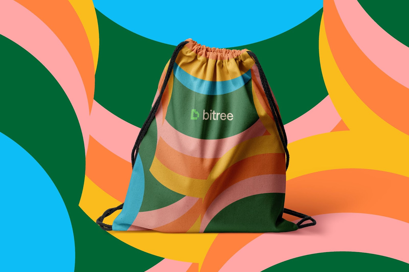
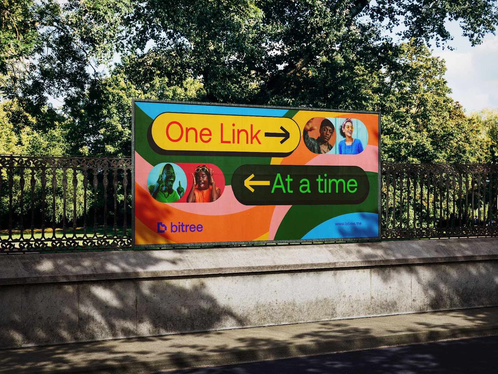
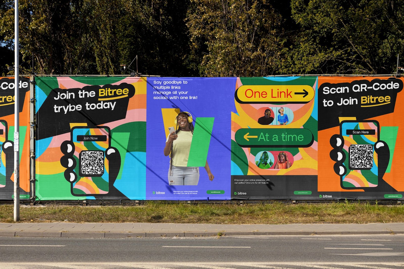
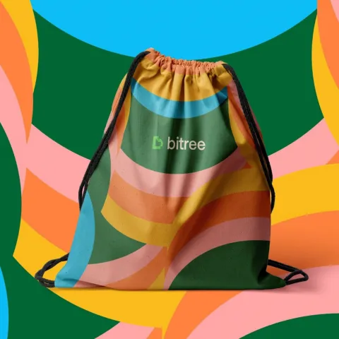
Branding and visual identity artifacts