by abduzeedo
Ten design projects from W19 2026 where the system itself was the creative act — from a generative orchestral identity that encodes its audience into pattern, to packaging where material constraint is the only argument, to display type calibrated for the way editorial actually works today.
This week's work had a consistent argument beneath the surface variety: the most convincing design doesn't announce its logic — it structures it. From generative brand identities encoding their own rules into pattern, to packaging systems where material constraint becomes the visual story, to editorial illustration that takes a position rather than decorates a page, W19 landed a cluster of projects where the system itself was the creative act. Precision and weight — not as stylistic choices, but as structural commitments.
Ten picks this week. Eight from Abduzeedo's own coverage, two from outside. All of them earned their place by having a specific reason to exist.
Budapest Festival Orchestra — DE_FORM
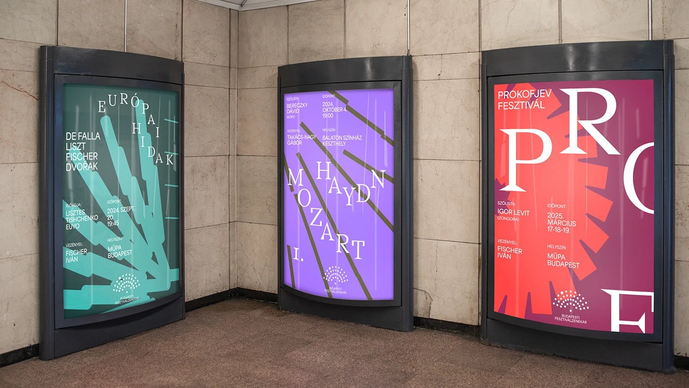
The central tension for any established orchestra: how do you signal contemporary relevance without abandoning the historical authority that makes the institution worth attending? DE_FORM's answer for the Budapest Festival Orchestra doesn't split the difference — it encodes the audience into the visual identity itself. The generative pattern system derives its motif from the relationship between ensemble and listener, producing dynamic compositions from a single rule. Best of Behance recognition for cultural identity work at this level is genuinely hard to argue with.
QUENTO™ Display Typeface — Kimmy Lee & Petros Afshar
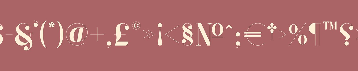
The Didone revival has been running for three years; QUENTO is one of the few entries that earns the comparison to its source material. Hairline serifs and maximum stroke contrast calibrated for high-resolution screens rather than letterpress — the type performs at 200px the way the tradition intended, without the brittleness that kills most digital revivals. Five hundred-plus glyphs and a free demo make the argument immediately testable.
Inflection — Lundgren+Lindqvist
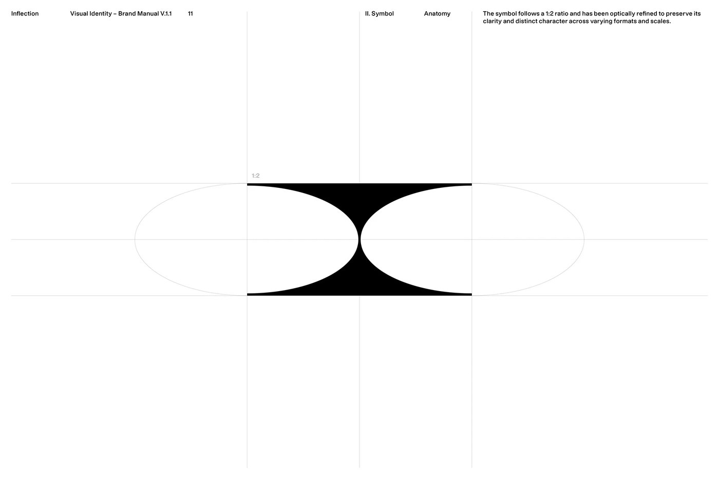
Venture capital branding almost always fails in one of two directions: illegibly abstract or embarrassingly literal. Lundgren+Lindqvist found a third path — a logomark built from a rectangular form interrupted by two elliptical cuts that reads simultaneously as the Roman god Janus's two-faced gaze and a precision-engineered aperture. Studio Pro typeface and a three-part color system (black, white, transitional grey, accent green) complete a system that is serious without being cold.
Muted Char — Alex O'Connor
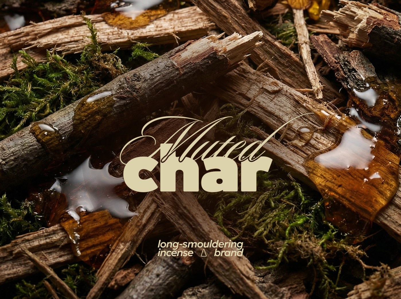
The incense category defaults to either spiritual cliché or lifestyle photography. Muted Char does neither. Alex O'Connor built the identity from material contrast and atmospheric restraint — muted tones that read as found rather than designed, texture treated as information, zero decorative spiritualism anywhere. The system extends across stick and cone variations without announcing the range; coherence comes from weight and atmosphere, not from repetition.
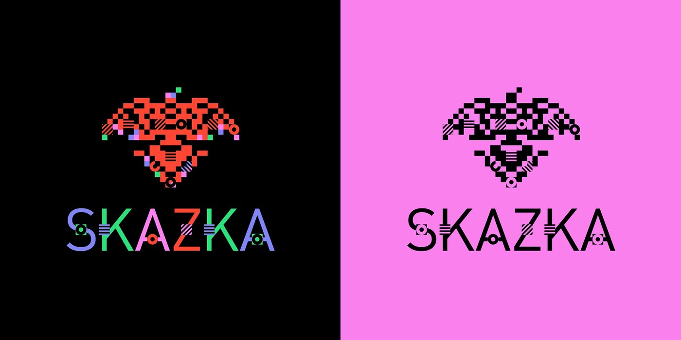
SKAZKA Music Festival — Anastasia Sharapova
The naming tension is the whole brief: fairy tale meets electronic music. Sharapova's resolution is a motion-first identity where kinetic typography is the primary brand carrier — not decoration, not support element, but the thing itself. Music visualization elements are structural components of how the brand moves, not after-the-fact graphics layered on top. The logo doesn't fully exist without the animation to anchor it, and that commitment is exactly what makes the system hold.
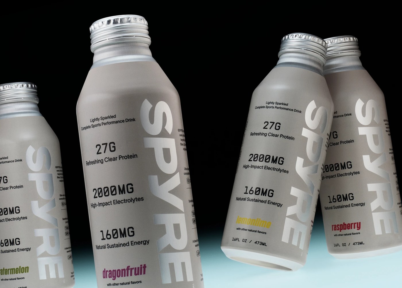
SPYRE™ — Hello Comrade
Most performance drink packaging communicates energy through aggression: jagged type, dark colors, peak-state photography. Hello Comrade in Amsterdam flipped the logic for SPYRE — the beverage's transparency is the visual event. The packaging system makes the product's clarity into the brand argument for purity and precision. The art direction is rigorous enough that product photography functions as composition, not as showcase.
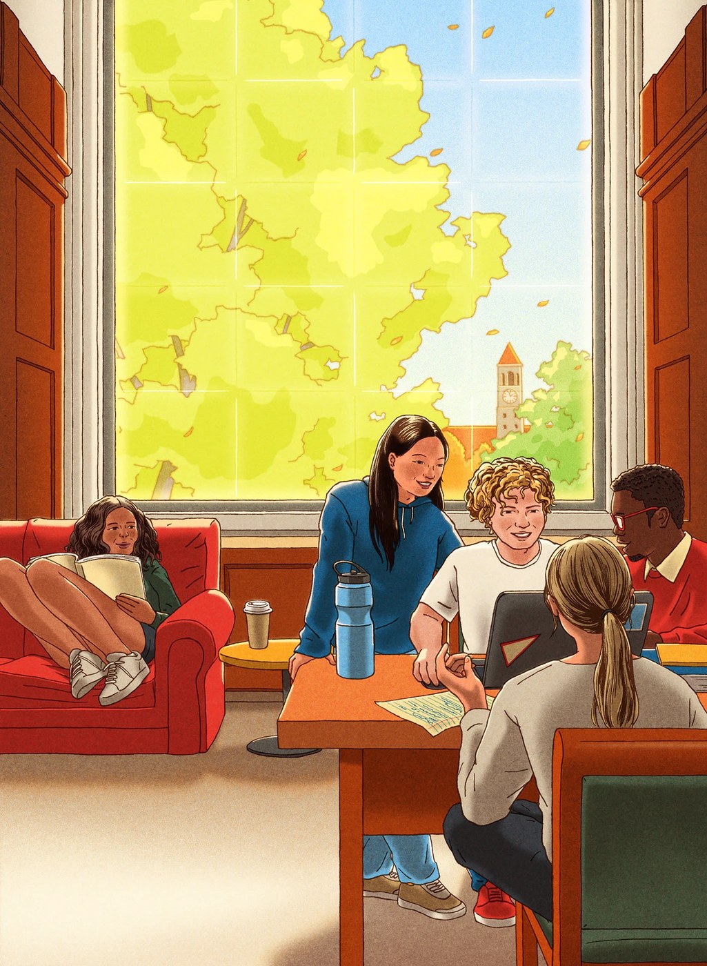
Select Editorial Illustrations 2025 — Xinmei Liu
Editorial illustration at its best doesn't illustrate the article — it makes an argument the article can't. Xinmei Liu's 2025 collection, drawn for The Economist, The Atlantic, Bloomberg, Monocle, and Vox, works consistently in that mode. The pen-and-ink foundation keeps marks legible at column width; the digital color overlays handle register: these are images you read as positions, not as decoration. The geopolitical subject matter is handled with specificity, not cliché.
Lollapalooza Brazil 2026 — LUKTHIS (Lucas Ribeiro)
A festival lineup reveal video has ten seconds to make the audience feel like they're already there. LUKTHIS solved it with a visual language built from the festival's own ingredients — halftones, collages, overlays — treated as dynamic composition material rather than static assets. The hybrid digital/analog approach reinforces the cultural argument of the 2026 edition: classics and avant-garde in collision. Motion by Ricki Mendes gives the animation a rhythm that mirrors what the festival promises.
Varus 775 — Olssøn Barbieri ★ DIELINE Best in Show 2026
The Oslo studio designed a three-part system for German distillery Varus 775: a glass bottle, an aluminum refill vessel, and a ceremonial porcelain piece — each material chosen to carry the historical narrative without decoration. Ceramic craft and systematic refill logic are the only visual argument. No heritage serifs, no borrowed luxury conventions — just the weight of the materials and the precision of the system. First spirits brand to take DIELINE Best in Show since 2019.
Fussy — Beta Design Office ★ DIELINE Editor's Choice 2026
Refillable body care where the design story is behavioral, not aesthetic. Beta Design Office built Fussy around a tinted PET forever-container with recyclable aluminum refills — a two-tone gradient system in magenta, lavender, burnt orange, and sage green. The visible refill inside the transparent exterior turns sustainability into visual logic rather than messaging: you see the behavior, you don't read about it. When structural constraint is the creative act, the system earns its claims through engineering rather than brand language.
Next week: code-native identity where the process is the product — a Paris studio that built a brand from particle systems tuned to the logic of algorithmic trading, and work that treats constraint as its only creative resource. The systems get more explicit.