by abduzeedo
After a week on vacations, I’m back and lots of things happened while I was off. One of the coolest things was that the Pixelmator was released and everybody can get it for 59 dollars, that is a really affordable price. However the sad part of the story is, as I was fortunate to be a beta tester, I lost the beta user’s discount because I was away.
As I said, I’ve been using it since the early versions. It has evolved a lot since then. The interface is one of the most beautiful I have seen, although sometimes I get lost because my background usually is dark and the interface seems to blend with it.
In terms of functionalities it cannot be compared to Photoshop or even GIMP, however it’s the very first version and probably the further updates will make it more powerful. But I have to say it has some very nice features, like very fast real time preview of filter effects, the gradient editing tool, and the iPhoto library integration.
Here I show a tutorial testing the Layer Blending options and some filters.
1 - Create a new document, any size, here I used 1440x900.
2 - Create a gradient: Go to Views>Show Gradients, then click on the add gradient button (+). Just drag the colors to the create the gradients. The circular controllers are for the gradient distribution.

3 - Add a new layer and fill with black, after that change the blending options to Color Dodge.


4 - Using the Ellipse Selection tool, create an ellipse and fill it with white.

5 - Apply a Gaussian Blur, a sort of glow will be created.

6 - Rotate the Layer in Edit>Transform>Rotate.

7 - Duplicate the ellipse layer, resize it in Edit>Transform>Scale and change its position to something like the second photo below. After that use the Text tool.


8 - Create another layer fill it with black, put it below the Text Layer. after that select both layers and merge them Layer>Merge Layer.

9 - Apply the gaussian blur to the merged layer, the same as the step 5.

10 - Create one more layer, fill it with black. Set the Background Color to a dark blue and the Foreground Color to black and go to Filter>Generator>Stripes.

11 - There it goes, the first effect completed.
Second effect
12 - Using the same document, create a new layer and fill it with a beige. Put it in front of the others and set the blending options to Exclusion.

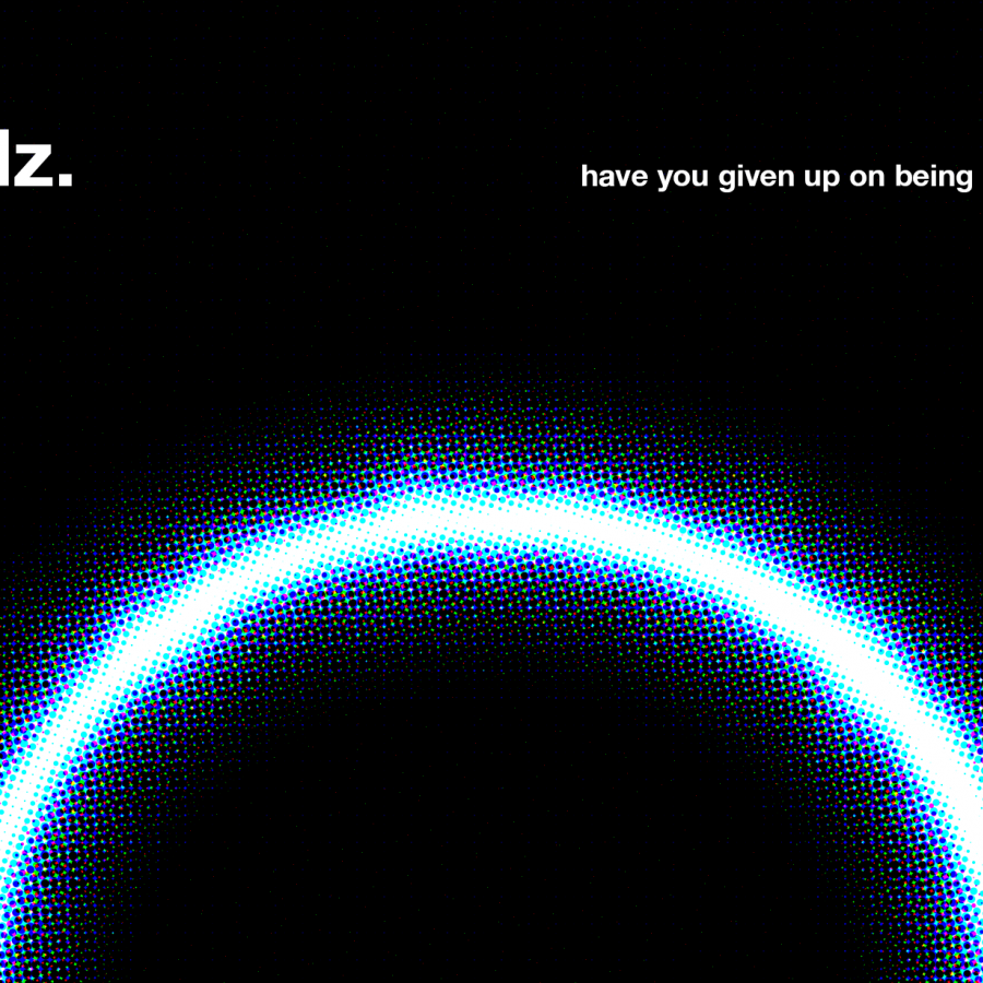
13 - Now it looks like a burned paper or something like that. Anyways, create a new layer and go to Filter>Halftone>Hatched Screen like the image below.

14 - Place the image to your document using the very handy Photo Browser tool ( the image used can be downloaded here). Set the blending options to Color Burn.

15 - Create another layer, go to Filter>Generator>Random to add a bit of noise to the image. Change the blending options to Color Burn 35%.

16 - Using the text tool, add the tag line.

17 - Create another layer and fill it with a gradient. Put it in front of the tag line layer and go to Layer>Create Clipping Mask. Your text will get the gradient effect.


