by abduzeedo
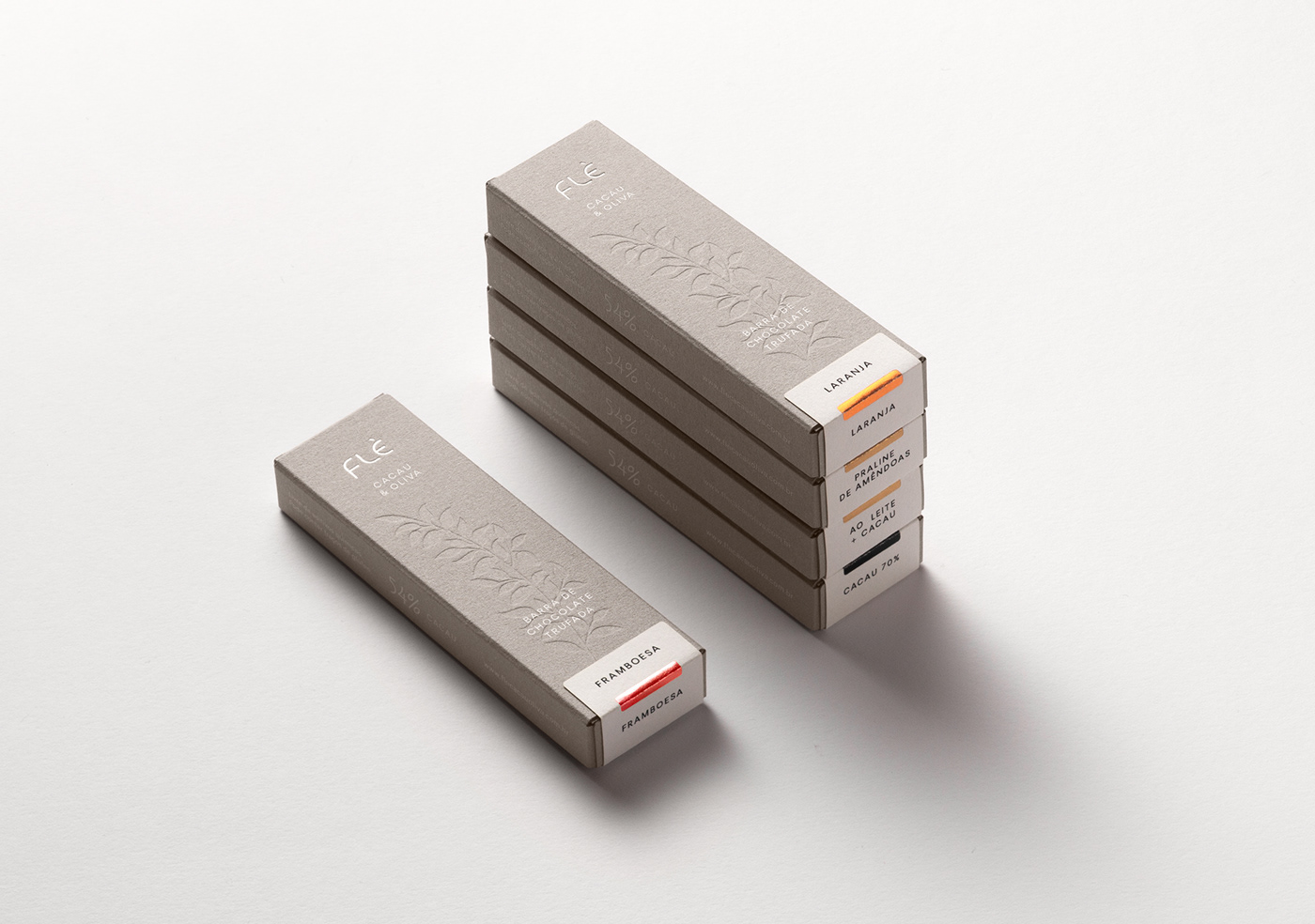
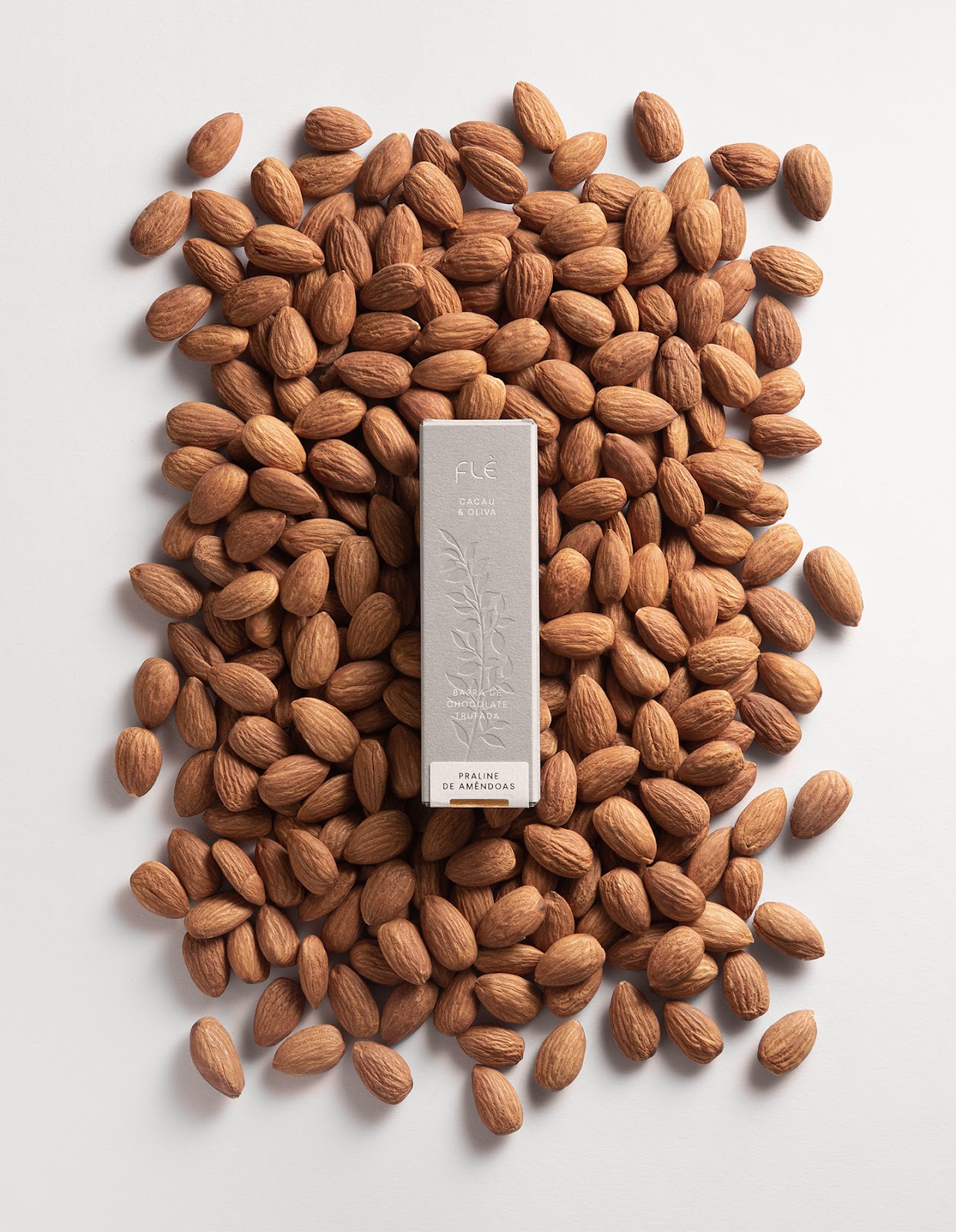
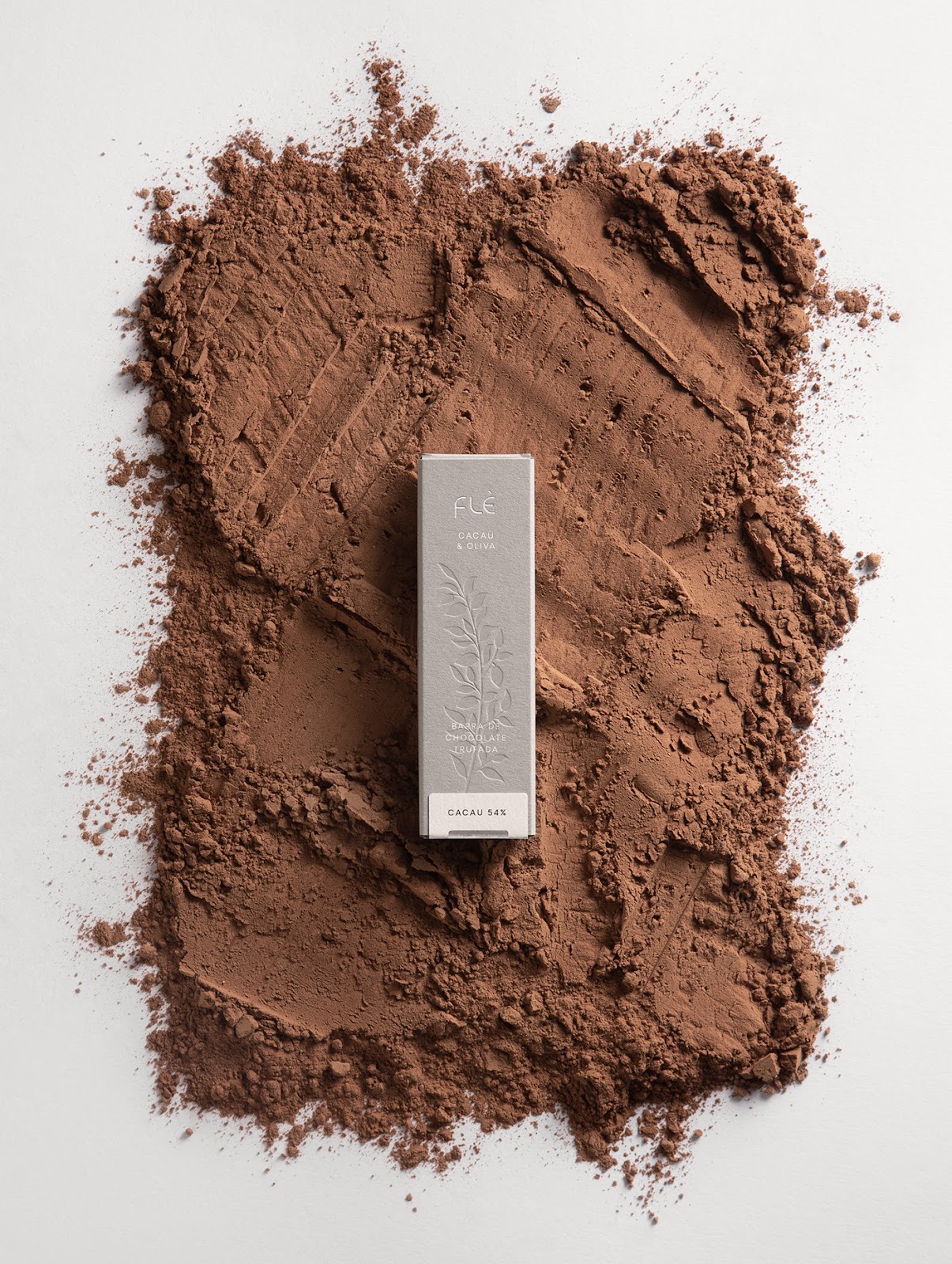
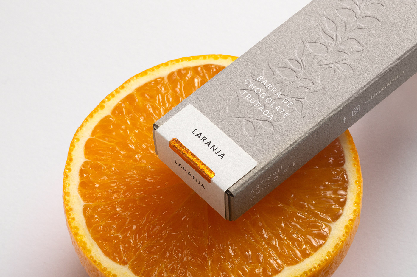
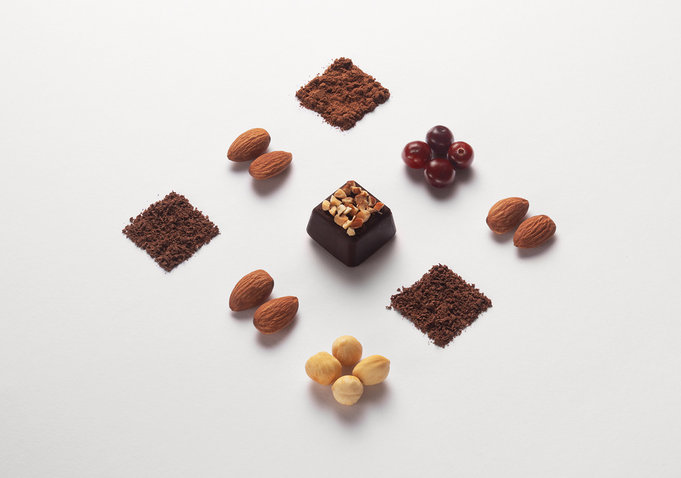
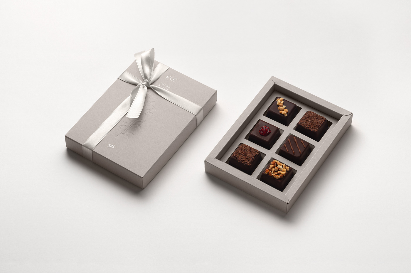
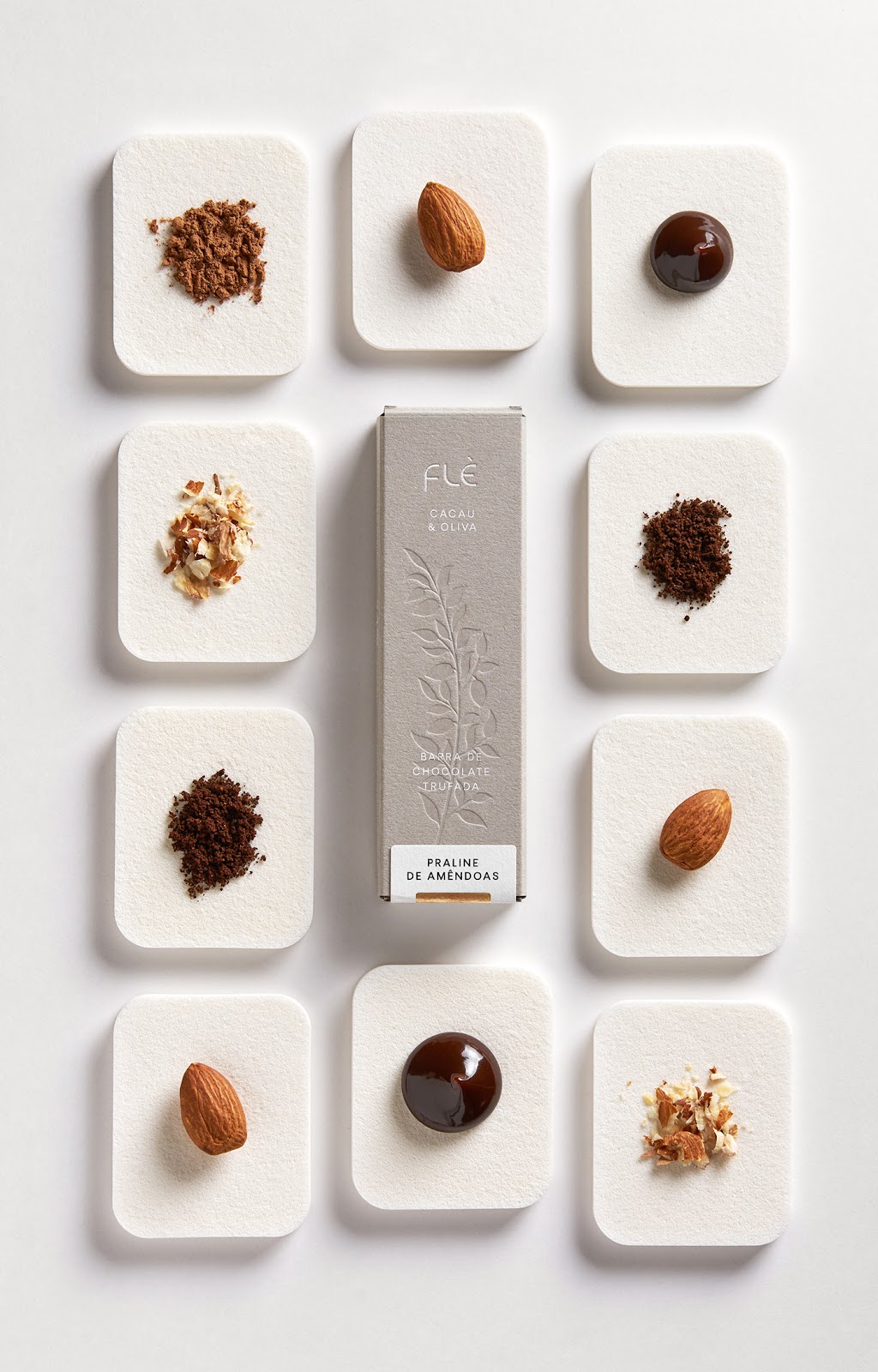
Pavel Emelyanov, Irina Emelyanova, and Comence Studio shared a branding, packaging design and visual identity project for Flè, a Brazilian brand that produces artisan chocolate truffles and bars. They combine a high quality chocolate, olive oil and organic ingredients with their own philosophy. Flè means a flower, symbolically a gift to their customers. “Flowers are the mark of spring, a sign of renewal, awakening and rebirth.”
The symbol is based on the shape of an olive tree flower. The final sign is a combination of the first name letter (f) and a flower symbol. Logotype was inspired by the organic forms of plants and leaves. Smooth natural lines will be associated with the natural origin of the products. One of the main elements of identity is the illustration of the cacao branch. It has modular construction and can be reassembled from simple parts.


Credits
- Art-direction, design: Pavel Emelyanov, Irina Emelyanova
- Photo set: Pavel Emelyanov, Irina Emelyanova
- Print production: Alan Bur
- Photography: Anatoly Vasiliev, Daniil Zherdev
- Paper: Materica Clay, 250g (Fedrigoni)
For more information make sure to visit


