by AoiroStudio
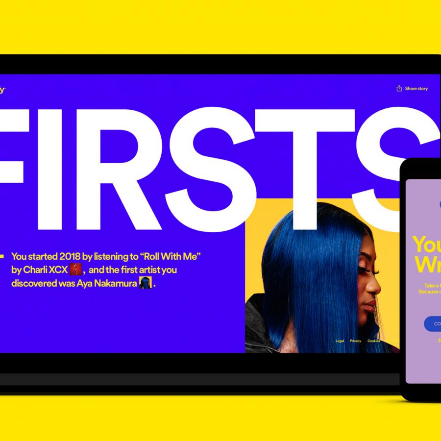
We would like this cool project by designers Diogo Ferreira and Diogo Rosa based in Portugal and their UI/UX concept titled 'Spotify ID'. What is it? Well it's an amazing design that would be based on data visualization of 'how you can you share your favorite music playlist' with your peers, friends, and family. What's particular is how visually it looks through what they conceptualize as 'digital code'. The visuals are stunning and the experience gives you a personal touch to the ones listening to your playlist. Take a look at this Spotify!
Spotify ID also provides the ability to merge different IDs to create a perfect playlist for each group of friends, no matter how different they are.
Art Direction & UI/UX
Diogo Ferreira and Diogo Rosa are the designers behind this proposal, check out the full project on Behance.
- Contribution by Diogo Ferreira
- Contribution by Diogo Rosa

