by AoiroStudio
Graphéine is a brand design agency based in Paris, France. They have shared through via their Behance, the new visual identity for the French Ministry of Culture. The Ministry's logo was initially designed back in 1989 by Pippo Lionni and later in 1999, the logo of the French Republic was added. It's only two decades later that Graphéine had the task to rethink this endeavor into a more flexible and functional visual system for our new digital usages. If you are interested, I really recommend you go on their Behance where they even included a podcast talking about the 'behind-the-scenes', it's really interesting. It's in French, by the way, be warned.
In their words
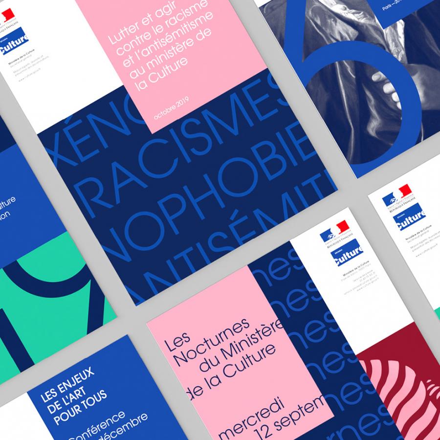
The challenge of this project was to be part of continuity while reinventing contemporary codes. We decided to keep as many of the existing ingredients as possible, despite certain weaknesses, such as the Republic logo, which could only be used on a white background. We couldn't accept this constraint, and by adding a midnight blue tint and taking on the framing in a radical way, we opened up new possibilities.
Links
Intentionally choosing off-centre images and overflowing text helps to arouse curiosity. The image is a "call" which "meaning" is not delivered immediately. The reader is invited to imagine what happens next and must, in turn, do the "work of the mind". This is one of the missions of the ministry!
