03781.
Brand Identity and Packaging Design for INCA
branding

Fieras Estudio and Jorge Luis Campozano shared a beautiful brand identity and packaging design project on their Behance profile.
Fieras Estudio and Jorge Luis Campozano shared a beautiful brand identity and packaging design project on their Behance profile.

Our friends from Adobe have shared the beautiful work from Julieanne Kost, she is the principal digital imaging evangelist at Adobe. She started a series entitled: "Color of Place", a series of images created from blurred strips of travel photographs.

It's finally here, a couple weeks ago Apple has been running its contest for the best Shot on iPhone Challenge and the winners are here. The selected winners will be featured on billboards in selected cities, Apple retail stores and online.

I wanted to change the pace a little and share the incredible work by Deane McGahan, a sculptor based in Seattle, WA, USA. Her incentive foundation is coming right from that region where natural beauty lies everywhere. The simple color strikes me clear beauty and almost feel like the piece of Fortress of Solitude.

I am a fan of simplicity and for this post, I would love to share some artwork that inspired me for some recent personal projects. These are graphic design explorations using simple elements like lines and adding some deformation. It is a super simple effect, you can basically create it in Photoshop using the Displacement Map. The same goes if you want to animate it in After Effects.

The so-long Perfect Office series now turning into Cool Tech Series. A roundup of cool gadgets and tech for your perfect office; not necessarily for designers explicitly but for all of you tech-savvy nerds out there. This is an open concept! if you have any suggestions, please let us know!
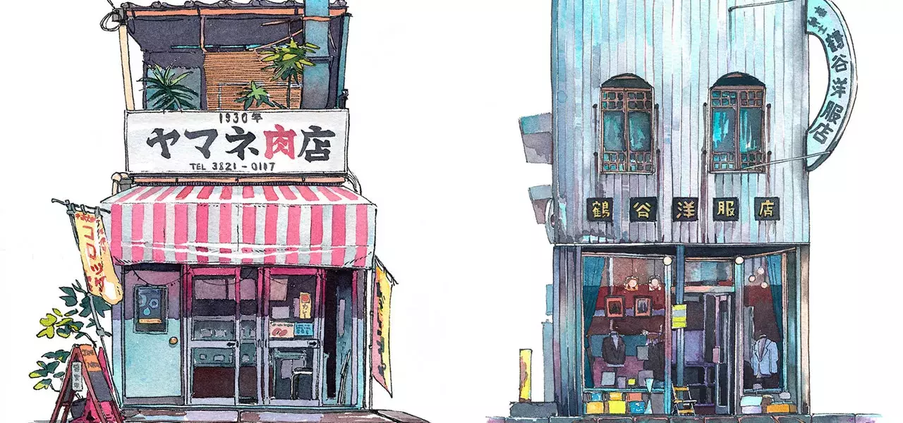
Mateusz Urbanowicz aka. Matto, is a very talented illustrator and digital designer. Born and raised in Silesia, Poland, Matto currently lives in Tokyo. The artist has a lot of beautiful artworks on his portfolio. But one series of illustrations he created really caught my attention.

10 original portfolios that will thrust you to actually redo yours

I stumbled across this beautiful illustration and graphic design project by Imédia Firme Créative, especially the work from Marie-Joëlle Lemire, Nicolas Lambert, Valérie Pilotte and Claudie Déry. It’s one of those things that you’ll giveaway as a gift and for this present case is so well done. I also really enjoy the print work with the shiny vinyl.

DAZZLE SHIP™ have shared with us their latest personal experiment where they taking us on a trip around the world through typographic forms. DAZZLE SHIP™ is a creative production studio focusing their work in direction for design and motion. Can you guess the countries the designs are from?


It's been a longtime coming and it's nice to see an from Lightroom, they have introduced huge updates including the all-new Sensei-powered feature called Enhance Details. Combining the power of machine learning and computational photograph that takes a brand new approach to RAW photos.

We have been posting a series of posts featuring graphic design and web design work that, in a way, brings back the 90s in terms of aesthetics and style. It’s hard to define that, it might vary from person to person. For me, while the 80s was all about neon, futuristic computer-generated images with chrome, unicorns running across a digital grid, and of course the RGB colors.

We are featuring a collaborative work from Mill+ and Antibody with Nic Pizzolato to create the opening title sequence for the long-awaited third season of HBO's ‘True Detective’.

I grew up watching "futebol", that's the way we call soccer in Brazil. My father was the one that introduced us to the passion behind this sport in Brazil. We used to go to pretty much every soccer game that our local team would play. In Brazil you root for your team and that's it, you don't support or even sympathize with any other team.

Mixing through branding, graphic design and typography, we've always been fans of Kevin Cantrell. Learning more about Kevin's motto/philosophy, we'll find ourselves in a branding system filled with brand architecture, graphic marks, monograms, seals, badges and much more worth considering.

Spanish digital artist Retoka created this amazing project called "Client Error 4xx" which illustrator some error images in a way I've never seen before. There's also a video of the process, check it out!
For more from Retoka visit retoka.com.

Being a student is hard work... you spend hundreds of hours designing and evolving so that you may get to the point where you start doing solid, awesome projects that make you proud. The feeling of being able to design an awesome piece is just priceless.

The unfamous Daily Design Inspiration series that started it all on Abduzeedo. Where you'll find the most interesting designs/artworks/concepts curated by one of us to utterly inspire your day.

Today, I was just browsing on Instagram and I stumbled across this lovely series of wallpapers made by our pal Jordan Metcalf, a graphic designer based in Portland, Oregon. Focusing his work into lettering and identity design, he designed 3 wallpapers available for your Desktop and Mobile.


