1
What Was Design? A Bold Book Design by Slanted Publishers
Typography
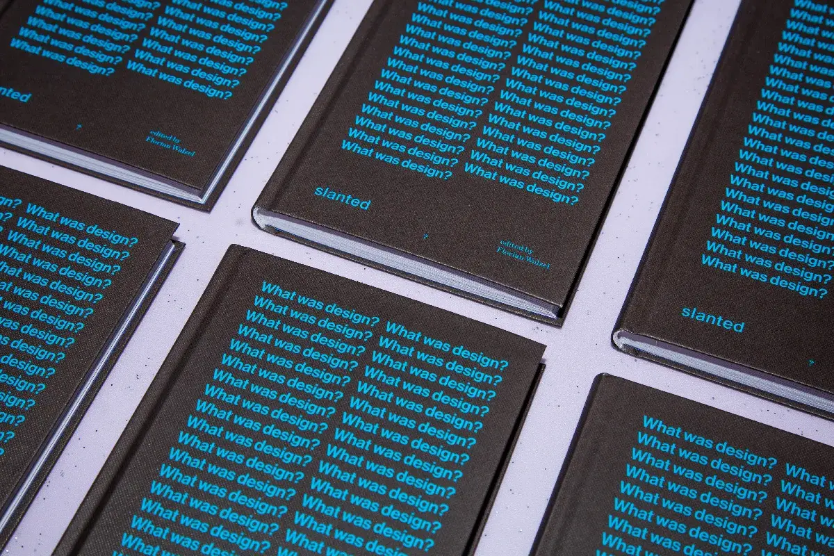
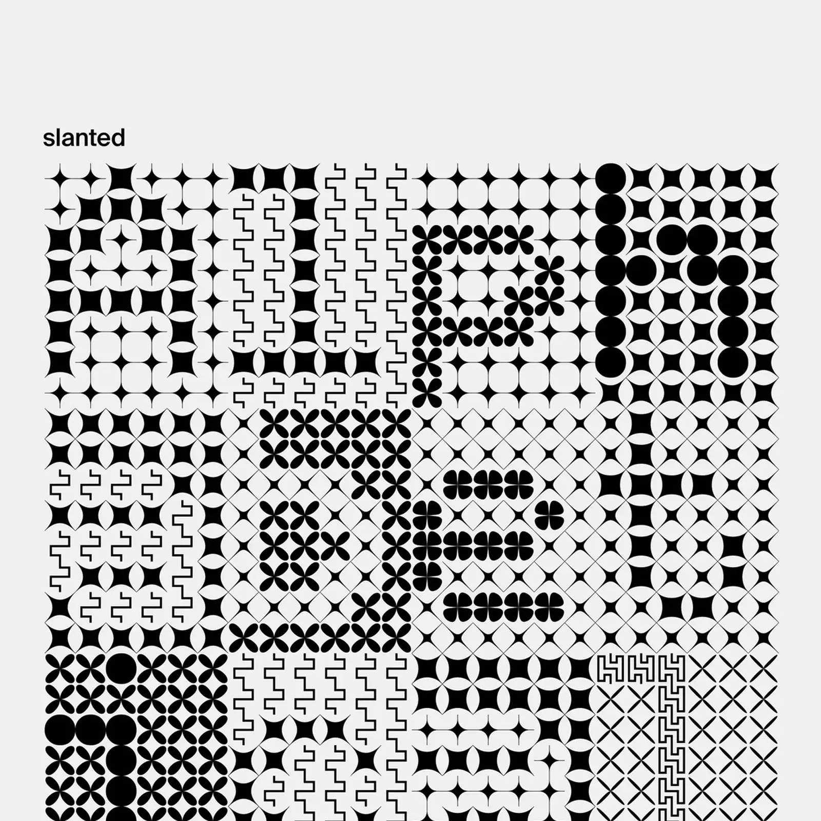
Slanted Publishers releases What was design?, a compact book design that collects 87 one-sentence definitions from a century of creative minds. By Walzel
Slanted Publishers releases What was design?, a compact book design that collects 87 one-sentence definitions from a century of creative minds. By Walzel
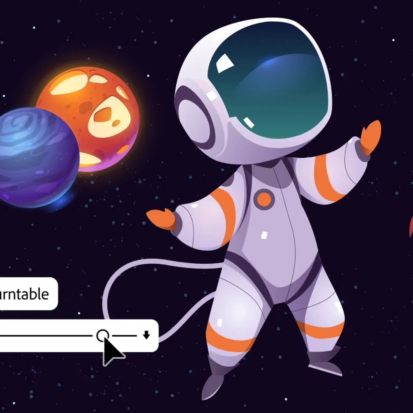
Adobe Turntable is now generally available in Illustrator, letting designers generate up to 74 editable vector views from a single flat illustration now.
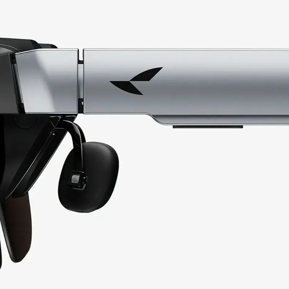
Han Gao's RayNeo brand identity turns optics and speed into a bird-in-flight mark built from precise geometric planes—sharp, directional, built for tech.
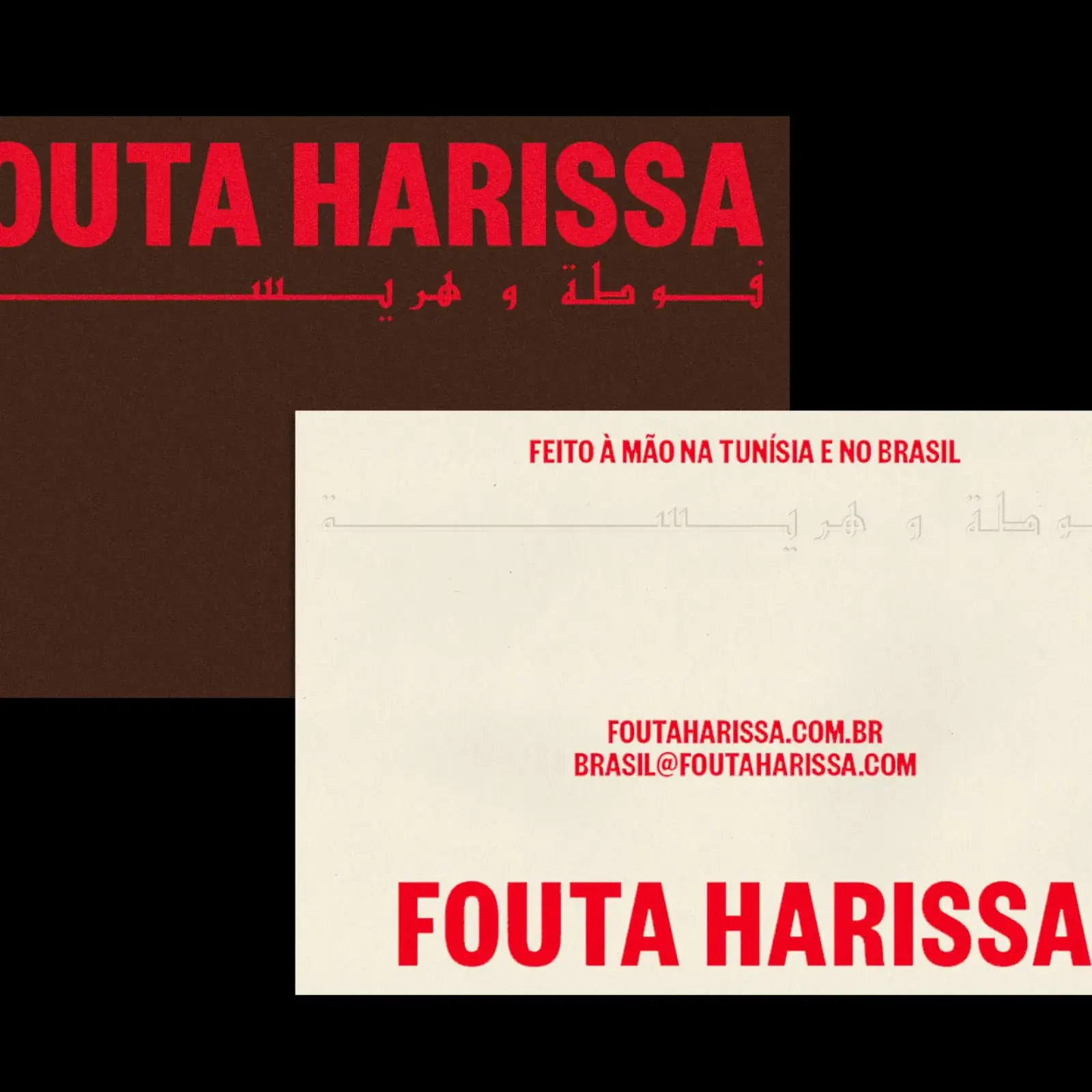
Sometimes Always rebuilt Fouta Harissa’s brand identity around bold harissa red, warm earthy tones, and geometric frames drawn from vintage cassette art.
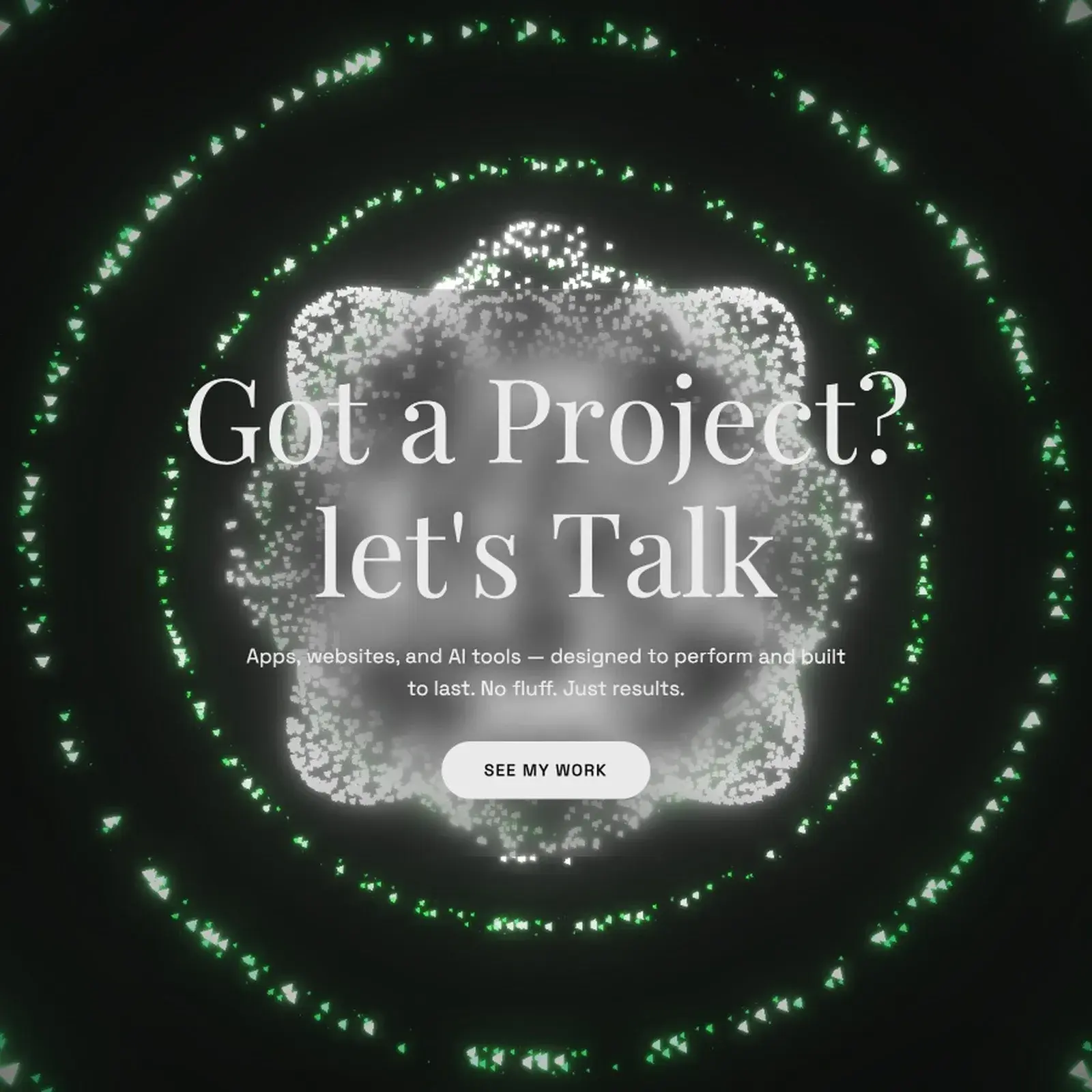
Casberry is Eswar Prasaath's own web design portfolio: a bold green-particle brand identity that merges cursive type with sharp interactive digital work.
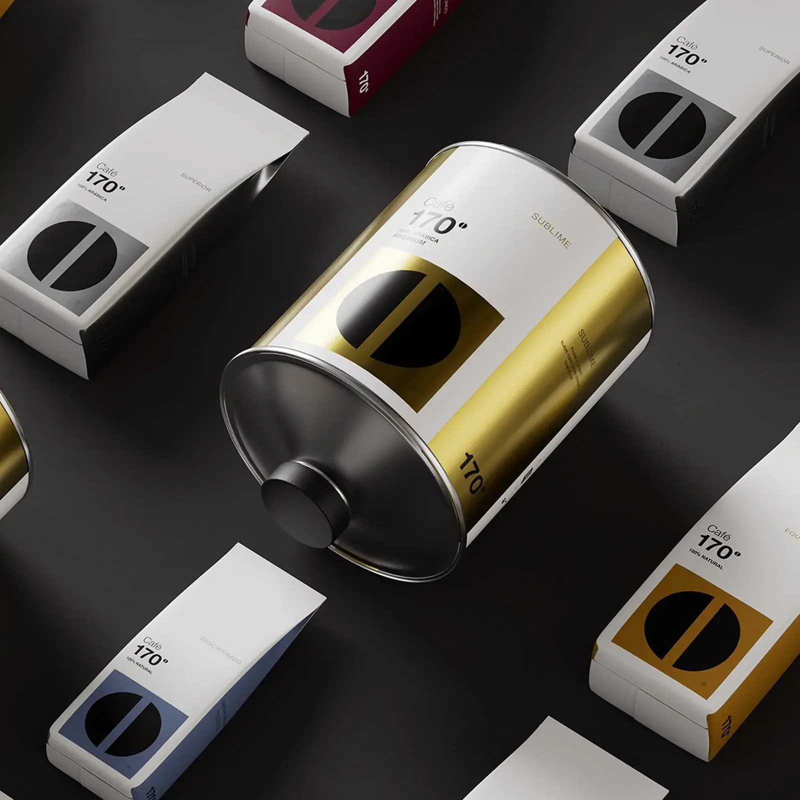
M+C SAATCHI Spain designed the coffee packaging for Café 170º, building an entire brand system around the exact temperature at which beans transform
This weekly design recap from March 23-28 covers Google Stitch, AI writing to Figma, topographic web design, fluid Three.js shaders, and type that lives.

Phase by Pixelpaw Labs is a modular mouse controller that detaches magnetically into a two-handed game controller, giving gamers one device in two forms.
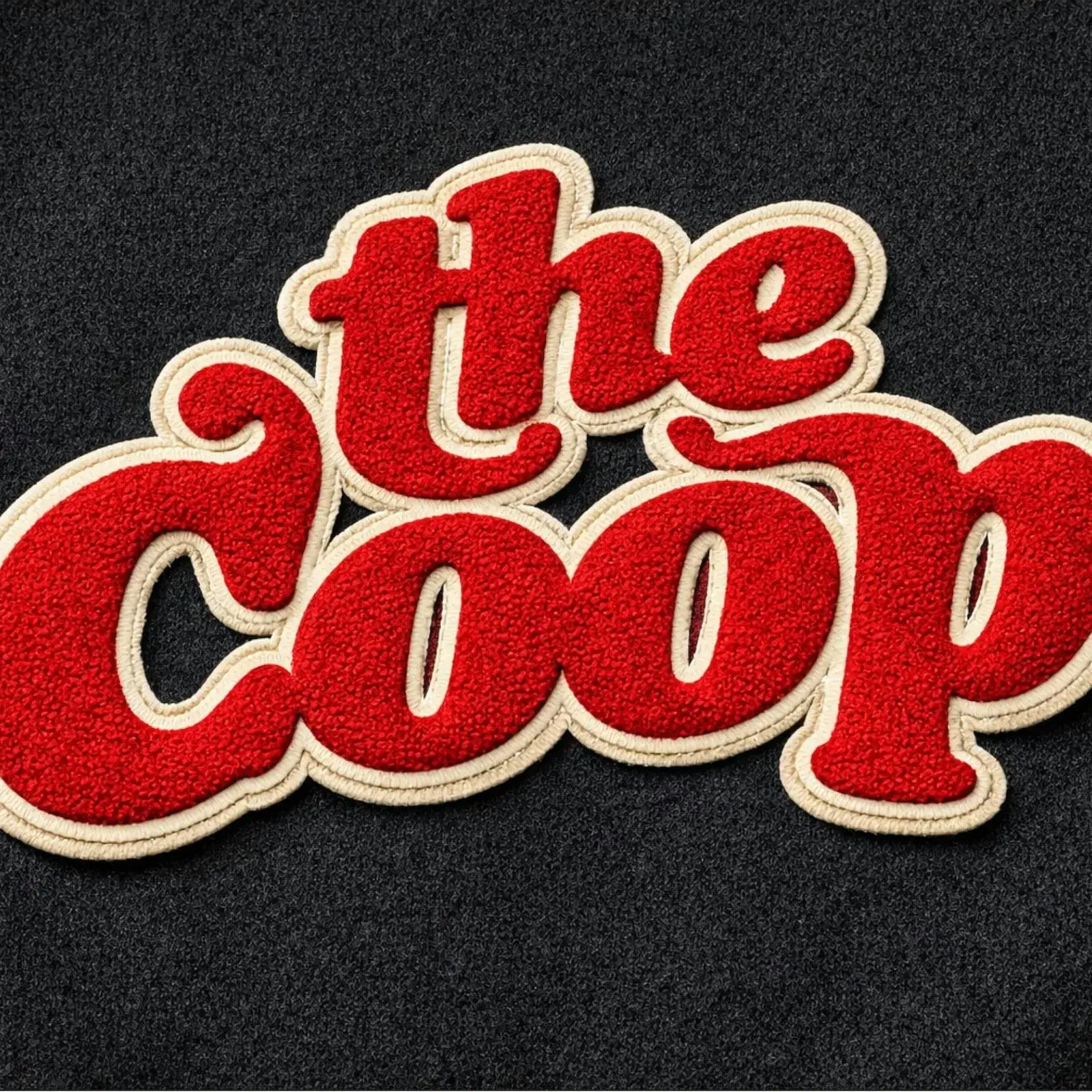
YummyColours redesigned the Harvard COOP brand identity, returning the cooperative to its community-first roots with a refined and enduring visual system

Meshy-6 brings AI image to 3D inside MakerWorld by Bambu Lab. Upload any photo, get a full-color 3MF file in under two minutes. No CAD experience needed.
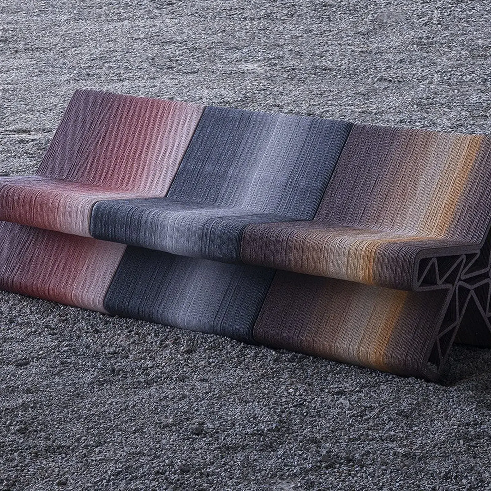
BENTU DESIGN's Inorganic Growth converts demolition waste from urban villages into 3D printed street furniture, with algorithmically derived color tones.
Eleanor Yang's Synthetic Nature transforms generative typography into a living system. Three typefaces respond to the body via webcams, touch, and p5.js.
Discover the best free fonts March 2026 has released. From Neville Brody's BF Popaganda to Tatemod, here is a curated selection of the top new typefaces.
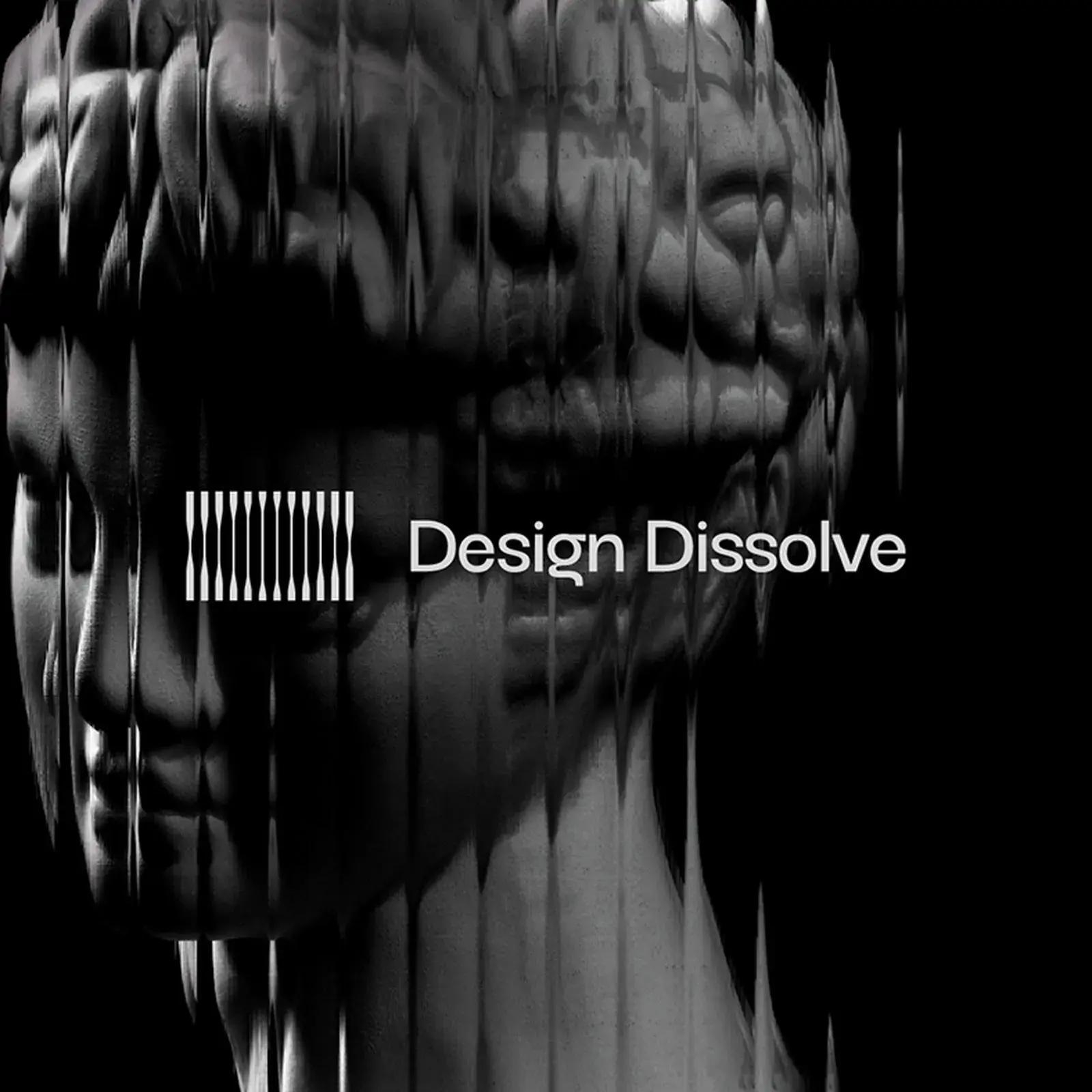
Brand identity for Design Dissolve, a Brazilian design school with a fluted-glass logo mark, dark type palette, and a versatile print and digital system.

Lil Agents is a free, open-source macOS app that places tiny animated AI companions above your dock, giving instant access to Claude, Codex, and Copilot.
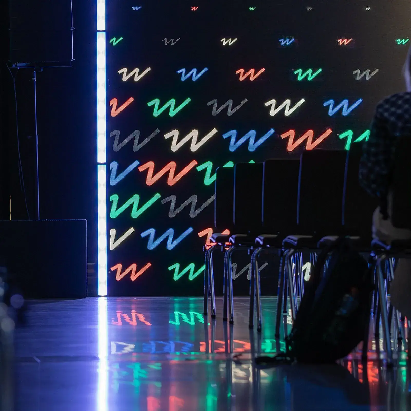
Brand identity design for WaysConf, Central Europe's top product conference, scales a local event into a world-class visual system for 1,500+ attendees.
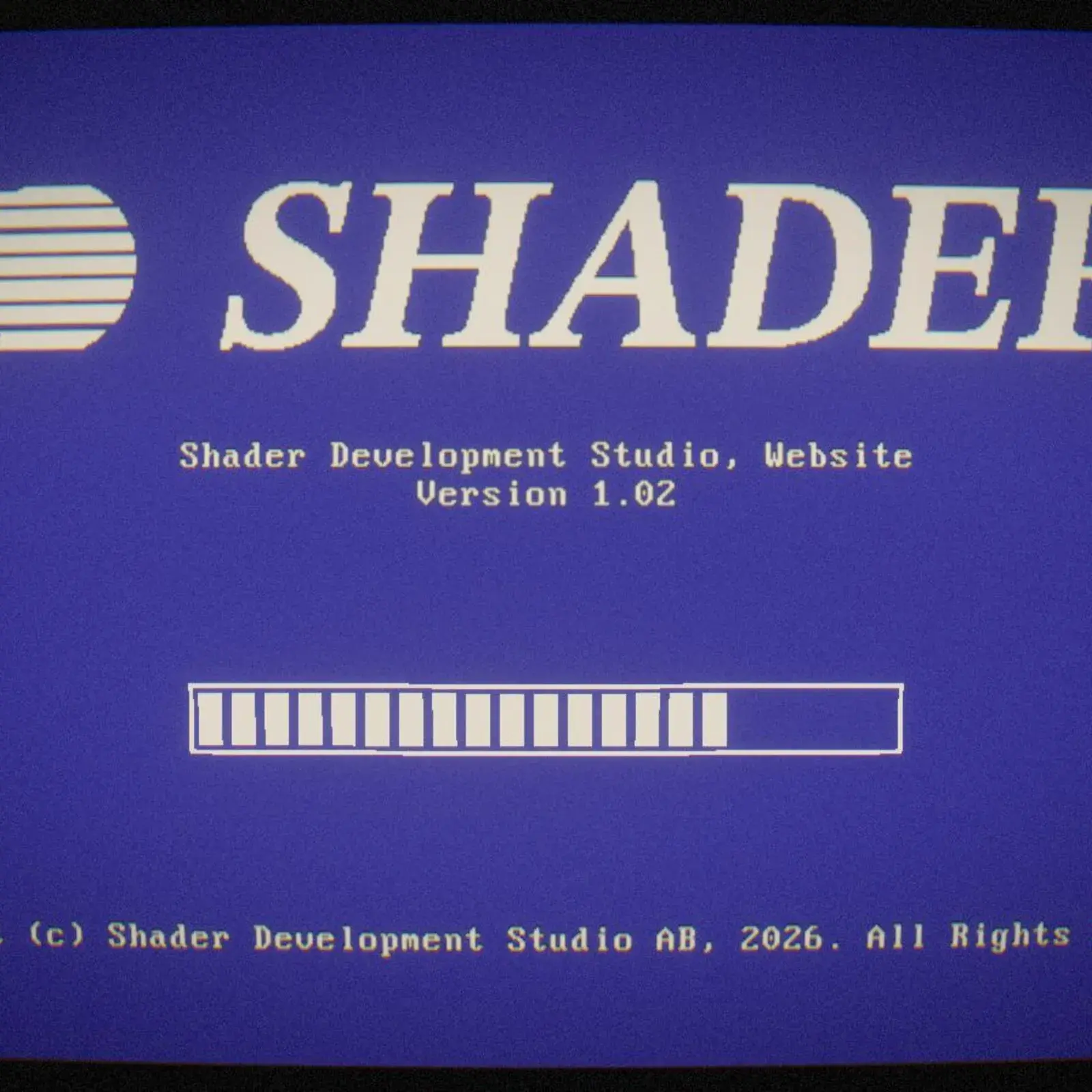
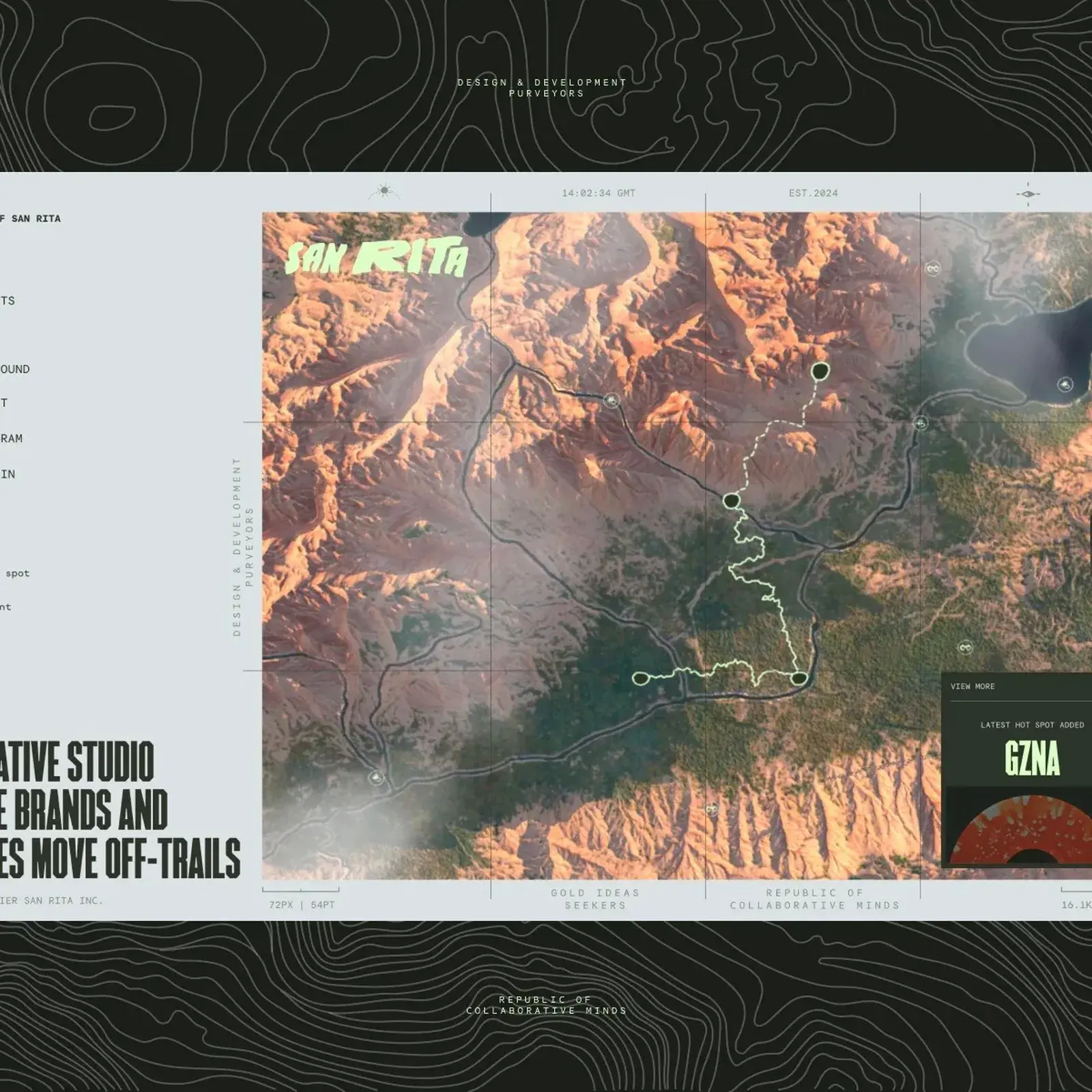
Interactive web design hits new depth with Shader, a Swedish studio crafting WebGL, 3D, and AI-driven web experiences that turns the site into the brand.
Void Reflections marks the ten-year anniversary of VOID Studio Oslo with multi-voiced essays and visual narratives spanning art, design, and informatics.
Peilin Li illustration takes small moments and builds warm character-driven scenes that blend graphic design structure with personal visual storytelling.
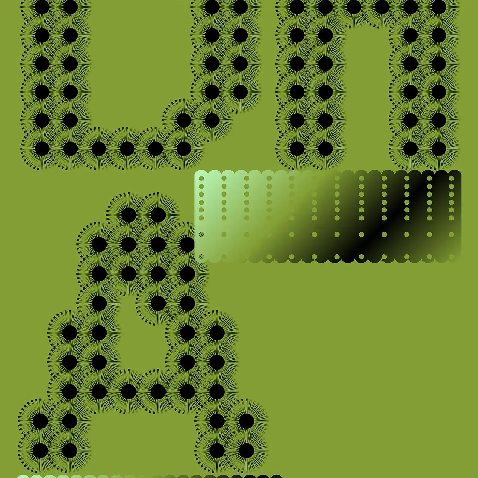
Alphabetical Playground by Nigel Cottier is a 696-page experimental type design book treating the alphabet as a limitless space for creative expression.
Send your project to be featured on the blog. Follow the instruction on the template and good luck. Ah, make sure you add the images and credits that are due.


