Featured Content

03001.

Photos of the Week - Tokyo, Germany and California

photography

A couple of weeks ago I shared some photos I took last year. The main goal was, one, to share high resolution images, and two, to create an incentive for me to take more photos. With those noble causes in mind I had the chance to travel to Europe last week for a short business trip. In between meetings I was able to sneak out and capture some photos.

03005.

Today is Photoshop’s 30th birthday! 

photoshop

It’s crazy to think that a design tool is 30 years young but for me especially it’s even more surreal because Photoshop had a huge impact in my career and in my life. Abduzeedo was built around Photoshop tutorials pretty much. I had, and still have, a lot of fun creating images and light effects in Photoshop.

03006.

CGI Compositions & Light Effects Bottoms Up

3d

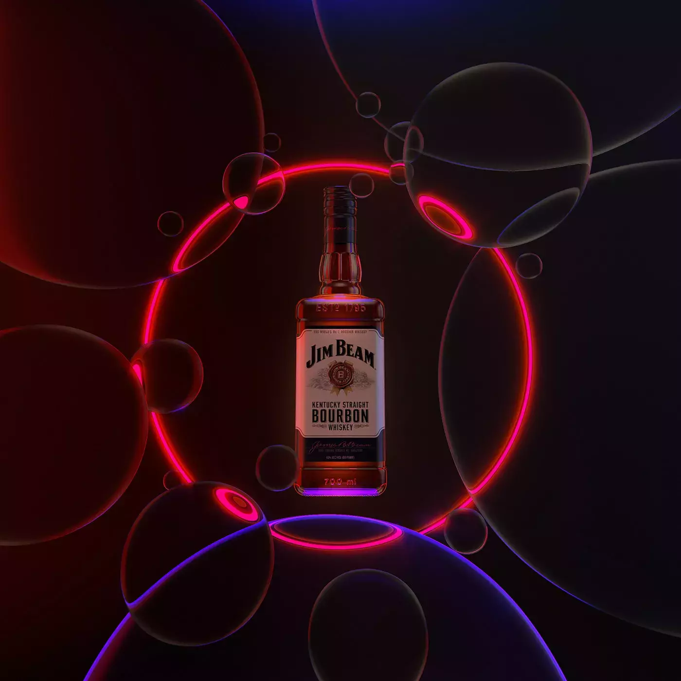
Mike Campau shared some incredible CGI explorations for beverage campaigns featuring famous brands like Jim Beam, Courvoisier and others. There are tons of different compositions but the ones that caught my attention were the ones that had some flashy and classy neon light effects, not a surprise you might say.

03007.

Modular Kaleidoscopic Patterns and Illustration

illustration

Flavio Melchiorre shared a colorful illustration project titled ”Tropicália” - 2020. He describes the project as an Experimental Digital Design involving modular kaleidoscopic patterns. The result is a super colorful set of compositions with a style that reminds me a bit of the art of the famous Brazilian artist Romero Brito.

03008.

Web Design Inspiration: Carloct.com

web design

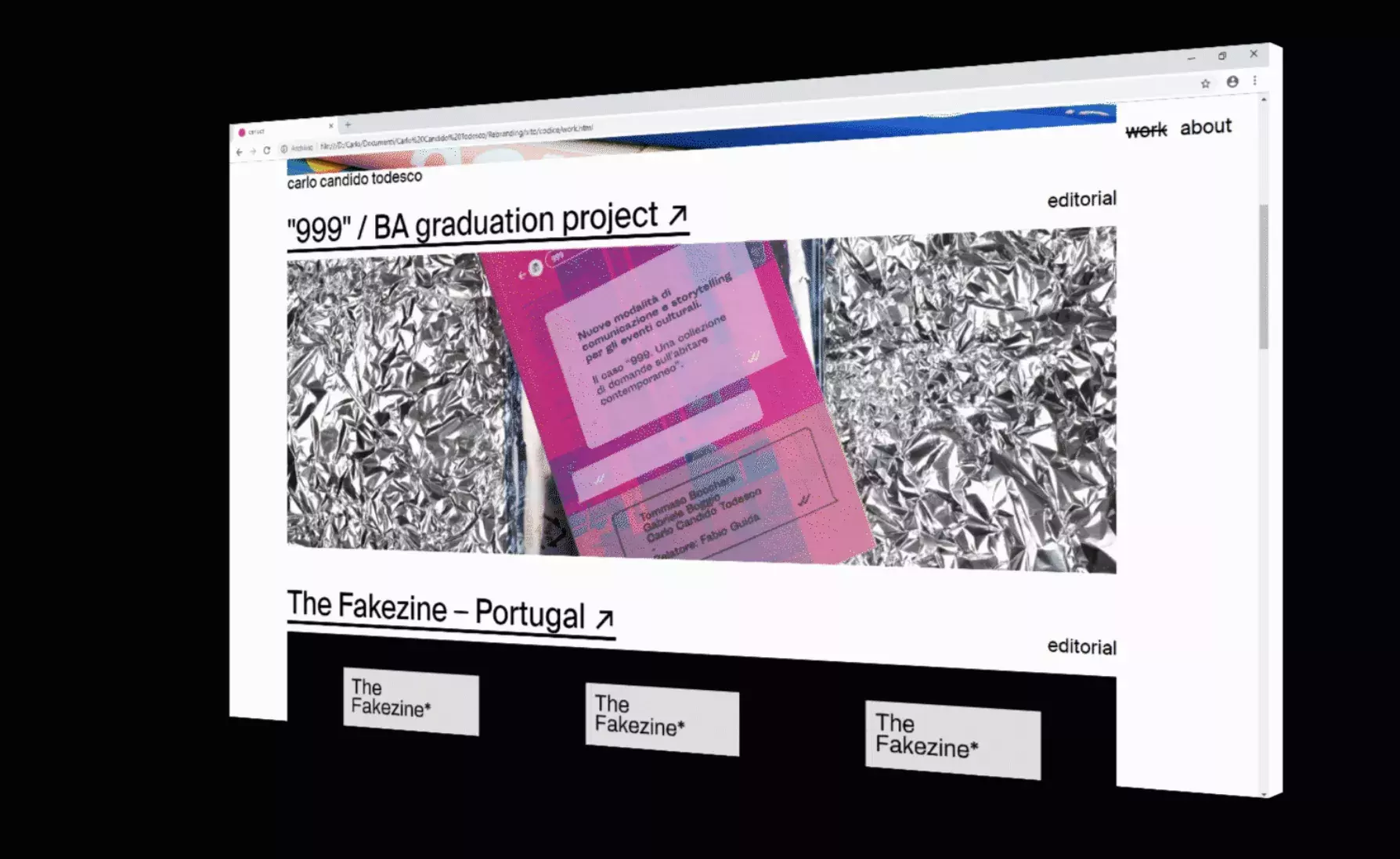
It’s that time of the year that I am thinking about redesigning both my personal website and the blog. With this phase comes a lot of browsing thru inspiration examples of web design. Some are new, some are old but it’s always nice to see what it’s out there. I know that I am also stuck to simple, black and white, editorial design-like style. No neo-skeuomorphism just yet.

03009.

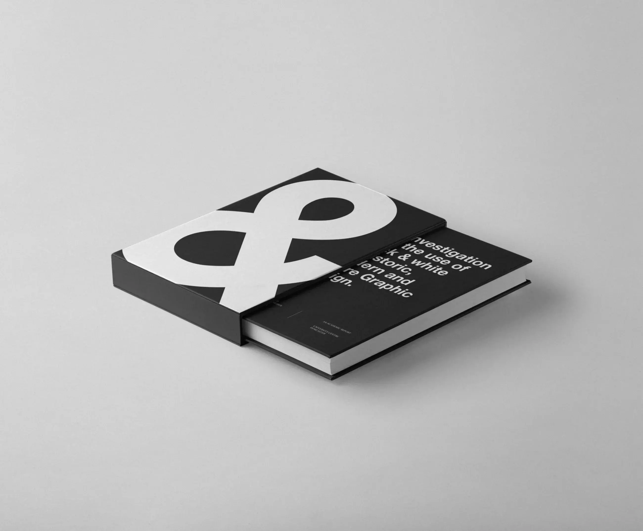
Simplicity in Design at its best with B+W

editorial design

Simplicity is the biggest challenge for any designer. Well, at least it’s for me as I constantly battle to find ways to reduce elements, colors and pretty much anything without sacrificing usability. That’s why it’s difficult, however for some people it seems a bit easier, or they make it look easier, which highlights their talent.

03012.

Motion & Production for "We Need To Talk" Opening Sequence

Motion

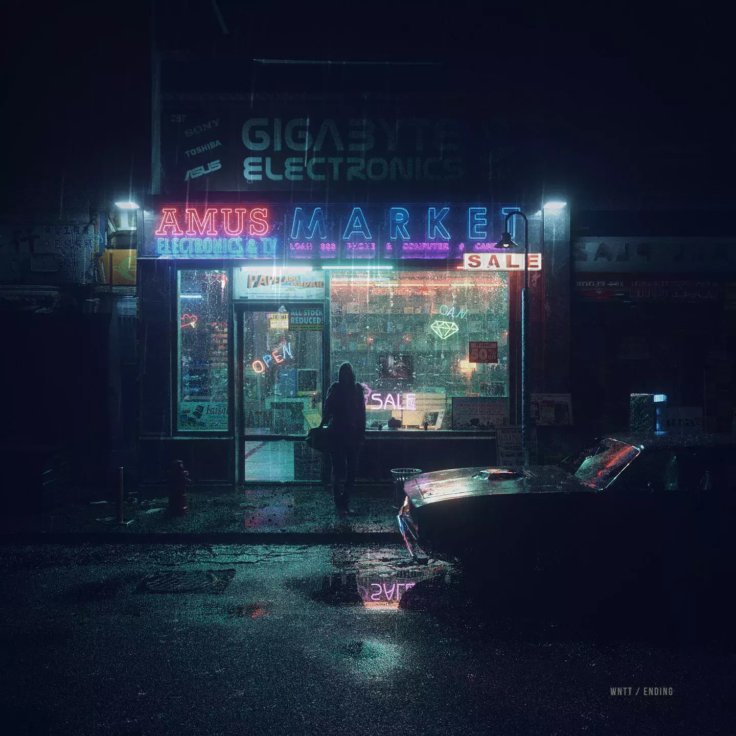
A couple of months ago, we have shared on ABDZ a very outstanding tribute for the cult AKIRA animated movie by Ash Thorp in collaboration with zaoeyo. zaoeyo has administered to introduce a new project and it's a motion & production for "We Need To Talk" opening sequence. You can totally feel the inspirational vibes from Blade Runner, Mr. Robot and neons!

03013.

Samsonite Rebranding Campaign

rebranding

Nowadays, I like to think that any brands/companies with an existence with more than two decades, with how advanced is today's technology and social media. They must be trying to re-invent how the users will or can interact with the future of the brand.

03016.

Motion Design for the Comprehensive Pixel 4 Visual System

motion design

I own an iPhone 11 Pro and the Pixel 4 XL and I have to say. Pause here, the Pixel 4 is much nicer from the industrial design point of view than the iPhone. I am talking about just the way that it feels when holding. There's something about the black rails, the pop of color of the white one and the simplicity that makes it especial.

03017.

Is this really coming back? UI Design Trends

visual design

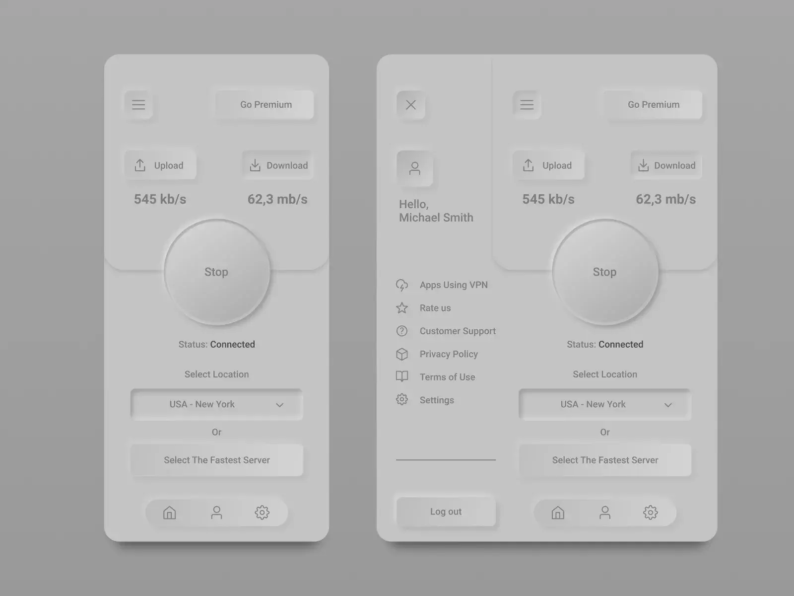
We posted about this new trend a month or so ago, however it seems that it’s really picking up steam on sites like Dribbble. With more and more people sharing snippets of working exploring this style it makes me wonder, is the skeuomorphism or as we call it now, the neo-skeuomorphism coming back?

03019.

Packaging Design Awesomeness: Abrogratto

packaging design

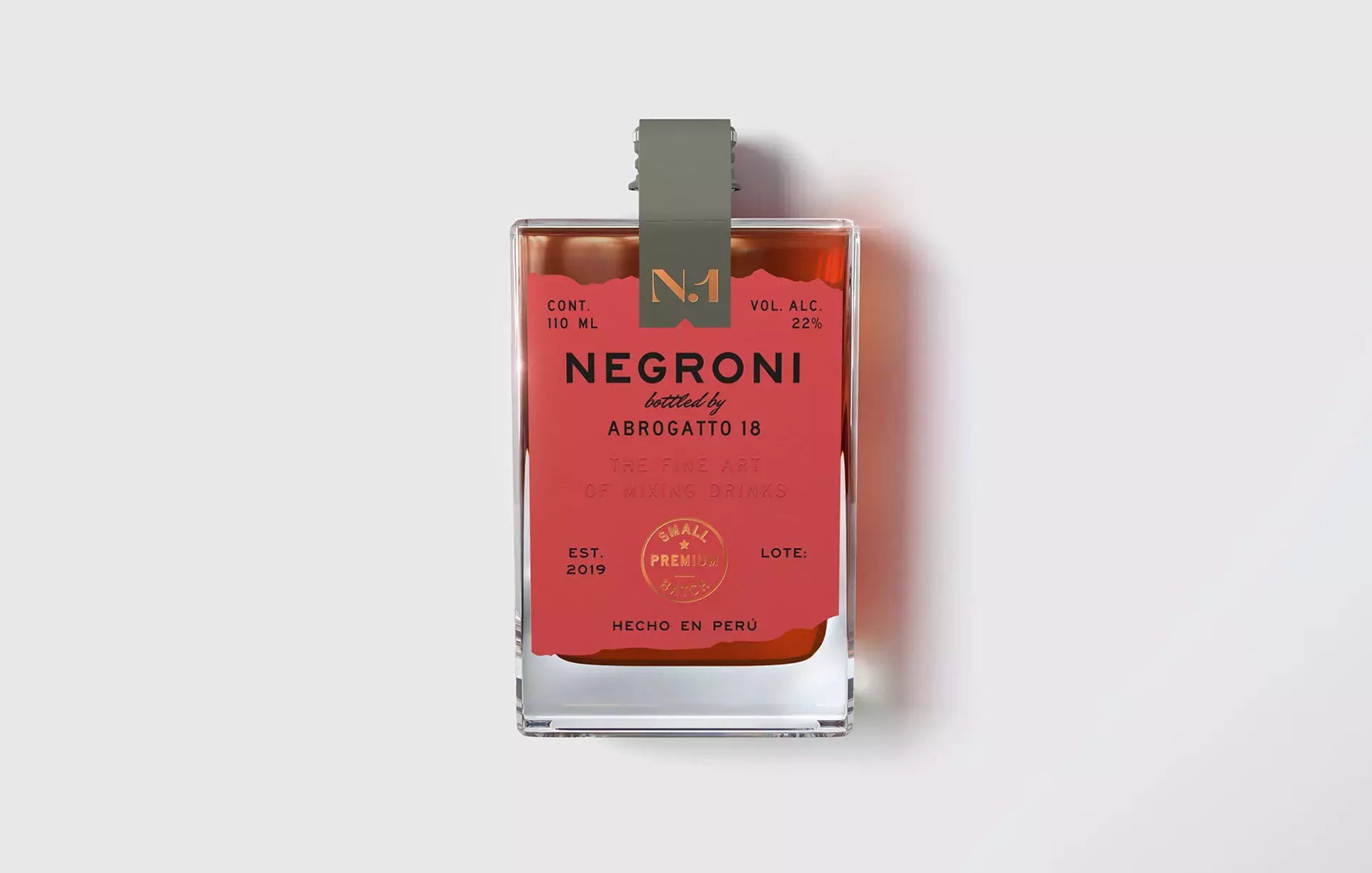
Abrogratto 18 is a brand of premium, ready-to-drink bottled cocktails. As it is a small company, they have chosen to create collections of small batches of classic cocktails, the first one being Negroni. The visual identity of Abrogratto 18 is versatile and neutral so that it can adapt to each of the collections without losing the essence of the brand.